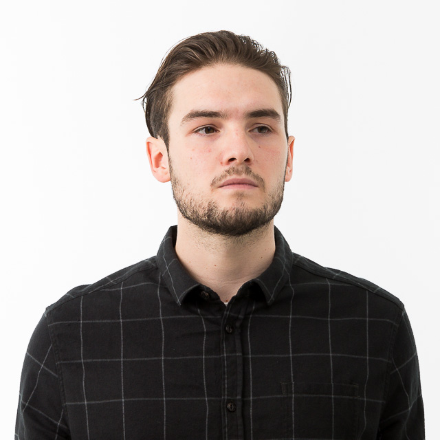
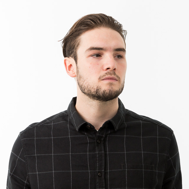
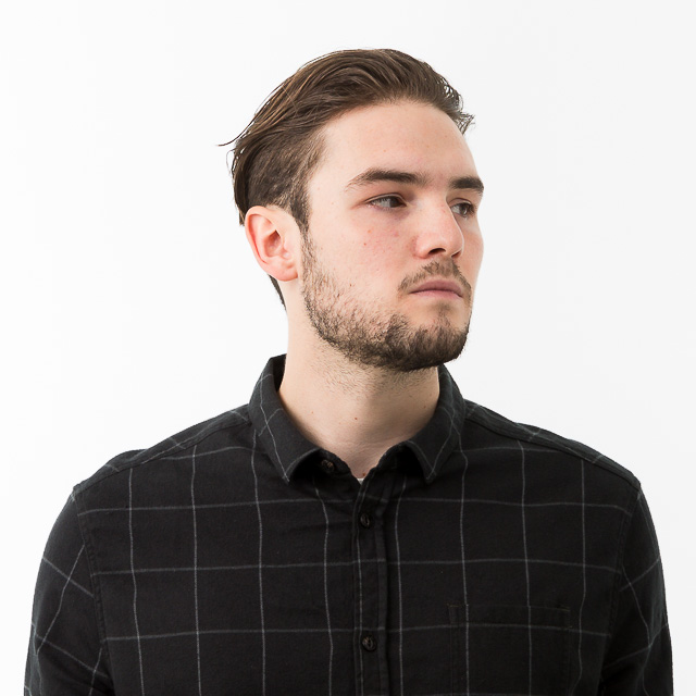
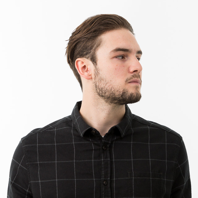
2017 in pictures
A selection of commissions from the past year for clients including National Theatre, Huawei, Sense and Pfizer
Here are some of my favourite shots taken in 2017. As some have already appeared - one of the drawbacks of blogging - I'm including some background this time around.
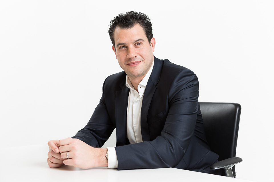
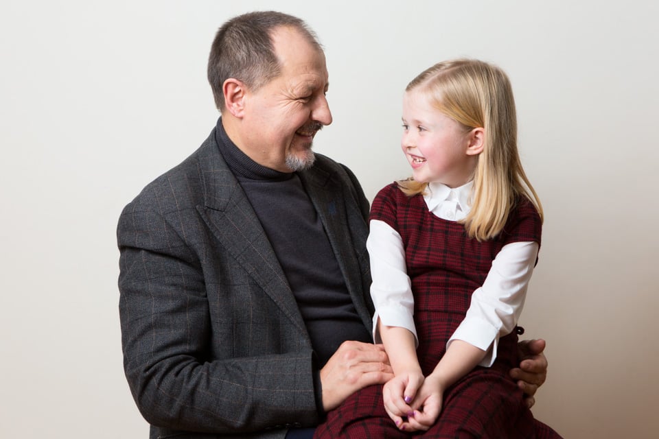
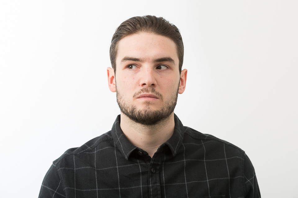
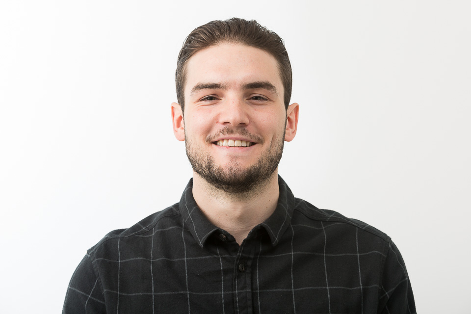
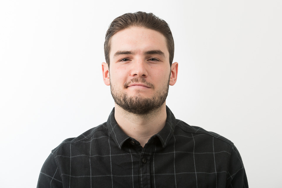
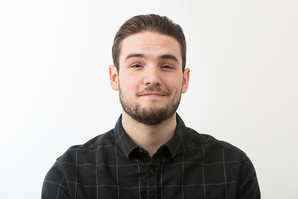
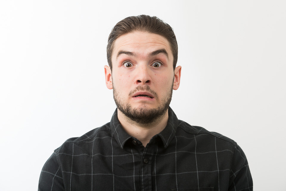
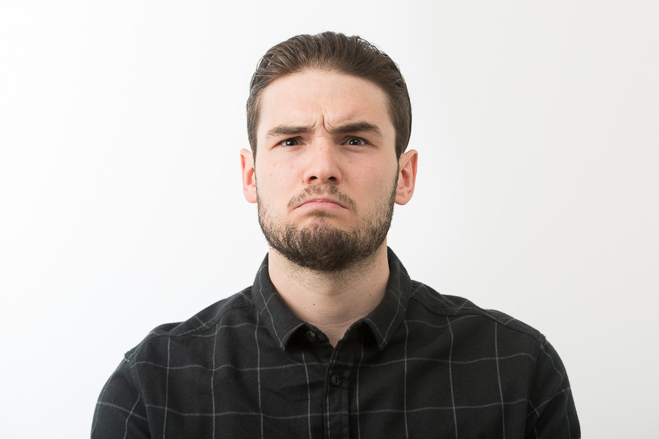
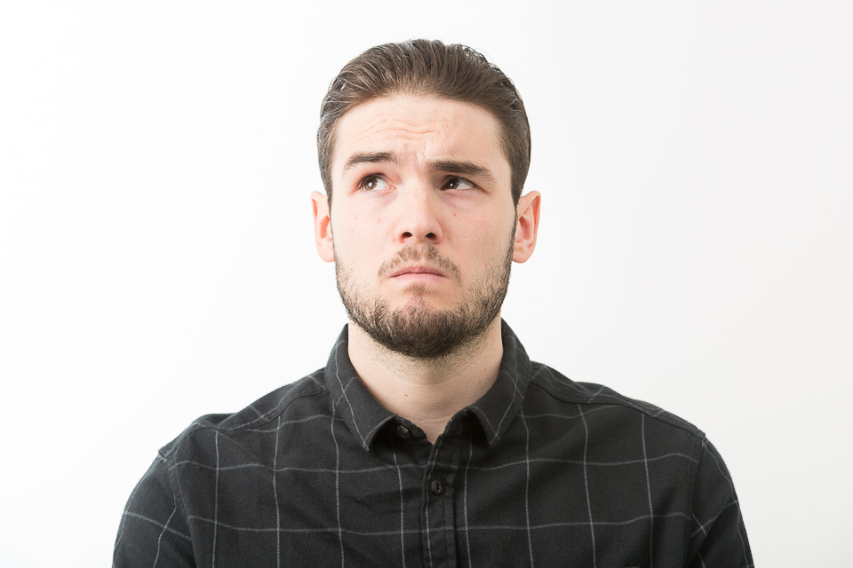
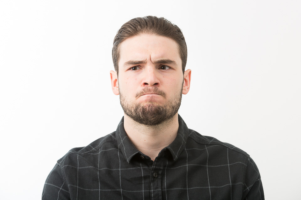
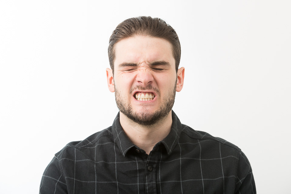
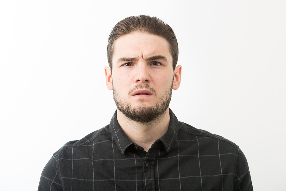
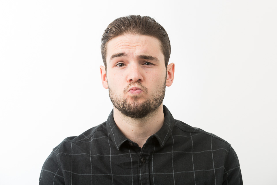
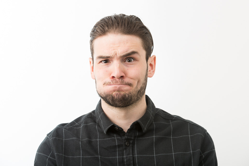
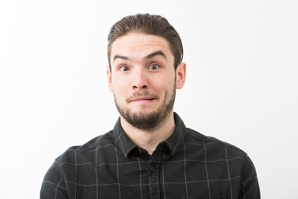
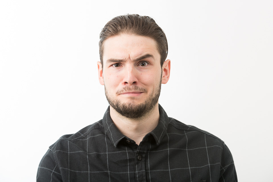
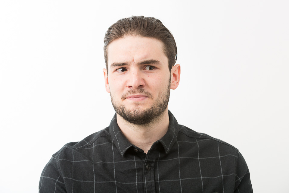
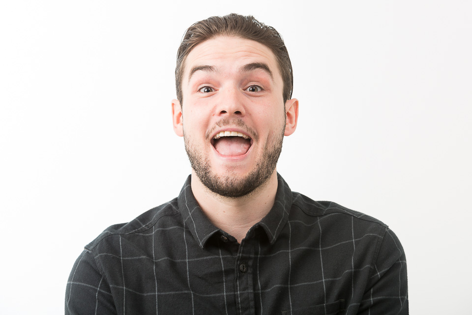
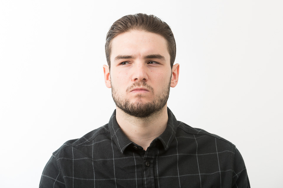
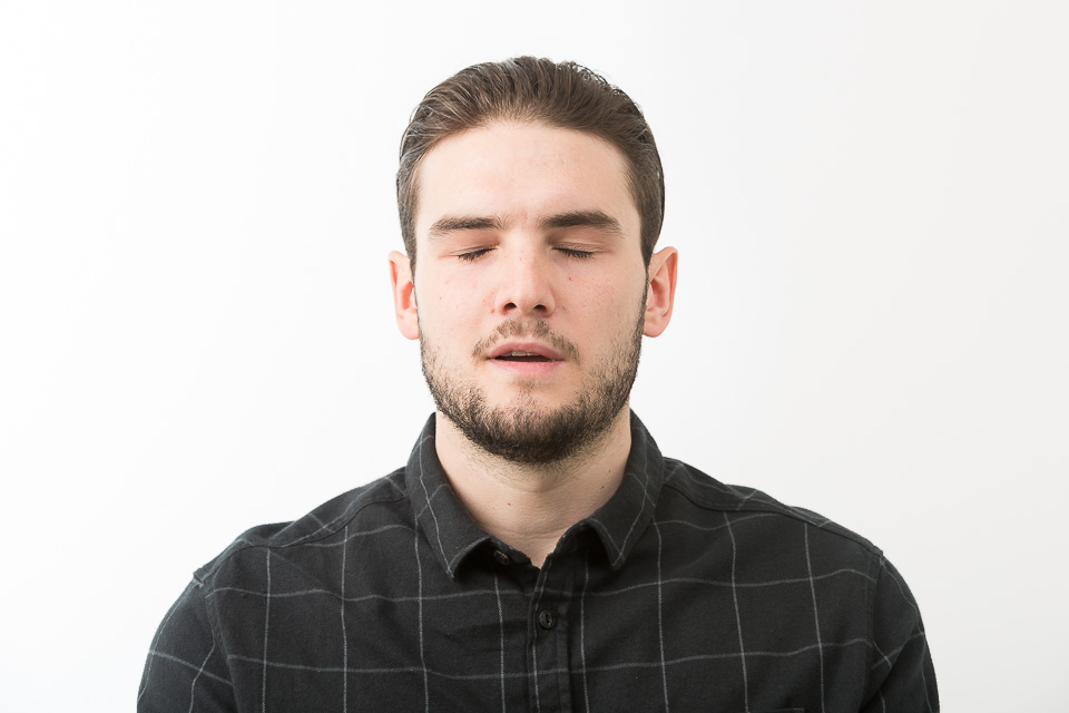
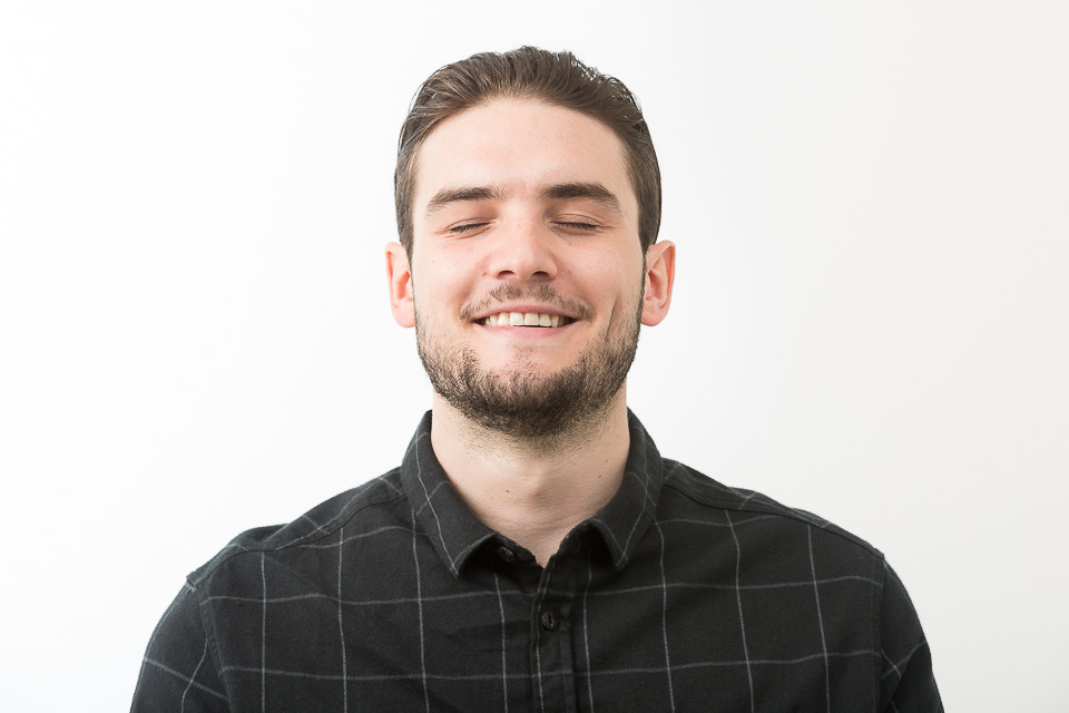
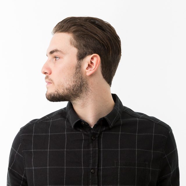
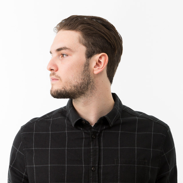
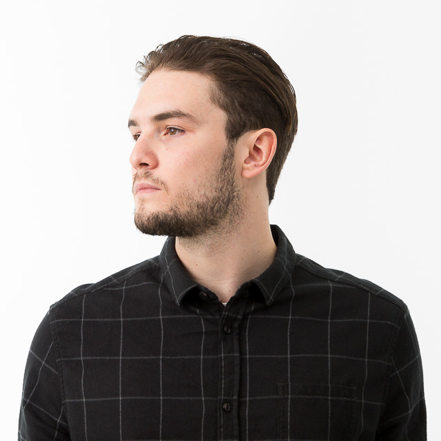
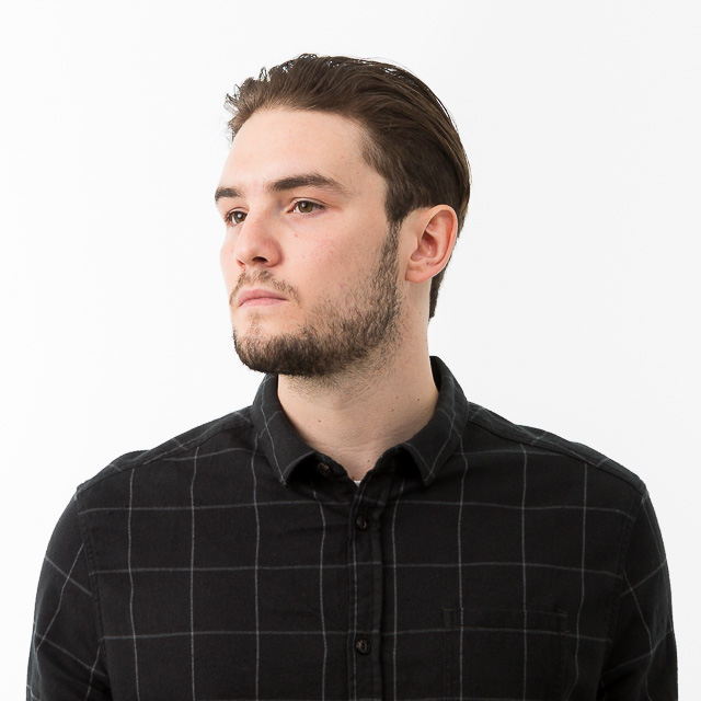
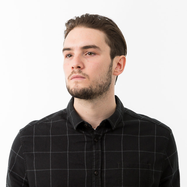
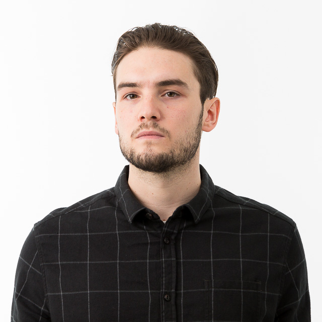
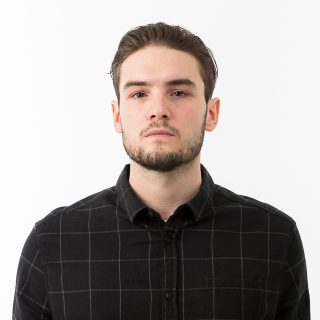
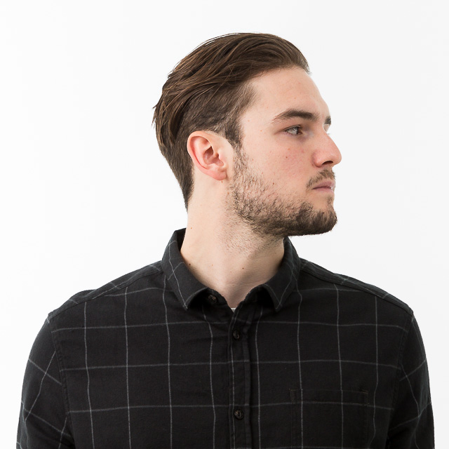
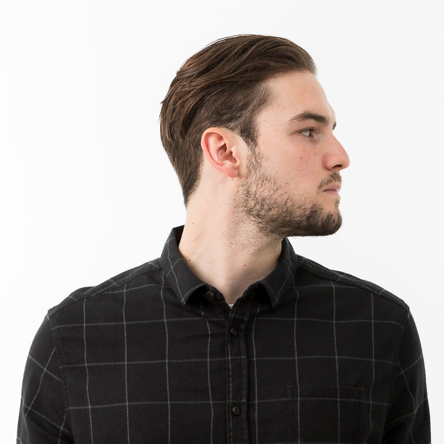
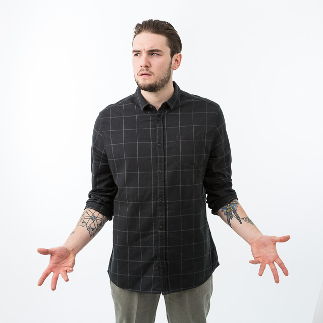
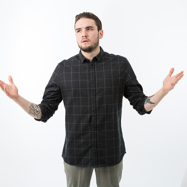
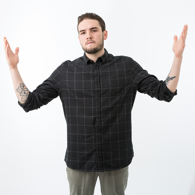
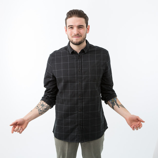
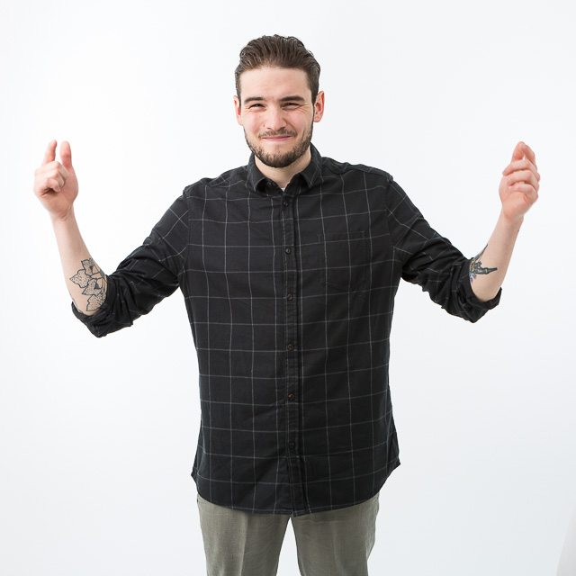
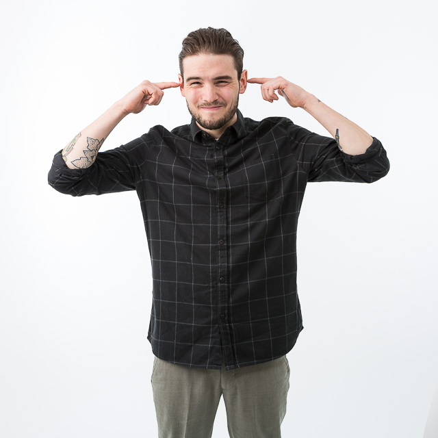
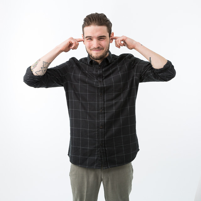
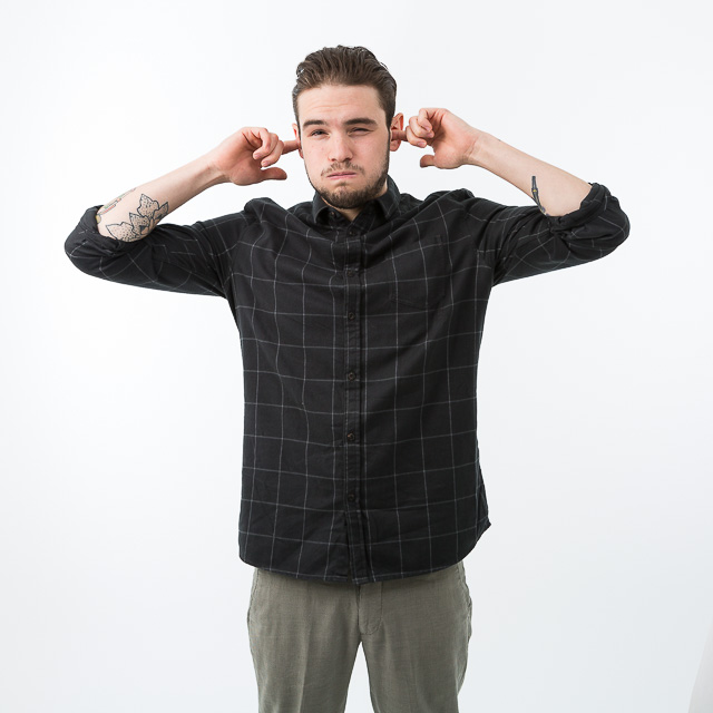
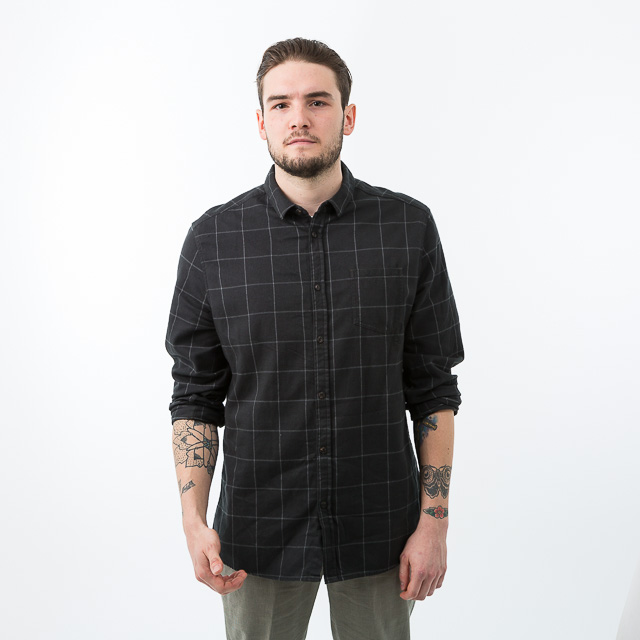
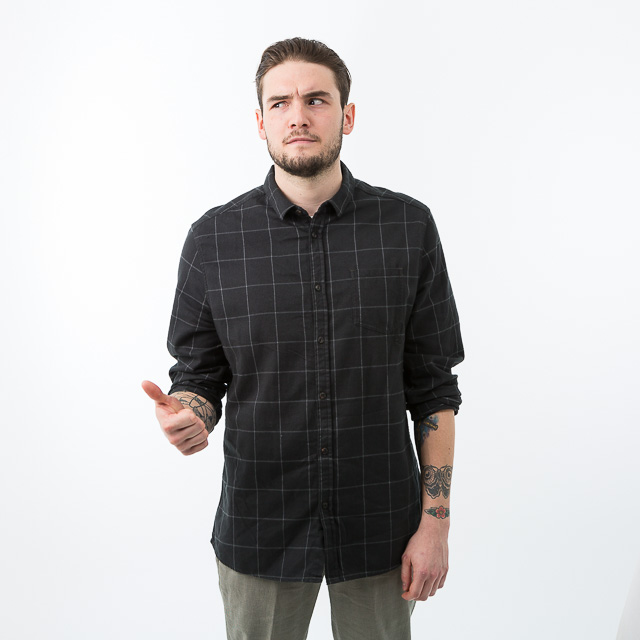
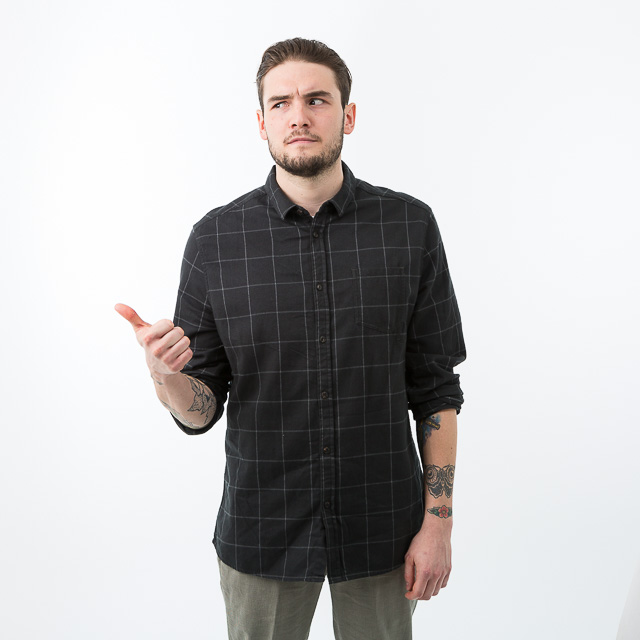
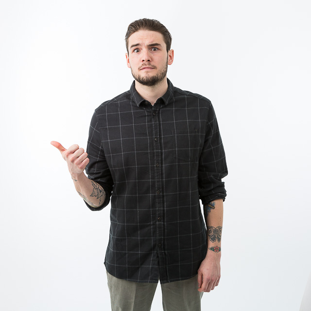
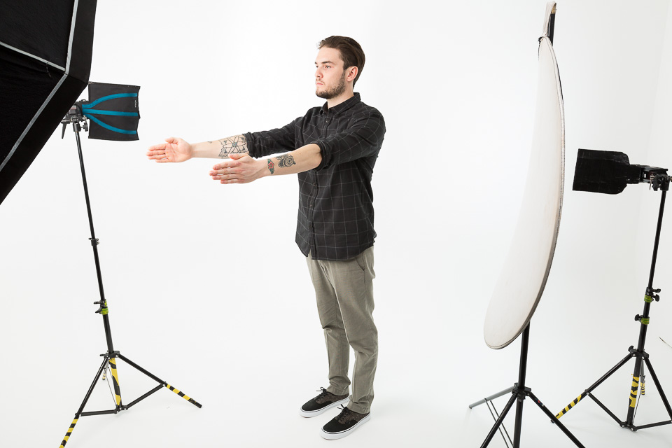
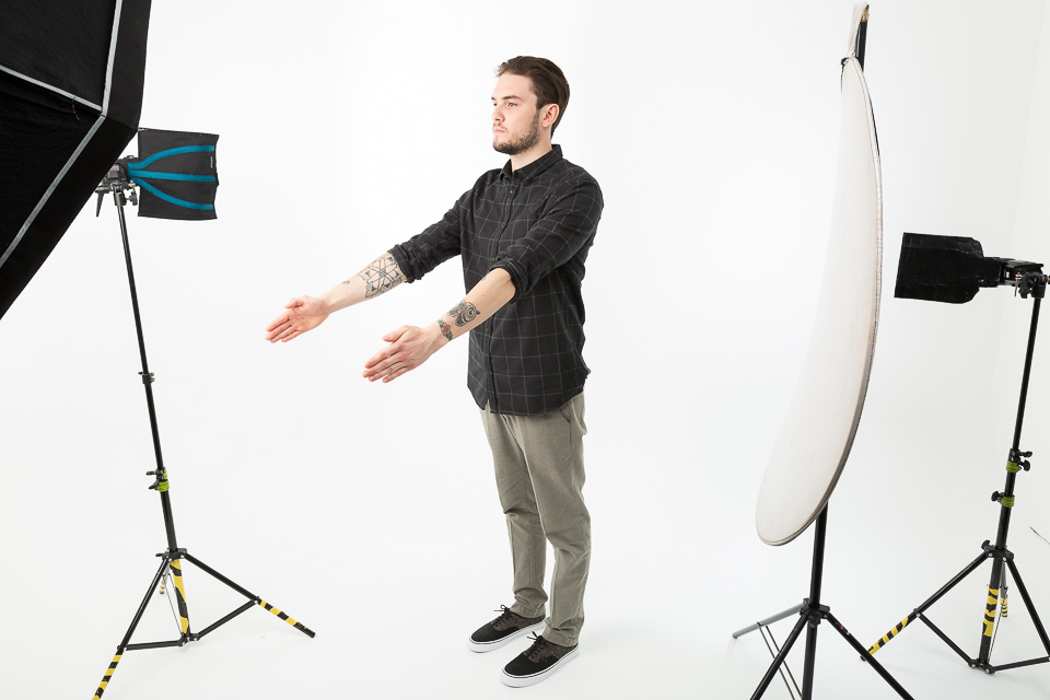
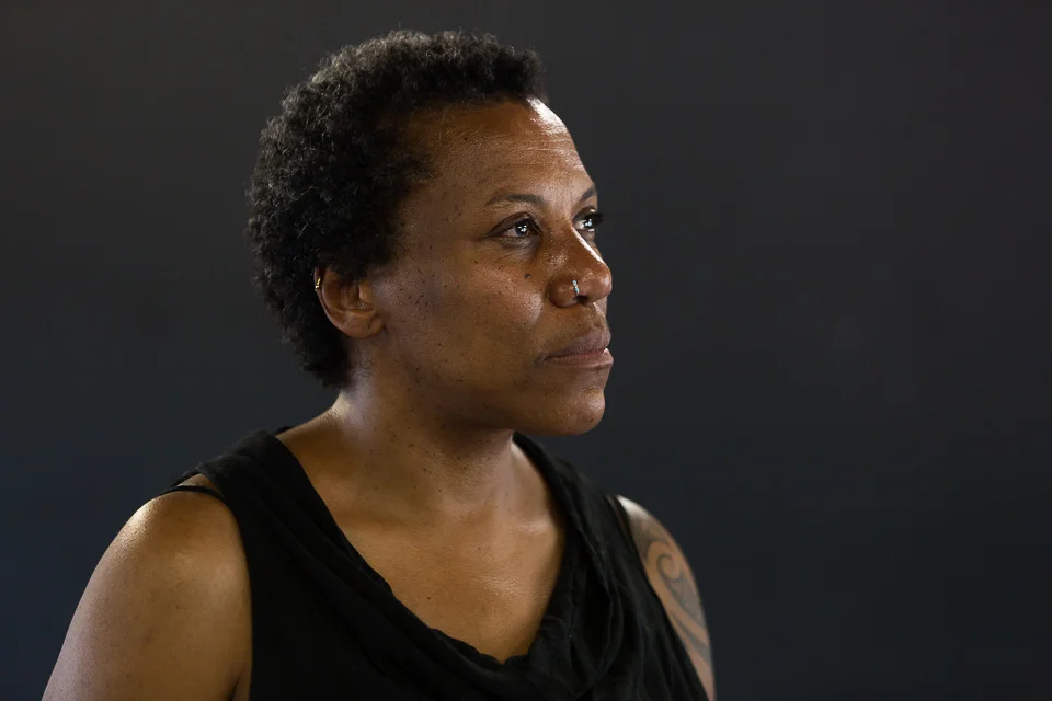
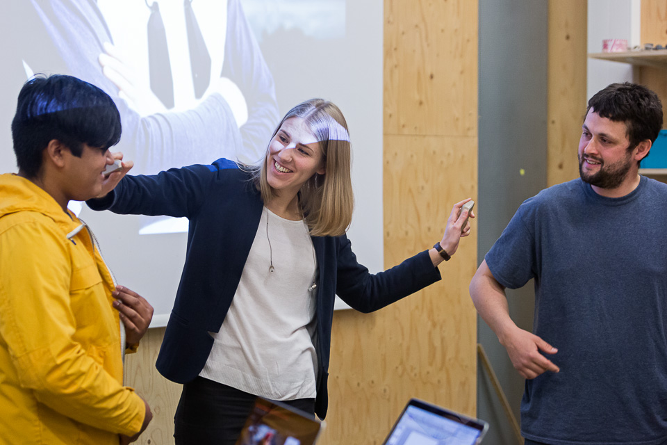
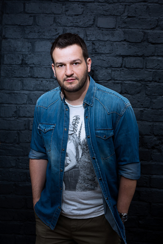
(Above) I'll start with a shot which wasn't even taken last year, but was under embargo until then. Nor is it a shot which will change the direction of photography, but I've included it as it was one of those simple portraits where you go with what you have. One of a series shot for Pfizer to accompany a video, we had a small space, zero props, limited furniture - but then with a little expression, the photo works out. It sits better as part of the series.
One of a number of portraits for the Toyota Mobility Foundation, our original plan here was to shoot near here in Shad Thames, in that lovely narrow cobbled lane, with its walkways and sense of history. On arrival, however, we found the street swamped in bright, ugly barriers and garish signage for some ongoing and ghastly repairs. So we used the riverside, and although Tower Bridge was a bit obvious - I'd emphatically NOT wanted to use it - for our purposes it (grudgingly) photographed ok.
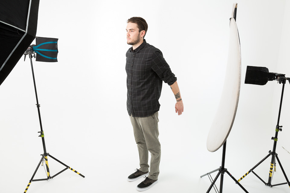
I'd recently bought a ~30cm circular mini-diffuser (a disc, basically, which fits over the flash) which I used here for the first time. I wanted something quick and portable, yet not susceptible to pulling down stands - as umbrellas are wont to do - in the slightest of breezes. The disc gives a fairly soft light for the tradeoff, although it is a bit of a faff to attach securely. Anyway, it helps a very flat lighting situation. I had it close, just out of shot, which softened it further and meant I could keep an eye (and a foot, for security) on the stand.
Technically this is old. But it appeared in my blog this year, so. I love shooting top-end performance, where costumes and lighting complement the extreme skill and dedication of the dancers to make great images. The slightest imperfections really show with this kind of photography, and so when everything is exactly as it should be and everyone is perfectly in time, it makes all the difference in the world.
This was a simple campaign portrait, which I've included only because I was pleased at how well the colours of clothing & hair worked together, despite there being no guidance.
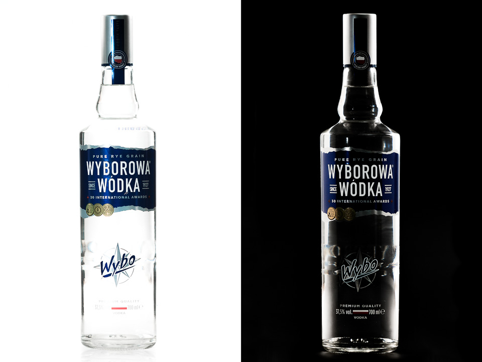
Jewellery, Cutlery and Glass make up the unholy trinity of really difficult things to photograph, and I have always avoided them when they've come up in the product photography requests which I get from time to time. I don’t do products. These bottle shots, however, were a small part of a wider lifestyle series, much more up my street.
This kind of work is first and foremost science, requiring precision, patience, some logic, common sense and attention to detail. None of which are my strong points. Glass is mainly about lighting - specifically, not lighting the glass - and while the physics of light is quite simple in theory, it's quite the infuriating opposite in practice. With this kind of work, you really have to know what you're doing and understand the approach and its principles. But with a lot of reading up, watching YouTube tutorials and practising beforehand and, later, work in PS, I managed to do a reasonable job on these.
I'd be remiss if I didn't point out that while these are decent product photographs, they are probably dreadful Product Photographs (and I'm ok with that).
You know you're struggling for locations when you find yourself on the roof..! I'd made the fatal mistake of browsing what others had done around the National Theatre with it's lovely concrete and soft shadows (hard and graphic on bright days), and had utterly failed to use the environment satisfactorily for my own efforts, so we kept moving. Finally we ended up here, in front of the Fly Tower at the top of the NT. As in, if this doesn't work then there's nowhere else to go.
Actually, it's one I think could work and I'd like to shoot again, but on a longer lens and further back, so the subject is framed more tightly by the grey facade behind. Or maybe try harder to make the most out of the indoor options. Or not as hard. I don't know.
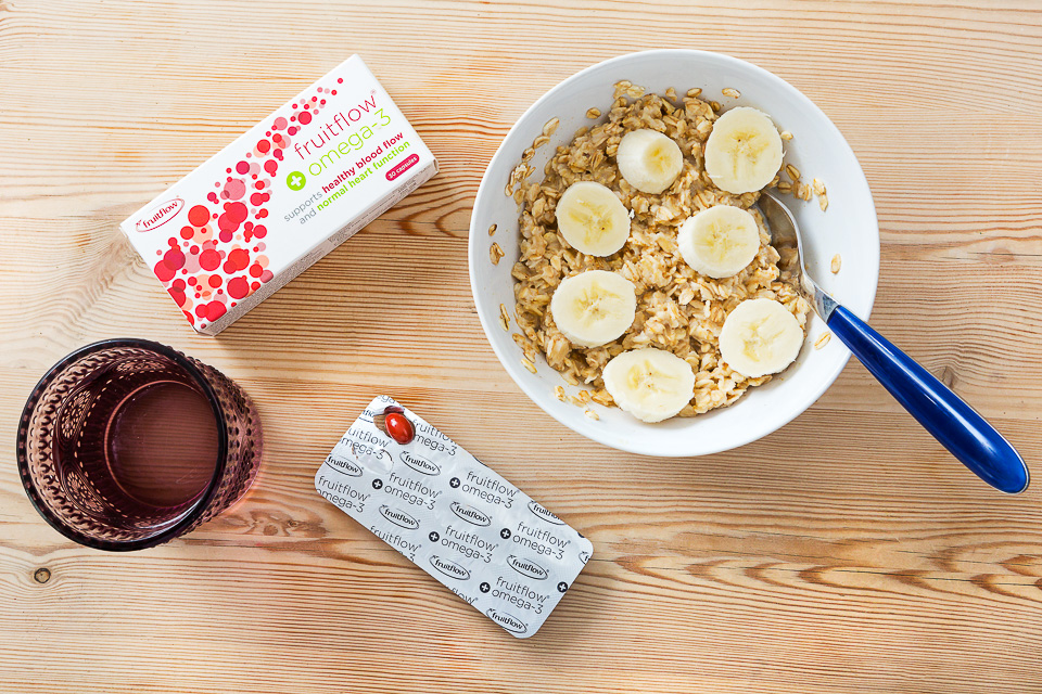
A product image for Fruitflow, included here only because it was shot on my kitchen table. I don't know why this fact makes me happy.
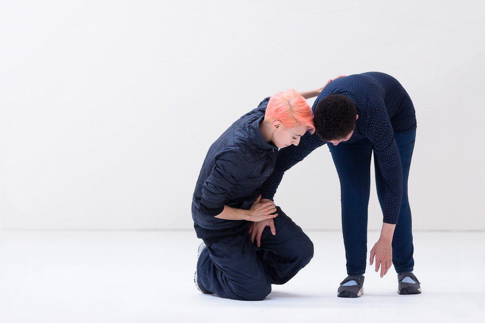
Photographed for the charity Sense, who help people with complex communication needs, this was a workshop collaboration with Wayne MacGregor Dance.
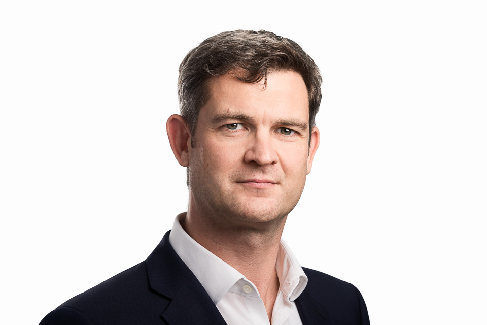
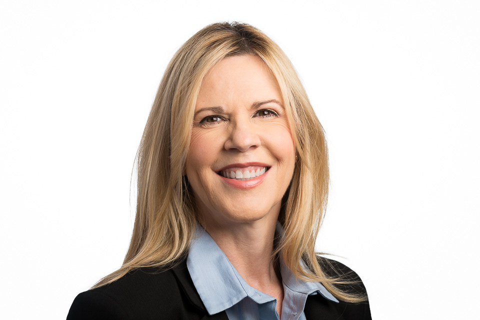
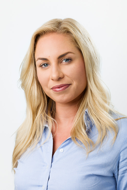
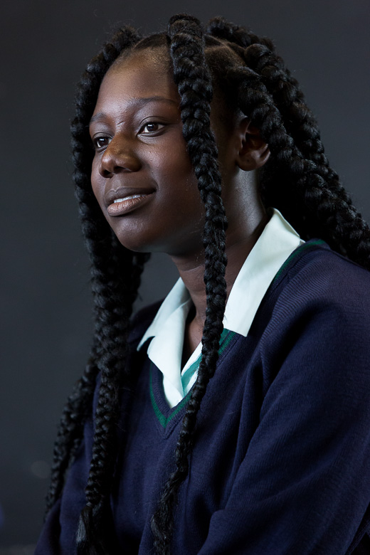
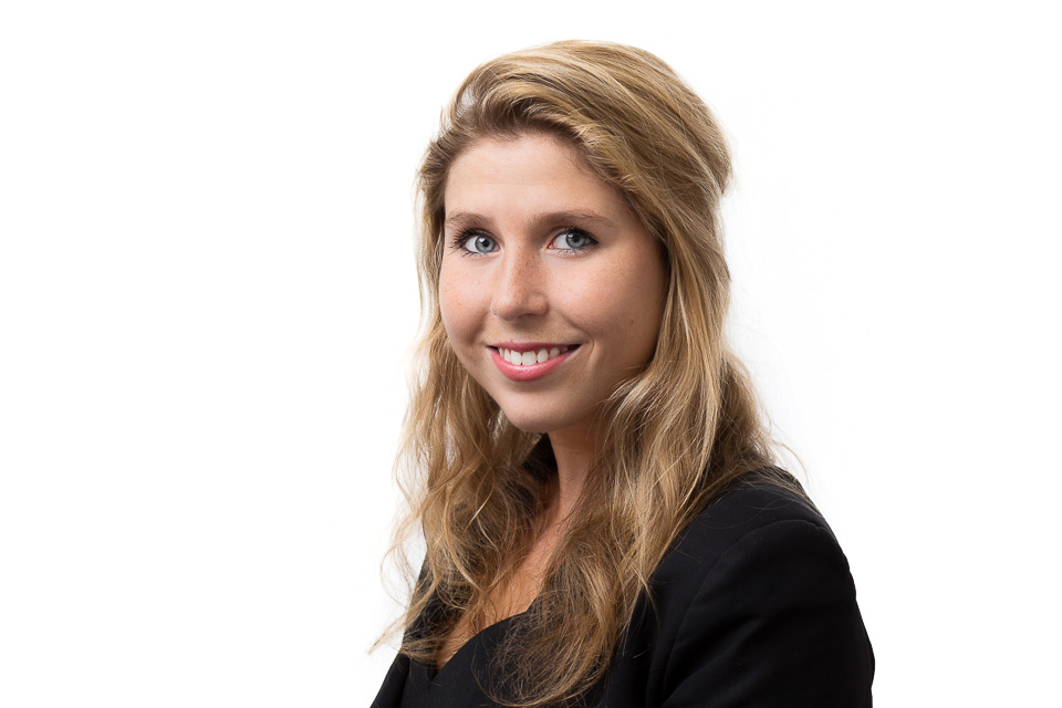
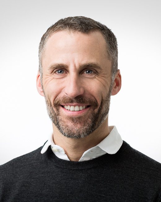
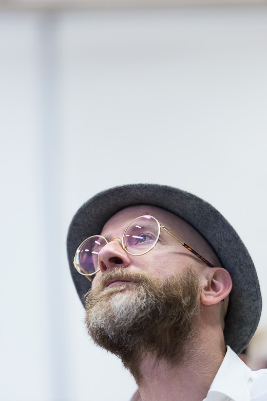
Often, a corporate portrait means a headshot on a white background. Lighting tends to be conservative, so the focus is on getting the right expression and mood.
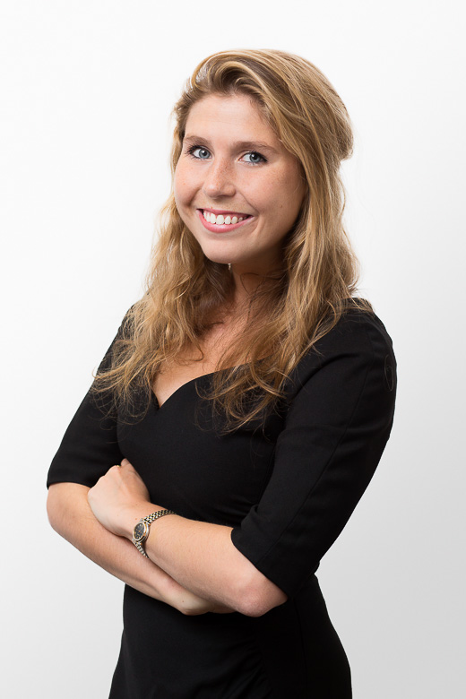
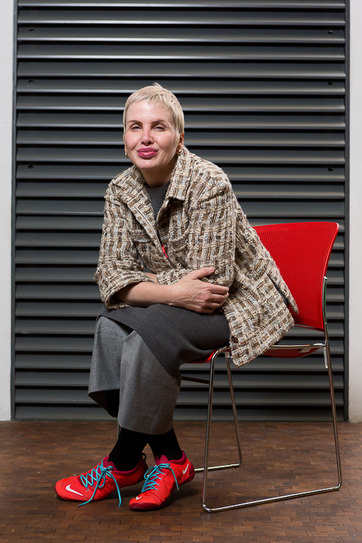
Environmental/location portraits are, of course, more interesting, and I liked this shot. Being further back normally helps the subject to relax, and although the arms could be read as defensive - rather than confident, which would negate this - it's a simple way to break up the picture. With her arms at her side you'd have a large part of the photo taken up by the dead space of her light, plain shirt, as well as having her hands right at the edge of frame.
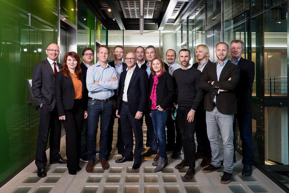
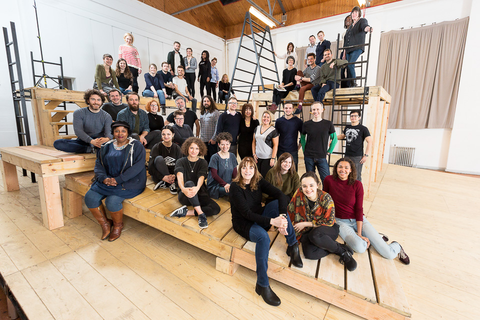
I'd discussed the lighting and space issues with this at length in my blog, but have included it here on its merit regardless as a pretty successful group photo. It was hard to envisage how or even if ~40 people would fit into this shot without it becoming a mess. I can usually imagine up to ten fitting into a location, then it's all shrugs and crossed fingers.
My recurring photographer's dream - well, nightmare, really - is of a group photo that never quite gets taken, as various people wander off, cameras stop working, and endless interruptions and delays prevent what should otherwise be something straightforward happening, but gets worse and worse. A rising crescendo of stress and chaos, before waking.
It's pleasant, then, when in reality, a potentially tricky large group somehow comes together!
Your mind begins to wander when you're covering an event. Shortly after you've got all the 'safe shots', there's a moment when realise you haven't taken a photo in a few minutes. Some might call it creativity. To others, it's just messing around.
It usually results in (completely irrelevant) zoom bursts, shooting through bottles of water on the tables, looking for weird compositions and ultra-tight crops, even looking for reflections in attendees' glasses. Most of these shots get deleted straight away, but occasionally you get something that works, and that might be useful for the client.
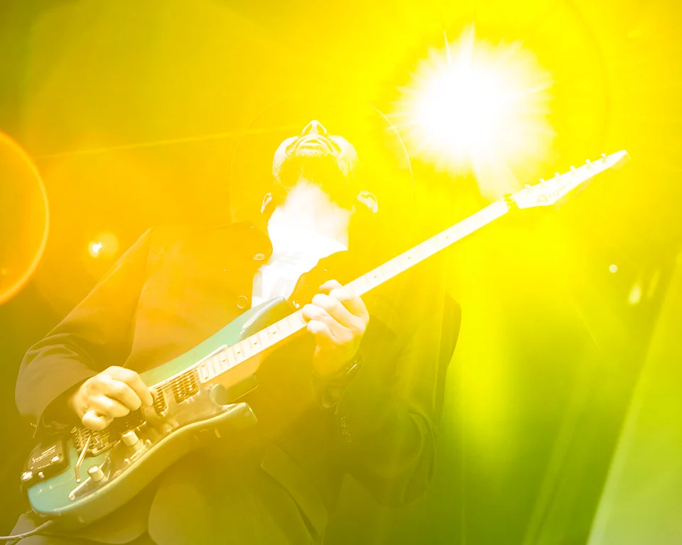
Or perhaps the flash just failed to go off on this shot and the resulting silhouette was a happy accident - I can't remember.
Retouching... I couldn't work out what needed to be done with this, let alone envisage where I'd further like to take it. So I just played around in PS but without any real goal in mind. So it feels unfinished, not quite there, and slightly fraudulent as it's outside my normal style anyway. I'm certain I'll come back to it at some point.
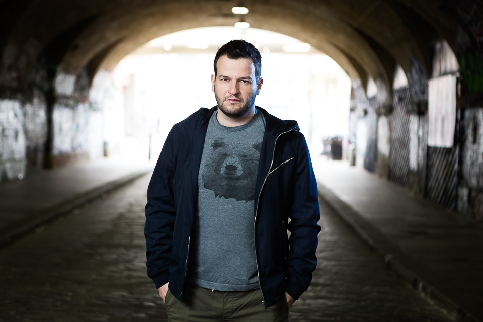
Hindsight is 20/20, and in this case my immediate thought is that I'd have added another gelled rim light to the left for symmetry if I were to do it again, but that's not actually my main issue. For any shot which relies on perspective, I'm never sure if I've got the best one. Should I be closer to the subject for impact? Or have both of us move further back (behind me), using more of the tunnel? Should we be lower to the ground (crouching or similar) adding a vertical aspect to the shot? Or perhaps just have me shooting lower to emphasise dominance? Should he be further away - do I always have the subject too dominant in the frame?
Yes, it would have been possible to try these variations - and perhaps we did try a few - but at the cost of precious seconds or minutes spent on each. So you often go with your instinct and return to the one you think works best. Which could be the shot you feel is safest. This, then, becomes your style, as you reassure yourself each time it was the right one. But the problem with having a certain style is that it can be limiting. Is 'best' the same as 'safest'? How can you continue to work on a shot which makes you feel uncomfortable, knowing that a different approach - often the straightforward one - works?
(Above) I didn't have much of a plan going into this parkour shot, other than I wanted to heavily light it, and darken the (busy) backgrounds both out of necessity and aiming for drama. But to get an action shot (at least, the ones I'd have liked to capture) would require more precise lighting than there was time for.
So it became something very static, rather defeating what the sport is about! When she posed, looking at camera, it just didn't work at all. We came up with the idea that she's readying herself - well, planning, at least, by her expression - to jump, and it turns out that potential energy isn't too bad a tradeoff for kinetic.
(Below) This was a straight portrait of another parkour practitioner taken shortly after - I just like the colours and basic setup after the (over?)complexity, stress and scrabbling around involved in the previous shot.
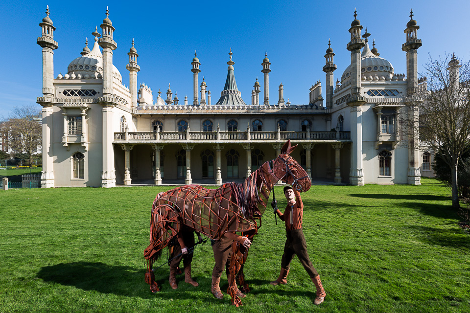
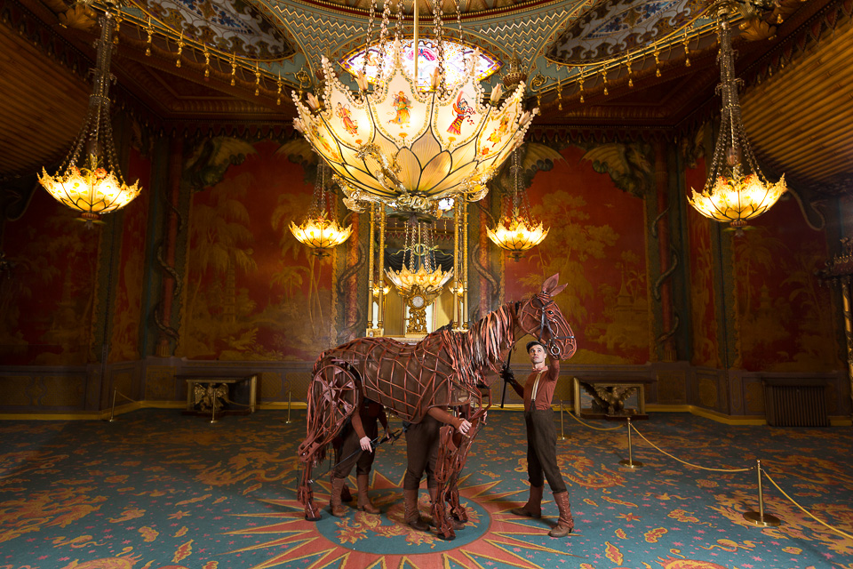
War Horse was on tour, and this is your typical PR photo to announce his visit to Brighton. Bright and sunny, I stopped it right down to darken the sky, and if you can partly obscure the sun, you get the starburst effect. I then used two 600EX flashes from the right on full (or nearly full) power to light Joey (horse) and the person's face, with a third flash lighting Joey's body. There may have been a fourth filling in from the left, but it doesn't look like it's doing much.
A silhouette might have been another option, but it didn't work as it the shape was too busy. We also tried Joey rearing but this didn't work either as we lost his face, the eyeline connection with the person holding him, and it also looked rather messy with bodies etc.
Despite Joey being a model, you still look at his eye first, and that led the approach to the picture.
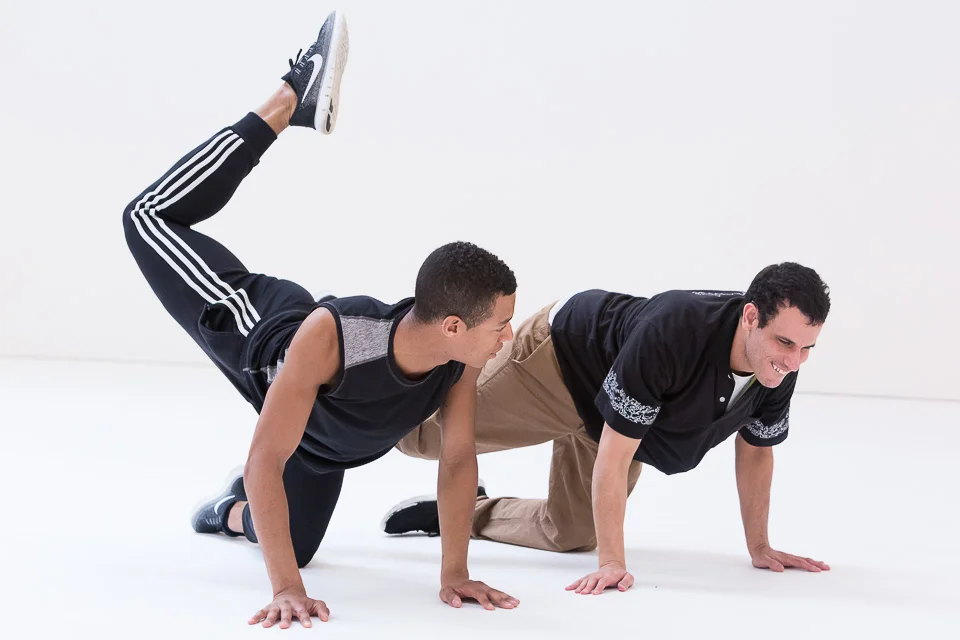
Lighting is key in dance, not only to emphasise motion and shape, but because there needs to be enough of it to freeze the action. Breakdance is fast and unpredictable, and getting decent shots of people spinning around on their heads are as much luck as judgement, in low light. Freezes and other gestures, as above, are much easier. In other words, I was being lazy.
As with the parkour image, a pause at the height, or moment of change in an action, can be enough. On his own, a shot of just the guy in centre really would be a bit lazy and missing real action, but the gesture of guy in the background just saves it.
Toyota Mobility Foundation
Portraits taken by myself and photographers around the world for a multimillion-dollar campaign challenge with the goal of improving the lives of people with lower-limb paralysis
The Toyota Mobility Foundation has launched a $4 million dollar global challenge to change the lives of people with lower-limb paralysis, culminating in the unveiling of the winners in Tokyo in 2020.
The competition is is looking for teams around the world - including startups - to create game-changing technology that will help radically improve the mobility and independence of people with paralysis. The mobility solutions of the future could include anything from exoskeletons to artificial intelligence and machine learning, from cloud computing to batteries.
Artist Yinka Shonibare MBE, photographed at his studio in Dalston. He is perhaps best known for his 1:30 scale model, Nelson's Ship in a Bottle, which occupied Trafalgar Square's fourth plinth for two years in 2010.
To raise awareness of the competition, volunteers from around the world (including athletes, presenters, scientists and artists) with lower-limb paralysis acted as spokespeople.
I was commissioned to source, commission and liaise with photographers from various countries and create a brief in order to produce a stylistically consistent set of portraits. I was also to photograph the two London representatives, Yinka Shonibare and Sophie Morgan.
Head of Design and Research at Pinterest, August de los Reyes. Photographed at Pinterest head office in San Fransisco by Brooke Porter (www.brookeporterphotography.com)
Finding the photographers began with asking for recommendations and referrals, googling, searching agencies and skimming databases, and browsing scores of websites to find people with a roughly similar approach and portfolio. Narrowing them down based on their availability at short notice and, of course, budget, I presented these to the client for the final decision.
Dealing with my own, separate commissions alongside dealing with correspondence from various time zones meant late nights and early mornings, as well as lengthy, rather chaotic spreadsheets - something I've never had to deal with. And lots of coffee.
Preethi Srinivasan (founder of Soulfree) photographed near Bangalore, India by Boban James (www.bobanjames.com).
In a nutshell, the brief was to provide two portraits of each person: one full-length, wide shot to show their environment, locating them within their country or region, otherwise at a place which might suggest their profession or background; the other was to be a closer crop, with the emphasis on them and their expression (positive, challenging etc.) at, ideally, a different location. Lighting was to be simple, minimal to none where possible.
To maintain consistency, I did the basic retouch work on the selected RAW files myself which was extremely generous of the photographers to allow.
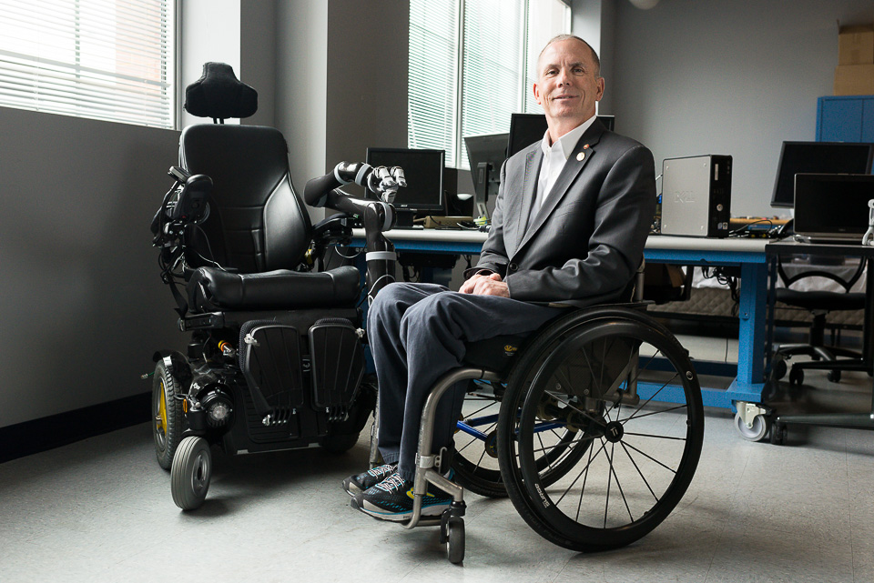
Dr Rory Cooper Ph.D, photographed by Angelo Merendino (www.angelomerendino.com). Dr Cooper is FISA & Paralyzed Veterans of America (PVA) Chair and Distinguished Professor of the Department of Rehabilitation Science & Technology, and professor of Bioengineering, Physical Med & Rehab, and Orthopedic Surgery at the University of Pittsburgh.
In the end, and despite best intentions and plans - as is often the case - some of it came down to what the photographers could do on the ground, what they could use to tell the story in the (usually short) time available from whatever relevant/photogenic locations they had in the vicinity. Mostly the time and location were dictated by the busy schedules of the volunteers and photographers, rather than by the best light or ideal spot. But you wouldn't know! - I think they did a superb job, and the launch was a great success.
Paralympian rower Sandra Khumalo at Victoria Lake Rowing Club in Germiston, Johannesburg. Photographed by Ilan Godfrey (www.ilangodfrey.com).
So, happy with the results (and slightly baffled as to how I got it done), I have now have on file fifty or so photographers around the world I could contact should this come up again - a pretty comprehensive spreadsheet. If only I could remember where I filed it...
Presenter, reporter, artist and model Sophie Morgan, photographed near Tower Bridge, London.
Corporate work
A selection of recent headshots and business portraits
Here's a selection of business portraits and similar. Yes, they're nearly all corporate headshots against a light or white background. I'd normally not post these kinds of pictures but the first one I shot yesterday had a bit of personality to it which I quite liked. One headshot not being enough to justify a post, I found myself browsing others from the past year or so which stood out, and here they are.
Recent work - October 2017
A range of recent commissions, including portrait, event and performance photography
Here's another selection of images taken over the past few months. There's something about taking commissioned work out of context and with less explanation than with a typical blog post, and putting them into these 'mixed bag' posts. Especially those shots may have come from larger series, but which would have been picked here as being the most interesting, the most representative of the set etc. Without some blog-type explanation, they could be anything, so you can see them on their own merits rather than as the usual (and rather boring-sounding), "examples of commissioned work".
Pfizer - Protecting our Heroes
Portraits of grandparents and grandchildren for Pfizer
I shot portraits to accompany the video made for pharmaceutical company Pfizer at Centrestage Studios, Angel, about the relationship between grandparents and grandchildren, "Protecting Our Heroes."
Wyborowa vodka
Product and lifestyle photography commission for Wyborowa vodka
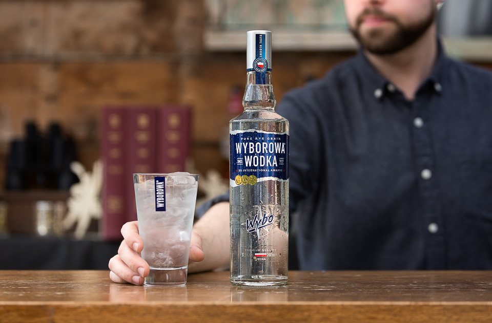
I shot a range of lifestyle & location images of Polish Wódka Wyborowa for use in their social media:
Vauxhall animation
A stop-frame animation shoot for Vauxhall
Vauxhall put together a stop-frame animation about the typical frustrations drivers experience for their new Mokka. (Above) I photographed our model running through the gamut of expressions. Then (below) from every angle:
(Below left) We then covered dozens of gestures and reactions as sequences, both left-handed and right-handed, with different expressions. (Below right) BTS.
Take your parents to work
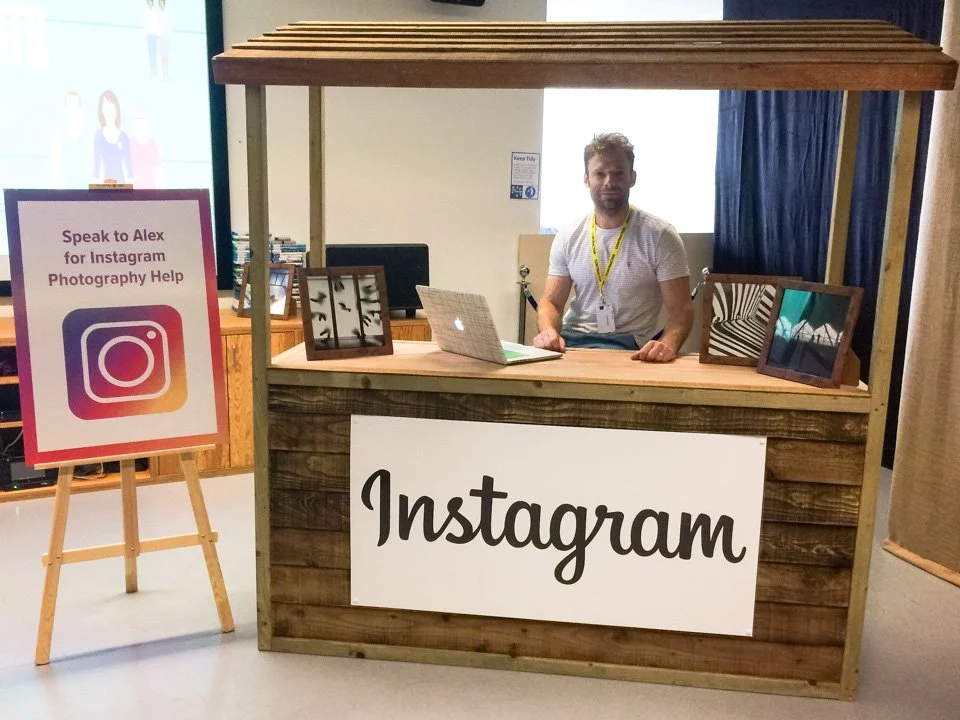
Facebook / Instagram gave me a stall in their offices to answer photography questions from visitors on their ‘Take your parents to work day’.
I had the great privilege of running my own photography/Instagram stall at Facebook's first "Take your parents to work" day. I gave visitors pointers on photography, helped them understand the IG app, and edited a few pictures.
Questions ranged from, "What is Instagram?" to "Why don't I look nice in photos?" - as well as the ubiquitous, "How can I get more followers?" (which was my question). It was a lot of fun!
Recent work - June 2017
A range of recent images, including portraits, corporate work, and personal / abstract shots
Here's a collection of (mostly) recent shots:
For this portrait, I used the Magmod gobo to create a window light. Really lovely bit of kit!
A quick portrait for the charity Sense, who were working with Wayne McGregor dance at their new studios at the Olympic park.
Product photography for Fruitflow, a natural supplement which improves blood flow.
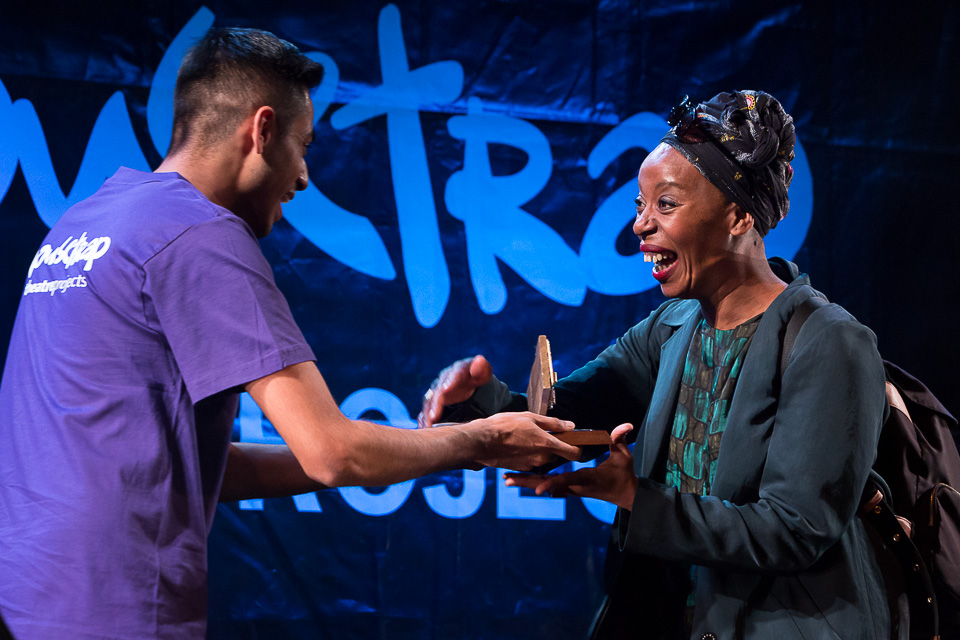
Noma Dumezweni, who plays Hermione in Harry Potter and the Cursed Child, wins best actress at the Mousetrap Awards.
Shot for The Times, there weren't many options for this portrait of an entrepreneur. They wanted him photographed outside next to some goalposts. Sadly, the goals were half-size and we only had a few minutes before the kids' teams took over the pitch. We did what we could, but it quickly turned into the photographer's (dreaded) "Man in a Field" situation, which I obliged but - well, let's just say there won't be a blog post about this shoot. As the saying goes, "I don't want excuses -I want pictures."
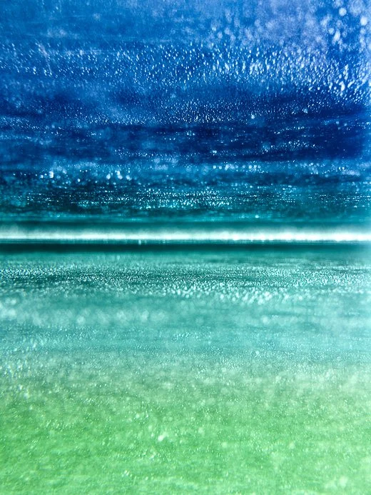
Roy G. Biv and all that. Apparently, Isaac Newton added the indigo (previously they used to think there were three colours, then five, then six in a rainbow). And nobody knew what a rainbow was until the 17th century. The Greeks thought rainbows were a path created by the goddess of the rainbow, Iris, linking us to the immortals. Anyway, there aren't three, five, six or seven colours, but millions, all blending into one another.
Huawei - The New Aesthetic
St. Martin’s College students design accessories for Huawei, around the launch of a new phone
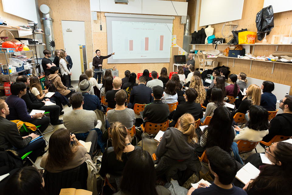
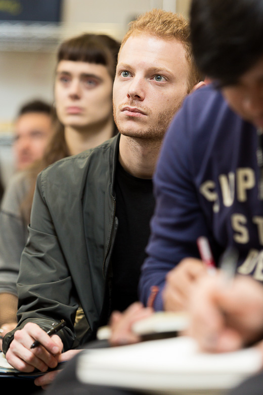
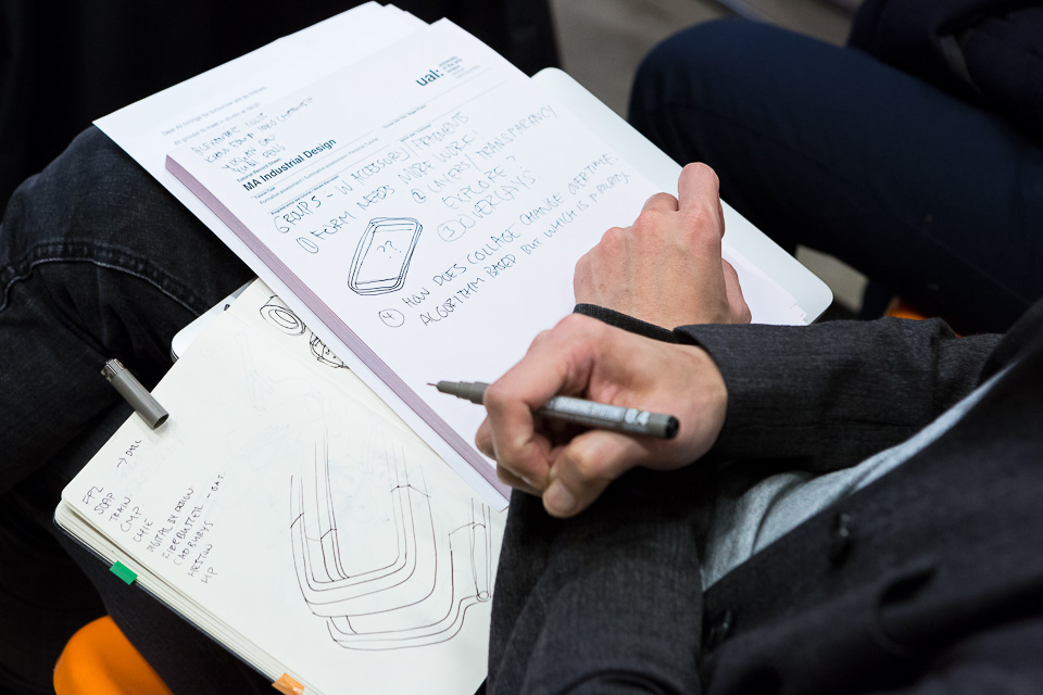
At the end of 2016, MA Design: Ceramics, Furniture, Jewellery and MA Industrial Design students at Central Saint Martin's College were tasked with a brief to create new accessories for the brand, based around the concept of "The New Aesthetic". The winner and runner-up designs were developed into models and showcased at the Mobile World Congress in Barcelona to coincide with the launch of Huawei's P10 phone.
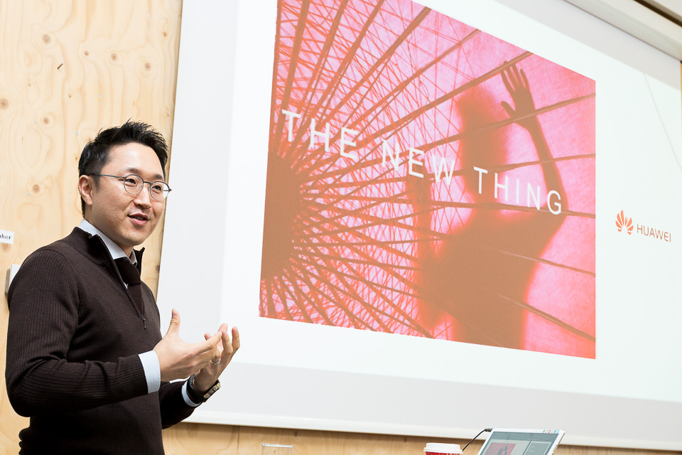
David Kim, Huawei Brand Director, introduces the brief and gives a background to the company. Not so well-known here, yet Huawei is the world's 3rd largest smartphone vendor, after Samsung and Apple.
Two design masterclasses followed later from Mark Delaney, Head of Huawei London Design Centre, and Abi Brody - formerly of Apple, PayPal and eBay - who is Chief Designer + VP at Huawei Consumer.
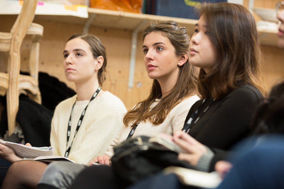
In February, students presented their ideas in front of the panel of judges from Huawei and CSM.
The winning design - Spectra - is a necklace which scans colours and textures, transforming them into sounds.
The user can "collect" sounds to create a kind of music as a way to document their experiences of a place.
The entries are debated until late in the afternoon, and the winning team announced.
The winners - Spectra.
War Horse in Brighton
National Theatre’s War Horse photographed on Brighton Beach as part of UK tour publicity
The amazing Joey again, this time around various Brighton landmarks to publicise the upcoming UK tour.
We started early on Brighton beach, with the sun to the South-West - low and strong - exactly what I didn't want. Ideal for a silhouette - but Joey doesn't make for a silhouette.
Yes, we could have moved to the other side of the pier to have the sun lighting it from the side, but that would have been a bit of a hassle to move, and too easy to shoot. He's quite large, so I doubled up flashes and set them to full power to overpower the sun. A third flash was used to light his face.
Moving further down the beach, something similar but facing out of shot:
After a public launch event, we went to the Royal Pavilion where I shot similar from a stepladder. Other than rearing (which I liked less) there's not much for Joey to do, so it actually comes down to Jack (who controls Joey's head) to take more of a role. When I couldn't see Jack's face, it just didn't work. Finally we went inside to this lovely room (below) for one more quick photo to the bemusement of the many visitors just off camera left.
It's an amazing show - see it if you can.
Jane Eyre
My approach to a large group photo of the Jane Eyre cast and crew on set, shot for National Theatre
Following a critically acclaimed season at the National Theatre, Jane Eyre is touring the UK from April. I was commissioned to photograph the cast and crew on their first day of rehearsals.
Normally, these take place in a large, open space with chairs which we arrange so as not to have everyone just standing in a line. It's a quick group shot, a smaller group of the cast, and then a shot of the lead(s).
This time, I walked in to see this great set:
Finally, a chance to place people on different levels, where they can have different poses in, on and around a relevant and interesting location.
Except...
The first thing is that when something looks good, it doesn't necessarily translate well or immediately in a photo. This angle is ok, but I didn't much want to include the fire exit to the left of A, nor the lights above the stage. Also, somehow I always feel I want to get in "among" a location, but by shooting from points A or B, at once I lose 1/4 of the useful area of stage, as well as showing the doors, tables, fire exits etc. (out of shot).
It seems something from around the bottom/left of the ramp is probably the best option.
As for lighting, the yellowish ambient is 1/60 at f5 on 1250 ISO, but I've brightened it up here so it's perhaps a stop or so less. Ideally I want a better depth of field, as there are a lot of people and I'm intending to spread them around the set.
I have three speedlights and my stands reach about 8 feet high.
On the right (C) I can't use (any kind) of light on a stand, because it won't be high enough for people around point B: it would light them from below. Apart from the fact the ramp is sloped, the end of the stage is higher than the floor. Moving it further away would begin equate to side-lighting - as well as distributing the light more evenly across the image from right to left - I'd need a huge amount of power, and due to to numbers, some of the forty or so people would likely fall into shadow. It could be done at full power perhaps, but recycle times would be slow.
On the left of A and running behind towards me, there's a wall, limiting lighting options there. It's white and it can be bounced off, but its relative proximity to those on the ramp means they'll be lit, but those around B won't be.
Bouncing isn't a good solution either as the ceiling is high and dark brown wood. A lot of power for a limited return.
The messy diagram above shows what I ended up doing. On the left, a reflective umbrella at point A (which you can see in the final shot below). It has less effect as the light falls off moving across to the right, becoming more of a fill.
The second light, also on a stand, was pointed at a grey curtain several metres away at C. Pointing it upwards at a 60° angle created a high bounce, which made a soft fill light, from above right.
I kept one light on camera and also pointed it up and backwards (roughly 75°), again to bounce high off the wall right behind me. This acted as a fill for those at the front, who had no light on them. 1/100 at f6.3 was enough (just barely) to keep people sharp throughout.
A simpler shot ie without flash, using a higher ISO (perhaps 2500 or 5000) and sorting colours and general muddiness later in post might have been preferable: the portrait below of the actress playing Jane used one light and took less than 30 seconds!
Framing 101
A photo of me from inside a washing-machine
I don't do weddings, pets, or selfies. But I had a quick, informal shoot recently: general pictures of an LG stand displaying some of their incredible products, including a £4.5K OLED television, the thickness of two (!?) credit cards, and a refrigerator which opens when you stand in front of it. Anyway, they also had a washing machine on display, and for the last shot of the visit I thought it might be fun* to get a photo from inside: of me in my own photo. Actually, I knew it would take several attempts and doubted I could get a customer to pose for long enough.
I lit the drum with our iphones, and supported the camera with a stack of various Gary Fong rubber flash modifiers. I'll bring a fisheye lens next time.
* Fun in its loosest definition.
-
June 2025
- Jun 19, 2025 The forever purge
- Jun 11, 2025 Recent work - June 2025
- Jun 6, 2025 On Looking
-
January 2025
- Jan 21, 2025 The photographer's dictionary
-
November 2024
- Nov 19, 2024 Recent work - November 2024
-
September 2024
- Sep 17, 2024 Recent work - September 2024
-
July 2024
- Jul 4, 2024 Mean Girls
-
May 2024
- May 28, 2024 Wakehurst
- May 20, 2024 Graduation
-
April 2024
- Apr 16, 2024 Recent work - April 2024
-
January 2024
- Jan 22, 2024 Recent work - January 2024
- Jan 9, 2024 Long live the local
-
October 2023
- Oct 13, 2023 CBRE
- Oct 4, 2023 Recent work - October 2023
-
September 2023
- Sep 22, 2023 Seeing past the subject (2)
-
April 2023
- Apr 12, 2023 Recent work - April 2023
-
February 2023
- Feb 7, 2023 Will AI do me out of a job?
-
December 2022
- Dec 12, 2022 Freelance life and other animals
-
November 2022
- Nov 4, 2022 Recent work - November 2022
-
July 2022
- Jul 26, 2022 Recent work - July 2022
- Jul 25, 2022 SOAS
- May 2022
-
January 2022
- Jan 6, 2022 Recent work - December 2021
- Jan 5, 2022 Prevayl
-
December 2021
- Dec 17, 2021 The day the hairdressers opened
-
December 2020
- Dec 15, 2020 SOAS - postgraduate prospectus
- Dec 7, 2020 Online teaching
-
October 2020
- Oct 11, 2020 Gratitudes
-
September 2020
- Sep 24, 2020 Headshots: why we need them, and why we don't like them
- Sep 15, 2020 From the archives - seven
- Sep 10, 2020 Recent work - September 2020
-
February 2020
- Feb 13, 2020 Mootral
-
November 2019
- Nov 7, 2019 Biteback 2030
-
September 2019
- Sep 16, 2019 B3 Living
-
July 2019
- Jul 22, 2019 Recent work - July 2019
- Jul 19, 2019 From the archives - six
-
April 2019
- Apr 15, 2019 Recent work - April 2019
-
March 2019
- Mar 12, 2019 International Women's Day
-
February 2019
- Feb 4, 2019 Recent work - February 2019
-
January 2019
- Jan 17, 2019 Four photographs
-
December 2018
- Dec 10, 2018 From the archives - five
-
November 2018
- Nov 26, 2018 How to compose photographs
- Nov 5, 2018 Recent work - November 2018
-
October 2018
- Oct 17, 2018 How to edit photographs in Instagram
- Oct 8, 2018 Out with the old
- Oct 4, 2018 Recent work - October 2018
- Oct 1, 2018 A little learning is a dangerous thing
-
September 2018
- Sep 12, 2018 From the archives - four
-
August 2018
- Aug 16, 2018 Recent work - August 2018
- Aug 15, 2018 I don't follow you
- Aug 6, 2018 Cookpad
-
June 2018
- Jun 7, 2018 Monks & Marbles
-
May 2018
- May 23, 2018 Netflix & Woof
- May 21, 2018 Best of Instagram
-
April 2018
- Apr 24, 2018 Standard Chartered Bank
-
March 2018
- Mar 16, 2018 Corporate self-portraiture (two)
- Mar 8, 2018 International Women's Day
-
February 2018
- Feb 9, 2018 Winter swimming
-
January 2018
- Jan 16, 2018 2017 in pictures
-
December 2017
- Dec 6, 2017 Toyota Mobility Foundation
-
November 2017
- Nov 24, 2017 Corporate work
-
October 2017
- Oct 31, 2017 Recent work - October 2017
- Oct 13, 2017 Pfizer - Protecting our Heroes
-
August 2017
- Aug 22, 2017 Wyborowa vodka
- Aug 1, 2017 Vauxhall animation
-
July 2017
- Jul 20, 2017 Take your parents to work
-
June 2017
- Jun 22, 2017 Recent work - June 2017
-
May 2017
- May 9, 2017 Huawei - The New Aesthetic
-
April 2017
- Apr 24, 2017 S.H.O.K.K.
-
March 2017
- Mar 30, 2017 Parkour Generations
- Mar 27, 2017 War Horse in Brighton
- Mar 20, 2017 Jane Eyre
-
January 2017
- Jan 23, 2017 Framing 101
-
December 2016
- Dec 14, 2016 Studio Fractal
-
November 2016
- Nov 29, 2016 Musician
- Nov 10, 2016 While I was waiting...
- Nov 3, 2016 Canvas
-
October 2016
- Oct 11, 2016 Rose Bruford
-
September 2016
- Sep 21, 2016 Instawalks
-
July 2016
- Jul 28, 2016 Property brochure
-
April 2016
- Apr 6, 2016 Breaks and burns
-
March 2016
- Mar 31, 2016 Mixed bag
- Mar 1, 2016 Sky Garden
-
November 2015
- Nov 10, 2015 Romain Grosjean
- Nov 2, 2015 Egosurfing
-
October 2015
- Oct 1, 2015 Ratings are overrated
-
September 2015
- Sep 15, 2015 Seeing past the subject
-
August 2015
- Aug 25, 2015 British Gas
- Aug 19, 2015 Problem solving vs creativity
-
December 2014
- Dec 15, 2014 2014 in pictures
-
January 2014
- Jan 9, 2014 2013 in pictures
-
December 2012
- Dec 31, 2012 2012 in pictures


