How to compose photographs
While composition is only one aspect of what makes a picture work, it’s the one aspect over which you always have some control. It’s about balance, so we can think of the frame as a lever. The simplest setup has a weight directly over the fulcrum:

It is stable, certainly - but in a photograph stable implies safe, and safe can equate to uninteresting, boring. Often something else is done with the composition to imply counterbalance. This image of an umbrella has been cropped to a panorama. Whilst still a very static shot, the crop reduces dead space and makes it about solitude:

A weight placed slightly off-centre is sometimes all that’s required to create some imbalance or tension:

In this analogy, a simple off-placement is an effective technique for a photograph containing just one subject. In the image below, placing the girl centre-frame would probably result in cropping to a square, to fill the frame better. The off-centre composition, the angle of the chair, the girl’s legs over the corner and her informal pose work to emphasise her spirited, youthful nature:

Although the subject in the photo below has been placed centrally, her looking out of frame provides a similar - if only slight - imbalance:

This image uses a similar idea, but you could argue that the lighter side of the building acts as a counterbalance to the main subject (more on this later):

Moving on, the diagram below is balanced with equidistant objects of equal weighting:
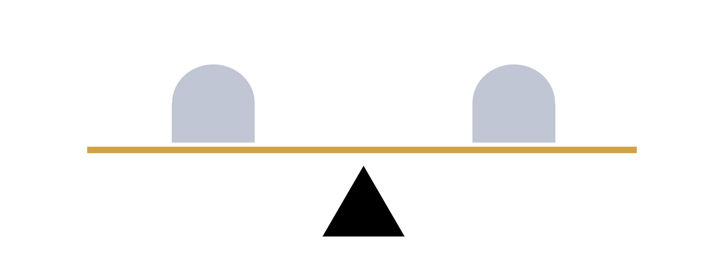
Photographically, this would refer to bisected or symmetrical compositions. Although a frame may (often) be filled more readily with two subjects - a good thing - one might assume that such blunt placement would lead to dull or confusing composition. Dull, because it’s reminiscent of the single object above the fulcrum. An confusing, because both subjects compete for attention, breaking the ‘rule’ of simplicity.
But this needn’t necessarily be the case: this kind of balance in a photograph can create various kind of tension.
They two subjects may invite comparison eg where they’re not quite the same. Consider the various series of images online which show a black and white city scene as it once looked during wartime, or a hundred years ago, blended with a colour photograph of how it appears now, both taken from the same viewpoint. This comparison is precisely the point when two images are combined in Before/After.
The composite of the two images (below) results in looking back and forth between the two expressions:

In a single shot, we might make comparisons with family photographs, for instance, and more specifically of siblings, with the most obvious example being identical twins. Here’s an excellent set of portraits by Peter Zelewski.
Other kinds of symmetry can be more exact - as in someone by a mirror - or merely suggested. And sometimes they just point to a simple, direct relationship between two subjects, as in the photograph of the chess players below.
Note that in all these cases (and as illustrated previously with the girl looking out of frame), composition can be merely implied. An example would be found in action shots, where traditionally we compose a photo so that the action is shown coming into the frame. That is, it needs space to move into. Normally we might think of a moving vehicle, a runner, or a ball being kicked - but even an eye line will suffice. That the players are both looking into frame serves to tighten the composition, drawing our own eyes to the chessboard:

Next, balance can be satisfied with the arrangement of one larger object, with a smaller one placed further from the fulcrum:

Translated to a photograph, the subject - sharp/dominant/larger in the frame - is composed with a secondary subject positioned on the other side of the frame which may be smaller/darker/out of focus etc:

The shot of the dancers below uses the same technique:

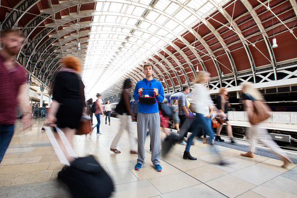
Moving onto imbalance, scales weighted with a single object near the end will fall, with nothing to act as a counterbalance:

In a photograph, this equates to skewed or disharmonious composition, and can be employed to create an edgy, uncomfortable, exciting or dramatic mood.
Typically I think of fashion photography, where it could be a face, cropped in half, right at the edge of the frame. It’s also often seen in war, ‘hard’ photojournalism and documentary photography. James Nachtwey, Martin Parr have plenty of examples. Or have a look at how TV drama series Mr Robot uses this framing device to evoke unease and tension.
This technique needn’t necessarily use composition to achieve this - disorder and discomfort can be created by subverting other expectations. For instance the subject, centre frame, but out of focus, would achieve the same discomforting effect as an off-composition.
I struggled to find any good examples from my own work to illustrate this kind of image! It’s neither my style, nor does it apply to much of my commissioned work by its nature. Anyway, hopefully I can make the point with this photo of my eldest when he was much smaller (I should admit I applied this crop in post):

In the triptych below, the effect is only slightly applied, and done so for comic/absurd effect. Note that given its subject matter, it would be hard to justify placement any further to the edge of frame:

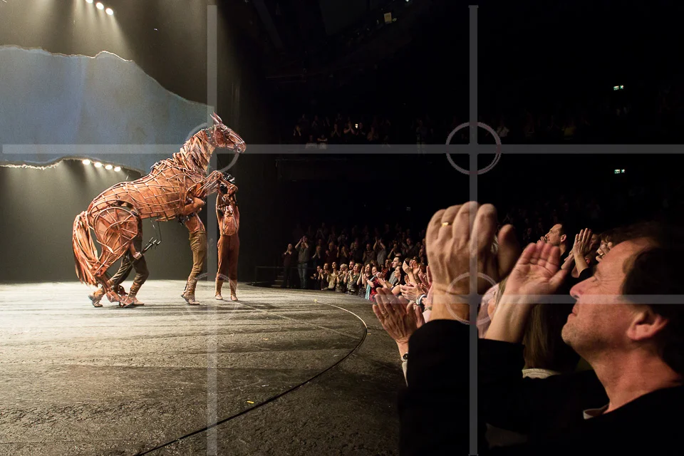
Finally, a complex arrangements of objects across the lever may still have equilibrium, and the diagram below illustrates how this might look:

Photographically, this refers to the majority of images which have several points of interest around the frame. Photos are rarely in perfect equilibrium; a mix of balance and imbalance within a frame is very common. After all - unlike the lever - composition is not exact mathematics, and I think most would agree that composition probably shouldn’t ever be too perfect. Nevertheless, with a focal point - something interesting / human / sharp / central / large / bright / colourful - even an apparently busy composition can still be simple:
In the image below, it’s easier to envisage an (unwelcome) imbalance if the lady in the background on the right of the frame weren’t there:

Where time or location is a constraint, eg day to day scenes, candid or street photography etc. situations don’t usually even allow for the 'clean’ setups shown in the examples so far (this is all assuming such a style of image were even desirable, of course - I’ve used these simple examples so far to illustrate the point). In any case, composition may not be the main aspect of what helps make a particular photograph.
The Rule of Thirds
Photographers tend to dislike photographic rules - this one in particular. Rules can be formulaic and safe: they often work best when they’re bent or broken. That said, I’d be remiss not to mention the ‘ROT’ - and it’s an easy go-to. With this idea, the frame is usually depicted as a noughts and crosses board:
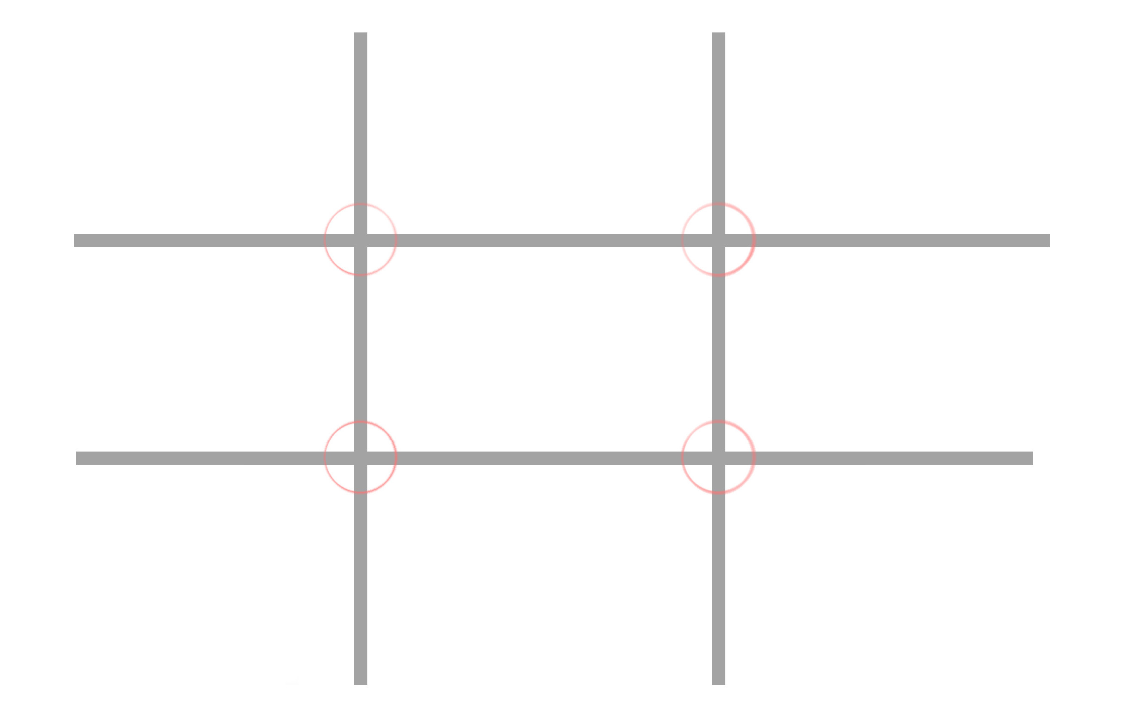
Simply put, it means placing the subject off-centre, on both axes. Where there are other points of interest, they would ‘ideally’ fall on the opposite junction:


As I’ve said elsewhere, cropping is the most powerful tool of all (and is included in all editing software), meaning composition can therefore be applied/corrected afterwards.
This leads to a final aside - if composition can be employed to emphasise or draw attention to something, at its extreme it can be used to change the meaning of a photo entirely. “Cause of Death” by John Hilliard illustrates this with four images of a dead body, each telling a different story:

I hope this has been of interest!