How to edit photographs in Instagram
#nofilter
This hashtag means, “This is straight out of camera. It looks great without any effects or editing. It’s all down to me.”
Well, even if they’re telling the truth (ahem), they’re sadly mistaken. The camera/phone has to process the shot to create a jpeg file. It applies sharpness, contrast, brightness, adds blacks, reduces noise and compresses the file, having already determined colour balance and exposure. That’s quite a lot of work.
Also - like it or not - pretty much every image can be improved - SHOULD be improved - with some further work. Editing is to an photographer what revision is to a writer, presentation is to a chef, or pruning is to a gardener. That’s why #nofilter doesn’t really impress. Depending on the image, I’d say the editing makes up between 20%-40% of the final impact.
Editing begins with correction, which gradually becomes improvement, which then runs into creation (which is at the opposite end of the scale to #nofilter). Everyone has different views to where the boundaries lie, how much to do or declare, and the context of the photo and its purpose will also largely determine this. Note that the ‘creation’ aspect is very limited in Instagram, but I’d certainly place the ‘filters’ in this camp.
So the first thing to say when editing is: ditch the filters. But not for the reason above. But instead, because they make an image look processed: all style over substance. And for anyone who cares about creating nice imagery, why put all that effort into taking a photograph, then leave the rest to an algorithm you don’t understand? I’ve found doing the editing myself informs my photography, and my photography influences the editing.
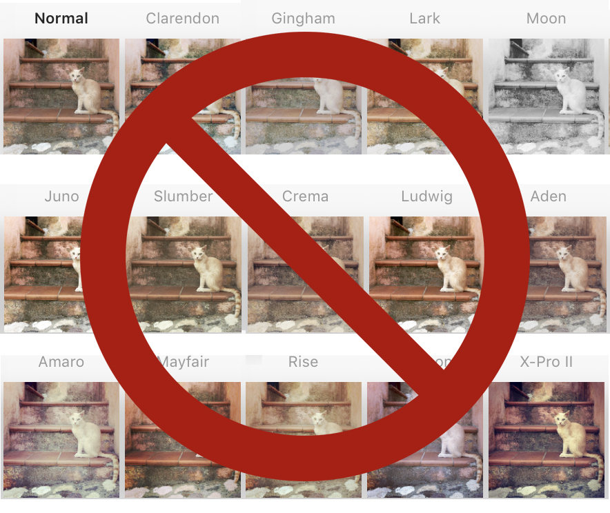
Some of Instagram’s filters, which apply an instant ‘look’ to an image.
Let’s think about what we’re trying to achieve.
The approach
For me, the rule is to make an image look as good as possible, without making it look like you’ve done much at all. And remember, edits are global. That is, the effect is applied to the entire image. So for instance if you wanted to darken something, then everything gets darker. Improvements will therefore have trade-offs: a good reason for a light touch.
OK - the ‘correction’ part' is easy - is it too dark, does it need cropping etc?
When it turns into improvement, it’s then about asking what the picture is about, and emphasising that aspect. So if it’s a picture of friends, your adjustments should mainly consider their faces, and so may involve Brightness, Saturation and Sharpness. If it’s a sunset silhouette, you’re looking at Contrast. If it’s a portrait of your grandmother, best to skip Structure. If the subject is centre-frame, you might be considering cropping, or the Vignette tool. And so on. With global edits, the trade-off means you have to let the rest of the frame fall where it may.
It is not about sliding every slider each way to see what looks nice. That’s time-consuming and results in an over-processed look ‘just because it looks good’. You’re not being sympathetic to the right treatment. Plus if you’re spending more than a minute editing, that’s too long.
We’ve dealt with the filters. Let’s look at the editing tools now, starting with the most essential one: the crop.
The editing tools

Crop
This is on the very first page, and not immediately obvious as it sits near Boomerang and Layout. Instagram defaults your image to a square, and this function returns it to its original shape, if different. You can crop in/out by pinching/squeezing, or move the canvas around.
When to use
Always. It can be used as a trim to tidy up the frame. It can be used more severely to cut out unwanted elements. Or it can be used to radically recompose and change the meaning of the image.

Lux
Also often missed, this appears at the top of the filter page. It’s the odd one out in that by clicking on it, it automatically adds 50%. It works on contrast, saturation and sharpness, and gives a bit of a ‘pop to flat images.
When to use
Nearly always, and roughly between 10-30. Never above 50. Be careful to press ‘Cancel’ - not ‘Done’ - if you don’t want it.

Adjust
Since you can crop on the opening edit page, this is only useful for perspective correction.
When to use
Almost never. Occasionally you’ll have something large or small at the edge of an image which looks wrong, eg a face in a group photo. Otherwise, it’s only necessary if your image relies on exact angles, parallel lines etc.
Brightness
I often return to this tool a couple of times during editing, as Highlights, Shadows and Contrast all affect overall brightness.
When to use
You should use this for almost every photo.

Contrast
This is about how much ‘punch’ there is in your image; it’s the difference between the shadows and the highlights. Be aware this will affect the saturation of an image.
When to use
Most of the time: the majority of images need a little boost. However, with misty landscapes and images with a calmer mood you might want to go the other way, reducing contrast.

Structure
Similar to the ‘clarity’ tool in professional editing programs, this tool lies somewhere between sharpness and contrast, and gives a crunchy, hi-definition feel to an image.
When to use
It pulls up texture, so definitely not to be used on a portrait of your grandmother as it would be unflattering. But for a photograph of her hands, it would be fantastic. I use it a lot for detail and abstract images.

Warmth
This gives a red/orange hue sliding right into the positive; sliding to the left (negative) gives a blue/green hue.
When to use
I rarely use this except to give a bit of a ‘look’. Use sparingly - you never want to push this too far in either direction.

Saturation
This determines how strong the colours appear in an image. Strictly, it’s about how much grey there is.
When to use
Naturally, images relying on (‘about’) colour may benefit from saturation. But you’d be surprised how effective a slight reduction can be, typically between -10 to -20, especially in more moody/soft-light portraiture.

Colour
This tints the highlights, shadows, or both with a colour and to a degree of your choosing.
When to use
Rarely, if ever. And extremely sparingly. It gives the image a look (in the same way as the filters do). So as soon as it’s noticeable, you’ve gone too far.

Fade
This reduces the blacks and colours. Again, it gives a very obvious look to an image.
When to use
Perhaps on a misty scene, but otherwise never: this belongs among the filters.

Highlights
This deals with the brightest parts of an image. Sliding to the right can ramp them towards white, whereas to the left darkens them.

Shadows
Like highlights, but covering the darker tones. Sliding to left pulls them towards black, while to the right lightens them, revealing shadow detail.
When to use
Nearly always, for both. While degree is a matter of taste, more contrast tends to be more desirable; pulling them apart achieves this, resulting in punchier and simpler results which work well on the platform, but at the risk of losing subtlety and detail. Bringing them together has a softening/fading effect, and can result in an HDR-type look.

Vignette
This darkens the edges of the picture, drawing the viewer’s attention to the centre of the frame.
When to use
Use for anything where the corners are unimportant, but they must already be (slightly) dark. On a light background, vignetting looks horrible, or at least makes the image look overly processed eg sky.

Tilt Shift
This is a naughty little cheat tool, blurring everything outside the target area. Blur can be radial, with both the size and location of the focus area set with pinching and moving. It can also be linear, where the width and angle can be changed. It’s a lot of fun and has immediate impact.
When to use
For snaps - if you use this, it’s very obvious and unnatural.

Sharpen
This is an essential tool, even though the results can be hard to see at anything less than about 50%, especially on small screens. It gives that final little tweak. Our eyes are drawn to - among other things - anything sharp, so it’s an important part of the process.
When to use
Always.
Final tips
Left to right workflow
Work left to right, and go back if you need to. A dot will appear underneath the settings you’ve changed. Remember, you don’t need to use every tool.

Touch and go
Keep checking the before and after. By holding your finger on an editing screen, you’ll see how the image would look without that adjustment. On the main screen, it shows how it would look without any adjustments applied. Touching and removing is a handy before/after view.

Ease off
With that last point in mind, pull back on your effects, as they compound one another. 34 Saturation, 47 Contrast, 45 Highlights, -28 Shadows: all of a sudden you have a very heavily-processed image. 34 should be 20; perhaps bring 47 down to around 30, and so on.
I hope this is of use! Happy ‘gramming.