War Horse in Brighton
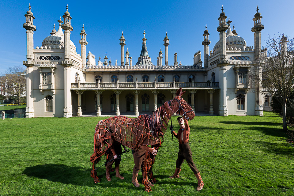
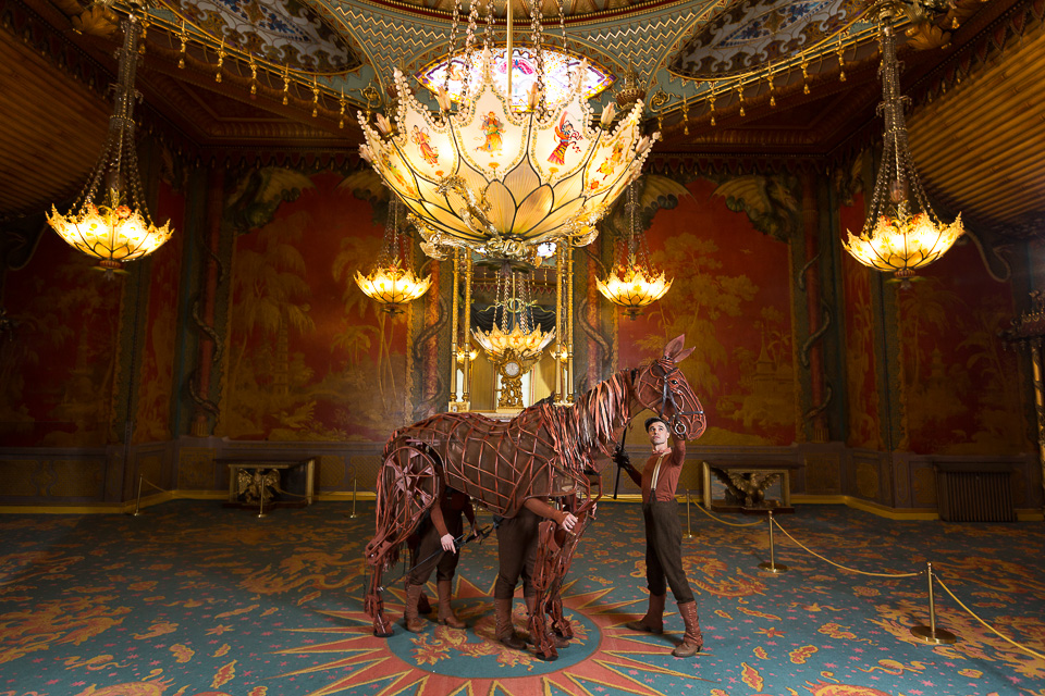
The amazing Joey again, this time around various Brighton landmarks to publicise the upcoming UK tour.
We started early on Brighton beach, with the sun to the South-West - low and strong - exactly what I didn't want. Ideal for a silhouette - but Joey doesn't make for a silhouette.
Yes, we could have moved to the other side of the pier to have the sun lighting it from the side, but that would have been a bit of a hassle to move, and too easy to shoot. He's quite large, so I doubled up flashes (a first for me) and set them to full power to overpower the sun. A third flash was held up, pointing at his face.
Moving further down the beach, something similar but facing out of shot:
After a public launch event, we went to the Royal Pavilion where I shot similar from a stepladder. Other than rearing (which I liked less) there's not much for Joey to do, so it actually comes down to Jack (who controls Joey's head) to take more of a role. When I couldn't see Jack's face, it just didn't work. Finally we went inside to this lovely room (below) for one more quick photo to the bemusement of the many visitors just off camera left.
It's an amazing show - see it if you can.
Jane Eyre
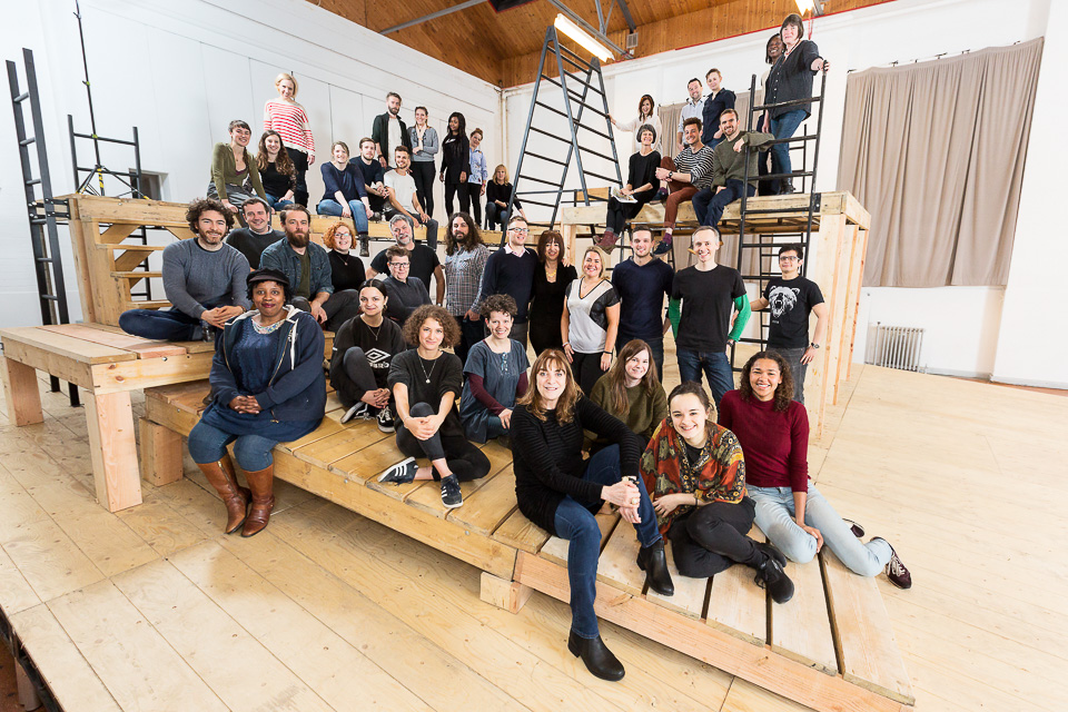
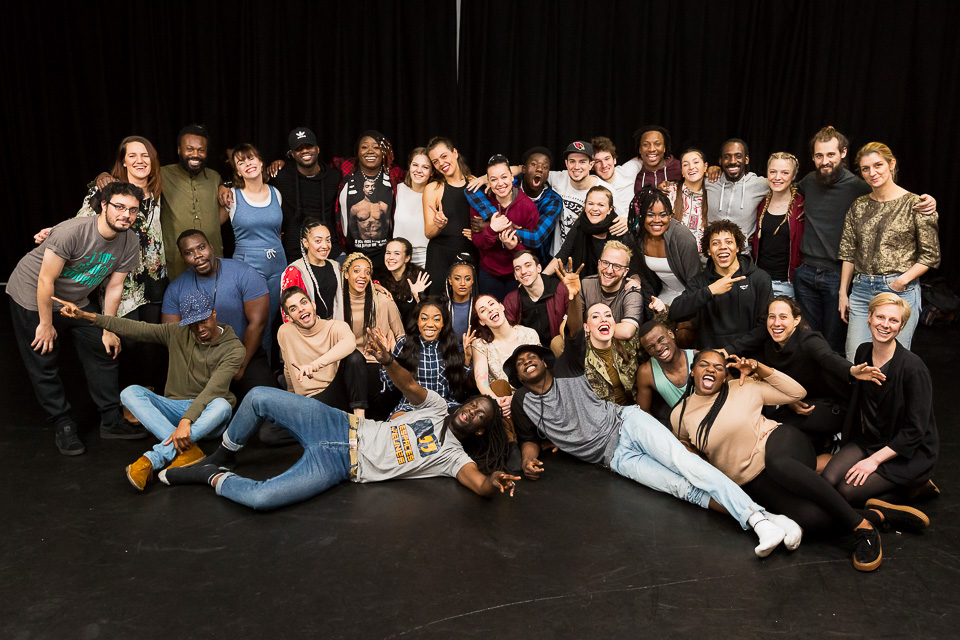
Following a critically acclaimed season at the National Theatre, Jane Eyre is touring the UK from April. I was commissioned to photograph the cast and crew on their first day of rehearsals.
Normally, these take place in a large, open space with chairs which we arrange so as not to have everyone just standing in a line. It's a quick group shot, a smaller group of the cast, and then a shot of the lead(s).
This time, I walked in to see this great set:
Finally, a chance to place people on different levels, where they can have different poses in, on and around a relevant and interesting location.
Except...
The first thing is that when something looks good, it doesn't necessarily translate well or immediately in a photo. This angle is ok, but I didn't much want to include the fire exit to the left of A, nor the lights above the stage. Also, somehow I always feel I want to get in "among" a location, but by shooting from points A or B, at once I lose 1/4 of the useful area of stage, as well as showing the doors, tables, fire exits etc. (out of shot).
It seems something from around the bottom/left of the ramp is probably the best option.
As for lighting, the yellowish ambient is 1/60 at f5 on 1250 ISO, but I've brightened it up here so it's perhaps a stop or so less. Ideally I want a better depth of field, as there are a lot of people and I'm intending to spread them around the set.
I have three speedlights and my stands reach about 8 feet high.
On the right (C) I can't use (any kind) of light on a stand, because it won't be high enough for people around point B: it would light them from below. Apart from the fact the ramp is sloped, the end of the stage is higher than the floor. Moving it further away would begin equate to side-lighting - as well as distributing the light more evenly across the image from right to left - I'd need a huge amount of power, and due to to numbers, some of the forty or so people would likely fall into shadow. It could be done at full power perhaps, but recycle times would be slow.
On the left of A and running behind towards me, there's a wall, limiting lighting options there. It's white and it can be bounced off, but its relative proximity to those on the ramp means they'll be lit, but those around B won't be.
Bouncing isn't a good solution either as the ceiling is high and dark brown wood. A lot of power for a limited return.
The messy diagram above shows what I ended up doing. On the left, a reflective umbrella at point A (which you can see in the final shot below). It has less effect as the light falls off moving across to the right, becoming more of a fill.
The second light, also on a stand, was pointed at a grey curtain several metres away at C. Pointing it upwards at a 60° angle created a high bounce, which made a soft fill light, from above right.
I kept one light on camera and also pointed it up and backwards (roughly 75°), again to bounce high off the wall right behind me. This acted as a fill for those at the front, who had no light on them. 1/100 at f6.3 was enough (just barely) to keep people sharp throughout.
A simpler shot ie without flash, using a higher ISO (perhaps 2500 or 5000) and sorting colours and general muddiness later in post might have been preferable: the portrait below of the actress playing Jane used one light and took less than 30 seconds!
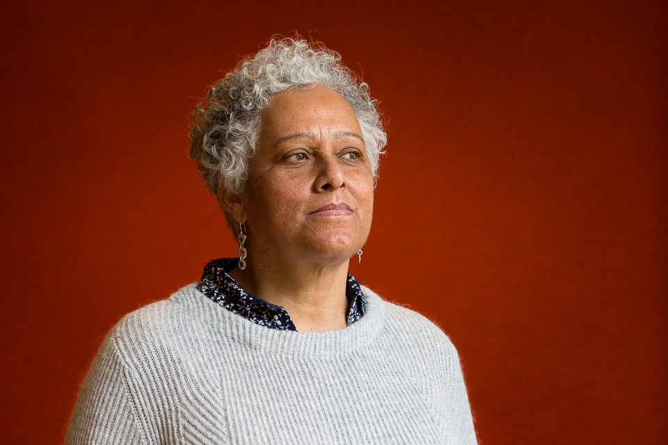
Patricia Cumper
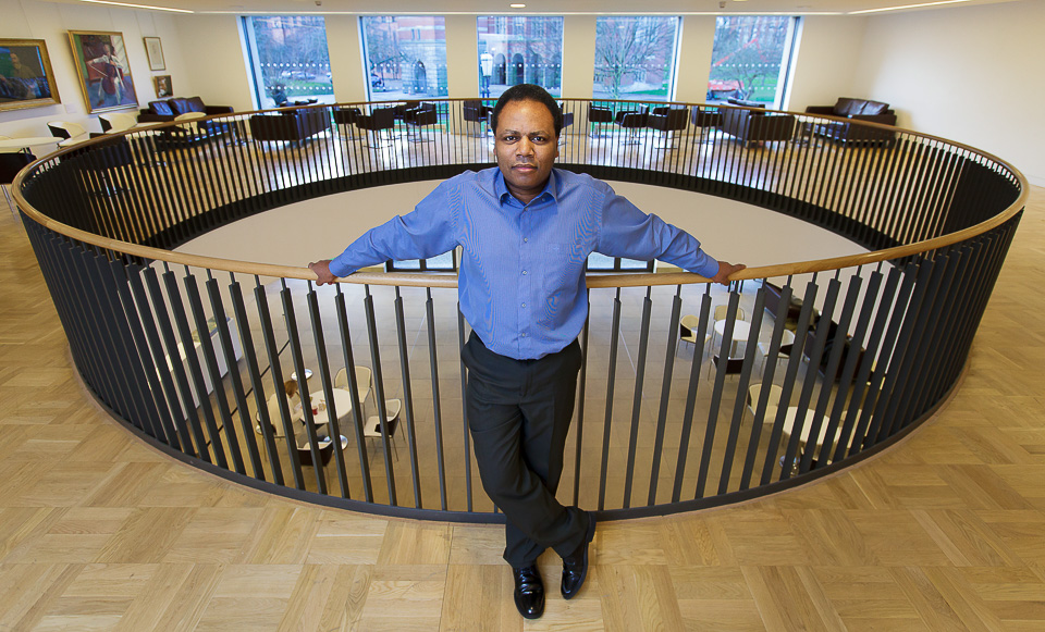
Playwright, producer and director Patricia Cumper MBE, who wrote Chigger Foot Boys.
1000 Pieces Puzzle
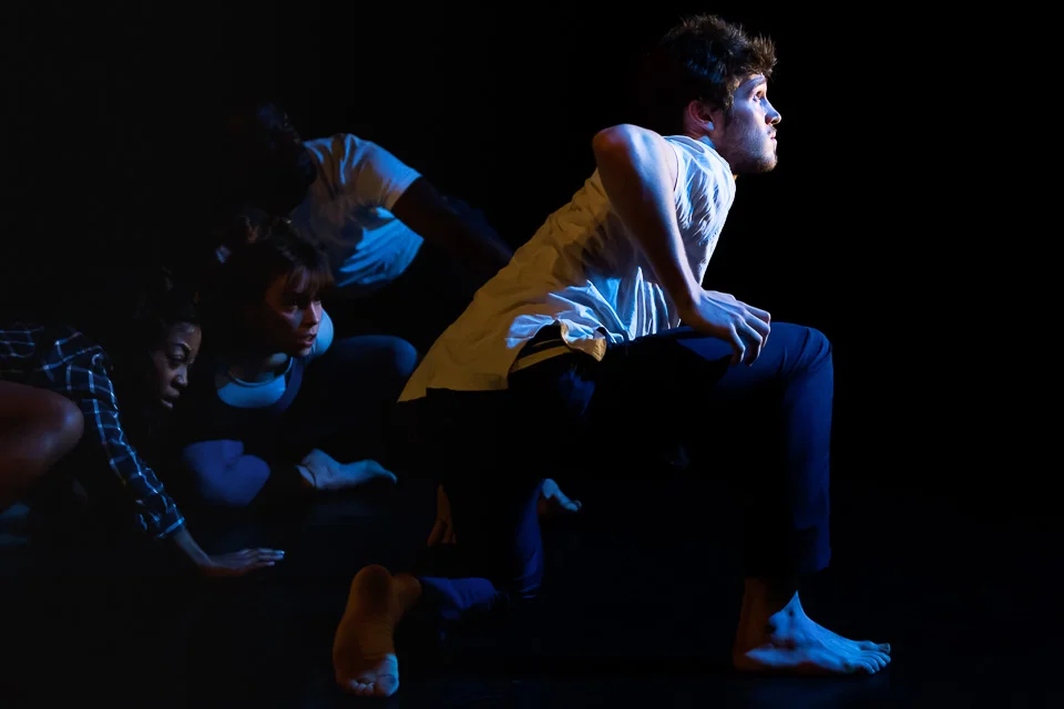
1000 Pieces Puzzle is a Belgium / UK dance & education exchange. Artists on the programme went on a two-week residency in Brussels and London, taking part in workshops around choreography and dance, as well as developing their entrepreneurial and leadership skills.
I photographed the culmination of the project, a performance at Rich Mix in Shoreditch:
Framing 101
I don't do weddings, pets, or selfies. But I had a quick, informal shoot recently: general pictures of an LG stand displaying some of their incredible products, including a £4.5K OLED television, the thickness of two (!?) credit cards, and a refrigerator which opens when you stand in front of it. Anyway, they also had a washing machine on display, and for the last shot of the visit I thought it might be fun* to get a photo from inside: of me in my own photo. Actually, I knew it would take several attempts and doubted I could get a customer to pose for long enough.
I lit the drum with our iphones, and supported the camera with a stack of various Gary Fong rubber flash modifiers. I'll bring a fisheye lens next time.
* Fun in it's loosest definition.
View from the gods
I covered a 'Relaxed Performance' of Mamma Mia for Mousetrap Theatre Projects. These are for families who have children with special needs, and provide an opportunity for young people with autism, learning difficulties or other sensory and communication needs who require a more relaxed environment.
I've shot a few of these, and look for images of families enjoying the shows in the stalls, but usually the light drops off considerably beyond the fourth or fifth rows closest to the stage, and with limited access to shoot from the front (sometimes I'll shoot from a box, or in front of the edge of the stage), coverage can be quite tricky and limiting.
This was taken from the gods - I'm not really sure why I was up there in the first place, as it's very dark - I'd enough of the usual images, and I often wander around locations for ideas, if I can. In any case, it hadn't occurred to me at all to look for silhouettes, but I noticed one boy dancing (something you wouldn't see usually - I imagine Abba fans can only tap their feet politely at a regular performance), but here everyone is free to express themselves.
The performers themselves comment afterwards on the incredible energy in the audience, and the families have a fantastic experience, at what (I assume) must be a fairly rare opportunity for many.
Studio Fractal
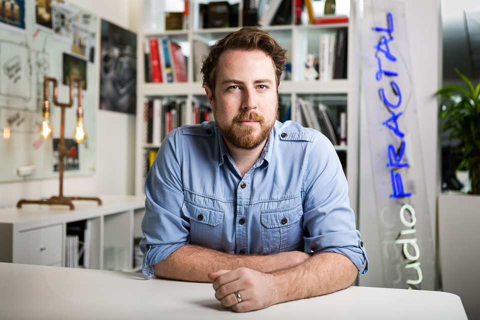
I spent a day with James Ball at the offices of lighting specialists Studio Fractal, whose work includes Bristol's Clifton Suspension Bridge and Cabot Circus, and London's King's Cross development.
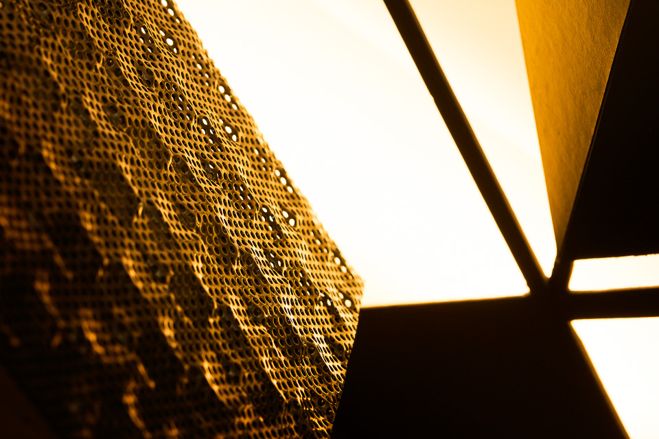
While James photographed their designs, products, templates and models - all the cool stuff - I did portraits of the designers. Not that I minded - it meant I spent (a bit too much) time chatting, as it's rare and lovely to meet a client who speaks exactly the same language as you. Their passion seems to boil down to "how light reacts with different things" which is pretty much all I think about. Despite running over time in conversation, I still found a little bit of time at the end to photograph some of the cool stuff, too.
Gavin Turk
Artist Gavin Turk, who is exhibiting at the Newport Street Gallery on Wednesday with "Who What When Where How & Why".
While I was waiting...
I've said elsewhere that one of the things I like about Instagram is that it's a place to put all the images which don't belong anywhere else. Too random for Facebook, not relevant for clients, and neither suitable nor strong enough for my portfolio. But worse would be to leave them on a hard-drive, forgotten in a cupboard, forever. While browsing my IG feed, I noticed that a great number were shot while I was waiting around for something.
It's an interesting category. These are the kind of images which, most of all, should fall between the floorboards. These shots are either an afterthought or noticed when you're thinking of other things. They're the result of time spent idle, with no planning or prior intention, and they wouldn't exist but for the opportunity of a few free moments.
A friend was delayed. St Pancras station, London.
In a cafe, waiting for a coffee.
In a car park, on arriving early for a shoot.
One New Change, London. Waiting for permission from the site manager.
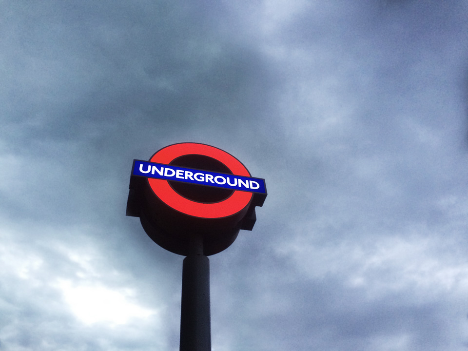
Underground station sign (I had arrived early).
Archway. Meeting a friend.
I don't remember where this was but it's a lamp-post (or was, originally). Strictly, I wasn't waiting and I knew I wanted to do this for a while, but it was taken on a break between shoots.
Taken through glass in a queue at an airport.
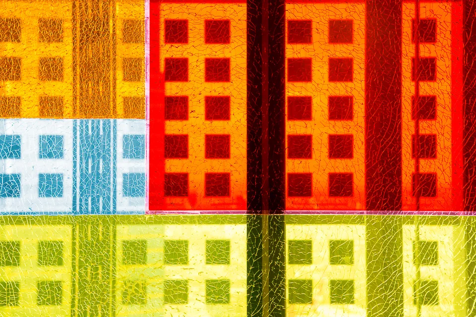
Cracked glass at Sushi Samba, London, while waiting for people to arrive for an event.
Gelled flash through opaque glass. Waiting to do a portrait, I was playing around with the idea of using a coloured spot behind the subject. It wasn't working (there wasn't enough space to spread the light), but did make this interesting shot.
London. During dinner at a press launch.
Photographed while the film crew were interviewing a subject. I did actually send this one to the client along with a couple of other stock images from the day (there was a lot of waiting around).
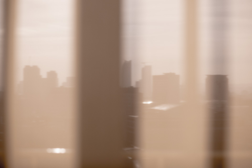
London, in between corporate portraits. The 'razor' building can be seen (centre) through curtains.
Not quite waiting for paint to dry, but the next best thing.
Various gas pipes and pressure gauges in a factory corridor. I have absolutely no idea what they were for.
The Tower of London, the Walkie-Talkie, the Cheese-Grater and the Gherkin. Taken from the event space at the top of Tower Bridge at dusk, while waiting for speeches to finish.
Canvas
I undertook a series of case-study portraits on behalf of Instructure for their state-of-the-art Learning Management Software (LMS). We photographed teachers, administrators and learners - users from all sides - and visited Birmingham University (where I studied!), Oxford, Sutton Tennis Academy and Trondheim, Norway. Here are a selection:
Rishi Khosla
Entrepreneur Rishi Khosla, CEO of OakNorth, a bank which focuses on lending to fast-growth businesses and entrepreneurs.
Sadlers Wells workshop
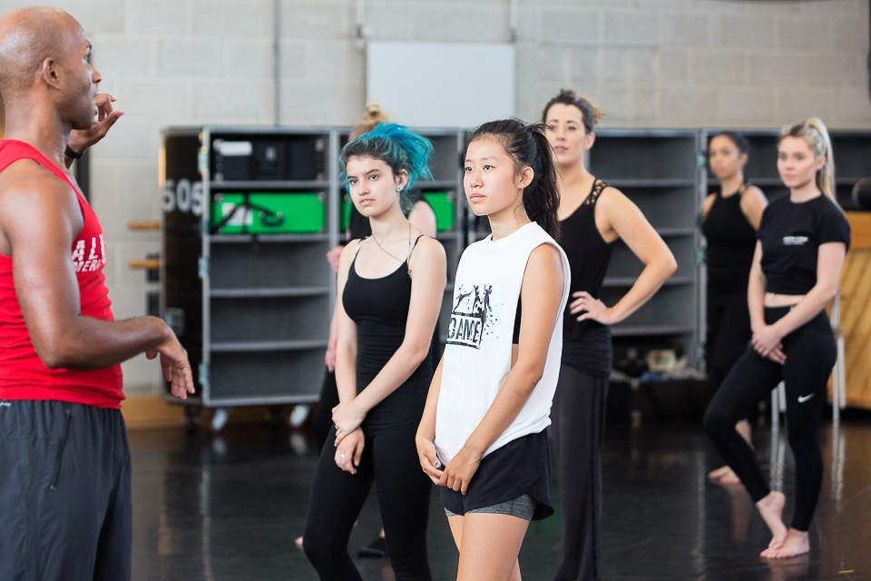
Images from a workshop run by a dancer from Alvin Ailey American Dance Theater at Sadler's Wells for Mousetrap Theatre projects:
Rose Bruford
I was commissioned to shoot around a few of the backstages courses taught at Rose Bruford College of Theatre and Performance in Sidcup for their prospectus. Here are a few images from the set:
Making lemonade at Harrods
A while back I wrote about how much of the job involves solving problems seemingly outside of photography: usually practical issues around the shoot which are unpredictable, unwanted or irritating. My argument was that however we may feel, they are very much part and parcel of a shoot. They must be dealt with, worked around, bulldozed over - or even leveraged to create something new.
Or in other words, when given lemons. And hence, "I don't want excuses - I want pictures." as the picture desks say.
So, a case in point last week. Two brand-new Maserati models arriving in London, to be displayed in the window of Harrods. I was commissioned to document their arrival on Saturday night (straightforward), and return early the next morning - when they'd be setup up and window-dressed - to shoot "teaser" detail, close-up images of shiny chrome and brand logos, that sort of thing (arty). A taste of the display, but without revealing too much.
Part one (the arrival) went fine - just some cars being dropped off into a showroom at night:
Part two, however, was a different story. Very early on the Sunday morning, after wending my way through the labyrinthine underground catacombs of the store (you wouldn't believe), and finally arriving at the display, this scene greeted me:
Oh, dear. A half-finished installation, with bubble wrap and sheeting covering the cars for their protection. And the sheeting was not going to be removed until the last moment (which was expected to be sometime in the early hours of the next morning).
Hmm. There would be no chrome. No close-ups of an ergonomic steering wheel or an Italian leather interior. No branding. No logos. How could I take evocatively teasing images when I could barely see the cars?
I was about to turn around and go home - really; did I mention it was a Sunday morning? - when it dawned on me that, in fact, the shots were right there. Not what I'd expected or hoped for, certainly - but possibilities for teaser images (of a rather different kind), just the same. A couple of dozen, as it turned out. So, here's a logo at the front:
If that was too abstract, a wider shot shows a little more. Like the Christmas wrapping around a bicycle, which shapes what's underneath rather predictably (and delightfully):
I then found that the sheeting and bubble-wrap could be pulled up over the wheels and part-way up the bonnet, meaning I could get shots nearer to what was expected:
Finally, a photo of a car as a whole is rather dull. This is a pity, as it's very much the definition of a teaser image:
But works just fine with one small change - here, the sheeting is being smoothed into place by one of the installation team. Job done:
Money Mentors
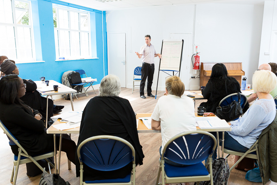
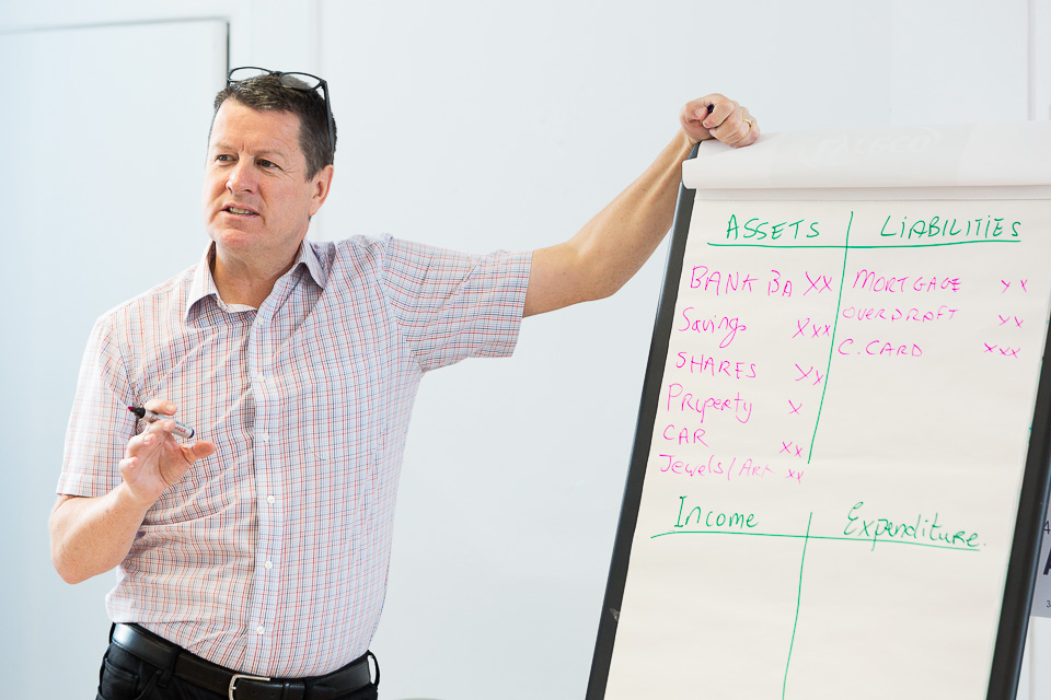
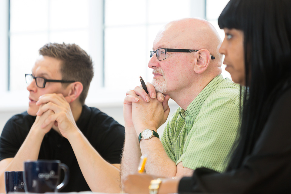
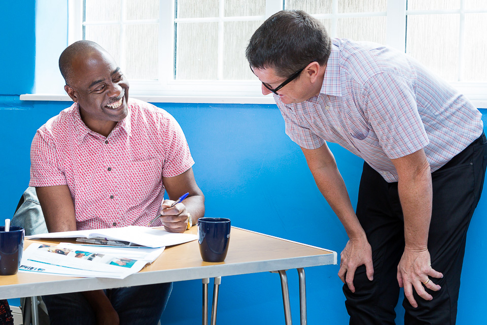
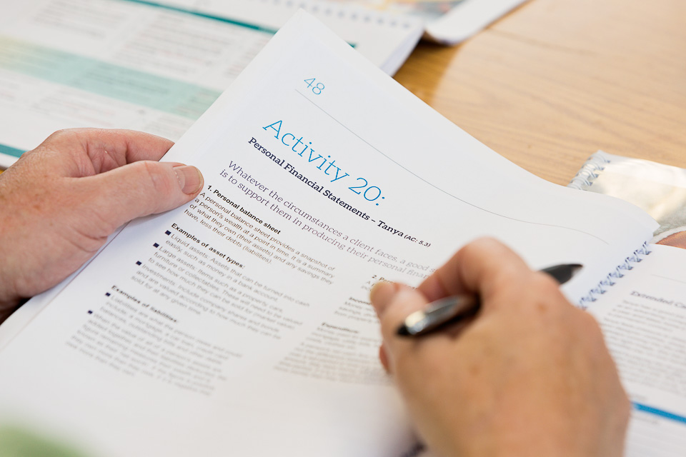
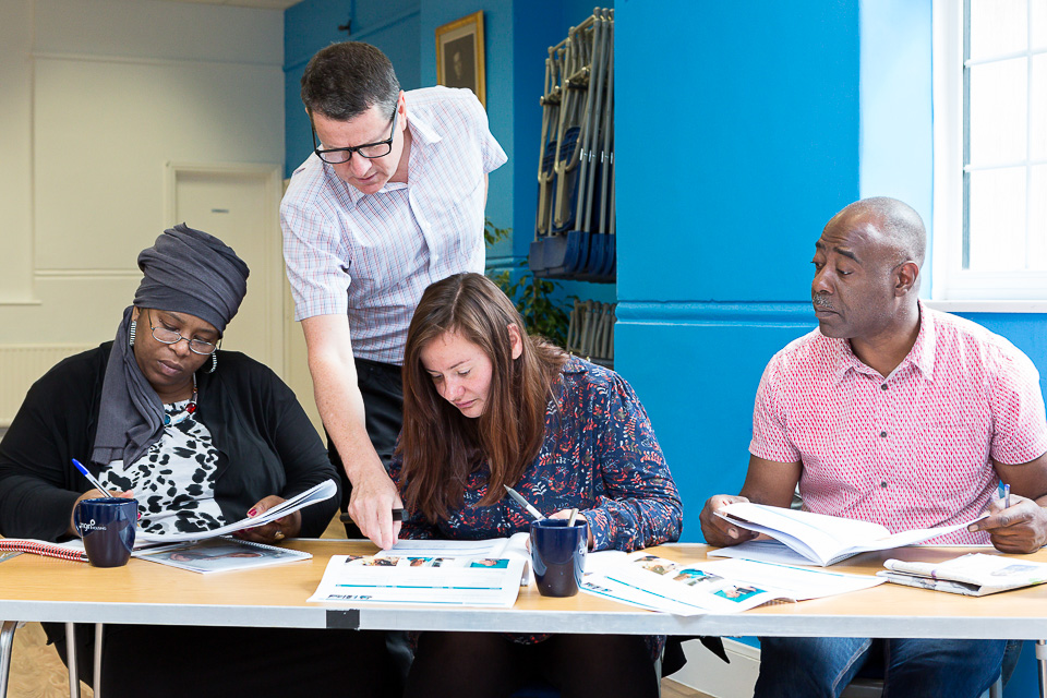
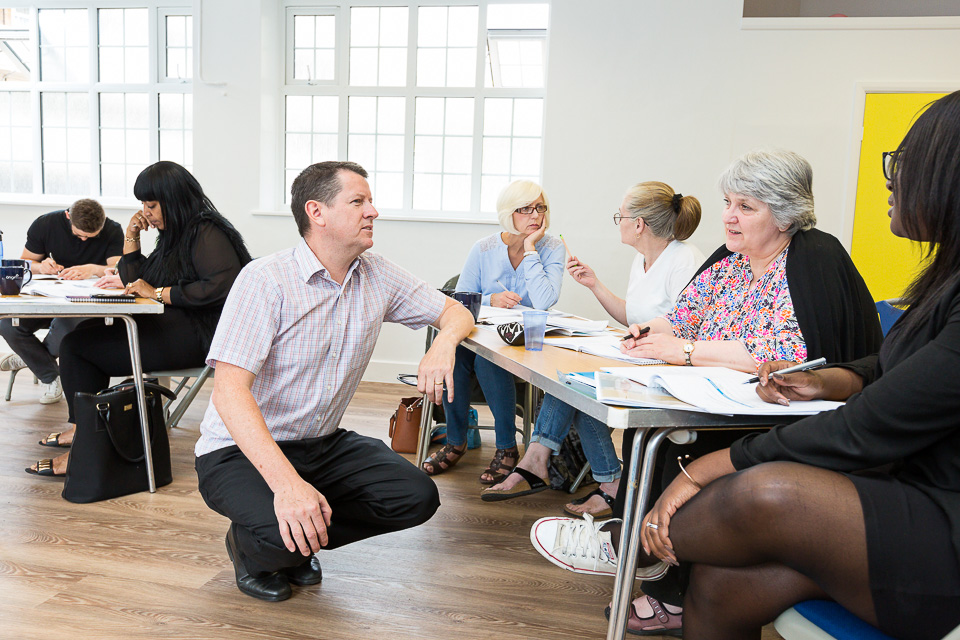
National Skills Academy for Financial Services (NSAFS) required images of their Money Mentors training scheme, part of the award-winning Lloyds Banking Group Money for Life Programme. This workshop runs over two days, training a variety of candidates to provide financial management support:
Instawalks
I've been running occasional classes for Instagram/Facebook over the past year. These are informal sessions where I teach their clients everything I know about photography (!) before letting them loose in Camden, King's Cross or Southbank. They have then 30-40 minutes' shooting before we regroup, critique, and decide on the winner(s).
The lesson itself lasts an hour. We cover some theory, a few practical tips and techniques, and then look at using the app to edit images. Nothing technical. Among others, clients have included Heineken and Starbucks, and there's one in the pipeline for Apple.
They're given a variety of themes to work towards - it's important to have limitations - but they're not obliged to keep to them. These are usually Reflections, Shapes & lines, Signs and symbols, Colour, and Close-ups.
Judging the winner is always difficult as many are equally good, but for different reasons.
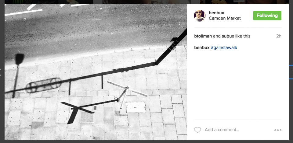
While I could have shown plenty of descriptive images, lovely detail shots and neat observations, this selection I've made of their work either reflects some of the points we cover, or tends towards fresh and quirky (often abstract and arty shots) which are right up my street. That is, I'd be very happy to have any of these in my own feed (@alexrumford)! Although I should point out that the best pictures on the day are just that - they have nothing do with my own taste or preferences.
I hope you enjoy them as much as I did:
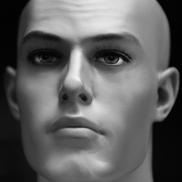
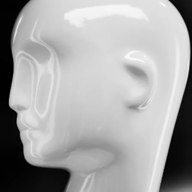
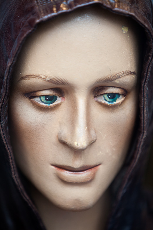
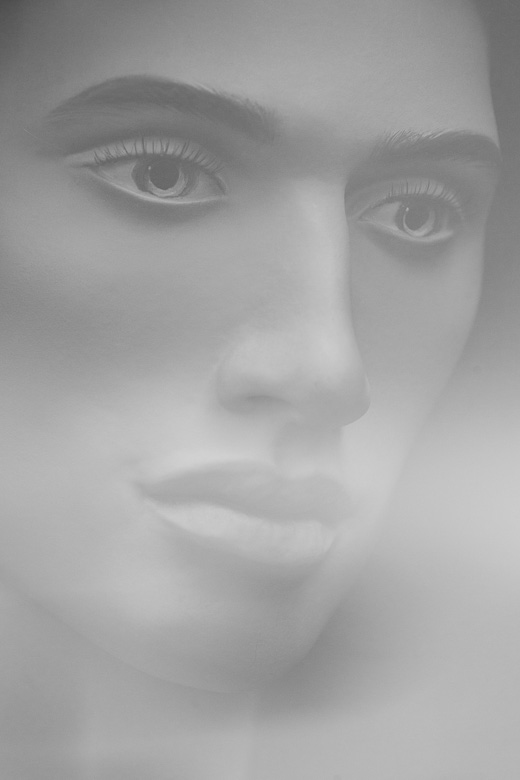
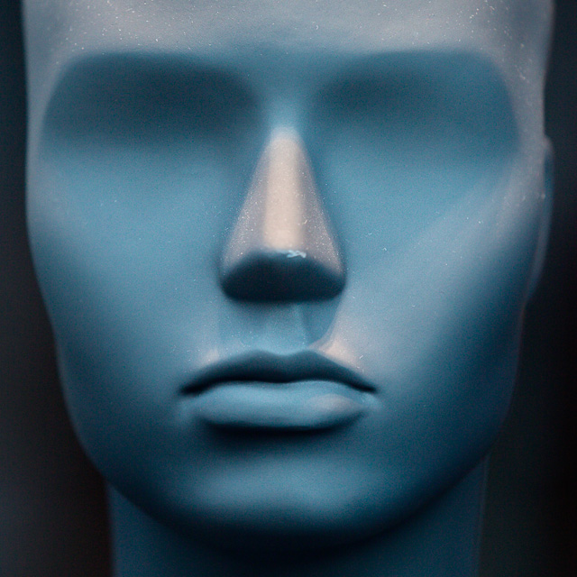
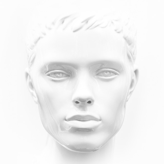
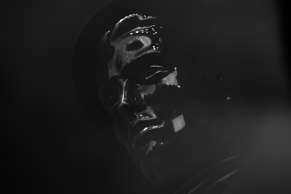
Mannequins (m)
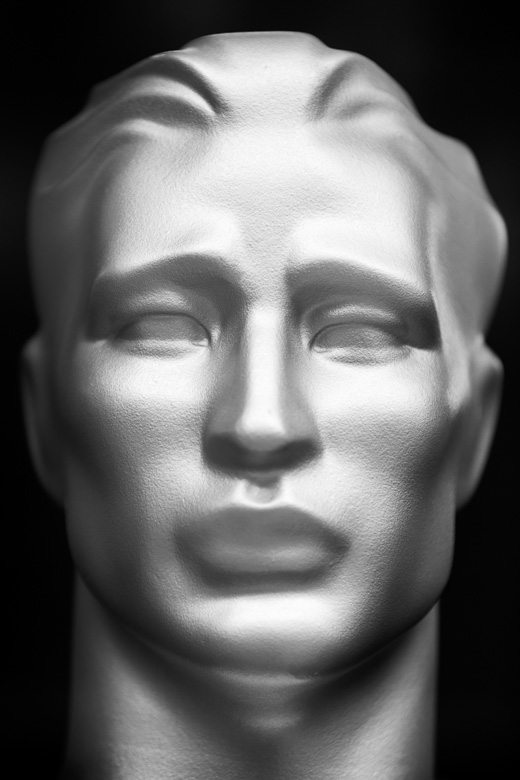
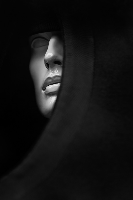
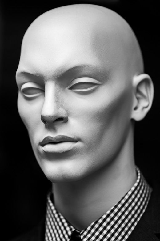
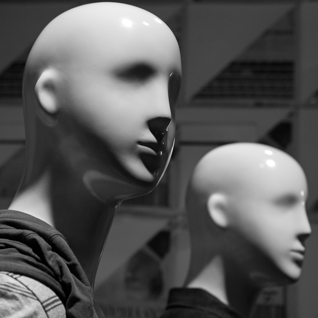
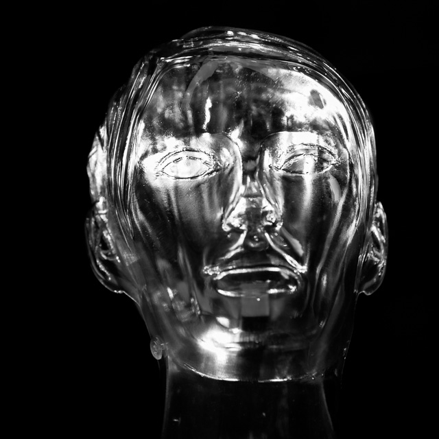
I posted a mannequin image on Instagram the other week. I have hundreds of these. I've been taking them for a while, usually through shop windows while on my way to shoots. There's no reason behind them. No underlying commentary on how idealisation results in lifeless, plastic, empty expressions. No comparison between the realist and impressionist takes on the human face.
I see them from time to time and I just find them interesting, I guess.
Now, I don't want to flood my IG feed - although I'll surely put more up there in time - but I feel I want to publish them.
It's a 'release', sure. Also, it clears the decks of the various non-commissioned, random miscellany which clogs up my archives, and which has nowhere to go.
Here are some of the men. Enjoy (?) -
-
June 2025
- Jun 19, 2025 The forever purge
- Jun 19, 2025 University prospectus
- Jun 11, 2025 Recent work - June 2025
- Jun 6, 2025 On Looking
-
January 2025
- Jan 21, 2025 The photographer's dictionary
-
November 2024
- Nov 19, 2024 Recent work - November 2024
-
September 2024
- Sep 17, 2024 Recent work - September 2024
-
July 2024
- Jul 4, 2024 Mean Girls
-
May 2024
- May 28, 2024 Wakehurst
- May 20, 2024 Graduation
-
April 2024
- Apr 16, 2024 Recent work - April 2024
-
January 2024
- Jan 22, 2024 Recent work - January 2024
- Jan 9, 2024 Long live the local
-
October 2023
- Oct 13, 2023 CBRE
- Oct 4, 2023 Recent work - October 2023
-
September 2023
- Sep 22, 2023 Seeing past the subject (2)
-
April 2023
- Apr 17, 2023 Tinder
- Apr 12, 2023 Recent work - April 2023
-
February 2023
- Feb 7, 2023 Will AI do me out of a job?
-
December 2022
- Dec 12, 2022 Freelance life and other animals
-
November 2022
- Nov 4, 2022 Recent work - November 2022
-
July 2022
- Jul 26, 2022 Recent work - July 2022
- Jul 25, 2022 SOAS
-
May 2022
- May 30, 2022 Ebay
- May 18, 2022 Physiotherapy
- May 4, 2022 Vertex
- May 4, 2022 Roche
-
January 2022
- Jan 6, 2022 Recent work - December 2021
- Jan 5, 2022 Prevayl
-
December 2021
- Dec 17, 2021 The day the hairdressers opened
-
December 2020
- Dec 15, 2020 SOAS - postgraduate prospectus
- Dec 7, 2020 Online teaching
-
October 2020
- Oct 11, 2020 Gratitudes
- Oct 5, 2020 GoFundMe Heroes
-
September 2020
- Sep 24, 2020 Headshots: why we need them, and why we don't like them
- Sep 15, 2020 From the archives - seven
- Sep 10, 2020 Recent work - September 2020
-
February 2020
- Feb 13, 2020 Mootral
-
November 2019
- Nov 7, 2019 Biteback 2030
-
October 2019
- Oct 2, 2019 Guinness World Records
-
September 2019
- Sep 16, 2019 B3 Living
-
July 2019
- Jul 22, 2019 Recent work - July 2019
- Jul 19, 2019 From the archives - six
-
April 2019
- Apr 15, 2019 Recent work - April 2019
-
March 2019
- Mar 12, 2019 International Women's Day
-
February 2019
- Feb 4, 2019 Recent work - February 2019
-
January 2019
- Jan 17, 2019 Four photographs
-
December 2018
- Dec 19, 2018 Handy gadgets and where to find them
- Dec 10, 2018 From the archives - five
-
November 2018
- Nov 26, 2018 How to compose photographs
- Nov 5, 2018 Recent work - November 2018
-
October 2018
- Oct 17, 2018 How to edit photographs in Instagram
- Oct 8, 2018 Out with the old
- Oct 4, 2018 Recent work - October 2018
- Oct 1, 2018 A little learning is a dangerous thing
-
September 2018
- Sep 12, 2018 From the archives - four
-
August 2018
- Aug 16, 2018 Recent work - August 2018
- Aug 15, 2018 I don't follow you
- Aug 6, 2018 Cookpad
-
June 2018
- Jun 7, 2018 Monks & Marbles
-
May 2018
- May 23, 2018 Netflix & Woof
- May 21, 2018 Best of Instagram
-
April 2018
- Apr 24, 2018 Standard Chartered Bank
-
March 2018
- Mar 16, 2018 Corporate self-portraiture (two)
- Mar 8, 2018 International Women's Day
-
February 2018
- Feb 9, 2018 Winter swimming
-
January 2018
- Jan 23, 2018 From the archives - three
- Jan 16, 2018 2017 in pictures
-
December 2017
- Dec 6, 2017 Toyota Mobility Foundation
-
November 2017
- Nov 24, 2017 Corporate work
-
October 2017
- Oct 31, 2017 Recent work - October 2017
- Oct 13, 2017 Pfizer - Protecting our Heroes
-
September 2017
- Sep 21, 2017 Campaign portraits
-
August 2017
- Aug 22, 2017 Wyborowa vodka
- Aug 1, 2017 Vauxhall animation
-
July 2017
- Jul 31, 2017 Tanguera
- Jul 20, 2017 Take your parents to work
-
June 2017
- Jun 22, 2017 Recent work - June 2017
-
May 2017
- May 22, 2017 Mannequins (female)
- May 16, 2017 Scott Reid
- May 9, 2017 Huawei - The New Aesthetic
-
April 2017
- Apr 24, 2017 S.H.O.K.K.
- Apr 21, 2017 Battle
- Apr 18, 2017 Ashburton
- Apr 11, 2017 Victoria Jeffrey
-
March 2017
- Mar 30, 2017 Parkour Generations
- Mar 27, 2017 War Horse in Brighton
- Mar 23, 2017 Rock'n'roll
- Mar 20, 2017 Jane Eyre
- Mar 15, 2017 Patricia Cumper
- Mar 8, 2017 1000 Pieces Puzzle
-
January 2017
- Jan 23, 2017 Framing 101
- Jan 10, 2017 View from the gods
-
December 2016
- Dec 14, 2016 Studio Fractal
-
November 2016
- Nov 29, 2016 Musician
- Nov 21, 2016 Gavin Turk
- Nov 10, 2016 While I was waiting...
- Nov 3, 2016 Canvas
-
October 2016
- Oct 28, 2016 Rishi Khosla
- Oct 18, 2016 Sadlers Wells workshop
- Oct 11, 2016 Rose Bruford
- Oct 6, 2016 Making lemonade at Harrods
-
September 2016
- Sep 28, 2016 Money Mentors
- Sep 21, 2016 Instawalks
- Sep 12, 2016 Mannequins (m)
-
August 2016
- Aug 23, 2016 Tomorrow's People
- Aug 17, 2016 Mousetrap
-
July 2016
- Jul 28, 2016 Property brochure
- Jul 19, 2016 Choosing between photos
- Jul 8, 2016 Create Victoria
- Jul 1, 2016 Recent work - July 2016
-
June 2016
- Jun 21, 2016 Cohn & Wolfe 2
- Jun 10, 2016 Physical Justice
-
May 2016
- May 31, 2016 Corporate self-portraiture
- May 23, 2016 Photivation (two) & Instagram
- May 16, 2016 From the archives - two
- May 4, 2016 Red Channel
-
April 2016
- Apr 28, 2016 GBG corporate shoot
- Apr 21, 2016 28 days later
- Apr 14, 2016 Colgate
- Apr 6, 2016 Breaks and burns
-
March 2016
- Mar 31, 2016 Mixed bag
- Mar 22, 2016 Pearson
- Mar 15, 2016 War Horse - The Final Farewell
- Mar 8, 2016 The Jersey Boys
- Mar 1, 2016 Sky Garden
-
February 2016
- Feb 23, 2016 Avada Kedavra!
- Feb 17, 2016 Bees
- Feb 8, 2016 From the archives
-
January 2016
- Jan 27, 2016 Kaspersky - Alex Moiseev
- Jan 19, 2016 Melanie Stephenson
- Jan 11, 2016 Photivation
-
December 2015
- Dec 28, 2015 Noma Dumezweni
- Dec 17, 2015 Creating a portfolio
- Dec 8, 2015 Victoria
- Dec 1, 2015 Collabo
-
November 2015
- Nov 25, 2015 Danny Sapani
- Nov 17, 2015 People, Places and Things
- Nov 10, 2015 Romain Grosjean
- Nov 2, 2015 Egosurfing
-
October 2015
- Oct 23, 2015 The Curious Incident of the Dog in the Night-Time
- Oct 13, 2015 This Girl Can
- Oct 1, 2015 Ratings are overrated
-
September 2015
- Sep 23, 2015 Indra
- Sep 15, 2015 Seeing past the subject
- Sep 8, 2015 Black and white (two)
- Sep 2, 2015 The decisive moment (two)
-
August 2015
- Aug 25, 2015 British Gas
- Aug 19, 2015 Problem solving vs creativity
- Aug 12, 2015 Cohn & Wolfe
- Aug 5, 2015 James
-
July 2015
- Jul 31, 2015 Photographing the photographer
- Jul 28, 2015 Black and white
- Jul 20, 2015 Comedian
-
December 2014
- Dec 15, 2014 2014 in pictures
-
January 2014
- Jan 9, 2014 2013 in pictures
-
February 2013
- Feb 10, 2013 It's not the camera
-
December 2012
- Dec 31, 2012 2012 in pictures
-
April 2012
- Apr 30, 2012 What the job is - or, "Dealing with lemons"
- Apr 13, 2012 Your holiday photos aren't rubbish
-
May 2011
- May 13, 2011 Showing the world differently
- November 2010
-
October 2010
- Oct 9, 2010 Seeing pictures


