Studio Fractal
Office-based portrait and lifestyle shoot for a specialist architectural lighting design company
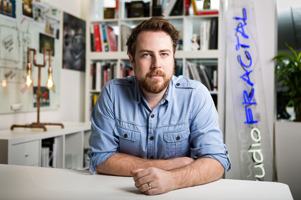
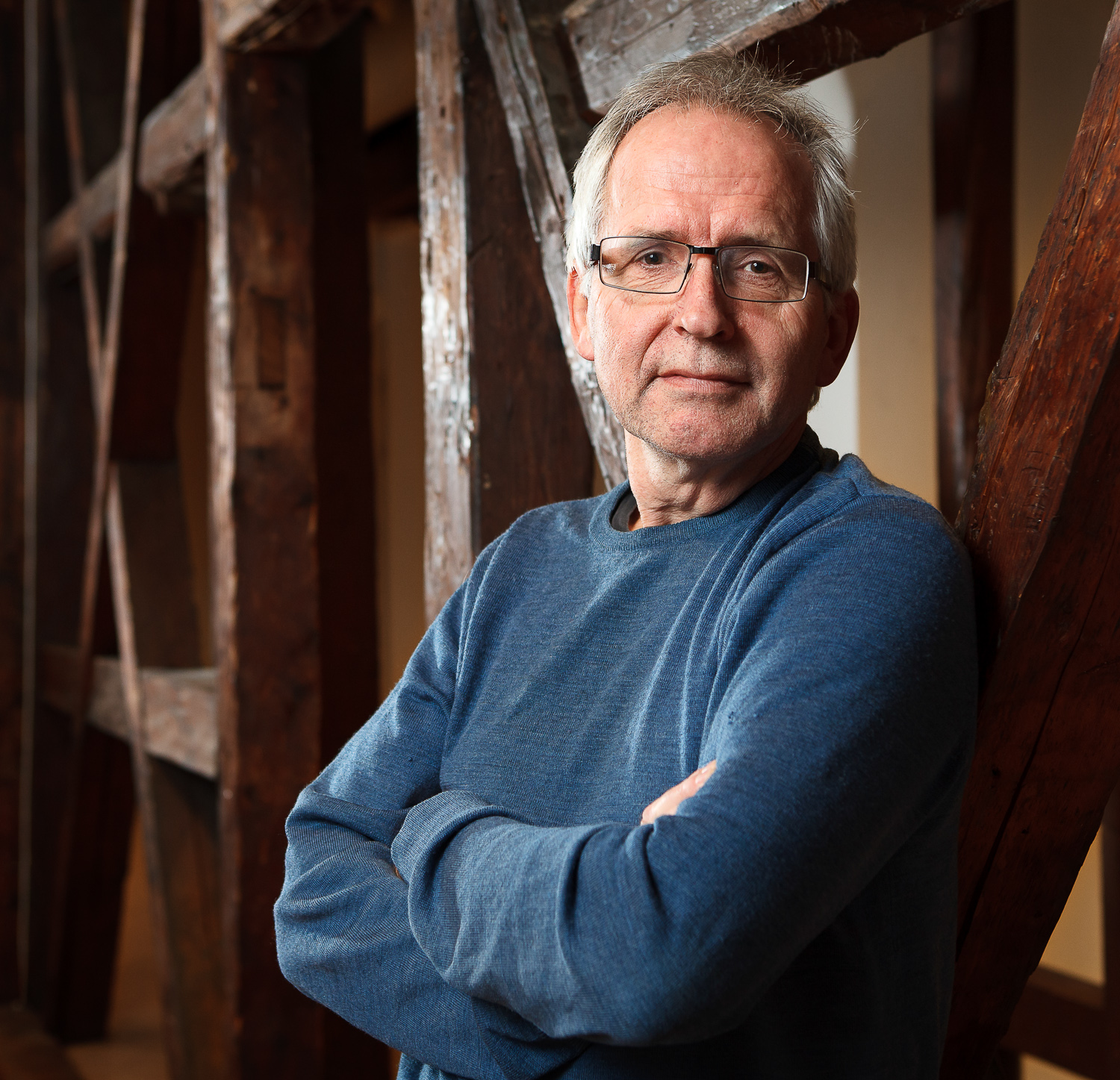
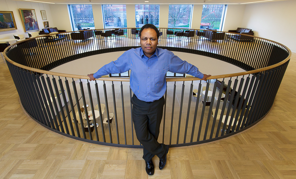
I spent a day with James Ball at the offices of lighting specialists Studio Fractal, whose work includes Bristol's Clifton Suspension Bridge and Cabot Circus, and London's King's Cross development.
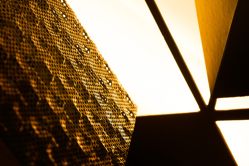
While James photographed their designs, products, templates and models - all the cool stuff - I did portraits of the designers. Not that I minded - it meant I spent (a bit too much) time chatting, as it's rare and lovely to meet a client who speaks exactly the same language as you. Their passion seems to boil down to "how light reacts with different things" which is pretty much all I think about. Despite running over time in conversation, I still found a little bit of time at the end to photograph some of the cool stuff, too.
While I was waiting...
Images taken in the spaces between things
I've said elsewhere that one of the things I like about Instagram is that it's a place to put all the images which don't belong anywhere else. Too random for Facebook, not relevant for clients, and neither suitable nor strong enough for my portfolio. But worse would be to leave them on a hard-drive, forgotten in a cupboard, forever. While browsing my IG feed, I noticed that a great number were shot while I was waiting around for something.
It's an interesting category. These are the kind of images which, most of all, should fall between the floorboards. These shots are either an afterthought or noticed when you're thinking of other things. They're the result of time spent idle, with no planning or prior intention, and they wouldn't exist but for the opportunity of a few free moments.
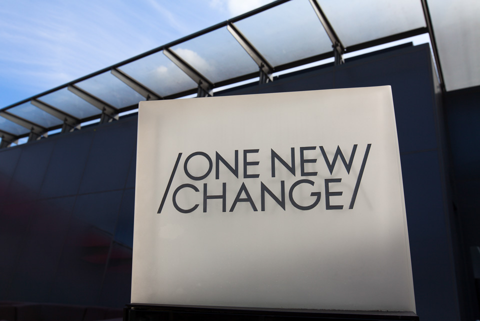
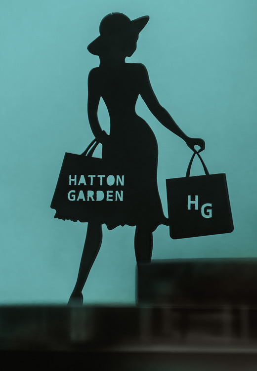
One New Change, London. Waiting for permission from the site manager.
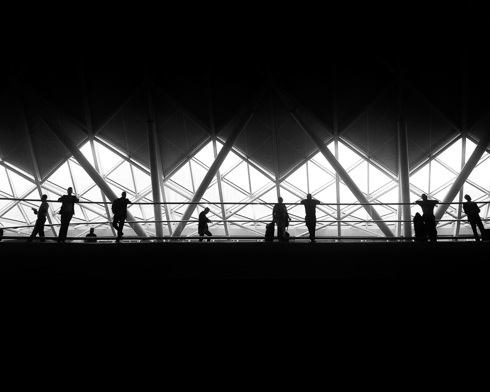
A friend was delayed. St Pancras station, London.
In a car park.
I don't remember where this was but it's a lamp-post (or was, originally). Strictly, I wasn't waiting and I knew I wanted to do this for a while, but it was taken on a break between shoots.
Archway. Meeting a friend.
Photographed while the film crew were interviewing a subject. I did actually send this one to the client along with a couple of other stock images from the day (there was a lot of waiting around).
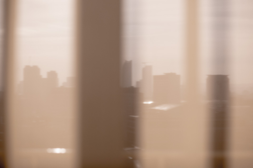
London, in between corporate portraits. The 'razor' building can be seen (centre) through curtains.
The Tower of London, the Walkie-Talkie, the Cheese-Grater and the Gherkin. Taken from the event space at the top of Tower Bridge at dusk, while waiting for speeches to finish.
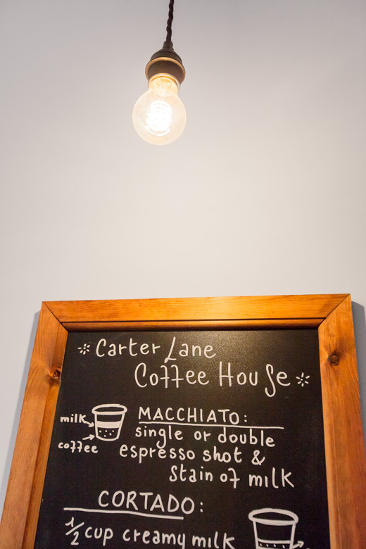
In a cafe, waiting for a coffee.
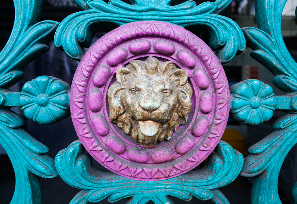
Taken through glass in a queue at an airport.
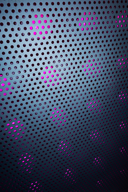
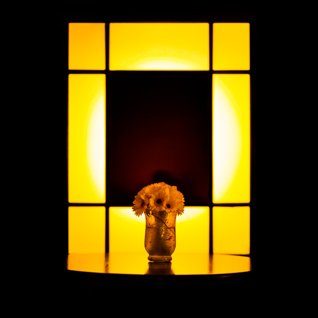
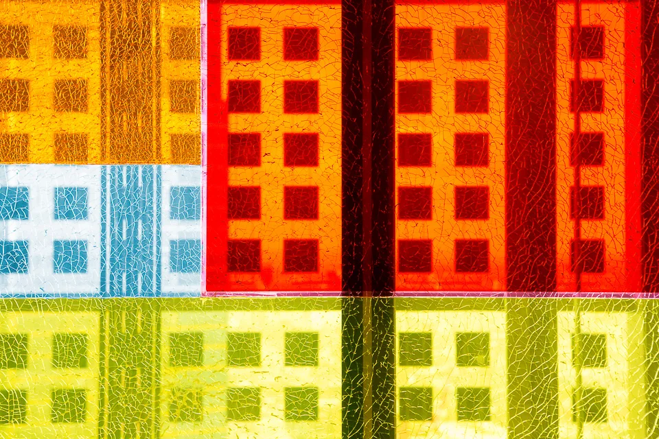
Gelled flash through opaque glass. Waiting to do a portrait, I was playing around with the idea of using a coloured spot behind the subject. It wasn't working (there wasn't enough space to spread the light), but did make this interesting shot.
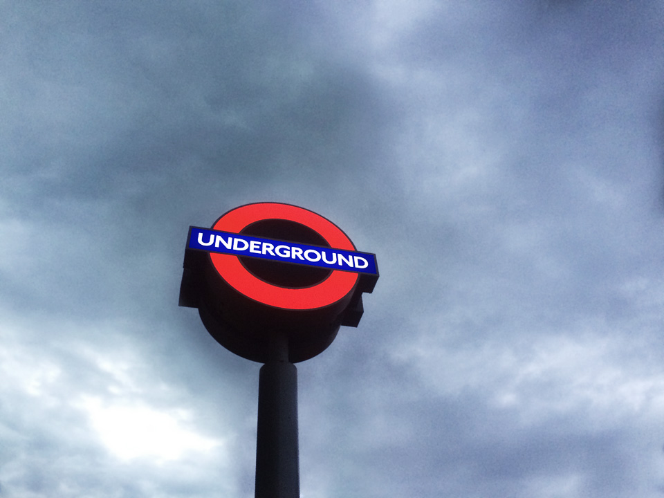
Underground station sign (I had arrived early).
London. During dinner at a press launch.
Not quite waiting for paint to dry, but the next best thing.
Cracked glass at Sushi Samba, London.
Various gas pipes and pressure gauges in a factory corridor.
Canvas
Portraits of educators and students in London, Birmingham, Trondheim and Oxford
I undertook a series of case-study portraits on behalf of Instructure for their state-of-the-art Learning Management Software (LMS). We photographed teachers, administrators and learners - users from all sides - and visited Birmingham University (where I studied!), Oxford, Sutton Tennis Academy and Trondheim, Norway. Here are a selection:
Rose Bruford
Prospectus images for a higher education college which offers courses around the performing arts
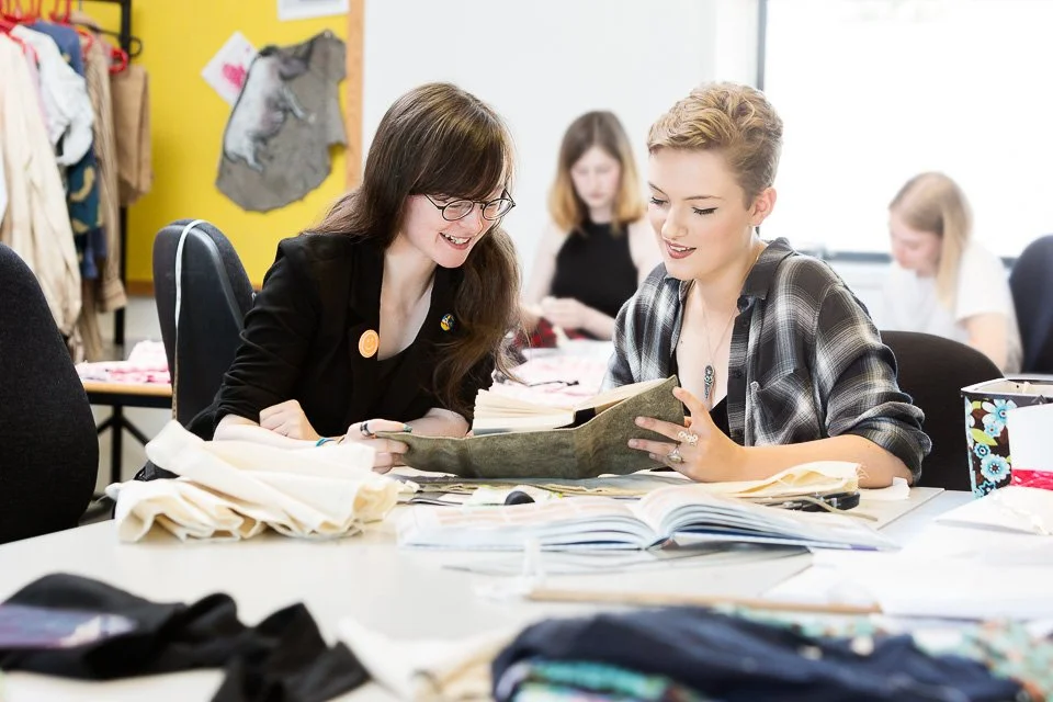
I was commissioned to shoot around a few of the backstages courses taught at Rose Bruford College of Theatre and Performance in Sidcup for their prospectus. Here are a few images from the set:
Instawalks
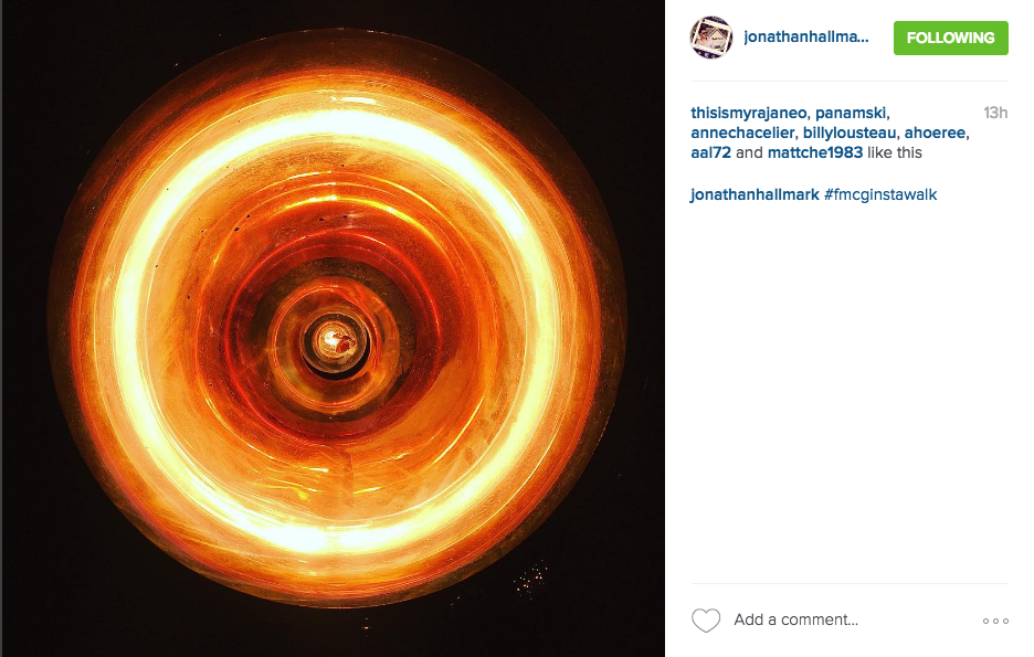
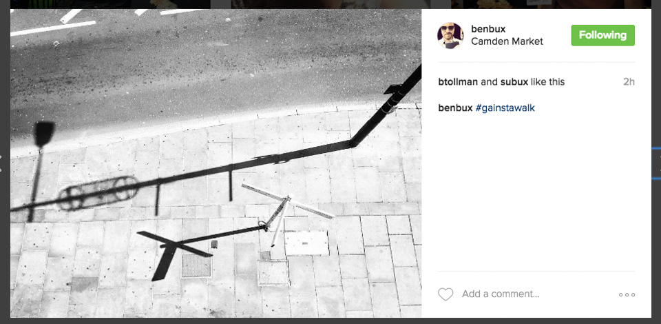
A selection of images from photography classes I’ve been running for Facebook
I've been running occasional classes for Instagram/Facebook over the past year. These are informal sessions where I teach their clients everything I know about photography (!) before letting them loose in Camden, King's Cross or Southbank. They have then 30-40 minutes' shooting before we regroup, critique, and decide on the winner(s).
The lesson itself lasts an hour. We cover some theory, a few practical tips and techniques, and then look at using the app to edit images. Nothing technical. Among others, clients have included Heineken and Starbucks, and there's one in the pipeline for Apple.
They're given a variety of themes to work towards - it's important to have limitations - but they're not obliged to keep to them. These are usually Reflections, Shapes & lines, Signs and symbols, Colour, and Close-ups.
Judging the winner is always difficult as many are equally good, but for different reasons.
While I could have shown plenty of descriptive images, lovely detail shots and neat observations, this selection I've made of their work either reflects some of the points we cover, or tends towards fresh and quirky (often abstract and arty shots) which are right up my street. That is, I'd be very happy to have any of these in my own feed (@alexrumford)! Although I should point out that the best pictures on the day are just that - they have nothing do with my own taste or preferences.
I hope you enjoy them as much as I did:
Property brochure
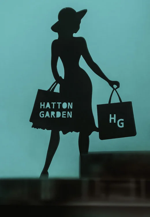
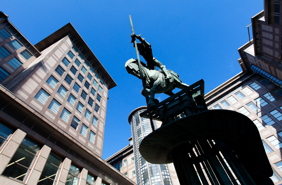
An editorial shoot for Landsec based around the parks, shops and offices around central London
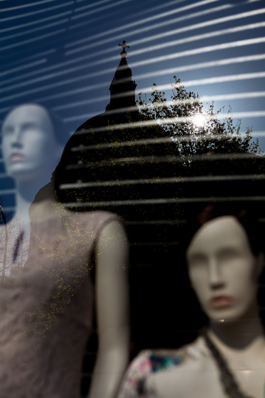
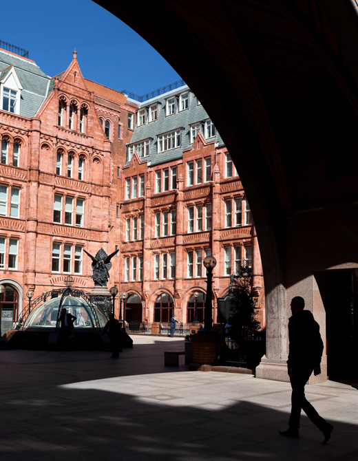
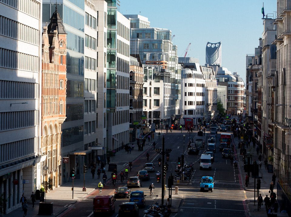
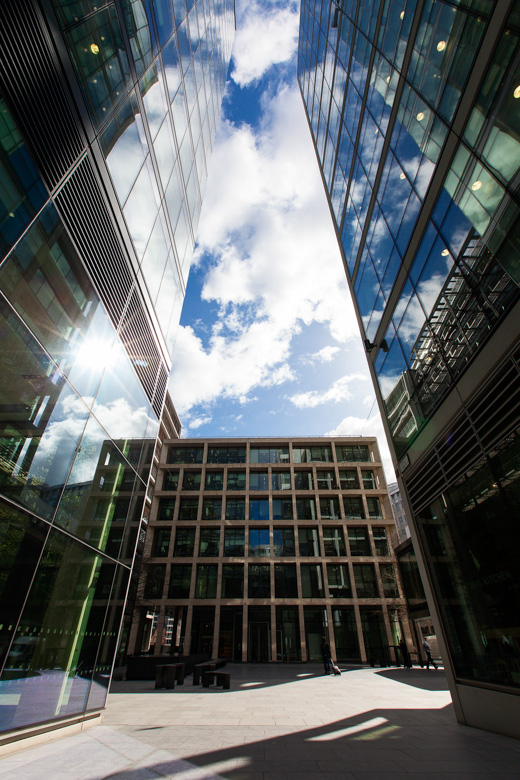
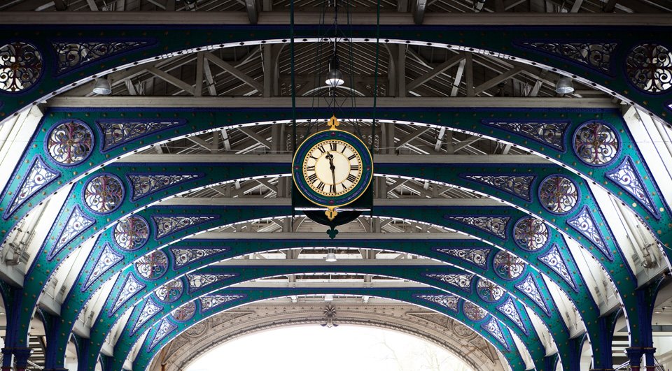
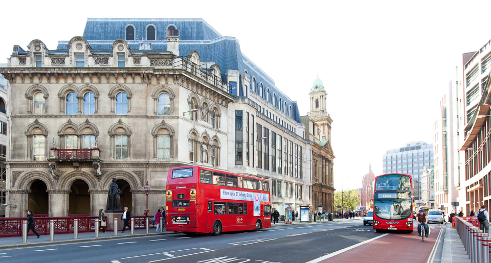
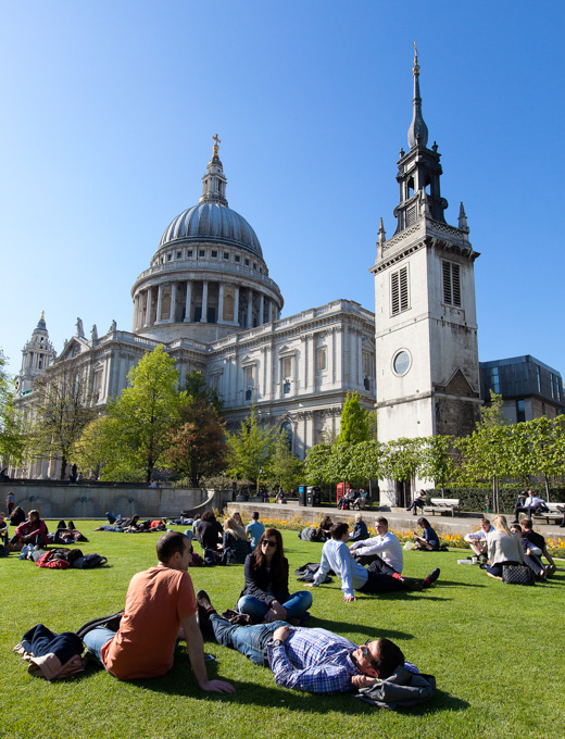
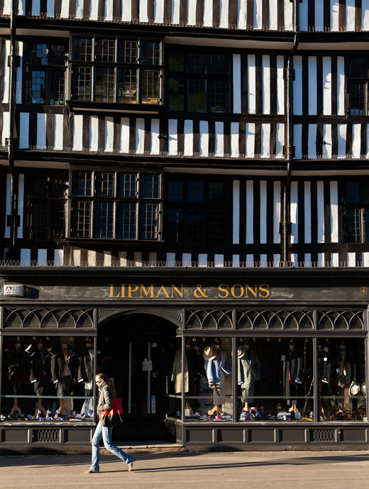
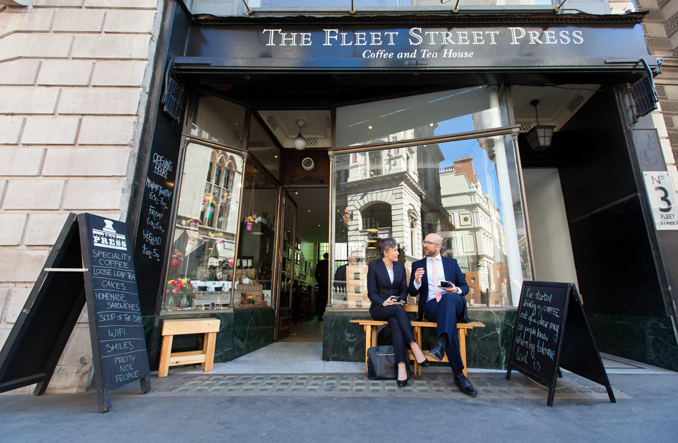
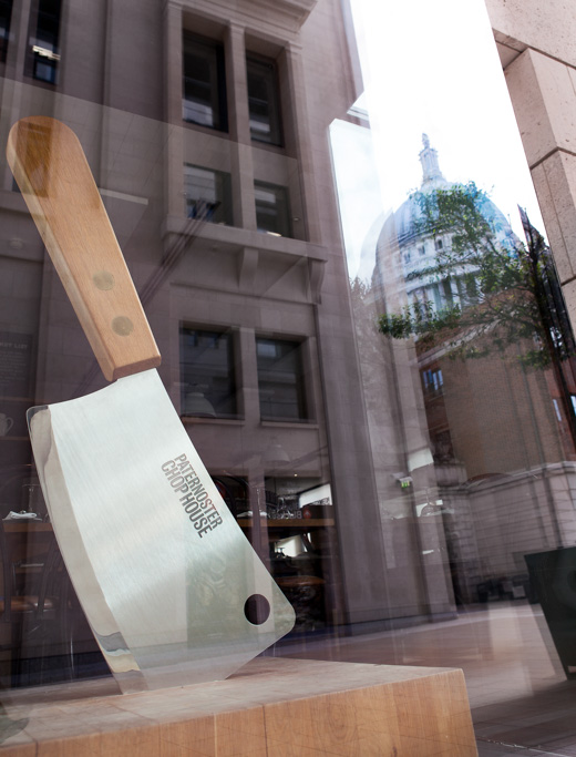
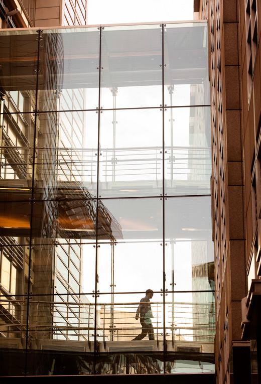
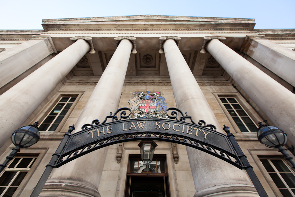
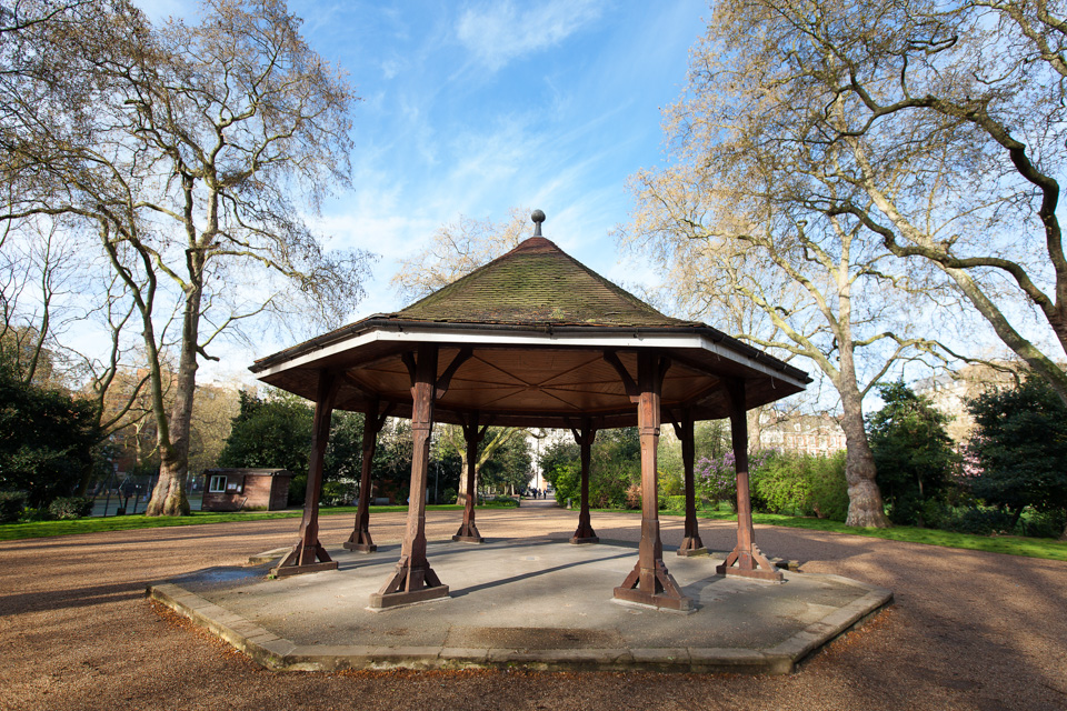
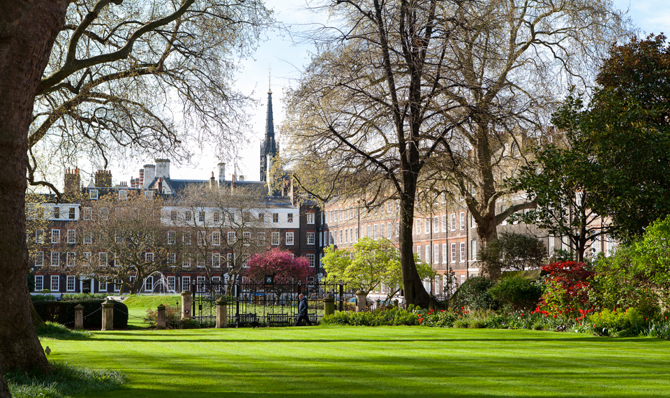
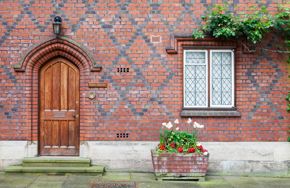
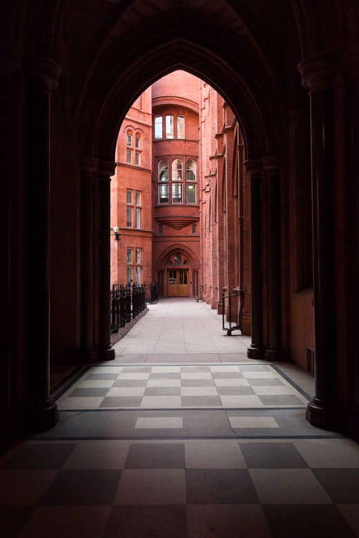
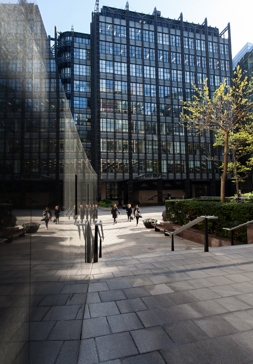
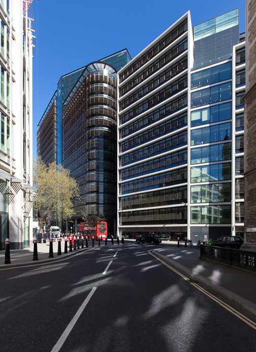
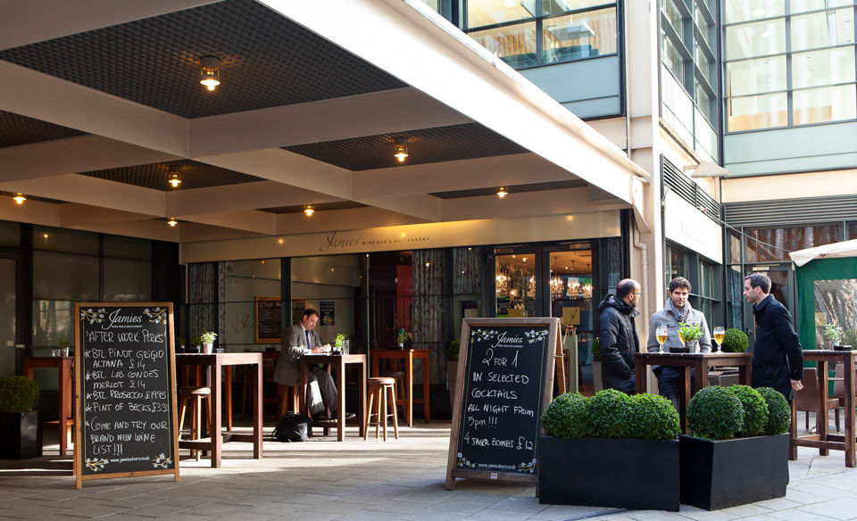
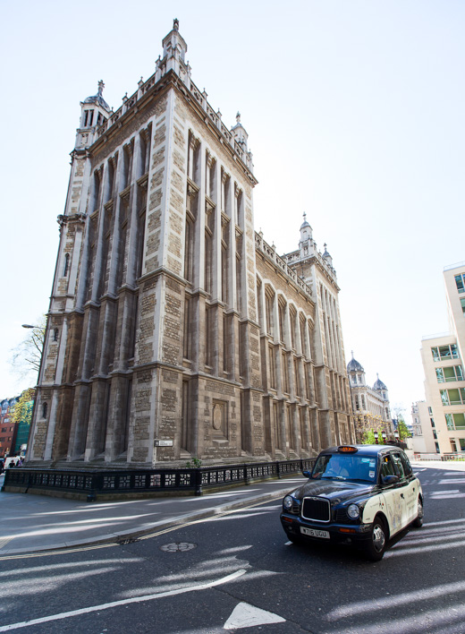
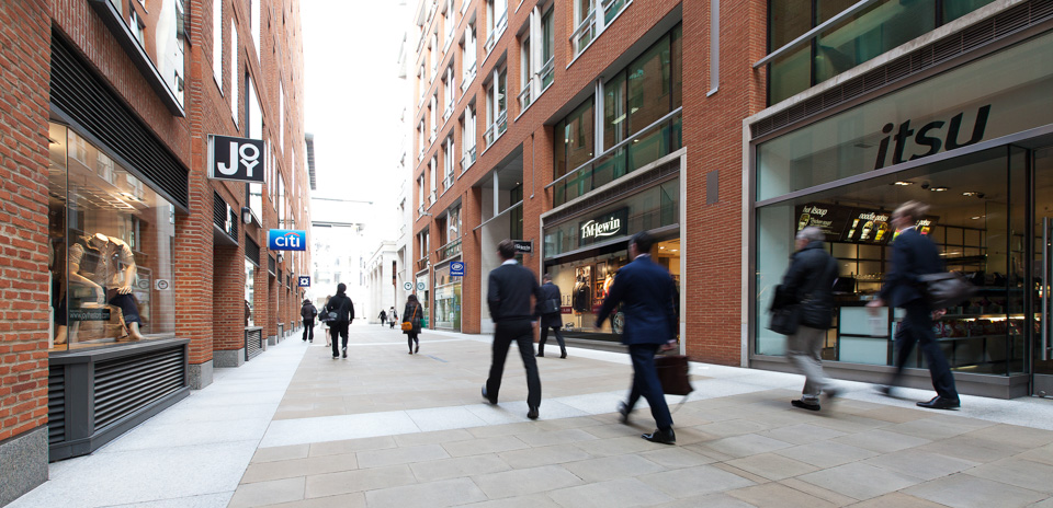
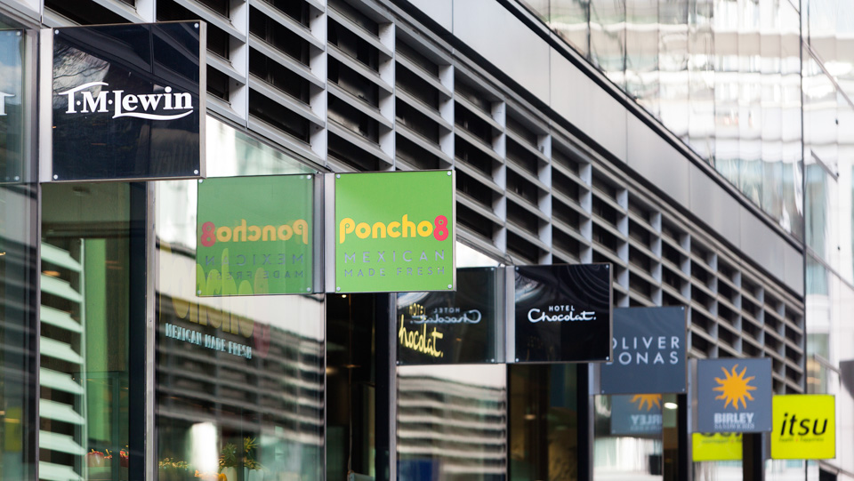
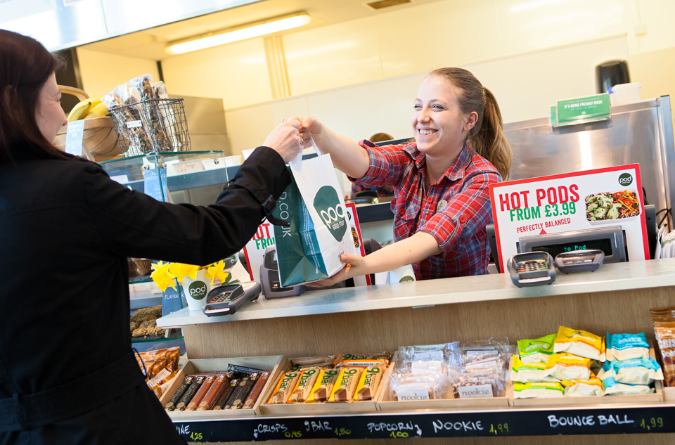
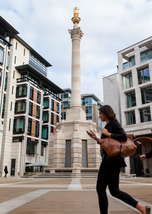
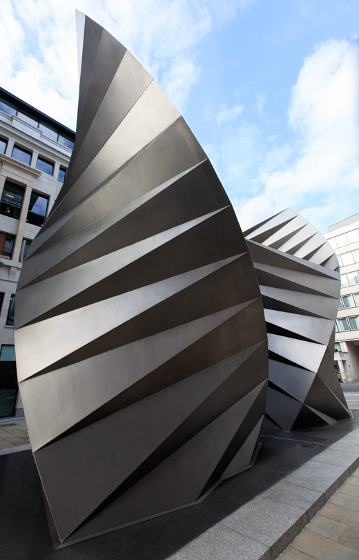
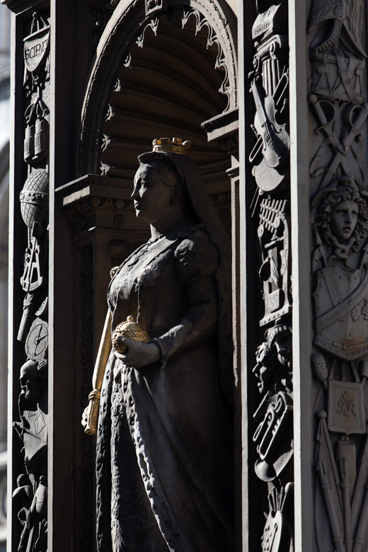
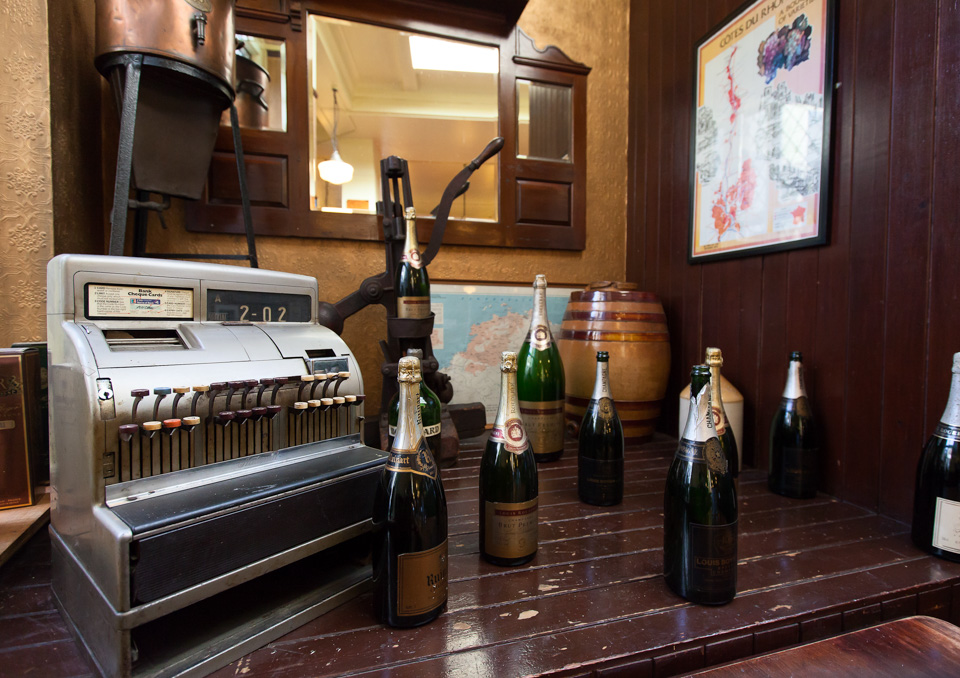
This was a shoot for Landsec. The brief was to spend time around the central London areas of Aldgate, St Pauls, Fleet Street and Chancery Lane, where it has properties and ongoing developments. They required imagery of the buildings, shops, interesting asides, key sights -and the general feel and atmosphere - for a brochure and some other materials.
I loved this shoot - I had freedom over my schedule and route, and while there were some required shots, I was mostly left to my own devices as to what else to capture and how to photograph it. Apart from seeking a few permissions, I barely spoke to anyone for two days!
I'd done a couple of recces to plan the route, locate the main areas of interest, and see how the light was for the more architectural and wider scene shots at the different times of day. But still, so often I found myself winding around and double-backing on myself, getting lost around backstreets and frequently sidetracked with details I'd not noticed. I delivered a small library of photos in the end, very much an interwoven document of the area, but with a number of shots which I felt stood alone.
Here's a selection of some of my favourite images:
-
June 2025
- Jun 19, 2025 The forever purge
- Jun 11, 2025 Recent work - June 2025
- Jun 6, 2025 On Looking
-
January 2025
- Jan 21, 2025 The photographer's dictionary
-
November 2024
- Nov 19, 2024 Recent work - November 2024
-
September 2024
- Sep 17, 2024 Recent work - September 2024
-
July 2024
- Jul 4, 2024 Mean Girls
-
May 2024
- May 28, 2024 Wakehurst
- May 20, 2024 Graduation
-
April 2024
- Apr 16, 2024 Recent work - April 2024
-
January 2024
- Jan 22, 2024 Recent work - January 2024
- Jan 9, 2024 Long live the local
-
October 2023
- Oct 13, 2023 CBRE
- Oct 4, 2023 Recent work - October 2023
-
September 2023
- Sep 22, 2023 Seeing past the subject (2)
-
April 2023
- Apr 12, 2023 Recent work - April 2023
-
February 2023
- Feb 7, 2023 Will AI do me out of a job?
-
December 2022
- Dec 12, 2022 Freelance life and other animals
-
November 2022
- Nov 4, 2022 Recent work - November 2022
-
July 2022
- Jul 26, 2022 Recent work - July 2022
- Jul 25, 2022 SOAS
- May 2022
-
January 2022
- Jan 6, 2022 Recent work - December 2021
- Jan 5, 2022 Prevayl
-
December 2021
- Dec 17, 2021 The day the hairdressers opened
-
December 2020
- Dec 15, 2020 SOAS - postgraduate prospectus
- Dec 7, 2020 Online teaching
-
October 2020
- Oct 11, 2020 Gratitudes
-
September 2020
- Sep 24, 2020 Headshots: why we need them, and why we don't like them
- Sep 15, 2020 From the archives - seven
- Sep 10, 2020 Recent work - September 2020
-
February 2020
- Feb 13, 2020 Mootral
-
November 2019
- Nov 7, 2019 Biteback 2030
-
September 2019
- Sep 16, 2019 B3 Living
-
July 2019
- Jul 22, 2019 Recent work - July 2019
- Jul 19, 2019 From the archives - six
-
April 2019
- Apr 15, 2019 Recent work - April 2019
-
March 2019
- Mar 12, 2019 International Women's Day
-
February 2019
- Feb 4, 2019 Recent work - February 2019
-
January 2019
- Jan 17, 2019 Four photographs
-
December 2018
- Dec 10, 2018 From the archives - five
-
November 2018
- Nov 26, 2018 How to compose photographs
- Nov 5, 2018 Recent work - November 2018
-
October 2018
- Oct 17, 2018 How to edit photographs in Instagram
- Oct 8, 2018 Out with the old
- Oct 4, 2018 Recent work - October 2018
- Oct 1, 2018 A little learning is a dangerous thing
-
September 2018
- Sep 12, 2018 From the archives - four
-
August 2018
- Aug 16, 2018 Recent work - August 2018
- Aug 15, 2018 I don't follow you
- Aug 6, 2018 Cookpad
-
June 2018
- Jun 7, 2018 Monks & Marbles
-
May 2018
- May 23, 2018 Netflix & Woof
- May 21, 2018 Best of Instagram
-
April 2018
- Apr 24, 2018 Standard Chartered Bank
-
March 2018
- Mar 16, 2018 Corporate self-portraiture (two)
- Mar 8, 2018 International Women's Day
-
February 2018
- Feb 9, 2018 Winter swimming
-
January 2018
- Jan 16, 2018 2017 in pictures
-
December 2017
- Dec 6, 2017 Toyota Mobility Foundation
-
November 2017
- Nov 24, 2017 Corporate work
-
October 2017
- Oct 31, 2017 Recent work - October 2017
- Oct 13, 2017 Pfizer - Protecting our Heroes
-
August 2017
- Aug 22, 2017 Wyborowa vodka
- Aug 1, 2017 Vauxhall animation
-
July 2017
- Jul 20, 2017 Take your parents to work
-
June 2017
- Jun 22, 2017 Recent work - June 2017
-
May 2017
- May 9, 2017 Huawei - The New Aesthetic
-
April 2017
- Apr 24, 2017 S.H.O.K.K.
-
March 2017
- Mar 30, 2017 Parkour Generations
- Mar 27, 2017 War Horse in Brighton
- Mar 20, 2017 Jane Eyre
-
January 2017
- Jan 23, 2017 Framing 101
-
December 2016
- Dec 14, 2016 Studio Fractal
-
November 2016
- Nov 29, 2016 Musician
- Nov 10, 2016 While I was waiting...
- Nov 3, 2016 Canvas
-
October 2016
- Oct 11, 2016 Rose Bruford
-
September 2016
- Sep 21, 2016 Instawalks
-
July 2016
- Jul 28, 2016 Property brochure
-
April 2016
- Apr 6, 2016 Breaks and burns
-
March 2016
- Mar 31, 2016 Mixed bag
- Mar 1, 2016 Sky Garden
-
November 2015
- Nov 10, 2015 Romain Grosjean
- Nov 2, 2015 Egosurfing
-
October 2015
- Oct 1, 2015 Ratings are overrated
-
September 2015
- Sep 15, 2015 Seeing past the subject
-
August 2015
- Aug 25, 2015 British Gas
- Aug 19, 2015 Problem solving vs creativity
-
December 2014
- Dec 15, 2014 2014 in pictures
-
January 2014
- Jan 9, 2014 2013 in pictures
-
December 2012
- Dec 31, 2012 2012 in pictures

