Instawalks

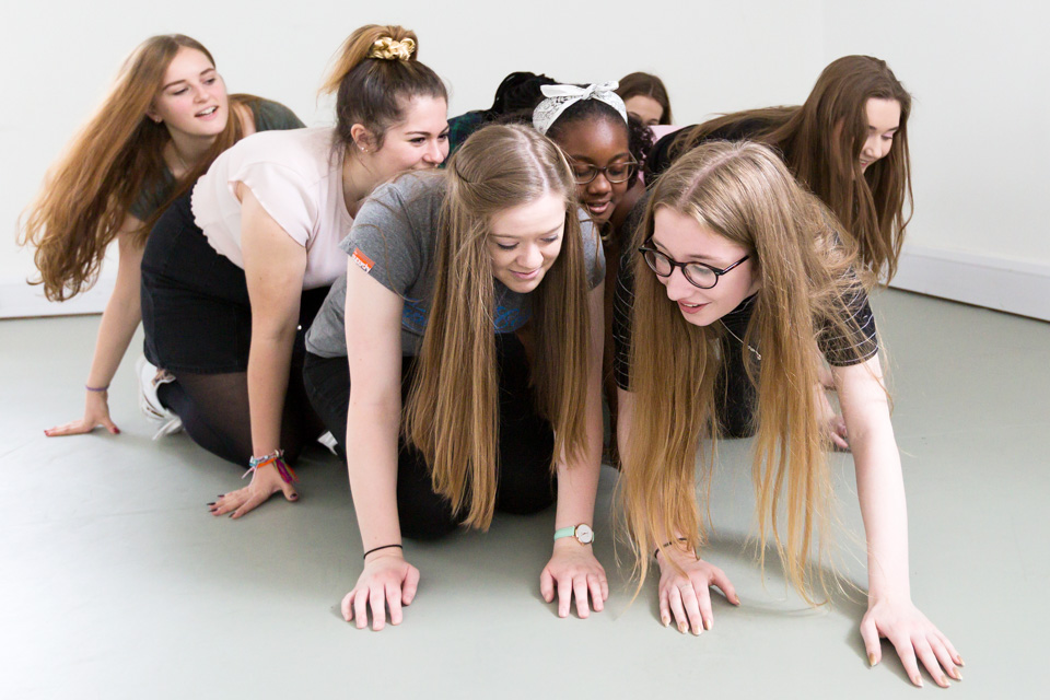
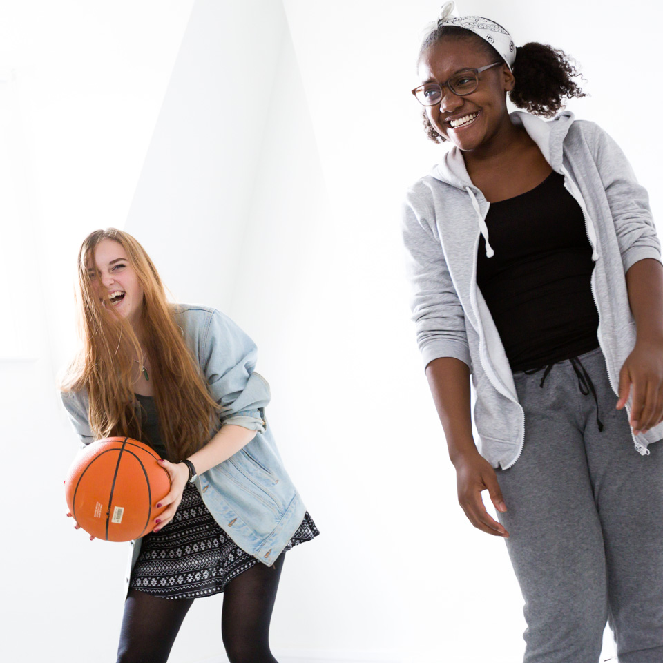
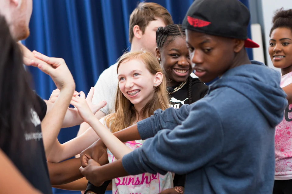
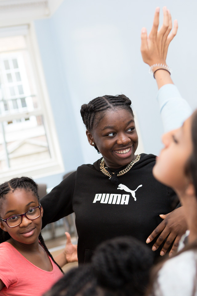
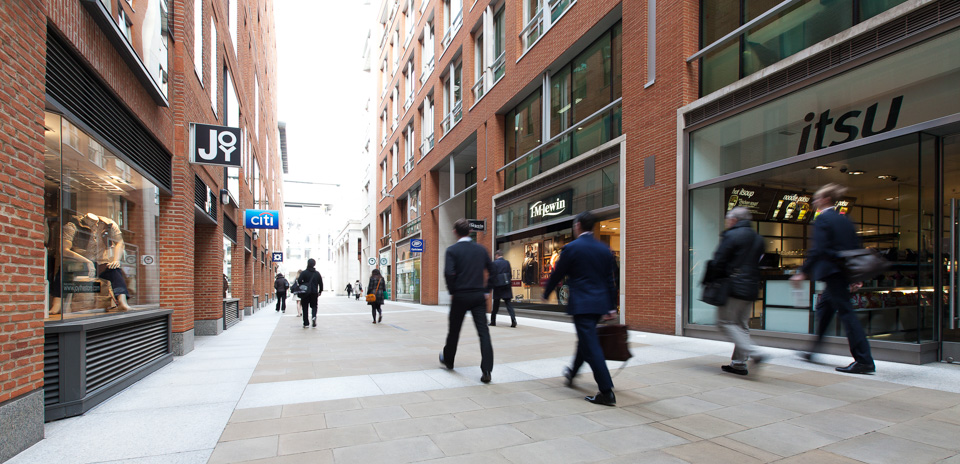
I've been running occasional classes for Instagram/Facebook over the past year. These are informal sessions where I teach their clients everything I know about photography (!) before letting them loose in Camden, King's Cross or Southbank. They have then 30-40 minutes' shooting before we regroup, critique, and decide on the winner(s).

The lesson itself lasts an hour. We cover some theory, a few practical tips and techniques, and then look at using the app to edit images. Nothing technical. Among others, clients have included Heineken and Starbucks, and there's one in the pipeline for Apple.

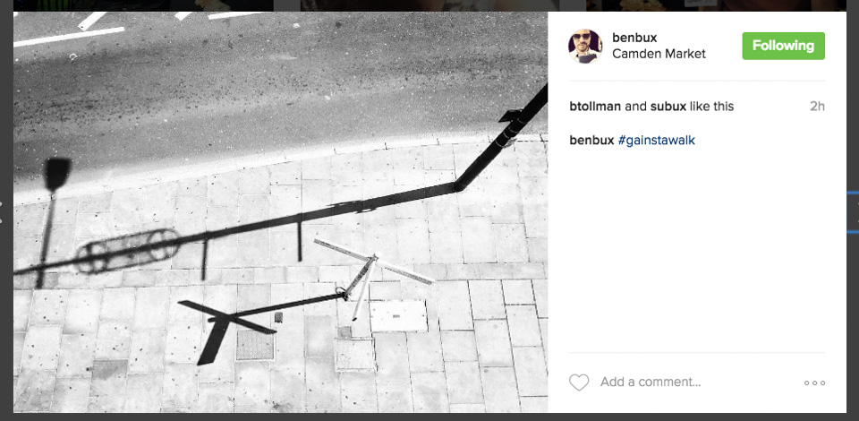
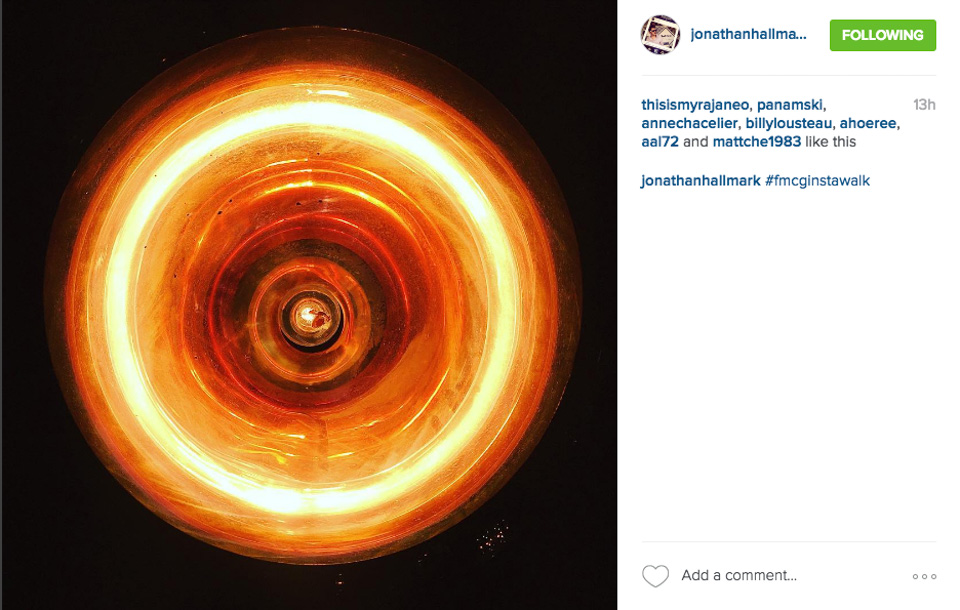
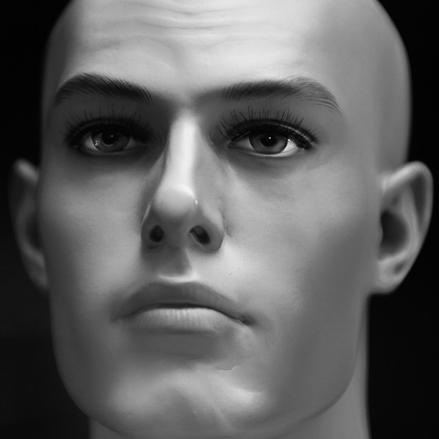
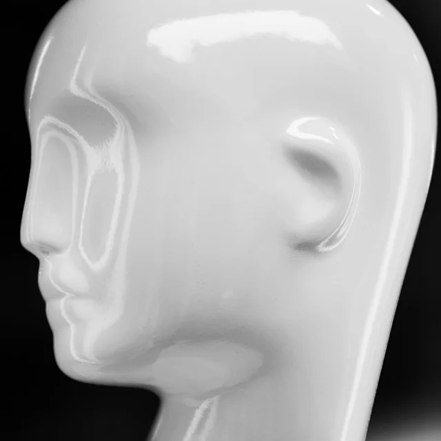
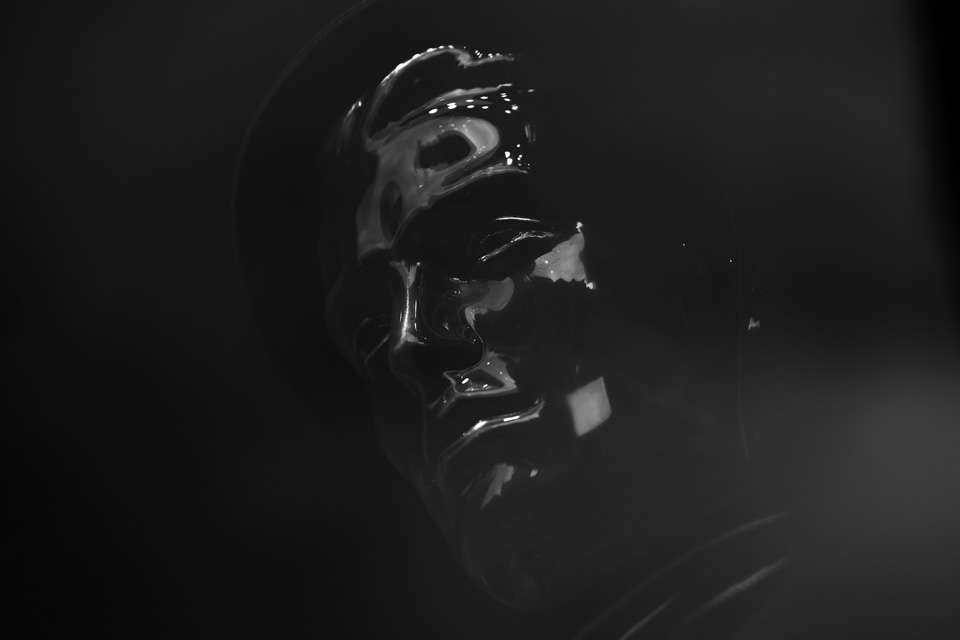
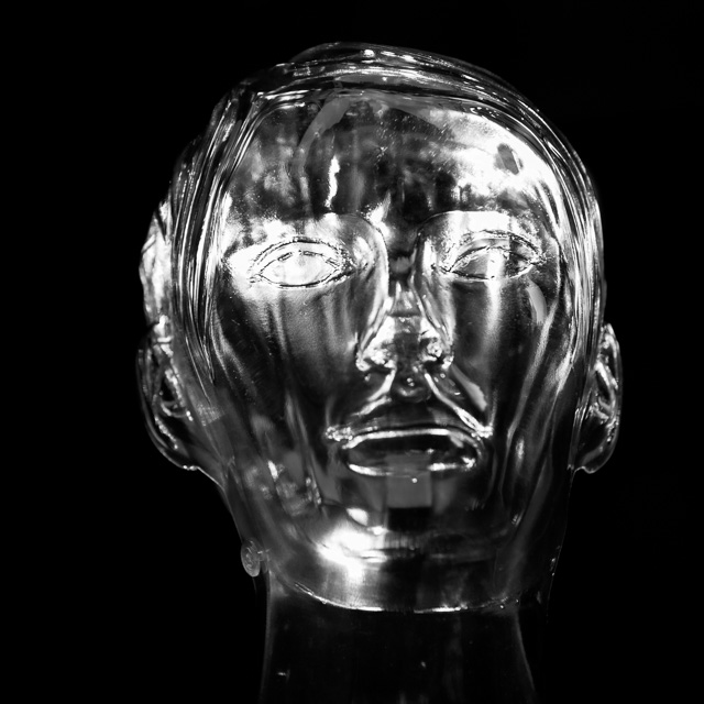
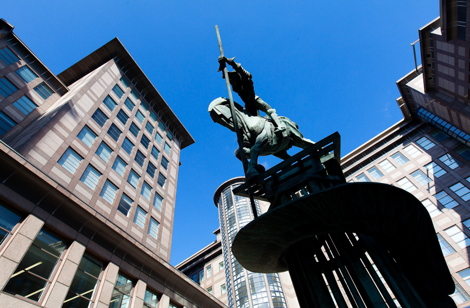
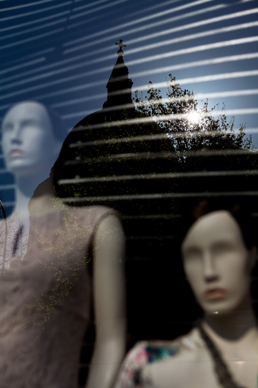
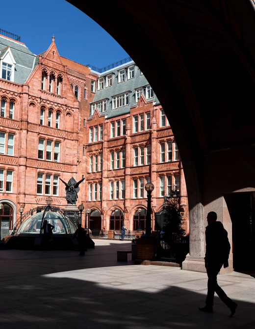
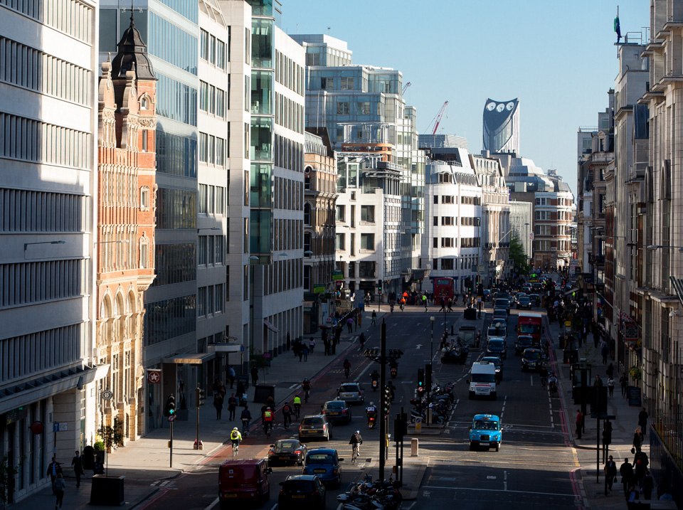
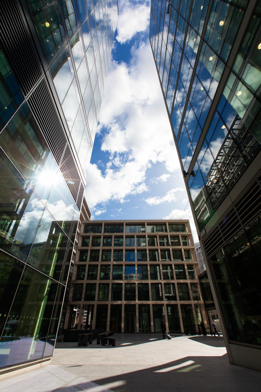
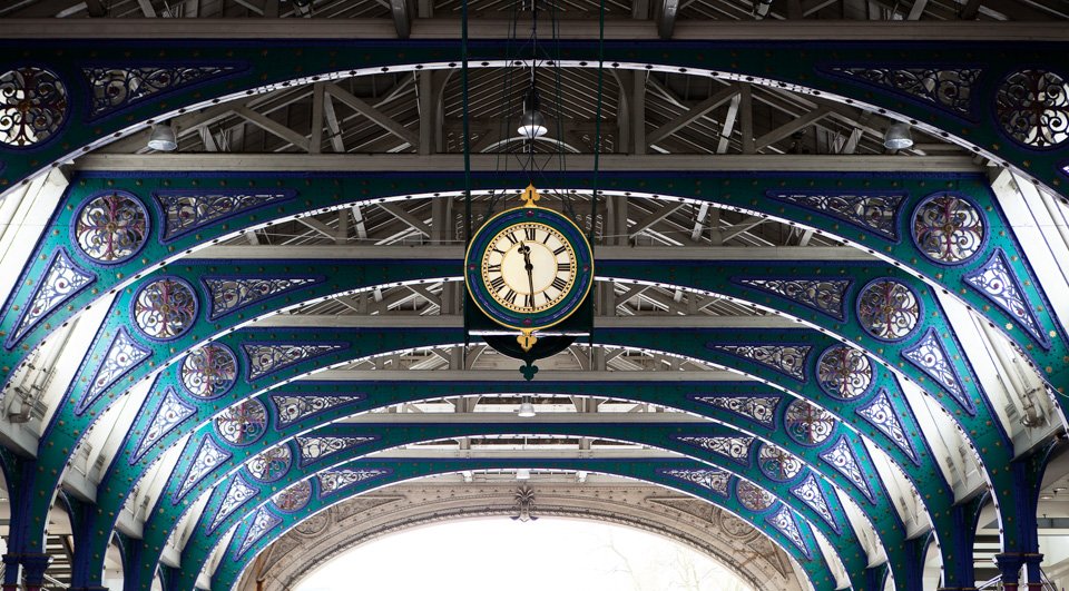
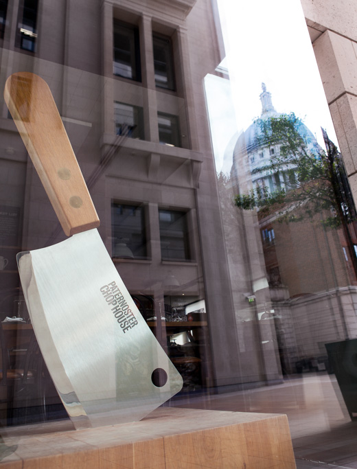
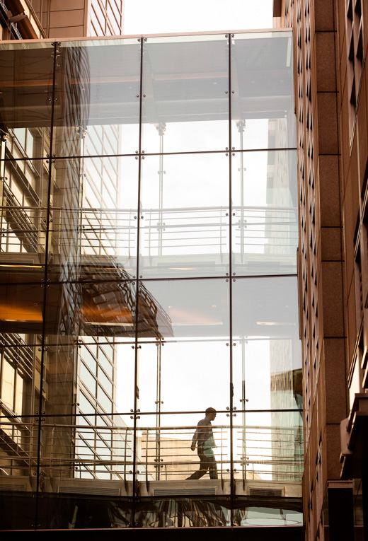
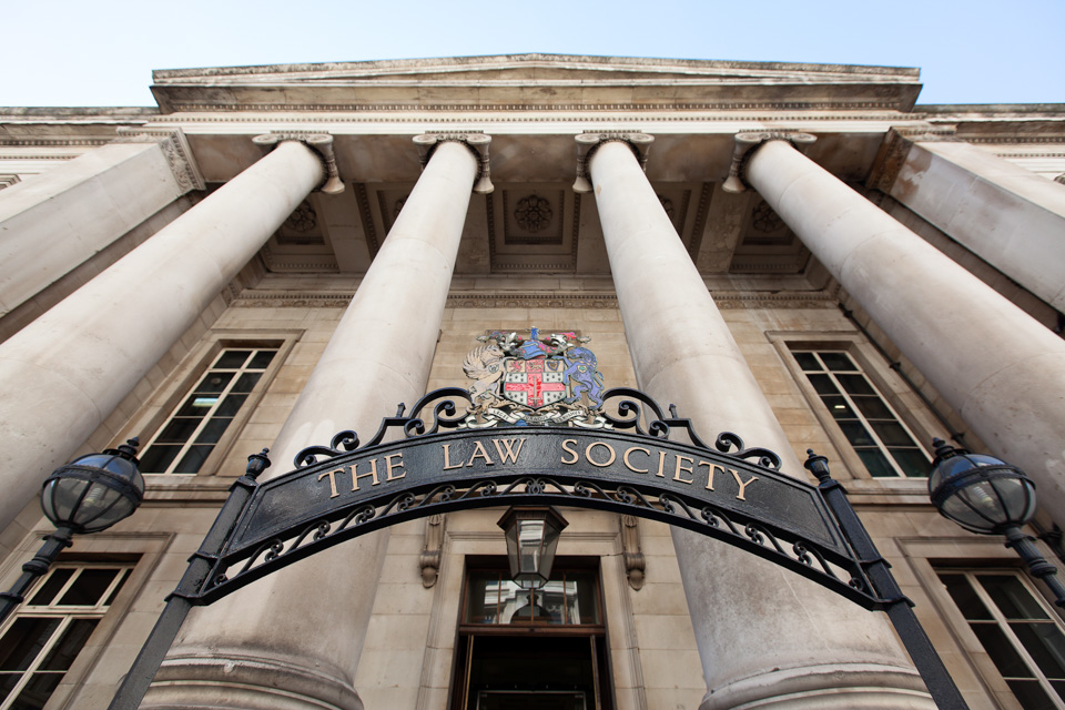
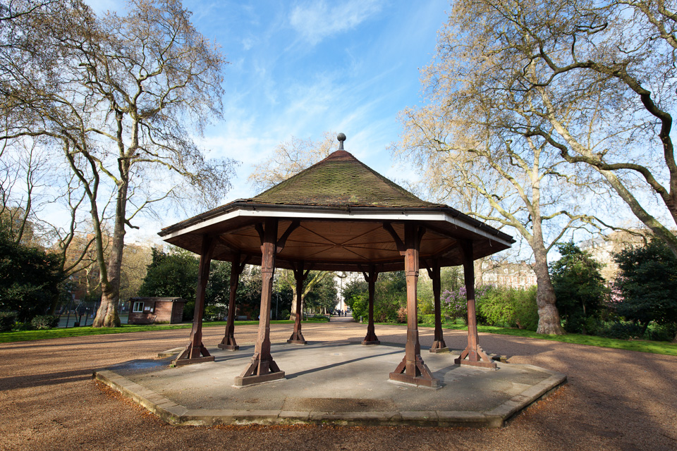
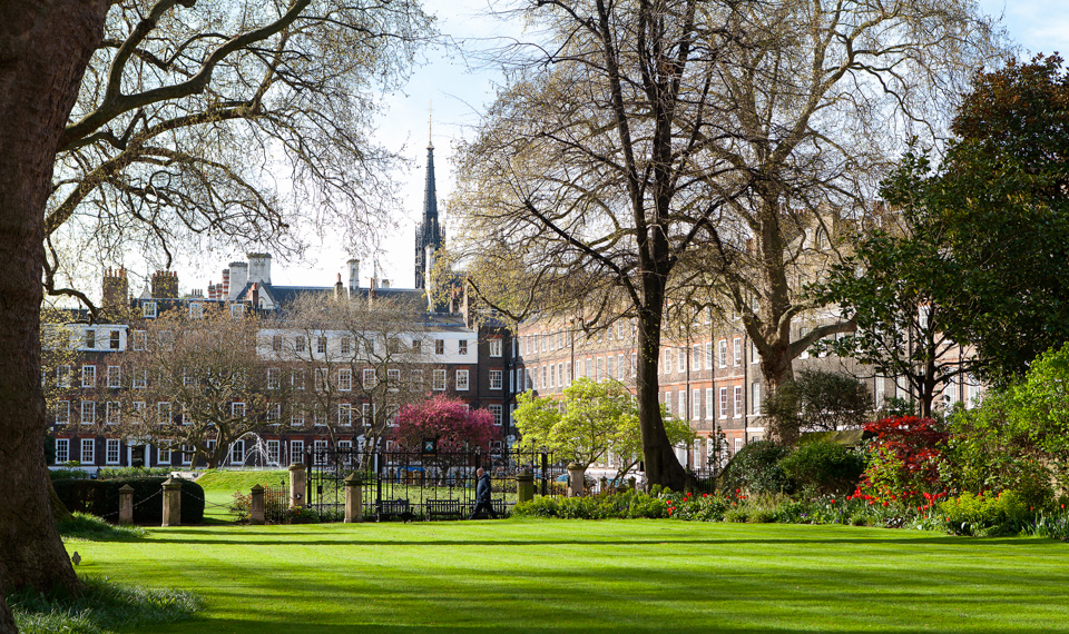
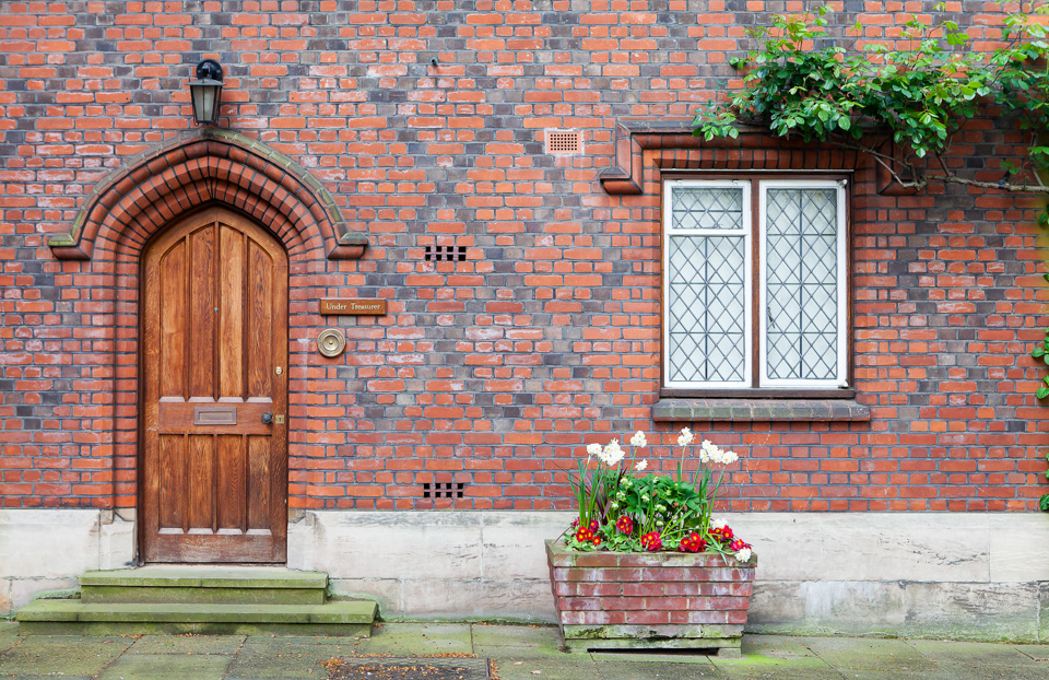
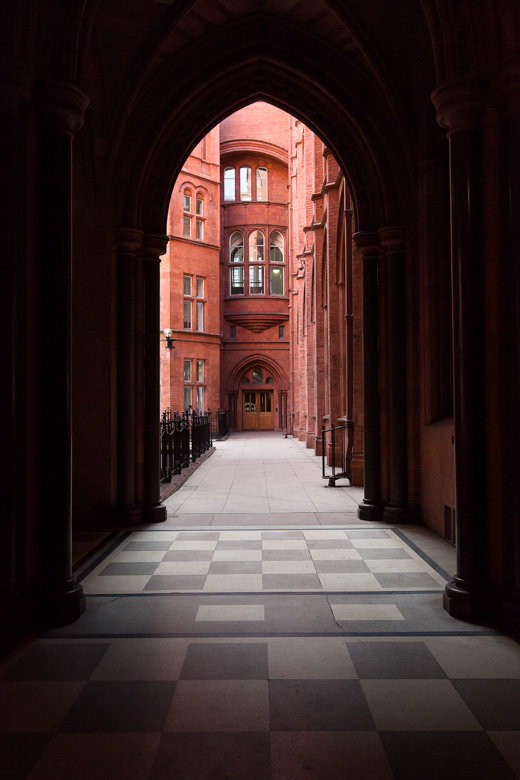
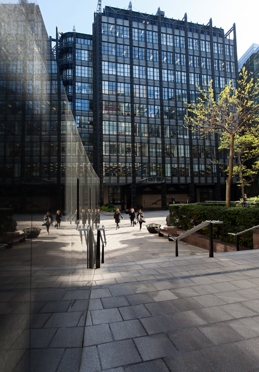
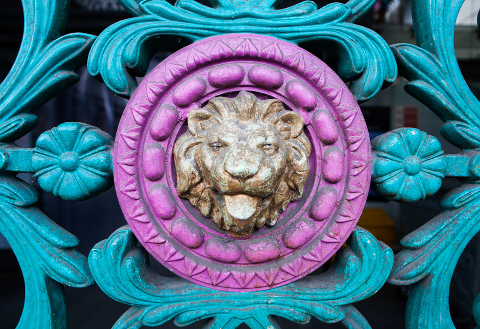
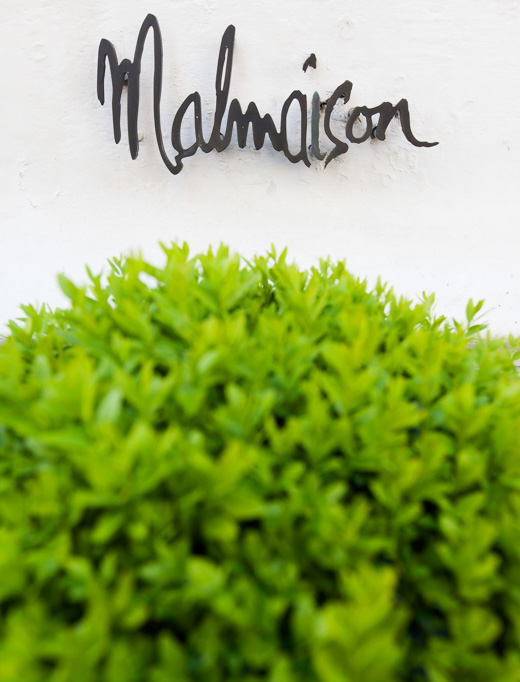
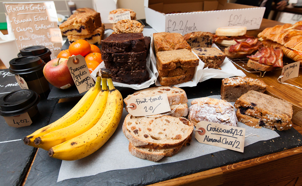
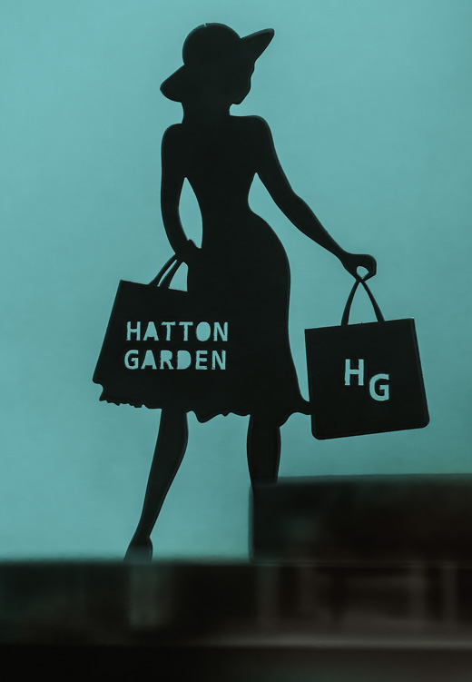
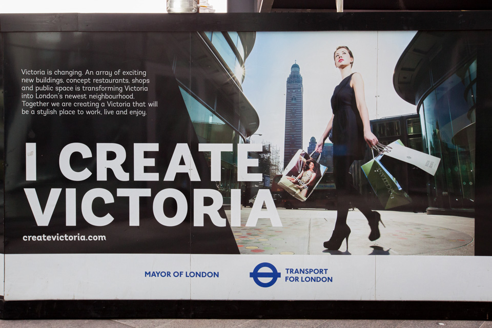
They're given a variety of themes to work towards - it's important to have limitations - but they're not obliged to keep to them. These are usually Reflections, Shapes & lines, Signs and symbols, Colour, and Close-ups.

Judging the winner is always difficult as many are equally good, but for different reasons.  

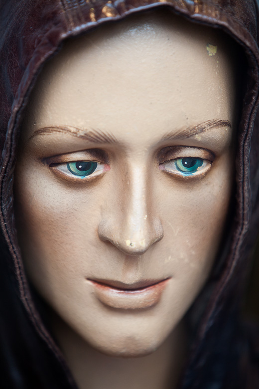
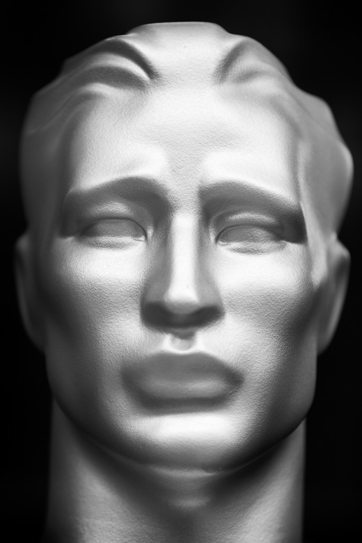
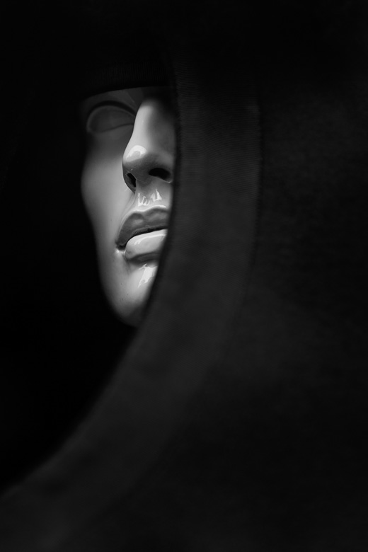
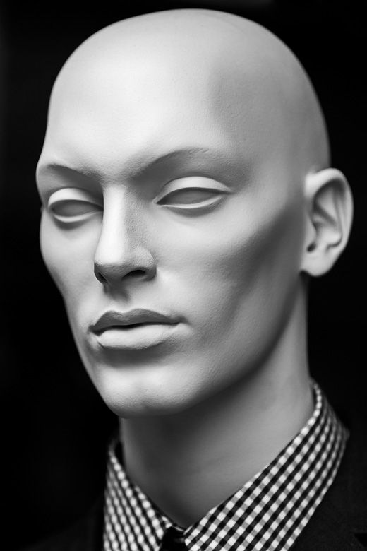
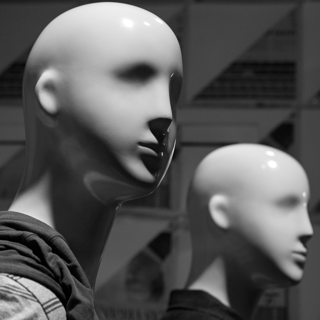
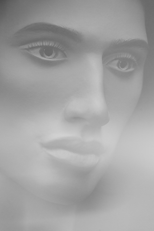
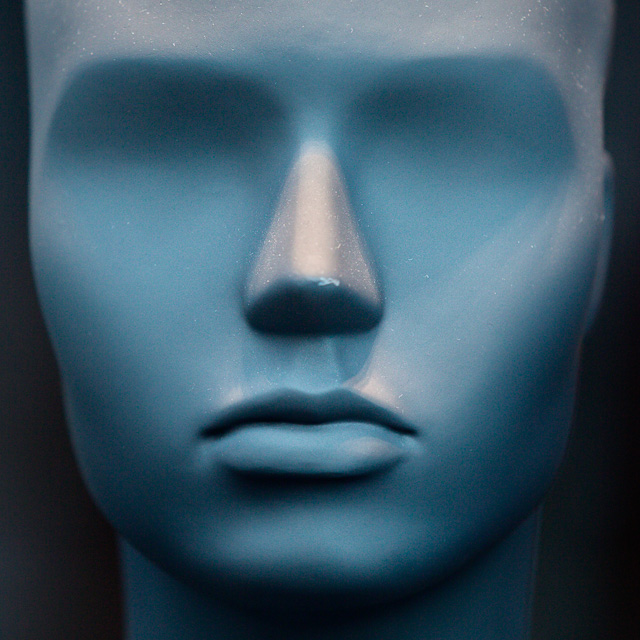
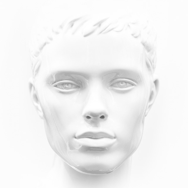
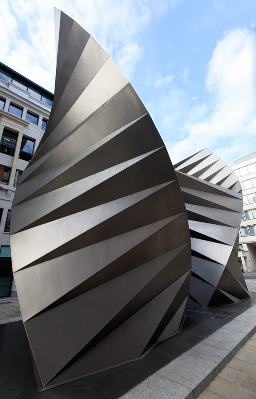
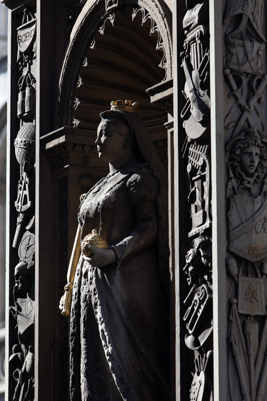
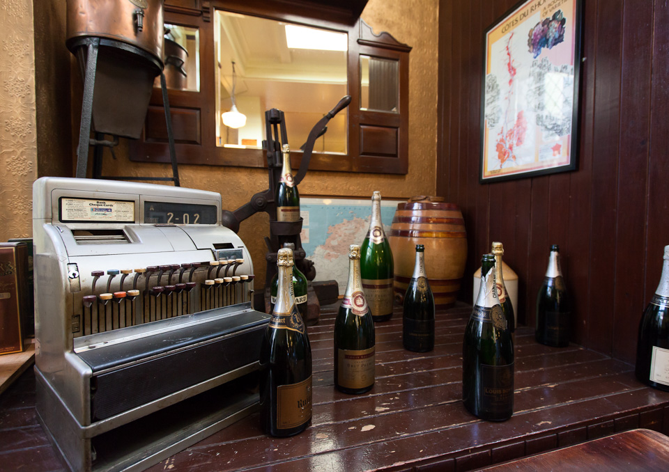
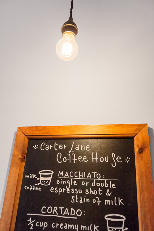
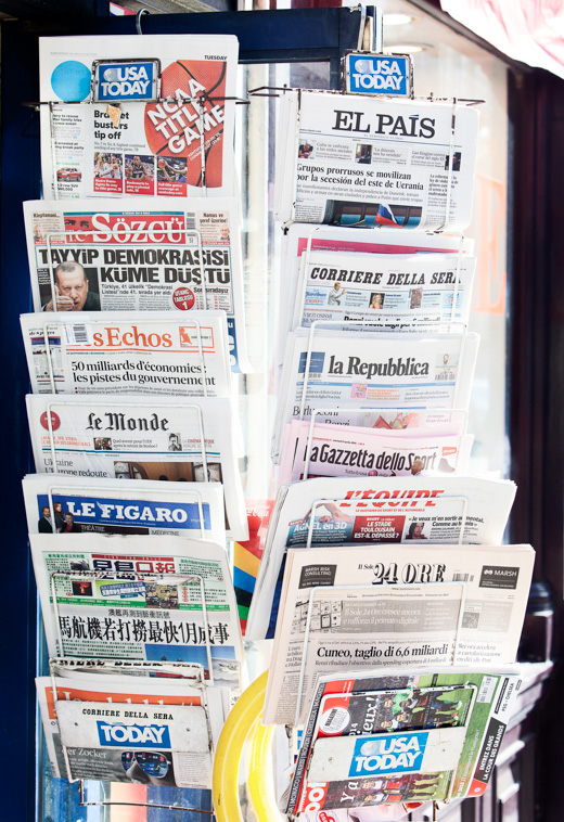
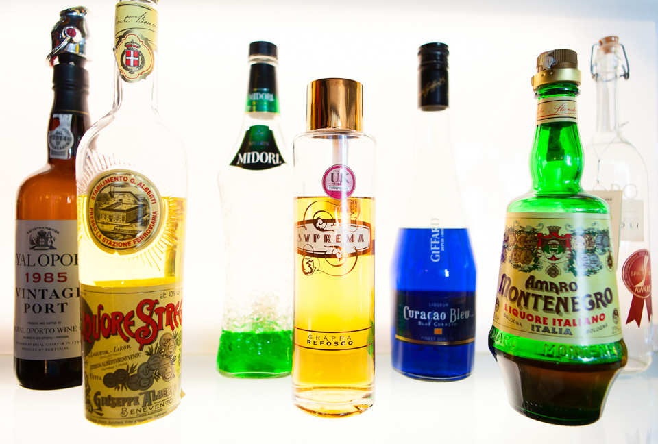
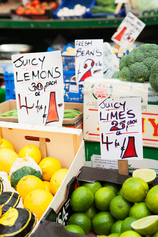
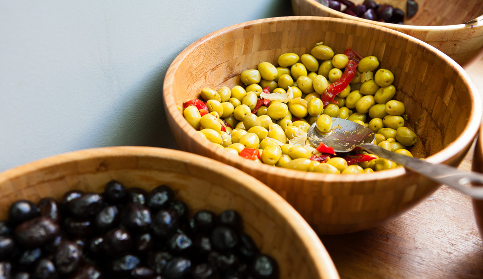
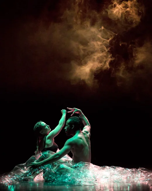
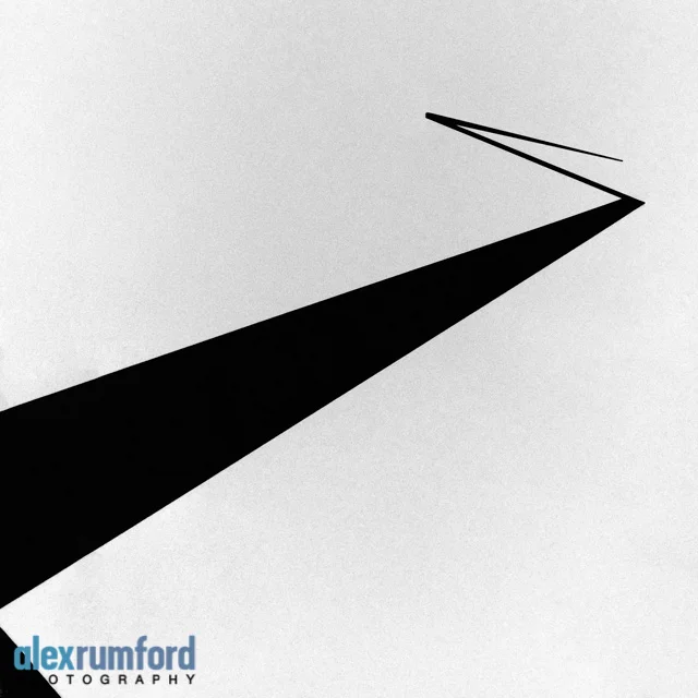
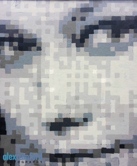
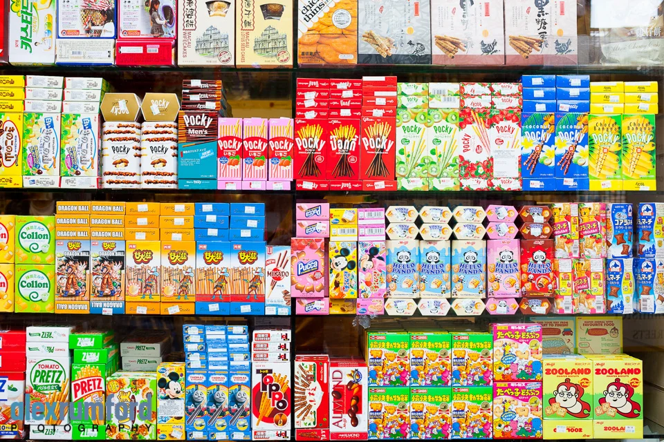
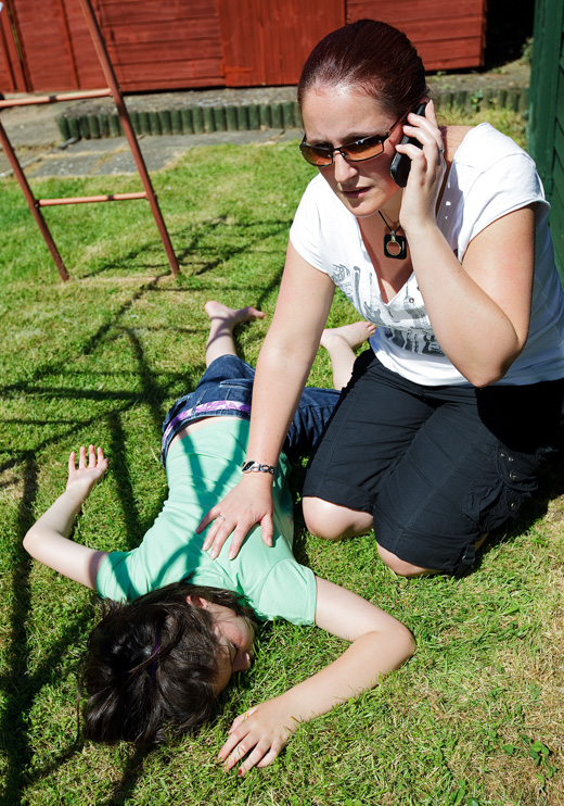
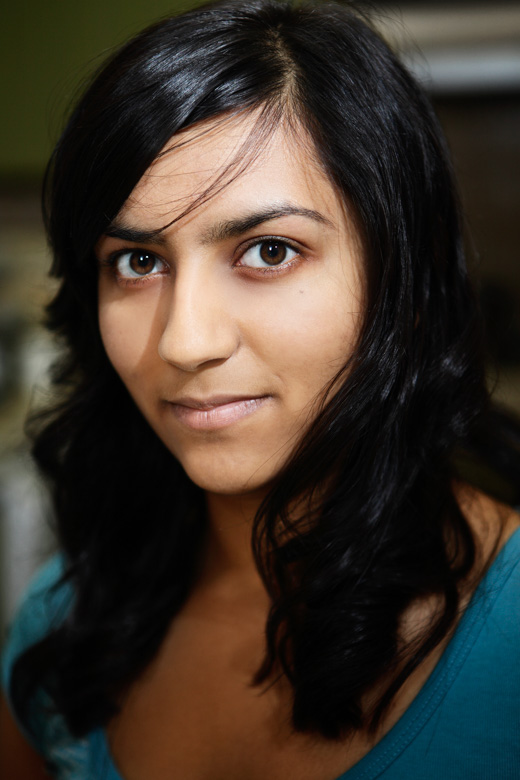
While I could have shown plenty of descriptive images, lovely detail shots and neat observations, this selection I've made of their work either reflects some of the points we cover, or tends towards fresh and quirky (often abstract and arty shots) which are right up my street. That is, I'd be very happy to have any of these in my own feed (@alexrumford)! Although I should point out that the best pictures on the day are just that - they have nothing do with my own taste or preferences.

I hope you enjoy them as much as I did:

Mannequins (m)

I posted a mannequin image on Instagram the other week. I have hundreds of these. I've been taking them for a while, usually through shop windows while on my way to shoots. There's no reason behind them. No underlying commentary on how idealisation results in lifeless, plastic, empty expressions. No comparison between the realist and impressionist takes on the human face. 

I see them from time to time and I just find them interesting, I guess.

Now, I don't want to flood my IG feed - although I'll surely put more up there in time - but I feel I want to publish them.

It's a 'release', sure. Also, it clears the decks of the various non-commissioned, random miscellany which clogs up my archives, and which has nowhere to go.

Here are some of the men. Enjoy (?) - 

Mousetrap

Mousetrap Theatre Projects' mission is to get young people involved in theatre, and their focus is on disadvantaged youth (be those learning, economic or social difficulties). One of my favourite clients, they tirelessly work to offer a wide range of opportunities and activities, alongside regular education within schools and colleges. 

I covered two workshops for them recently. The first was an "Insight" session, a 90 minute pre-show workshop for students to get inside the creative process of putting a show together (here, for Brecht's Threepenny Opera at the National Theatre):

The other was coverage of part of the "SummerStage" program, where students work with professional dance and theatre professionals to put together and perform a show in the West End:

Property brochure

My post a few weeks back on an advertising image for Land Securities reminded me of a shoot from back in 2014. I wasn't blogging regularly then; I neglectfully buried the images in a grid as part of a round-up post of my year's work. So it's a TBT. 

The brief was to spend time around the central London areas of Aldgate, St Pauls, Fleet Street and Chancery Lane, where Land Securities has properties and ongoing developments. They required imagery of the buildings, shops, interesting asides, key sights -and the general feel and atmosphere - for a brochure and some other materials.

I loved this shoot - I had freedom over my schedule and route, and while there were some required shots, I was mostly left to my own devices as to what else to capture and how to photograph it. Apart from seeking a few permissions, I barely spoke to anyone for two days!

I'd done a couple of recces to plan the route, locate the main areas of interest, and see how the light was for the more architectural and wider scene shots at the different times of day. But still, so often I found myself winding around and double-backing on myself, getting lost around backstreets and frequently sidetracked with details I'd not noticed. I delivered a small library of photos in the end, very much an interwoven document of the area, but with a number of shots which I felt stood alone. 

Here's a (small-ish) selection of some of my favourite ones - enjoy! 

Choosing between photos

A little about the editing process today, and the tough choice we have to make when choosing between two or more shots which are similar. This photo above is in my portrait gallery, and the subject is - possibly - good enough to be worthy of inclusion there, regardless of accompanying gestures (here, the gloved hand framing the eye).

Naturally, it was one of several ideas we tried out. The photo below could equally have been picked: there's little between them, especially since you could argue that the gesture in both is arbitrary. All things being equal, you go with your instinct when making a preference, but often you use more objective details (and in this case, it came down to the hand on the chin overdoing it). But it's not easy, knowing you're consigning a perfectly good, potential portfolio image to a hard drive in a cupboard.

Below are two images from a shoot with Shelly D'Inferno for mobile provider giffgaff:

Neither made the final cut (my preferred versions are here). How to compare them? The top image shows more of Shelley, but the expression doesn't fit. The bottom image makes more contact with a stronger (or at least more apt) expression, but I feel the hands should be more splayed, like claws, and that the clothes are rather lost. And I'm not sure if I like, or dislike, not being able to see her eyes. 

The point is this: whenever I have to choose between similar shots which I both like, alarm bells ring. Because if they both have obvious advantages over the other, there may be too much missing from both. It usually means I can't look past the subject to judge them on better criteria, that I just want it to work so badly I'll look past flaws which wouldn't get more than a moment's consideration on any other shoot.

Admittedly, sometimes the subject matter is so good that all other frames of comparison really do lose relevance - so in truth, knowing when this is the situation is the hardest judgement of all.


Create Victoria

I usually like to look up my work when it's been published, especially when it's something I'm proud of or feel particularly invested in. 

There's a huge, ongoing development by Land Securities at Victoria. They're currently working on the Nova building. Land Securities are a regular client of mine, and I'd shot this for them a few years ago (I preferred this version) for a press release. It was perhaps two years later when they decided that it could work well with this rather large advertising hoarding at Nova, and wanted to use it again. 

Which I then completely forgot about, until I happened to pass it on my way to a shoot some months later.

It was a nice surprise: so much of what we do stays online - it's lovely to see work used in the real world so prominently. 

Corporate self-portraiture

My colleague Annabel Moeller and I photographed each other for the profile page of our corporate portrait business (currently on hold). It was an exquisitely painful and self-conscious process for the both of us - you can't use patter or be objective (essential!) when you know someone. So it was an unusually cold, awkward and purposeful shoot, and not, then, despite being friends, but because of it.

Well, we got through it in the end, and while I (think I) like the shots, I don't feel that they're 'me'. I might normally put this down to the fact that many people dislike both the process and the results of being photographed. But it's simpler than that: we wanted to appear professional, so I shaved, donned a suit, and put on my best smile. Yet I never wear a suit. I never shave. And in real life I'm not even very sure I smile much anyway.

But then, perhaps my opinion is just coloured by my experience of the shoot. Knowing what went into it, from the lighting to the lens, the angles to the processing, I can't help but regard them as formulaic and posed. Or, at least, less natural/sponatenous than they might have appeared without this understanding. I guess some of our judgment on the worth of a photo will always be influenced by context and background, as I've talked about previously. 

It was at least useful in terms of putting myself in the shoes of a subject - but for the moment I'll keep using the shot below (by James). It was one of only a few very brief shots I think I recall were taken purely as a lighting test! Hyper-candid portraits - if you will - as I wasn't posing, or expecting to keep them on the card, but merely standing in place to see the effect of his new lights.

Or perhaps I just prefer it because it's been edited with the Awesome Filter Plugin™.

Photivation (two) & Instagram

It's been a few months since I started on Instagram (@alexrumford). I wanted to share some of my experiences. 

I still love it - and I'd like to think that my newly-rediscovered enthusiasm has fed into my regular work. I'm looking for images everywhere, all the time. I have tried to post a least once a week, even if it's something timely from my professional or personal archive. After all, the latter contains heaps of photos which would otherwise never have seen the light of day.

I love how everything is on the same platform: award-winning photos are followed by a throwaway shot of a coffee or the view from a hotel window. This is important - there's no pressure to categorise which images you're proud of, which are serious, and which you're merely posting as nothing more than a photo status update. And it's hard to tell the difference: everything is viewed on the same terms, and on its own merits. For myself, some pictures which I really like receive no attention, yet others which I put there to break up a quiet few days get likes. 

I've noticed that I'm taking mostly abstracts and details. I'm not sure if this is to do with my own preferences - an abiding and personal interest in what I enjoy about photography (outside of the profession) - or because these shots tend to be, almost by definition, 'found' pictures, suited to the iPhone and a busy life going to different places. Often with just a few moments available to capture them, and without being powerful enough in themselves neither to warrant more than a couple of frames (nor, indeed, very much attention), they suit how many of us treat photography. Rarely do I shoot more than a few frames on my phone of a subject.

And this is interesting for me: one of my guiding principles is that photography ought to be a process and not an event, hence shooting a *lot* of frames in my professional work, and working around the subject.

With Instagram, I try to get to the nub of what I see as quickly and efficiently as I can. In equal parts I'm therefore always unsatisfied with my effort, but also under no pressure to produce anything of worth, or feel like I would. Not to say I don't try to get the shot right, but that (and equally because they're nearly all abstracts and details) it's often more about the feeling than any kind of deeply-considered or committed art, or anything else. If that makes sense. 

The adjustments bring them to, and sometimes above, the reason for the photo. They emphasise what it is you meant to say. Again, as with spending time on the actual image, it follows that I then won't post a photo if I find I'm spending too much time messing about: adjustments aren't there to save a bad photo, and they won't. Although they can - and do - hide mediocrity and flaws below layers of contrast, saturation and clarity ("Structure"). It can be hard to tell, sometimes, and perhaps I'm partly guilty.

In my defence, I *never* use any of the named filters. I only use the adjustments, simply so I know what I'm doing. I usually have an idea beforehand of how I see something, and how I'd like it to look. I will (on occasion) go completely the other way, or play with various adjustments, just to see. But obviously most shots fall into a category, and require a specific approach. Anyway, I've noticed I tend to keep the photos fairly natural-looking. Perhaps I have to. Since my feed is dominated by abstracts, I can't have too many which I've pushed so far as to end up into that most-hated abstract category, where the first - or, worse, the only - reaction is, "What is it?"

Finally, I love the search icon, which opens up an endless stream of images to browse. I need to continually refine my feed, as so much is irrelevant and gets rather tedious (I've seen enough B&W images of birds on telephone wires, thanks!) I like to see fresh and unusual work outside of what I typically 'get'. The feature which I'd like to see would be a 'recommend' button. A place for you to list your top suggestion(s) for others to follow. 

Follow me! - @alexrumford

From the archives - two

I've nearly finished going through my archives in search of old images which I'd originally dismissed. 

As I've said elsewhere, even strong images tend to fade over time, both due to familiarity, and as one develops or improves. But occasionally, I'll come across an old reject which, with a fresh look, away from context - and usually with a different edit - I like much better second-time around.

Out of tens of thousands, only two or three of these I've since dusted off, tidied up, and put up in my galleries. But dozens got close - and were then rejected again.

The photo below is from a series of portraits of musicians (initially all 3- or 4-star rated I expect) but I thought this particular one could be worth another look - was it really only average? Yes. I really wanted it to work - a simple, outdoor shot like this would go well on my website. And there's nothing really wrong with it - and technically and aesthetically it's fine, but something about it's just a bit empty, boring, flat:

No matter how revised or polished a photo is, if it's not working, it's not working. You can do wonders in post-production, but there has to be something in the original which can't be created later, which has nothing to do with adjustments or photoshop. 

It's important to be brutally honest and unforgiving when judging an image, but often, subjectivity gets in the way. Usually it's the lengths you knew you'd gone to to achieve the shot - you were so invested in it that it becomes personal. 

I think it's about changing your role once you've put the camera down and when you're going through the work on the computer. You have to become an editor - a different set of skills - because as a photographer you can't be objective. And as an editor, this image isn't good enough. Next!

Red Channel

This was a (very quick) portrait of a dancer at East London Dance, where I was covering Collabo. I photographed her during the interval, although I took the photo really for myself: they tend to use the shots from the performers in action. I loved the dark red wall with her makeup:

I knew the makeup was uneven at the time, but I also knew this could be tidied up quickly in photoshop, and extending it across the bridge of her nose using the same technique would be simple enough.

I was wrong. 

Playing around with blending modes, brushes and hues (for a lot longer than I'm prepared to admit), it still didn't look right. And no matter what I did, it was ever so very slightly asymmetrical.

I was beaten. So - as I always do when I have a PS problem - I phoned my friend James for The Answer. He told me that yes, it could be done - but it wasn't as anywhere near as straightforward as I'd thought, and I'd been approaching it wrongly anyway.

What do do... I liked the picture, but didn't have the patience to start again. Well, I'd been approaching it with the belief that was all about the makeup, that it depended on it.

But what if it didn't? 

Selecting the red channel (less than three seconds' work) pretty much took care of the issue in a couple of clicks, producing a rather different picture. I might yet hire James to take care of it as I'd envisaged it, but in the meantime I'm happy with the result:

Breaks and burns

These two sets, shot for the British Red Cross, were for a series of pamphlets giving First Aid advice. Alas, the other sets are less blog-friendly: someone who'd had far too much to drink; a stroke; a heart attack; and a drug overdose.

Mixed bag

I had a week off... in the spirit of regular blogging, I've browsed my archives. The first image caught my eye, so I decided to search for other unseen portraits of ladies from the last couple of years.