2016a

Corporate self-portraiture

My colleague Annabel Moeller and I photographed each other for the profile page of our corporate portrait business (currently on hold). It was an exquisitely painful and self-conscious process for the both of us - you can't use patter or be objective (essential!) when you know someone. So it was an unusually cold, awkward and purposeful shoot, and not, then, despite being friends, but because of it.

Well, we got through it in the end, and while I (think I) like the shots, I don't feel that they're 'me'. I might normally put this down to the fact that many people dislike both the process and the results of being photographed. But it's simpler than that: we wanted to appear professional, so I shaved, donned a suit, and put on my best smile. Yet I never wear a suit. I never shave. And in real life I'm not even very sure I smile much anyway.

But then, perhaps my opinion is just coloured by my experience of the shoot. Knowing what went into it, from the lighting to the lens, the angles to the processing, I can't help but regard them as formulaic and posed. Or, at least, less natural/sponatenous than they might have appeared without this understanding. I guess some of our judgment on the worth of a photo will always be influenced by context and background, as I've talked about previously. 

It was at least useful in terms of putting myself in the shoes of a subject - but for the moment I'll keep using the shot below (by James). It was one of only a few very brief shots I think I recall were taken purely as a lighting test! Hyper-candid portraits - if you will - as I wasn't posing, or expecting to keep them on the card, but merely standing in place to see the effect of his new lights.

Or perhaps I just prefer it because it's been edited with the Awesome Filter Plugin™.

Photivation (two) & Instagram

It's been a few months since I started on Instagram (@alexrumford). I wanted to share some of my experiences. 

I still love it - and I'd like to think that my newly-rediscovered enthusiasm has fed into my regular work. I'm looking for images everywhere, all the time. I have tried to post a least once a week, even if it's something timely from my professional or personal archive. After all, the latter contains heaps of photos which would otherwise never have seen the light of day.

I love how everything is on the same platform: award-winning photos are followed by a throwaway shot of a coffee or the view from a hotel window. This is important - there's no pressure to categorise which images you're proud of, which are serious, and which you're merely posting as nothing more than a photo status update. And it's hard to tell the difference: everything is viewed on the same terms, and on its own merits. For myself, some pictures which I really like receive no attention, yet others which I put there to break up a quiet few days get likes. 

I've noticed that I'm taking mostly abstracts and details. I'm not sure if this is to do with my own preferences - an abiding and personal interest in what I enjoy about photography (outside of the profession) - or because these shots tend to be, almost by definition, 'found' pictures, suited to the iPhone and a busy life going to different places. Often with just a few moments available to capture them, and without being powerful enough in themselves neither to warrant more than a couple of frames (nor, indeed, very much attention), they suit how many of us treat photography. Rarely do I shoot more than a few frames on my phone of a subject.

And this is interesting for me: one of my guiding principles is that photography ought to be a process and not an event, hence shooting a *lot* of frames in my professional work, and working around the subject.

With Instagram, I try to get to the nub of what I see as quickly and efficiently as I can. In equal parts I'm therefore always unsatisfied with my effort, but also under no pressure to produce anything of worth, or feel like I would. Not to say I don't try to get the shot right, but that (and equally because they're nearly all abstracts and details) it's often more about the feeling than any kind of deeply-considered or committed art, or anything else. If that makes sense. 

The adjustments bring them to, and sometimes above, the reason for the photo. They emphasise what it is you meant to say. Again, as with spending time on the actual image, it follows that I then won't post a photo if I find I'm spending too much time messing about: adjustments aren't there to save a bad photo, and they won't. Although they can - and do - hide mediocrity and flaws below layers of contrast, saturation and clarity ("Structure"). It can be hard to tell, sometimes, and perhaps I'm partly guilty.

In my defence, I *never* use any of the named filters. I only use the adjustments, simply so I know what I'm doing. I usually have an idea beforehand of how I see something, and how I'd like it to look. I will (on occasion) go completely the other way, or play with various adjustments, just to see. But obviously most shots fall into a category, and require a specific approach. Anyway, I've noticed I tend to keep the photos fairly natural-looking. Perhaps I have to. Since my feed is dominated by abstracts, I can't have too many which I've pushed so far as to end up into that most-hated abstract category, where the first - or, worse, the only - reaction is, "What is it?"

Finally, I love the search icon, which opens up an endless stream of images to browse. I need to continually refine my feed, as so much is irrelevant and gets rather tedious (I've seen enough B&W images of birds on telephone wires, thanks!) I like to see fresh and unusual work outside of what I typically 'get'. The feature which I'd like to see would be a 'recommend' button. A place for you to list your top suggestion(s) for others to follow. 

Follow me! - @alexrumford

From the archives - two

I've nearly finished going through my archives in search of old images which I'd originally dismissed. 

As I've said elsewhere, even strong images tend to fade over time, both due to familiarity, and as one develops or improves. But occasionally, I'll come across an old reject which, with a fresh look, away from context - and usually with a different edit - I like much better second-time around.

Out of tens of thousands, only two or three of these I've since dusted off, tidied up, and put up in my galleries. But dozens got close - and were then rejected again.

The photo below is from a series of portraits of musicians (initially all 3- or 4-star rated I expect) but I thought this particular one could be worth another look - was it really only average? Yes. I really wanted it to work - a simple, outdoor shot like this would go well on my website. And there's nothing really wrong with it - and technically and aesthetically it's fine, but something about it's just a bit empty, boring, flat:

No matter how revised or polished a photo is, if it's not working, it's not working. You can do wonders in post-production, but there has to be something in the original which can't be created later, which has nothing to do with adjustments or photoshop. 

It's important to be brutally honest and unforgiving when judging an image, but often, subjectivity gets in the way. Usually it's the lengths you knew you'd gone to to achieve the shot - you were so invested in it that it becomes personal. 

I think it's about changing your role once you've put the camera down and when you're going through the work on the computer. You have to become an editor - a different set of skills - because as a photographer you can't be objective. And as an editor, this image isn't good enough. Next!

Red Channel

This was a (very quick) portrait of a dancer at East London Dance, where I was covering Collabo. I photographed her during the interval, although I took the photo really for myself: they tend to use the shots from the performers in action. I loved the dark red wall with her makeup:

I knew the makeup was uneven at the time, but I also knew this could be tidied up quickly in photoshop, and extending it across the bridge of her nose using the same technique would be simple enough.

I was wrong. 

Playing around with blending modes, brushes and hues (for a lot longer than I'm prepared to admit), it still didn't look right. And no matter what I did, it was ever so very slightly asymmetrical.

I was beaten. So - as I always do when I have a PS problem - I phoned my friend James for The Answer. He told me that yes, it could be done - but it wasn't as anywhere near as straightforward as I'd thought, and I'd been approaching it wrongly anyway.

What do do... I liked the picture, but didn't have the patience to start again. Well, I'd been approaching it with the belief that was all about the makeup, that it depended on it.

But what if it didn't? 

Selecting the red channel (less than three seconds' work) pretty much took care of the issue in a couple of clicks, producing a rather different picture. I might yet hire James to take care of it as I'd envisaged it, but in the meantime I'm happy with the result:

Breaks and burns

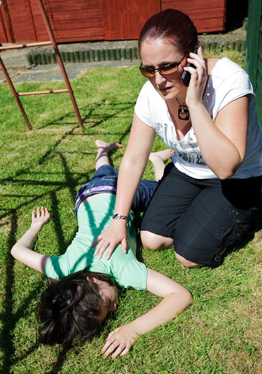
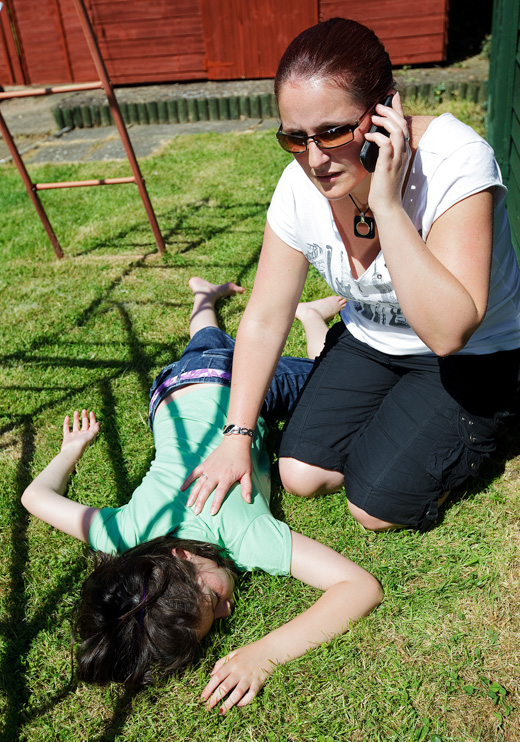
These two sets, shot for the British Red Cross, were for a series of pamphlets giving First Aid advice. Alas, the other sets are less blog-friendly: someone who'd had far too much to drink; a stroke; a heart attack; and a drug overdose.

Mixed bag

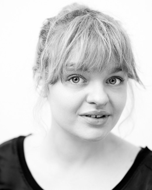
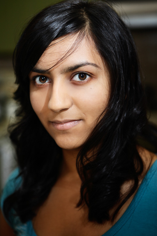
I had a week off... in the spirit of regular blogging, I've browsed my archives. The first image caught my eye, so I decided to search for other unseen portraits of ladies from the last couple of years.

Bees

I covered a series of pubic events at Victoria for Land Securities. The most interesting of which was a beekeeping session. Actually, even 'fascinating' doesn't do the lives of bees justice - they are incredible little creatures. Anyway, there's a happy colony at St. Ermin's Hotel‎, living on a balcony space, making honey and generally having a good time.

From the archives

I'm going through a bit of a phase where I'm reassessing my portfolio - there are a large number of images I like, yet which remain on my hard drives because they're not as strong - or didn't feel so at the time. Or perhaps it's just that I already have something similar in my portfolio. Here's one such picture. Usually I prefer a naturalistic look to my work, but going a little bit further and away from my usual ways of processing, this gets a new lease of life. And all of a sudden, I like it.