The forever purge
Portfolio thoughts again.
I think I’m a bit obsessed with the topic, but it’s so very important. A portfolio is one’s CV, brand, shop window.
As you’ll know - if you’re at all interested the plight of small kittens* - I’ve posted at various times here, on IG, and on my blog, a range of thoughts on portfolio curation. What to include, and how to choose. The difficulties and the rules. How it’s an art and a science. About how to think about who you’re “speaking to”, and what you’re saying. On the tricky balance between showing variety and consistency, the battle between new work and old; putting forward a clear, personal style but displaying the ability to handle the other stuff.
I’ve written about how images become like one’s children (but one’s you’d sacrifice). Why the work we’re proud of today is - by necessity - the same about which we cringe tomorrow. And I’ve touched on the ever-so-slight deterioration, the consistent degradation and corruption caused by each viewing. Sort of, a bit like Frodo and the Ring, if I stretch the analogy (but with the Ring getting worse instead of Frodo, or something). So that it’s generally best not to look at one’s work, ever.
Portfolio and website maintenance is an ongoing, never-ending process, or should be. Ask any photographer about their website and they’ll always say, “Oh, I’ve not updated it in ages.” I’m often adding to mine here and there, bit by bit. And then I hack it back in swathes once in a while. And today is that day, as it’s gotten rather bloated. That and the fact I’m pretty much wrapped for the year**. It’s the Alex Rumford Photography Purge, where, just like in the film, for 24 hours I can delete as many photos as I want. (And then worry about my decisions.)
The guiding questions when keeping or killing*** each picture, as always, are:
Does it say anything? Is it interesting / does it move me? Is it similar to work I already have?
As well as the less-obvious consideration, to do with honesty and objectivity: was it really its own merit which got it into the portfolio originally? Or because of what it took to get it? Because a tough challenge or interesting job doesn’t mean a good picture. It merely creates unwarranted and favourable bias, an attachment which unravels in time.
And, of course: is it any good?
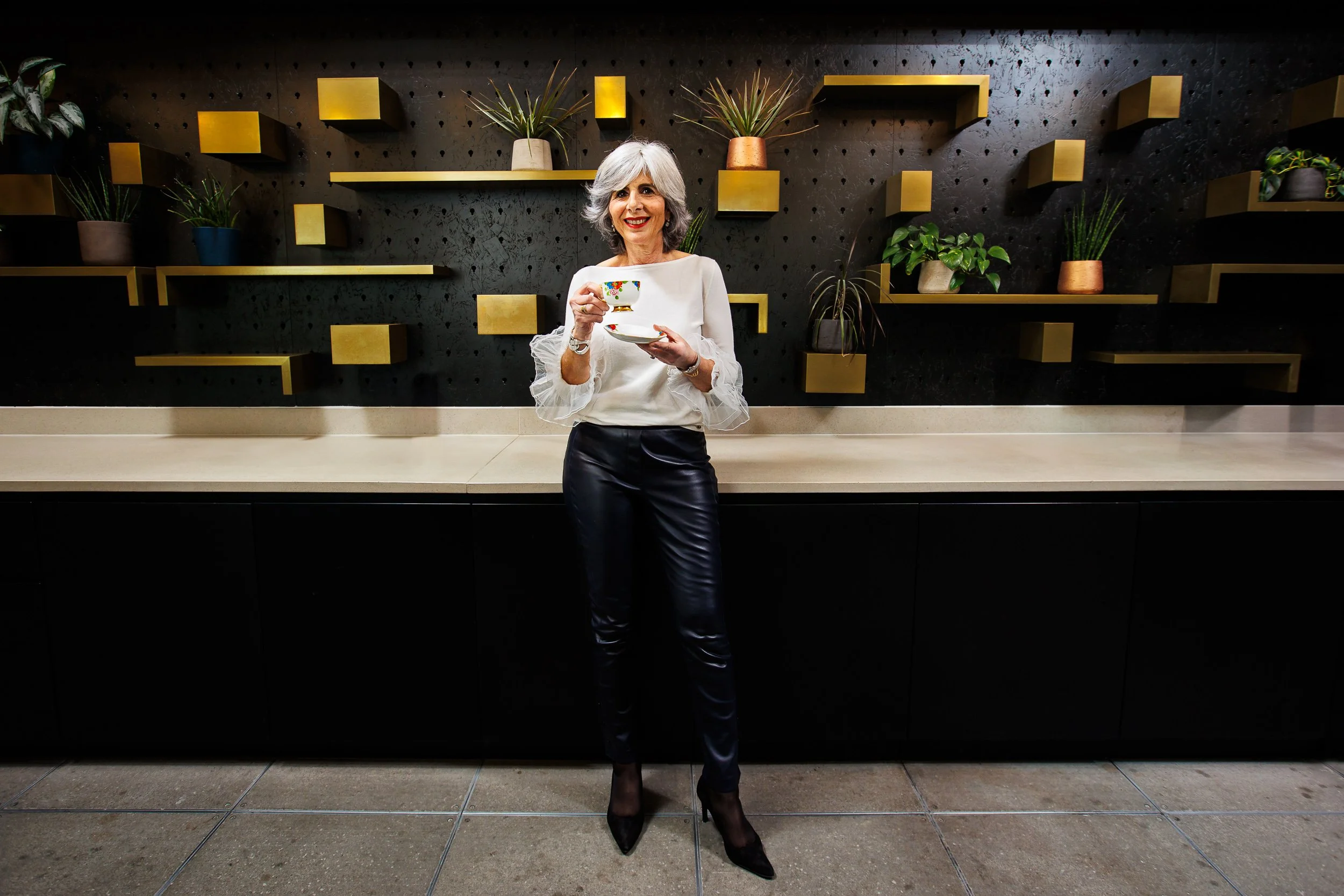
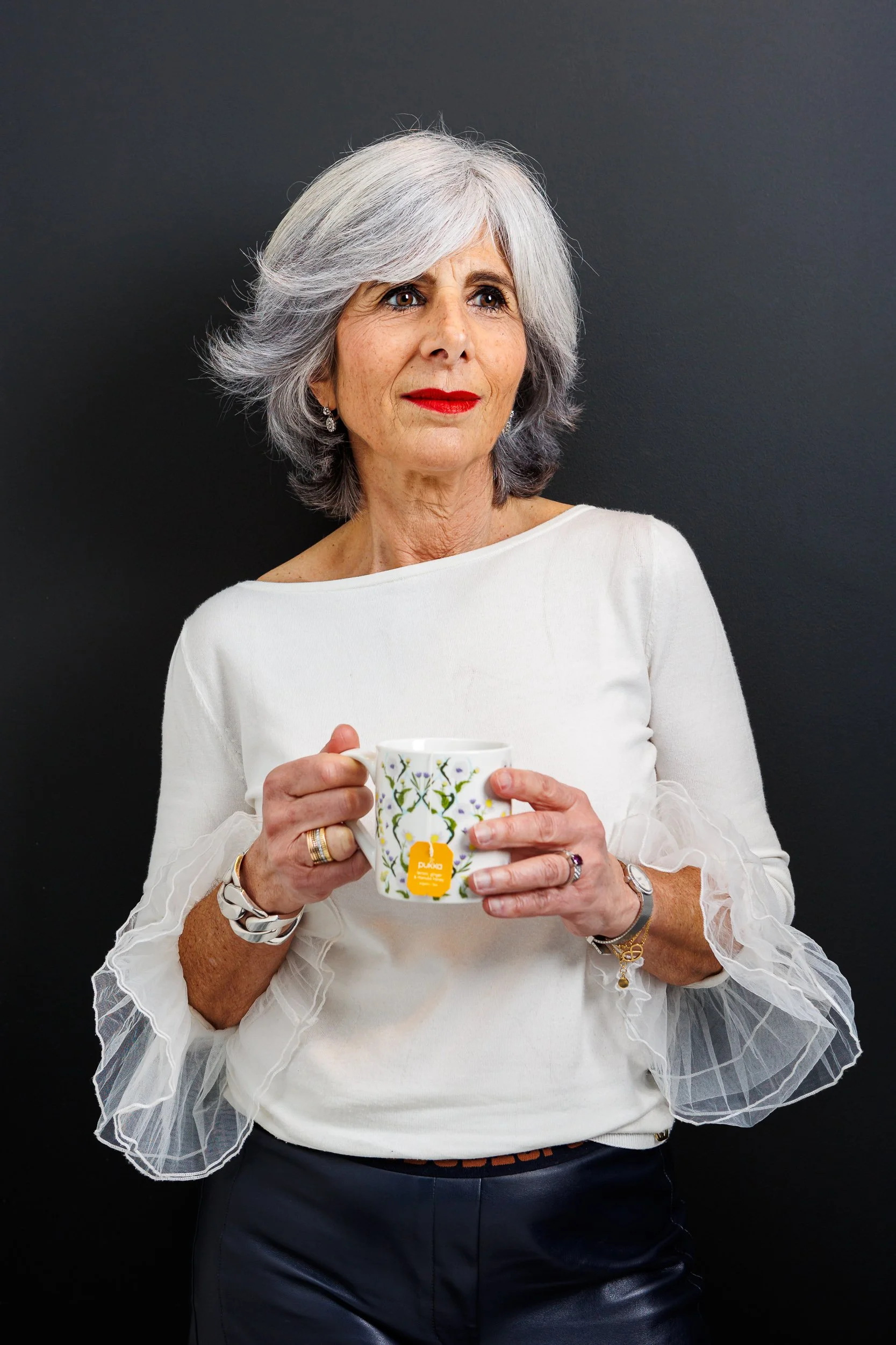
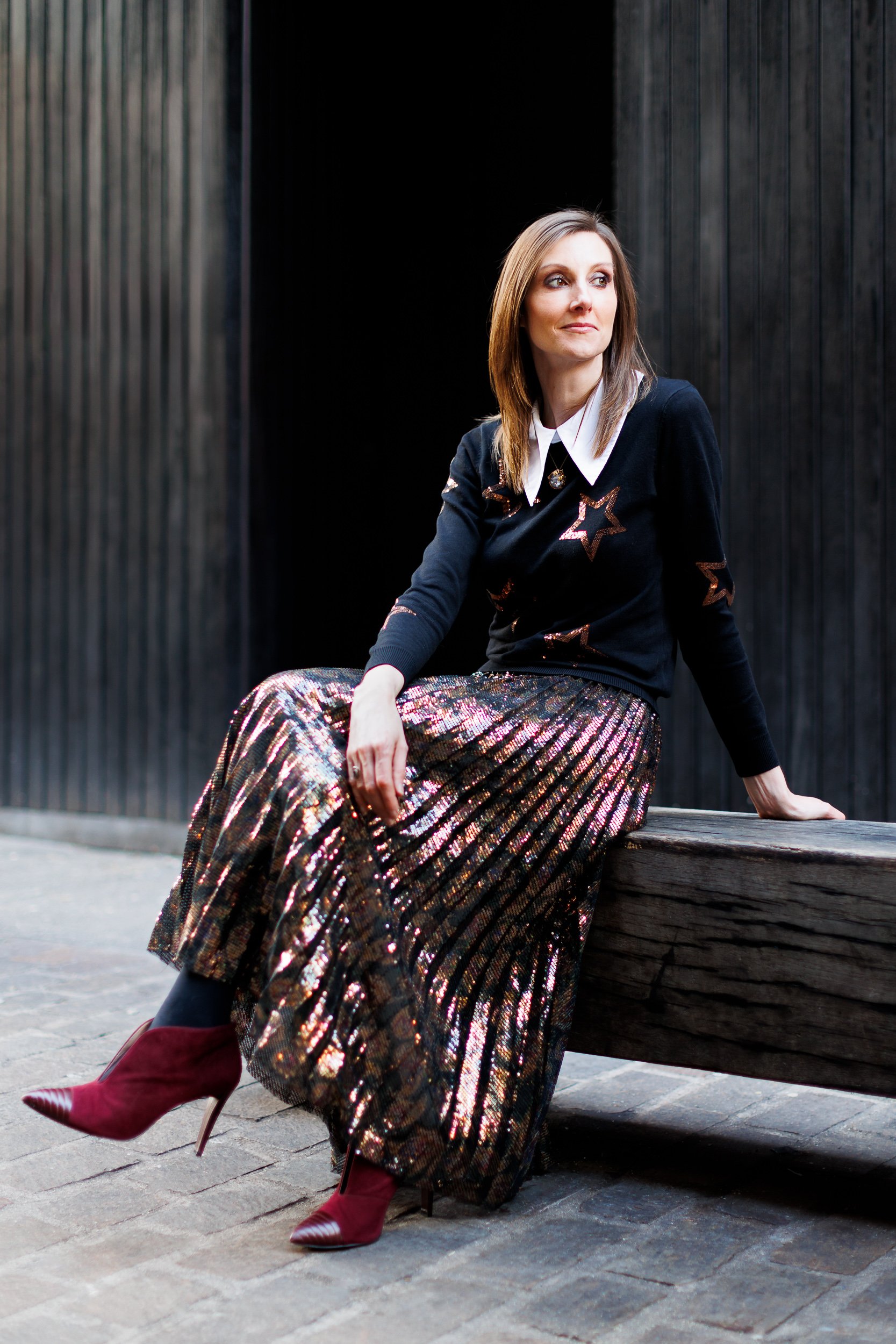
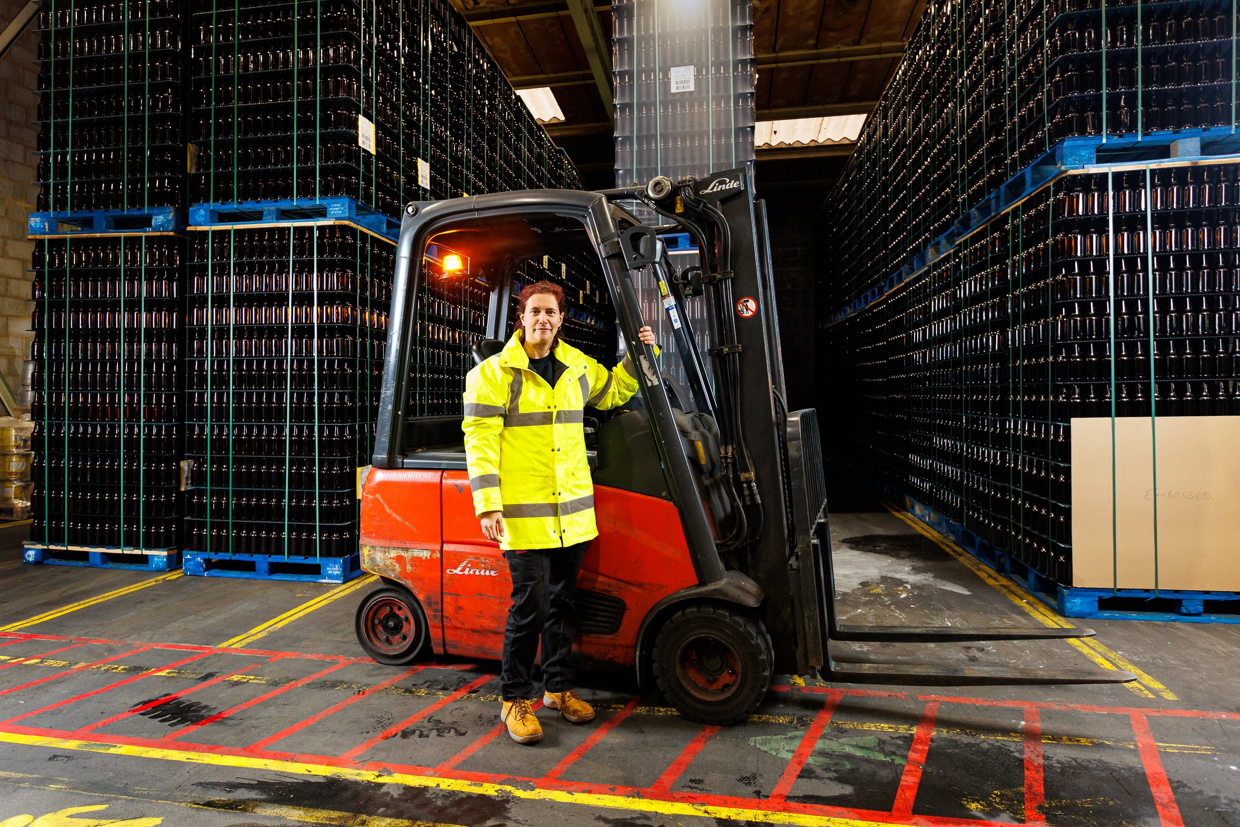
Anyway, have a look at my lovely portfolio over a nice cup of tea and a biscuit****.
*This has nothing to do with kittens. That was a cheap, clickbait-y trick. No animals were harmed in the making of my portfolio.
**This is the moment you realise, as I just did, that I’d forgotten to publish this blog post back in December. But don’t worry, in a few paragraphs there are biscuits.
***Yes, photographers do actually use the word “kill” when “cull” will do, because it sounds cool.
****I promised biscuits (plural) but that was to keep you reading. There’s just one left. Sorry.
Recent work - June 2025
As usual, this is an occasional selection of my 4* and 5* work over recent months (see here if you’re interested in the rating process). The 5* work will end up in one of my galleries. So these “Recent Work” posts are really about showing the 4* ones, the not-quite-portfolio-strong-but-a-shame-to-consign-to-the-hard-drive. Or NQPSBASTCTTHD for short.
A bit of a preamble: portfolios are on my mind at the moment. I noticed I’ve not updated mine much over the past year, and this has always been the litmus test for how I’m doing: how often am I on my website, updating my galleries with new images?
I’m not good at social media. And I’m unsure if anyone reads this blog (there are diagnostics… but the graphs look unhealthy. Again, it doesn’t matter, I’d write anyway). And so my portfolio is all I really have as my CV. It’s there to show my best work, without algorithms, echo chambers, or social media tomfoolery. Anything I’m not happy with gets removed over time, as it just can’t survive the seasons.
So it’s reliable. And I can direct people there.
But if it’s not watered regularly (to mix metaphors) with fresh content then that can be stressful. ‘You’re only as good as your last photo’ - and all that. And it hasn’t been fed or updated much. There are perhaps three 5* images in this set, but none of those that I really love. Which I’m not thrilled about. I don’t want to overstate it. All of the below are fine, even decent. The main thing - The. Main. Thing. - is that they did the job. But we always have to aim higher, for the client and for ourselves.
(If this applies to you, read this and then maybe this which I hope will help your thinking.)
OK love you all bye.
On Looking
I’ve just finished reading On Looking: A Walker’s Guide to the Art of Observation by Alexandra Horowitz.
In it, she walks a regular city block with eleven different people, including a sociologist, a geologist, a blind person, her child, a sound designer, and even her dog. And she sees eleven completely different worlds.
It’s a beautifully written, witty and fascinating exploration into the fact that our skills and background shape what we notice, and can determine our experience.
There’s a subset of this which is something I think about a lot: we see different things depending on what we’re doing. So: not just who we are, but what we’re preoccupied with in the moment. It determines the focus of our attention, and we then miss most of what’s around us. Not because it’s subtle, but because there’s too much information, and it’s nearly all irrelevant*.
If you’re waiting for a bus, you filter for buses. Lost your keys? You scan the ground. In psychology we create what’s known as a “Search Image” - a mental representation or schema to guide a search for a specific target, particularly in a visual context**.
To do this, we need light. Which surrounds us, all the time. It literally makes up *everything* we see - and is the framework of photography. It gives us shape, form, texture and colour. Yet we barely notice these facets in our day to day. They serve only to help us make sense of our surroundings.
We do this because - consciously or not - we’re always doing, planning, or thinking something. So we overlay everything in front of our eyes with meaning, constantly simplifying and interpreting our environment according to what’s on our mind, or how it relates to our situation. We see clouds in the sky: that just tells us it might rain later. And there’s a shape in the near distance. If it’s taller than it is wide, then it might be a person. Do we know them? Do we need to move out of the way? Or we see much larger shape approaching, in the road. But then we see it’s green. We can now ignore it, because it can’t be the bus we're waiting for, which would be red. Getting home, a pile of clothes on the floor catches our eye. We immediately notice they’re white - but that serves only to confirm they can all go in the wash together. And our next thought is likely annoyance that they’re a mess, and have been dumped - so that’s a conversation we need to have later with our teenager.
We couldn’t get by in the world without doing this. We see in order to process, in order to plan. Intentions and actions drive one another. Nothing just “is”.
Perhaps Del the Funky Homosapien (of Gorillaz fame) summed it up best in Clint Eastwood:
“…you don't see with your eye
You perceive with your mind.”
This is where photography comes in. Walking with a camera? Well, now the world can be purely visual. Devoid of practical considerations. Just what you see.
That bus is now a rectangle. The street, a straight line. The coffee cup, a circle.
With a camera, we learn to see things as they are, not how we think they are.
But no, not quite. Again, even here, in the abstract, we’re still doing it. It’s only for the sake of simplicity that we conceive of buses as rectangles, streets as lines, cups (their rims, at least) as circles.
But this is just another shorthand. Because they’re not.
Buses are trapezoids, in our experience (except from directly beside one and from far back - which is never). And coffee cups are never circular, except from directly above, which - again - is not how we usually look at them. The rims (at least) are nearly always ellipses***. And streets are triangles - yes, really - just take a photo when you’re next at the front of the queue at traffic lights.
This difference is important. It’s hard to see things as they are, even with all else stripped away, because we’ve already internalised objects into loose categories for the sake of convenience (and therefore speed in mental processing). We simplify and group shapes, even though we’re often very wrong. We place assumptions onto lines - consider the many optical illusions you’ll see on any social feed. Or you don’t have my distracting algorithm, you’ll have seen the one with two arrows of equal length. And don’t even get me started on colours - remember the blue and gold dress?
Anyway, that’s what I think about (and would recommend the book because it covers this, and so much more).
There’s something meditative in allowing the visual scene in front of you to be just as it is, without judgment or interpretation. It’s a gentle, mental shift in what you let yourself notice. And it comes from a simple, deliberate change in intention and in one’s attention.
*You may be familiar with the Invisible Gorilla test as an extreme example. Subjects are asked to watch a short video of people throwing a ball and are instructed to count the number of times a ball is thrown. More often than not, they completely miss someone dressed in a gorilla suit appearing and walking centre stage, waving, and then leaving. You can see versions on YouTube. It’s called “perceptual blindness” and is an extreme example of the occasionally bizarre results of selective focus.
**A good example was just the other day, when I was looking for something thin, flexible and curled in order to unhook something. I knew there wasn’t an exact tool and I didn’t know what I was looking for - or rather what item would provide the solution - but I could easily scan for the properties needed. I was equally likely to find the appropriate tool in a cutlery drawer, a toybox, a toolbox, or in a desk drawer.
***And if you’re interested, with your eyes in front of it and above i.e. when you’re drinking coffee, the shape of the cup, if it’s a cylinder, would be an “oblique conical frustum” (which I think sounds more like a painful stomach condition).
The photographer's dictionary
Capture (noun)
An irritating term for photograph with, “Nice capture!” being the most vexing.
Chimp (noun)
The practice of repeatedly checking the back of a camera, typically in between shots, to review or evaluate the captured image. Possibly originating from the resemblance between the excited vocalisations of chimpanzees (often rendered as "ooh, ooh!") and the sounds of a photographer reacting to a satisfactory image.
D.P.I. (abbreviation, archaic)
Dots Per Inch. Unnecessary unless you’re printing a photo, and probably unnecessary even then.
G.V. (abbreviation)
General View. A wide or establishing shot capturing the overall setting or context of a location. Considered a critical component in visual storytelling. Notably, failing to capture a GV often coincides - some might say ominously - with the location being destroyed on the same day. The lack of an image can then be problematic in subsequent stories about its destruction.
Glass (noun)
Camera lens or lenses, only ever used in the phrase, “Nice glass.”
Golden hour (noun)
The act of returning to sleep upon realising that the clocks have just gone back for daylight saving time.
Gen(erative) Fill (noun)
AI Photoshop tool which creates whatever you type and eliminates the need for photographers.
Kill (verb)
To delete an image.
Muzzy (adjective)
Out of focus.
Metadata (noun)
Information embedded within a digital photo file that details its technical and contextual attributes. Includes data such as camera model, lens type, exposure settings, file size, and timestamp, along with optional user-added information like the photographer’s name, and caption. While metadata identifying the copyright owner can technically be removed, doing so without permission is not lawful.
Moiré (noun) /mȯ-ˈrā/
The unresolved, wavy, rainbow pattern which appears when an object contains repetitive details (such as lines, dots) that exceed sensor resolution.
nofilter (hashtag)
Literally, no filter has been used to edit a photo, but generally used to mean that a photo has not been edited. A complete fiction, since by definition the creation of a jpeg involves editing processes including sharpening, contrast, saturation, colour profiling etc. (see RAW file). Moreover, if you’re not doing a least a little basic editing, you’re doing it wrong and should not brag about this.
Orphan work (noun)
An image without metadata.
Pin (adjective)
Sharp (of a photo)
RAW file (noun)
An uncompressed, unprocessed image. Asking for the RAW is like asking the cook for uncooked ingredients (see nofilter)
Schindler (noun); Schindlerise (verb, probably)
A term referencing Photoshop’s “selective colour” tool, inspired by the 1993 film Schindler's List, which is predominantly black and white except for a single element (a girl in red). In a black and white photograph, one detail is left in colour to draw attention. Don’t do this.
Tog (noun)
Also, “Photog” - a photographer.
Recent work - November 2024
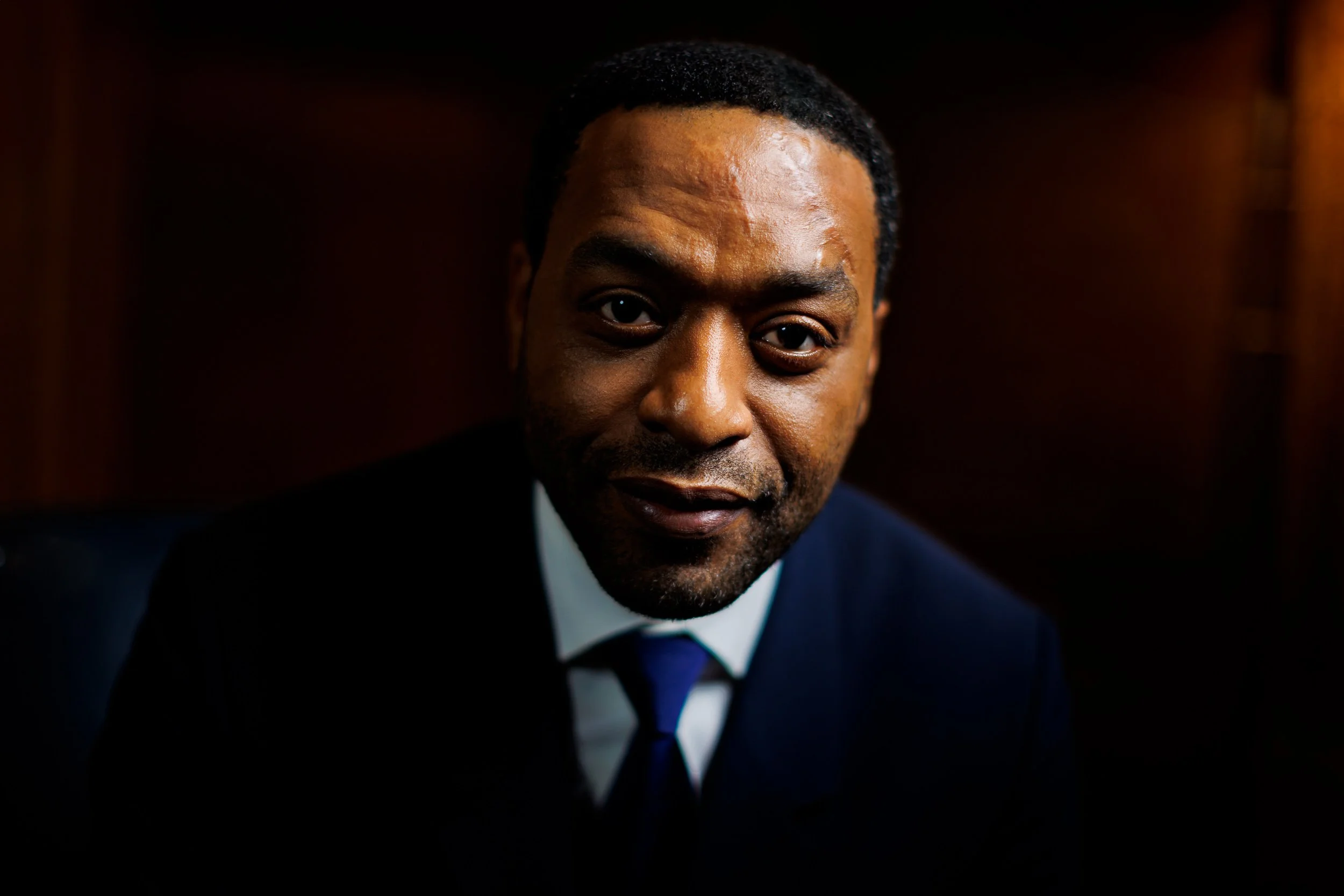
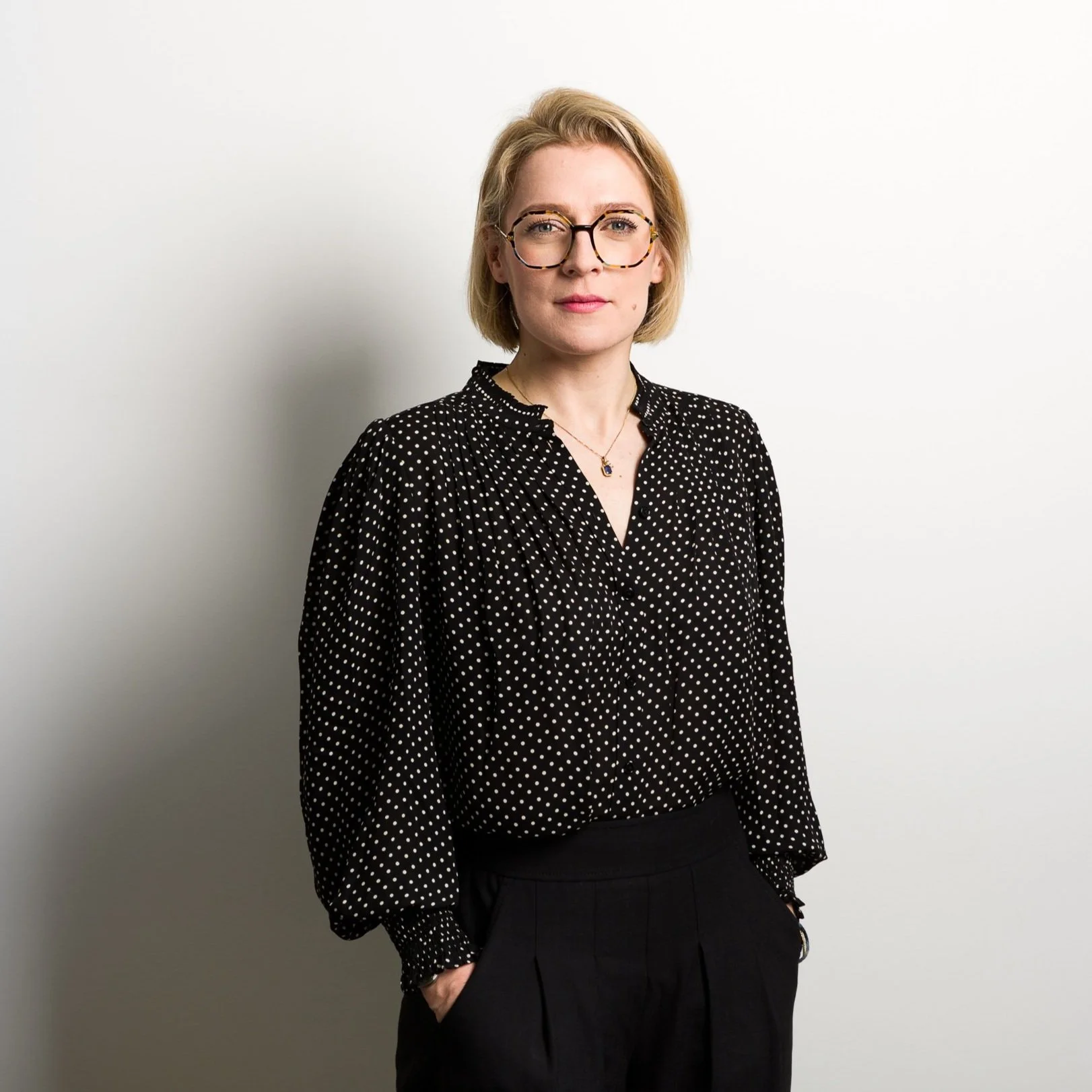
Recent portrait commissions
Portraits for business and magazine clients:
Recent work - September 2024
Recent portrait and lifestyle photography commissions
I’m sometimes torn with “recent work”. I’m always aware that as much of it won’t make it into my main galleries, it feels at odds with the idea of “less is more”. Surely best practice is only to show one’s very best* images?
Ideally, yes, that’s right. But the main problem with being so selective is that I’m not going to be posting very much: it’s hard to get more than about ten** good shots in a year.
So I try to remember that while all images stand alone, individually, they also play a wider role in a gallery (or blog post) of related items. And, indeed, each individual gallery is itself a subset of a portfolio. If I consider a blog post as a gallery of sorts, and contains work that I think is good enough to show, then it absolutely belongs on my website. An image’s strength may not lie in its impact as a photograph (“best”, again), but perhaps as evidence of a certain kind of work or technique. Or it’s a reference to a certain publication or client, or another example of a cohesive style etc.
Which is all to say that “good” is relative, and not absolute; and has many facets other than “impact”.
And so, while “recent work” nonetheless seems a very loose category when compared to, say, a full series from a particular assignment, I don’t know how else I could otherwise publish some of my work.
*“Best” in terms of website content, of course, not necessarily “most artistic”. For instance, an average picture of a celebrity carries more ‘weight’ because it implies access, and it shows one is current. So it would go in a portfolio ahead of a similar, slightly better shot of an unknown person. (Actually, it’s even quite reasonable to pull long-forgotten shots from the archives - I think of the photographer I met who’d taken an actor headshot of Benedict Cumberbatch in about 1998. Anyway, I’ve discussed portfolio theory in depth elsewhere on occasion on my blog.)
**And even if you were shooting every day, with various and interesting subject matter, clients and briefs; and produce, say, a hundred really wonderful photos, you’ll find yourself in the same position for two reasons.
One, unless you want a bloated (and slightly repetitive) portfolio, you have to make way for this new work, which means you have to remove old images.
And two, unless you want a jack-of-all-trades portfolio, you have to prune all but the very best of the best of the new stuff, as well as everything that isn’t core to your offering. Which might be forty images. However you look at it, there’s just some work that won’t make it into a portfolio.
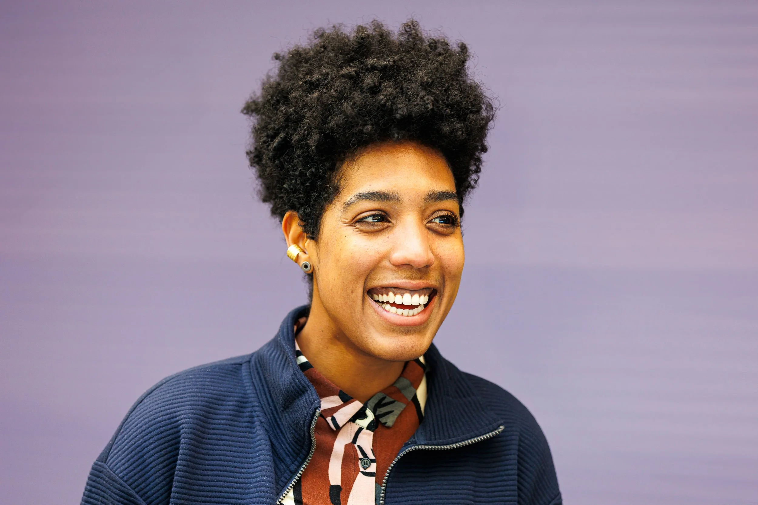
Mean Girls
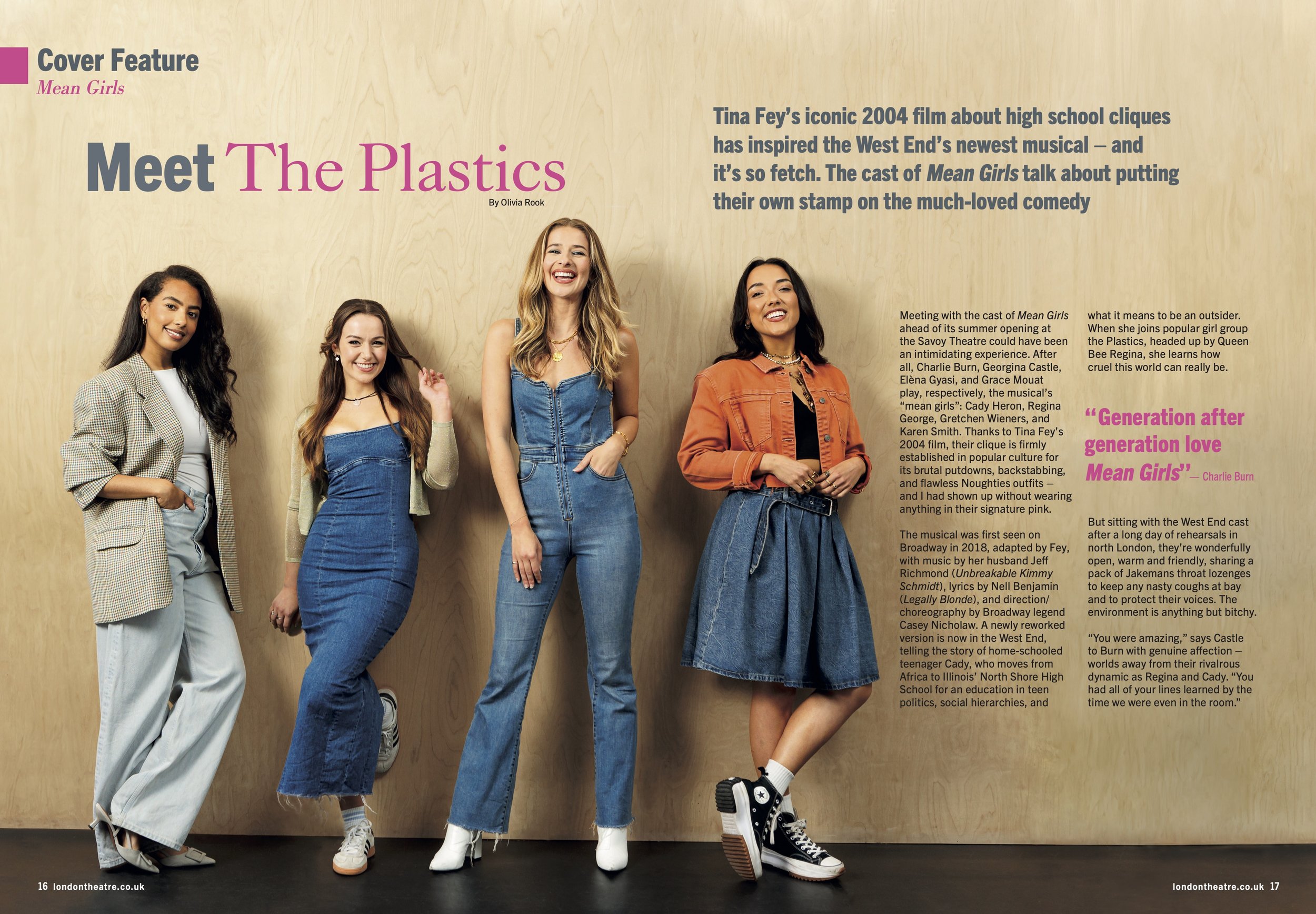
London Theatre Magazine shoot of the cast of Mean Girls
Really fun commission for London Theatre Magazine, featuring the cast of Mean Girls, now showing at the Savoy Theatre:
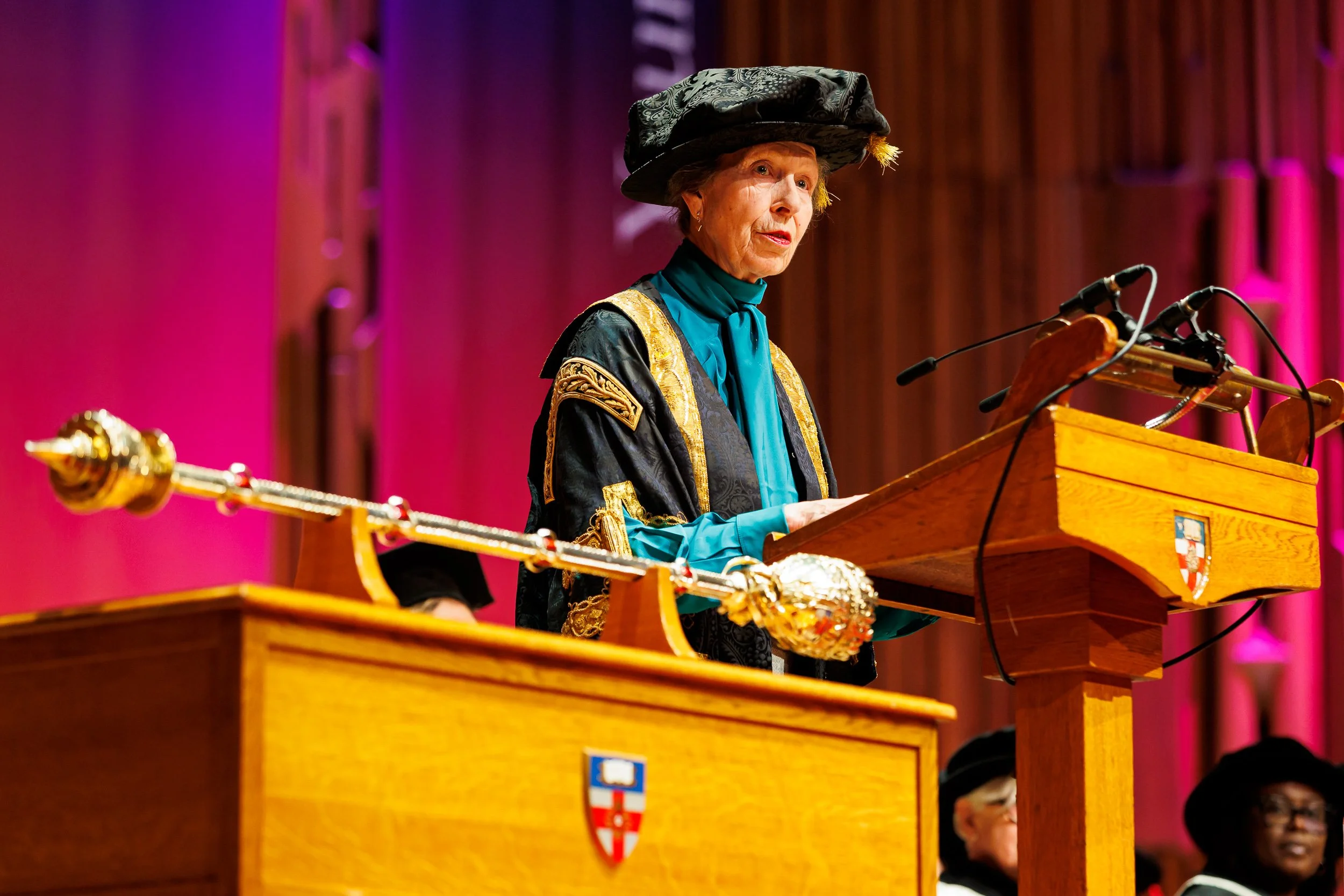
Graduation
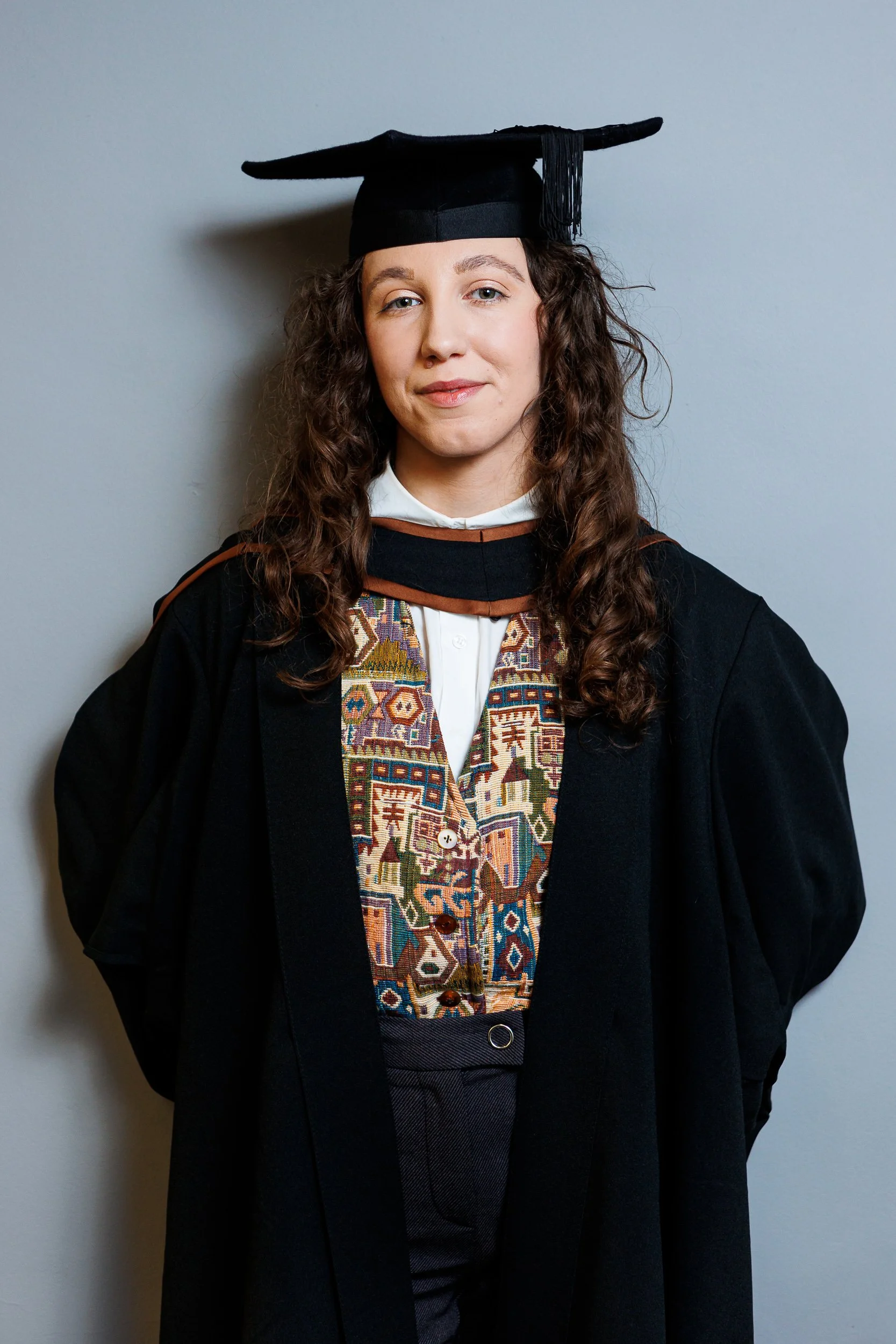
Graduation coverage for the University of London at the Barbican
I was commissioned to shoot University of London graduation images - event coverage and portraits at the Barbican:
Recent work - April 2024
Various portrait and corporate commissions from the past few months
Recent work - January 2024
Commissions for a range of clients, including Singapore Airlines and iCrossing
Recent portrait commissions including work for AB magazine, iCrossing, Singapore Airlines and Innovate Communications.
Long live the local
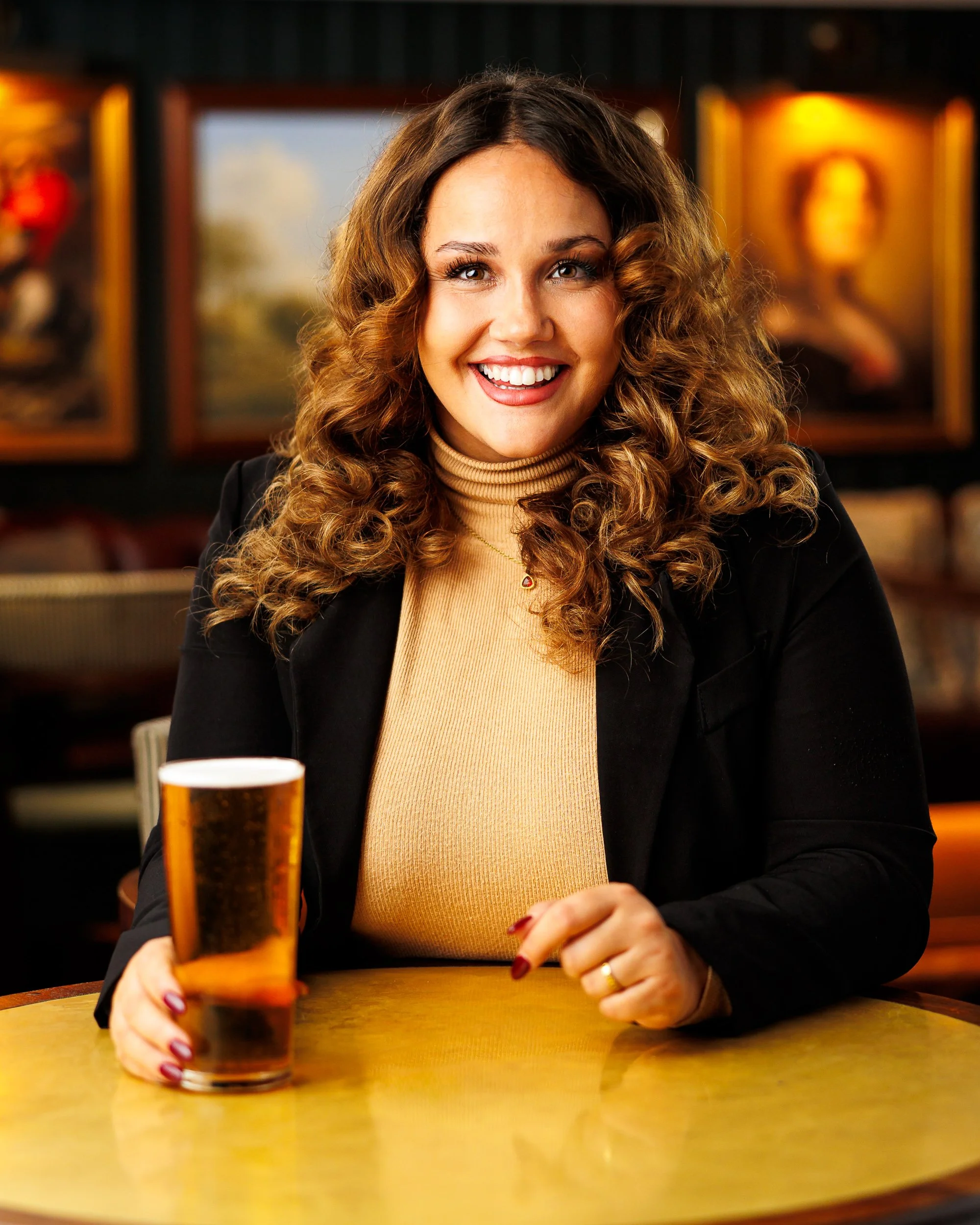
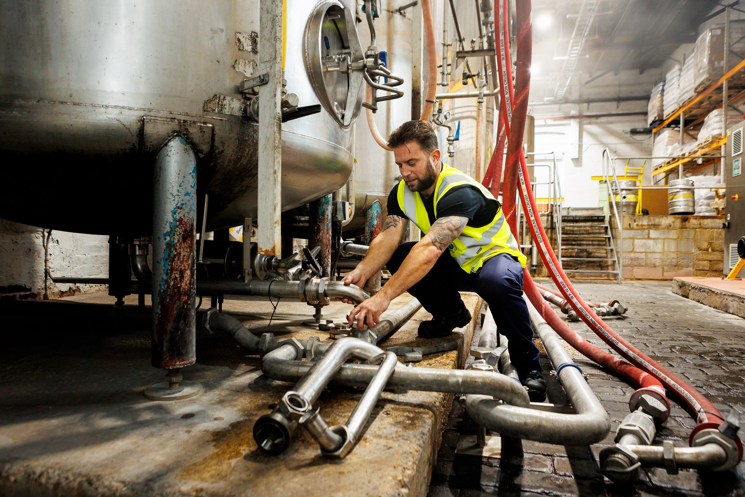
A selection of portraits of publicans, draymen, farmers and pubgoers around the country for a BBPA campaign
The British Beer and Pub Association supports pubs and breweries across the UK. I was commissioned by 89up to photograph the draymen, landladies, bartenders and farmers who make up the industry - the people behind the pint - to support the Christmas “Long Live the Local” campaign.
Recent work - October 2023
Various work, including commissions for SOAS, Ikea, Ebay and Amex
Adam Habib, Director of the School of Oriental and African Studies, University of London
AmEx Leadership Academy attendee at the US Ambassador's Residence, Winfield House, Regent’s Park.
Nick McClelland of Champion Health, shot for Corporate Adviser magazine.
Emma-Jayne Hamilton, Ebay’s head of luxury handbags
Community centre refurb by IKEA
Seeing past the subject (2)
Rules for using celebrities in one's portfolio
I wrote an article some time ago on the value of using famous faces in your portfolio.
tl;dr: celebrity shoots are shorthand for access, big campaigns or notable clients. In other words, a middling photo of an A-lister may have more impact than a good photo of an unknown person.
I wanted to follow up with some comments and rules on this perilous practice, because it is a recipe with a strict “use by” date. Celebrity photos age quickly. And badly. You need regular and fresh produce, and more so in the age of Instagram. Because - regardless of whether the person stays famous or fades into obscurity - without new material to update and replace one’s portfolio, the march of time leads to the same interpretation: your most up to date celebrity shoot was too long ago. I’m assured by colleagues that in all other respects one’s portfolio need not change, and keeping old photos is fine: this consideration only applies to photographers cashing in by using famous faces on their websites. You’re tied into a constant game of catch-up, but that's the price you pay for trading in the currency of currency.
Here are the rules:
A-Listers: You can keep them for around a decade in your portfolio. Just make sure they're still recognisable.
B-Listers: Remove/update after 5-7 years.
Reality TV stars: Remove after 3-5 years.
Influencers: Check if they’re still famous every 1-2 years.
People who appear on Christmas pantomime posters at train stations, if they have an accompanying line reminding you where you’ve seen them before e.g. “… from The Bill”: No.
Niche favourites: These are podcasters, TikTok stars etc. who have the envious position of being A-listers to those who know them, but otherwise aren’t widely recognised in public - so don’t count as celebrity, and therefore can be used indefinitely.
Political and Historical Figures: These shots are like vintage wine and can remain in your portfolio indefinitely, as long as you have a collection of similar images. One photo of Nelson Mandela won’t work - it’s just a lucky commission. You need Margaret Thatcher, Bob Geldof and Freddie Mercury to complete the set, and so establish yourself as someone who’s really been around.
Living legends: There are only a few of these but you can trade on them on your website forever. Ideally, place them on your homepage and bring them up in conversation regularly. They include people like David Attenborough, Helen Mirren, Christopher Walken and Stephen Fry.
The exception to the rule is if you have more than twelve famous faces, in which case you’re a regular at this - perhaps even a celeb photographer - and don’t need to remove any old photos ever, on the condition that you must keep adding.
Next time I’ll talk about why portfolios containing two pictures from the same shoot should result in a prison sentence.
Recent work - April 2023
Portraits, portraits, and portraits
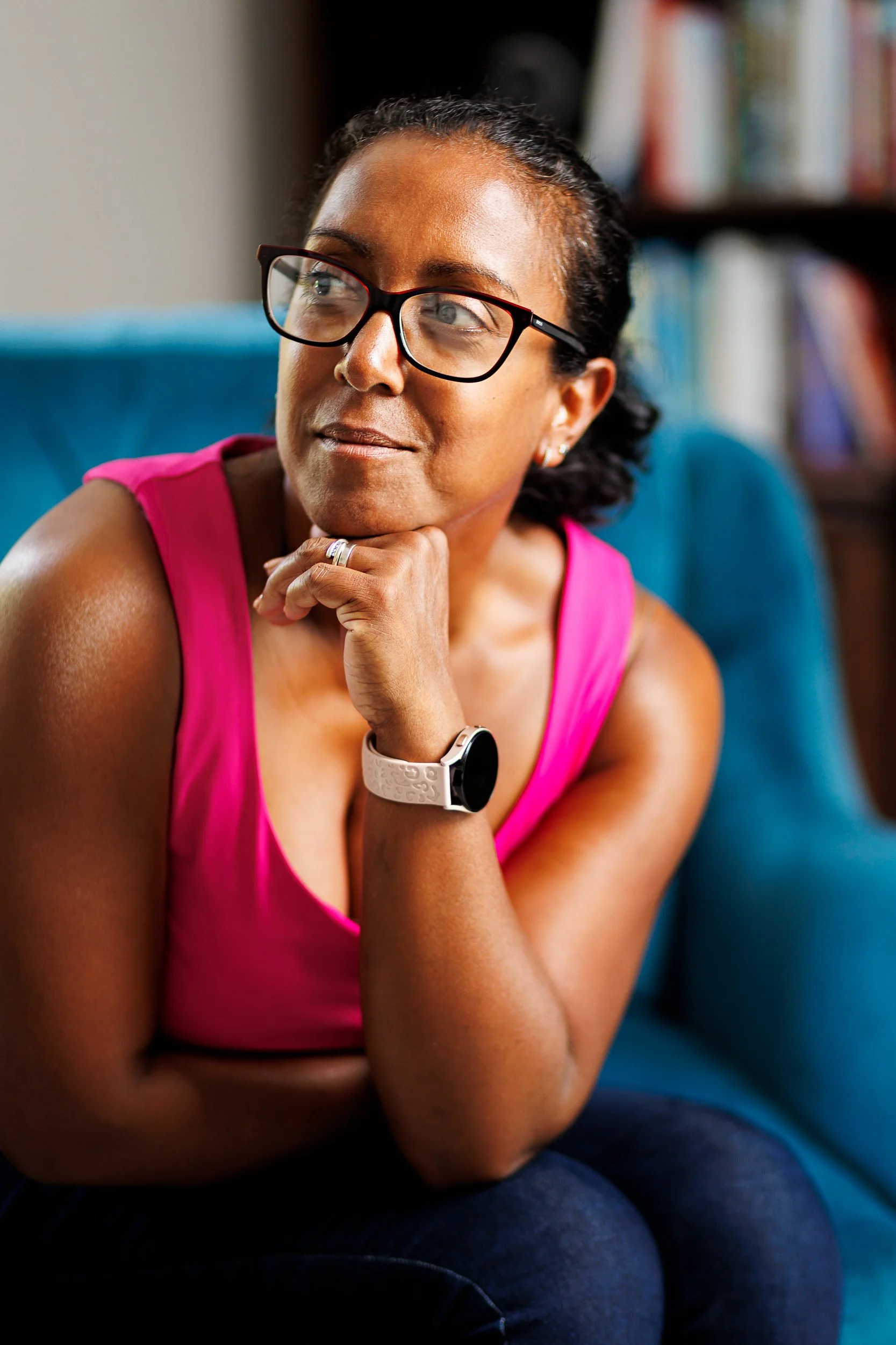
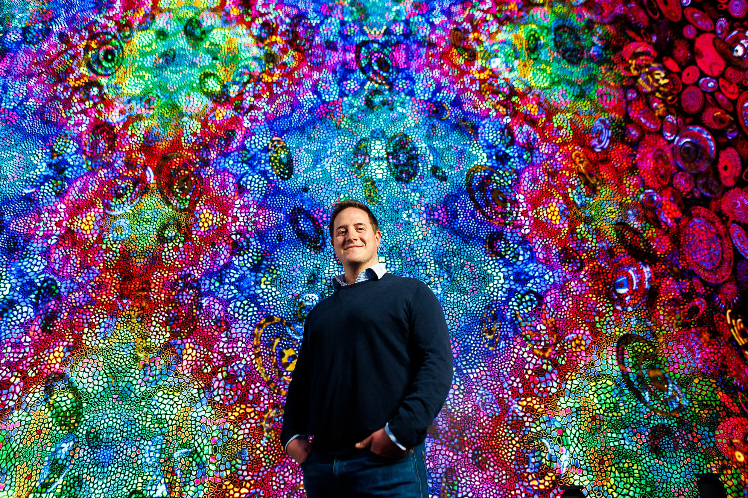
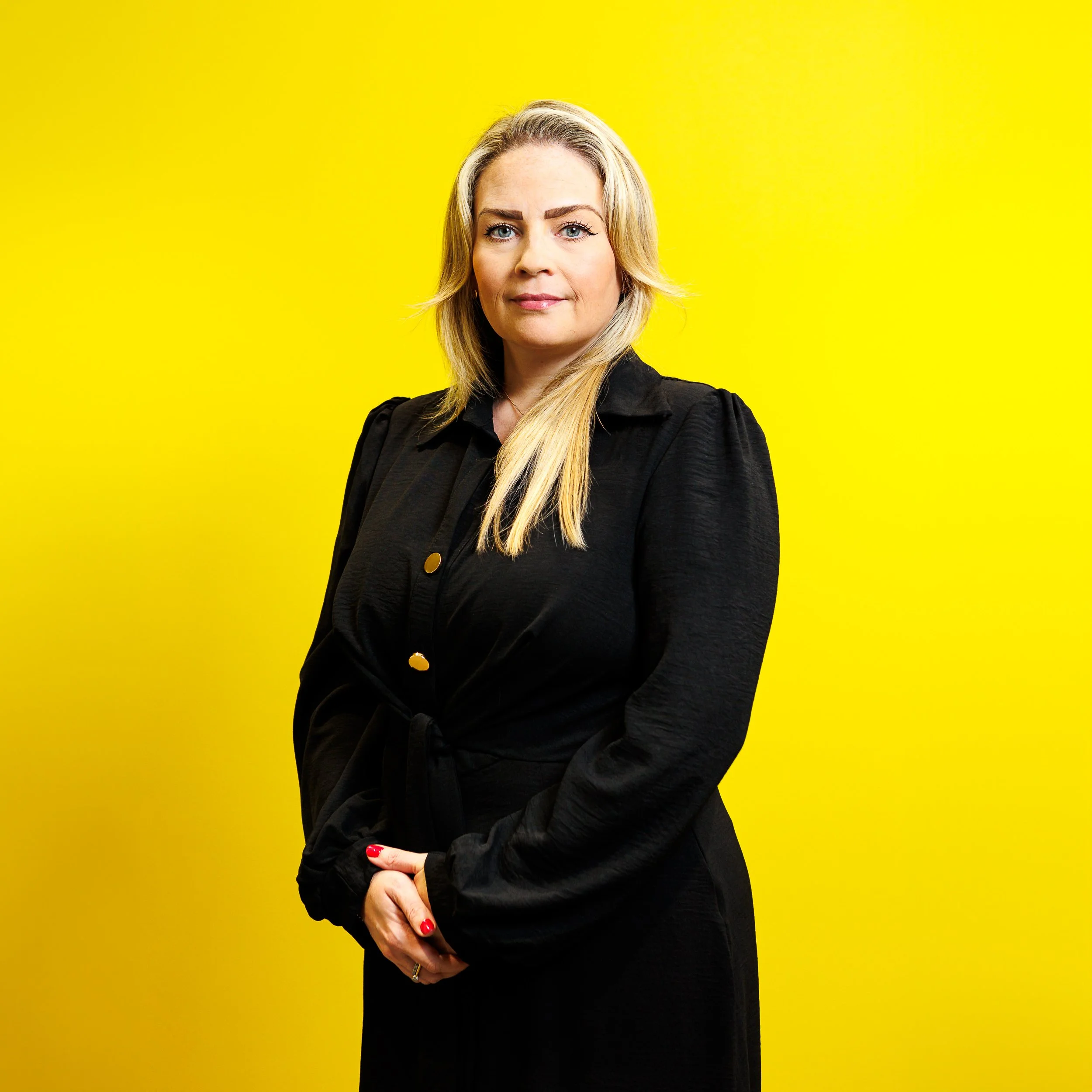
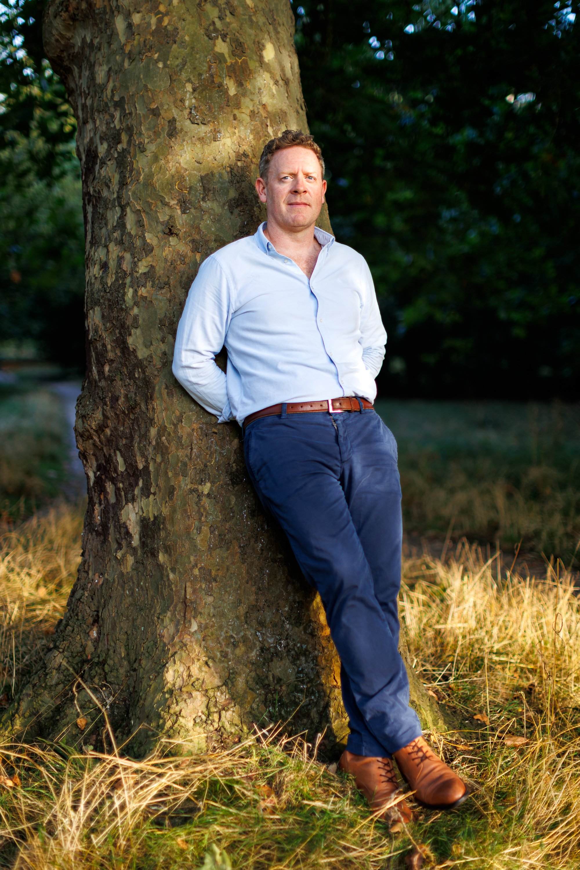
Recent work includes magazine portraits of Samuel de Frates, Procurement VP at Mars; of GenM founder Heather Jackson; and various staff portraits for University of London, The Euston Partnership, and others.
Will AI do me out of a job?
Thoughts about AI in photography, now it's started to get competent
Photographers are periodically under threat as each wave of technology renders various specialisms obsolete.
I was told when I went freelance there was no future because of “digital”. While that’s not been the case, it did kill news (with the help of the other horsemen: the internet, stock photography*, and pestilence).
But certainly the relentless advance of Photoshop, the iPhone, technical automation and instant communication can be punishing to an industry, and frustratingly so when combined with the inherent lack of understanding that goes along with its mass market audience.
And now AI.
The fear is not that it will do the creatives’ job for them - clearly this is nonsense. If there is one, it’s in the same Faustian pact threatened by the (currently bland) utterances of ChatGPT: anything which can be automated - and automated well - will, at first, free up creatives’ time and energy. But in exchange, and quickly after, there will be less need for those creatives. To put it another way, not everything I do in the course of a project is specialised, difficult or skilled labour. And when that’s taken out of my hands, there’s imbalance.
One-eyed Fletch, taken just now to illustrate what a good boy he is.
But let’s go back a bit. I can’t publish what I said when I tested my Canon R6 for the first time two years ago, but let’s just say its eye-tracking technology was game-changing. Out of the box, my first test photos were of one of my cats, Fletch, sitting six feet away in front of a glowing fire in an otherwise dark room. And every single frame was sharp. My previous camera would never have achieved this. I should add he only has one eye, and the camera found it. (I don’t even bother checking sharpness any more.)
And I won’t bore you with recent advances in Photoshop and Lightroom, but will just say that many things which may have taken a couple of (boring) minutes just a couple of years ago can now be done in a few seconds, thanks to AI.
But as I’ve suggested, easier for me means easier for everyone. So at least in some areas, what I can bring to the table in terms of skills and experience is gradually reduced, as we all level up. Part of my time from every job is spent assessing and selecting images. There are now apps that can check sharpness, composition and blinks, and do this for me. I know a dozen ways to mask out hair, but that hard-earned knowledge is less and less useful with every incremental update to Photoshop’s “refine hair” tool. And shooting with (my current overuse of) a very shallow depth of field with my expensive 50mm lens - unthinkable before my (also expensive) R6 - is more and more convincingly achieved with my iPhone’s “portrait mode”.
None of this is new of course. Technology improves. But just as with the text-based AI’s, we’re way beyond autocorrect here. Not for the first time, I couldn’t tell if a photographer was joking or not when he posted on my forum a few weeks ago that he was considering ditching his gear and using an iPhone. So aside from the usual concerns about the mixed blessings of hardware / software updates (which improve results) and automation (which speeds up post-production), we’re now reaching a very different point, where you can create work with minimal input or understanding. You don’t even need to to own a camera.
So there’s that.
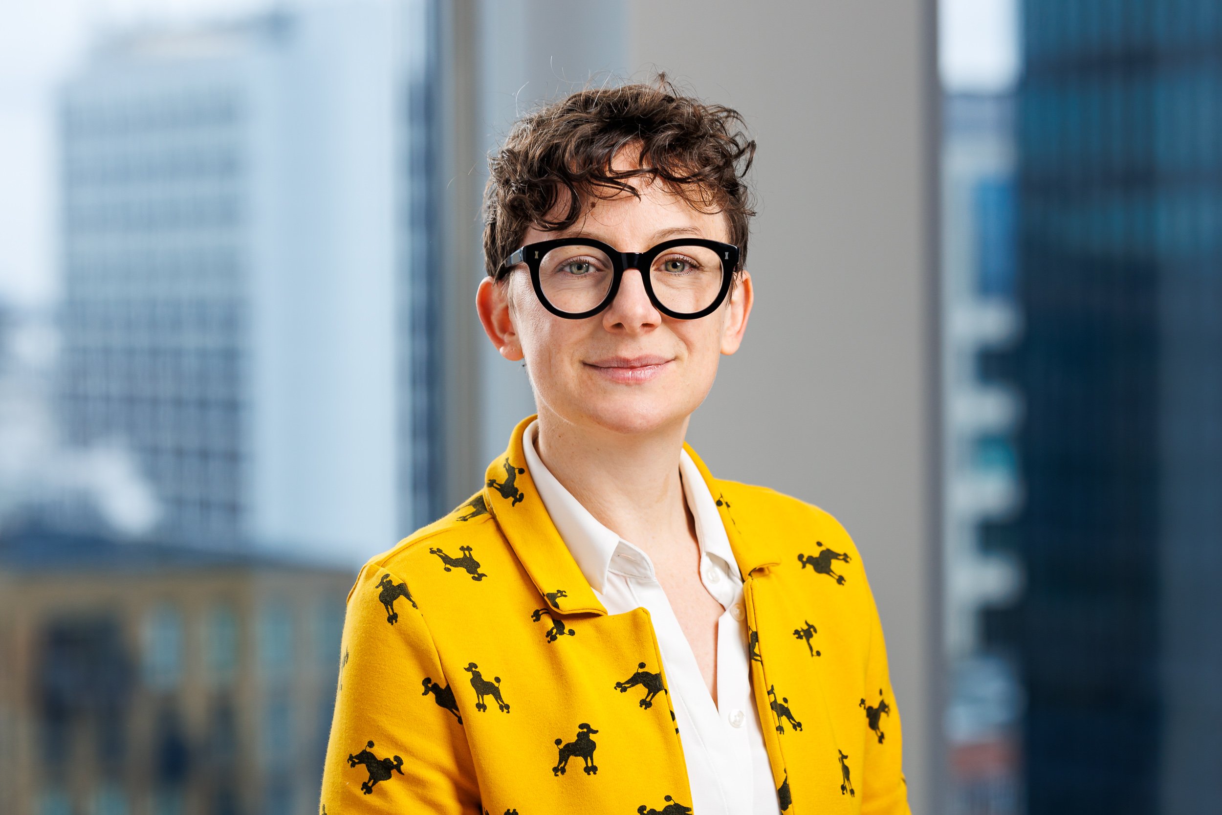
I based most of the prompts on my current headshot
But what about the results themselves? How good are the images that the AI’s can generate? Why should I worry about creeping AI indirectly affecting my livelihood, if it can just smash through the front door by actually making images, and doing a better job at the same time**?
Let’s consider portraits, and corporate portraiture, in particular (interestingly, the latter is an area which has massively grown because of digital, since every company needs a website, and often an “About Us” page). I’m interested to see if AI touches on my commissioned work directly: going back to the original “nonsense” concern, if we can just describe a person and get an image, then why use a photographer at all? Will we get to the day where, say, HR could ask for temporary access to a staff member’s Facebook or phone photos, pull out recent images, and use them to generate professional-looking headshots in the house style in a matter of minutes?
I had a go with DALL-E, midjourney and Stable Diffusion. Using a source image of myself, taken by me, I used various prompts including “corporate portrait”, “professional”, “headshot”, “in the style of Alex Rumford”, and “photorealistic” to generate new images. Would they resemble me accurately?
No. Not even slightly.
Which was a relief.
The more available images there are online, the better the results (for instance Beyoncé), but currently - when uploading - midjourney (which seemed to be the best tool for this) allows only two. And combining two images didn’t change things much.
Secondary images (left by the brilliant @docubyte)
Even playing around with the sliders and prompts the results were, at best, approximations for a better version of me. Results were slightly cartoonish, “Americanised” (presumably because most source material is from the US?), and almost always better-looking.
There’s been a lot written about AI bias, but it’s interesting to see results are akin to a Snapchat filter. It has the disappointing effect of feeling less descriptive (“this is what I think you would look like”) than it does prescriptive (“this is how you should look, ugly”). It’s depressing enough thinking about the negative effects of existing in-phone editing software which makes noses smaller and eyes larger, skin smoother and lips fuller.
I’m only guessing, but this “beauty ideal” in AI would presumably be from the influence of the more photogenic members of society (actors, models, perhaps even stock image models) whose appearance would make up a large percentage of the millions of source material portraits, and so influence the output.
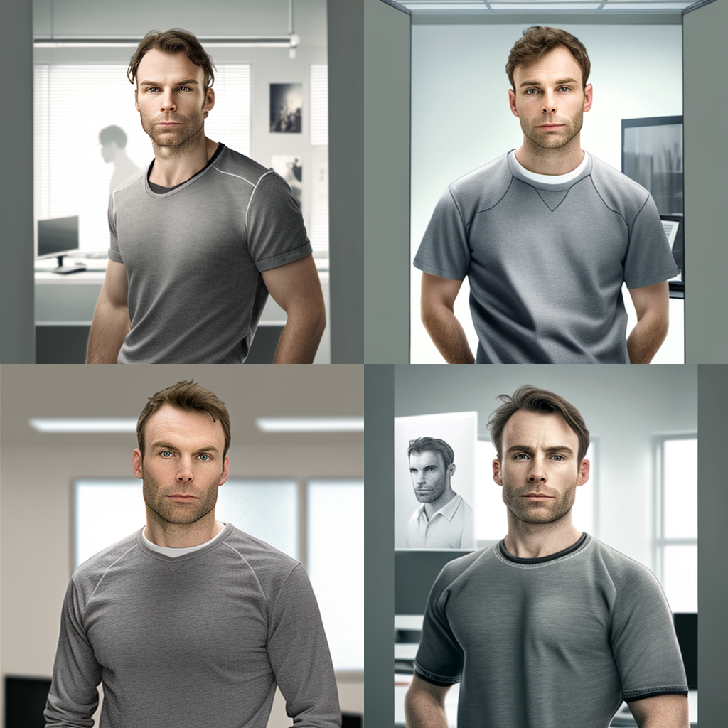
The first set, which had a decent variation, had minimal prompts.
The faces on #1 and #3 could pass as photographs, but the shirts and collars look drawn); #2 and #4 have slightly unusual cheekbones. #4 has a glint in the eye, which is interesting.
Looking at #3, it’s slightly Pixar-cartoonish (and are the eyes quite right?)
This time with a jacket. #4 looks the most realistic. Again, none look like me.
Wider shots, with the subject being smaller, could be more forgiving with facial features (#3).
This set was generated with no word prompts, just two source images. They’re consistent, but, alas, consistently not close to the originals.
There’s a lot of talk about bias in AI: a key prompt here was “friendly” and the results are decidedly more feminine.
Again without the “corporate” prompt, there’s a lot more variation in this set.
So it’s a way off, yet. And while there are options to further refine / create variations and possibly improve results, none of these originals was close enough for this to be worth trying. And to be clear: the primary goal here is photographic realism. If you like, there are of course plenty of options for interesting filters or styles one could apply to your LinkedIn portrait which aren’t photography at all (I recently saw a really effective set on a website (presumably architects or graphic designers) which had a clear Julian Opie look to them). But if an image is meant to be realistic, it has to look exactly like you.
You’ll note that I’ve smuggled in the assumption that a corporate portrait’s main purpose is merely to describe appearance. Which it isn’t. That’s a passport or the badge ID you’re thinking of. A portrait - yes, even the humble corporate headshot - needs to say something about the subject. Actually (in theory, at least) the mood / expression in a plain shot on a white background therefore has to count for more than a full-length environmental portrait (where clothes, surroundings and lighting help do the work for a more unique and interesting shot). That’s to say, the more easily something can be copied and regenerated, the more bland it would have to become. But I could be overstating this, and the market wouldn’t care: a free image which takes minimal effort and minutes to produce and remains pretty neutral will usually be preferable to a far more costly photograph which ‘says’ something.
And what about environmental portraiture? The below examples are extrapolated from the headshot, and are mostly awful (thankfully).
With just a headshot, the prompt here was “half-length, wearing a grey long-sleeved t-shirt, standing in a modern office.” #3 isn’t too bad, but the others aren’t anywhere near realistic enough to be photos, nor are they stylised enough to be anything else.
Stability AI (in DreamStudio) has the option of using data from (whilst keeping) an existing image to extend it. In another attempt (not shown here) I had it work on the source image at the same time, but it immediately looked less like me. #4 is the only one which nearly works. Perhaps a couple more iterations might something passable.
Starting with just a headshot, this is from DALL-E and took a couple of minutes to build. The description was, “Man in a long-sleeved grey t-shirt in front of a plain office background.” A few minutes further in photoshop and this could be passable.
Perhaps it’s just not what AI is good at. While so much of the concept art is truly brilliant, and some of it realistic, my first impressions are that it’s not directly a threat to portrait photography.
But I’ll check back again in six months.
*Stock photography is a zombie. It’s dead, yet it continues to feed by killing off potential commissions.
**I’m told that the effect of AI is already felt directly, or is soon to be, in photographic areas including automotive, fashion e-commerce, interiors and still life / products. I do a lot of portraits, and even if they can’t be done by AI, market forces mean that if other genres’ photographers’ work is reduced, it makes sense for them to move in on my patch (the positive term is “diversifying”…) in the same way that PR photographers had to move into weddings when the ex-press photographers joined their ranks, en masse, a decade ago. Leading to the question: where to go next? What genres will be safe tomorrow in an industry entirely based around technology?)
Freelance life and other animals
My background in press photography, and my life as a freelance
This post is a rambling set of tangents roughly based around what it means to be a freelancer: how I got here from starting out in press, and aspects of being self-employed that I’d never have considered. There’s an exciting part where I nearly get beaten up, and some comments about the death of news photography. There are thoughts about personal development and being one’s own boss. There’s a sad bit where I explain why I don’t go to Christmas parties. And some other thoughts. That’s it. No animals were involved, so apologies for the clickbait. Also, all the photos are very old. I umm’d and err’d about posting them (because, you know, brand) but which I decided to go ahead because in each caption I remind you that they’re old.
Background: I’ve been freelance for about 15 years, but I started out at the Derby Evening Telegraph as a trainee, part-way through my NCTJ qualification in Sheffield. We had seven full-time photographers and three people running things from the picture desk, as well as a few occasional freelancers. There was also a sports department, a features department, advertising, news desk, property, subs, motoring, and others. The newspaper was in its very own building with a car park, a printing press and a restaurant. This was when regional press photography was a skilled*, qualified profession.
Not now.
For a start, the job at a regional / local level no longer exists (I understand the DET staff is comprised of just three reporters, who work from home. If I’m mistaken, please correct me in the comments. Which I’ve turned off).
Press photography was about problem-solving under pressure, across a wide variety of subjects: hard news, sport, portraiture and events, all on deadline. From a house fire to an Ofsted report, a court snatch to a fashion show, a charity fundraising appeal to a murder, all in a day. The press photographer’s job was working out how to best to answer the question, “What’s the story?” in an engaging way. Now, I expect it would be rather closer to Lenny’s portrayal in After Life.
The definitive press photo, in that you should be able to deduce the story without any further information.
The dreaded “court snatch”. You’d have to go and wait outside the Crown court or (here) the magistrates’ court, and take a photo of the person involved in some or other case. Sometimes you’d have a clear description, such as “Female, aged 24, with one leg,” but more often than not you’d photograph everyone going in, and then ID them later in court. You could be there for an hour or more, offending everyone going into the building. Many people don’t take kindly to being ‘papped’, and those who have an appointment with our legal system on a rainy Tuesday tend to be the type to make their feelings clear. I was threatened with violence on a few occasions, often by those shortly about to face a judge specifically because of their violence. But it sold newspapers.
It wasn’t all exciting - far from it - but on the dull shoots things could be even more pressured. Because with less to work with, you had to think harder in order to make something interesting. And some jobs were, of course, repetitive (especially in the news cycle), but each time you found yourself back in the same place, or in a similar situation, or covering a similar story, it was another chance to do better. And this opportunity would create a shortcut to your thought process: your starting point would be where you’d ended up last time, yet you wouldn’t want to repeat exactly what you did before. You’d remember what didn’t work and what did, and would refine your approach. When you’d photographed Shrovetide football, a grieving mother, a court snatch, or someone complaining about roadworks (the epitome of press photography?) for the third time, you knew how to do it. To put it another way, there are certain ways to shoot certain things**.
Shrovetide football, held annually in Ashbourne. Violent and dangerous, the game has been played for hundreds of years and goes on for two days. It’s characterised by long periods of inaction as a giant scrum forms over the ball, suddenly pops up, is caught, a flurry of movement, then that person is mauled before a new scrum is formed over their battered body. Sometimes, someone gets free with the ball and runs to the goal - one or other side of town - but usually regrets their moment of glory after just a few seconds. Murder is strictly prohibited, but otherwise there aren’t a lot of rules. Anyway, the shot is almost invariably hands, faces and ball (essential) so get up high, be patient but be ready (and be very sure you’ve parked very far away, as anything in the way of the scrum gets trashed).
Regular football. It’s not as bad as cricket but that’s about the best thing I can say.
Anyway, as well as the variety of work, the best part was having your colleagues critique what you’d done as it appeared in the morning edition (whether you’d like it or not). Tips, experiences and knowledge were fuel and motivation for the next day - when you’d normally end up doing a bunch of completely different shoots.
In 2005, cuts were starting to taking place as newspapers’ income declined. It used to be that people would sell their house / car / dining-room table through the newspaper. There were ads for local tradespeople, dating ads and vouchers. Advertising revenues dwindled and then plummeted as people started to do all this online. And newspapers’ (usually free) online editions meant you needn’t actually buy a copy any longer. Photographers were one of the first to become expendable, as a low-quality submitted image of an RTA - which cost nothing - would beat a professional shot from a nearby bridge 20 minutes later. (People would, and still do, send in their images of snow or car crashes to mainstream media in the hope of five minutes of fame or perhaps with a sense of public duty, not realising the true value of their submission and seemingly oblivious that they’re dealing with/supporting multi-million pound industries who, incidentally, charge them to subscribe!)
After a few years I went to the Bristol Evening Post. Already a smaller team than it had once been, we were encouraged to work remotely, sending in images wirelessly. This was more productive and therefore more economical, but a drawback (for me, at least) was far less of the over-the-shoulder commentary I relied on to learn. I left after a year - the salary was a joke, I felt I wasn’t improving, and the writing was on the wall anyway. Staff who had left (across many departments) weren’t being replaced: I remember noticing I never needed to search for a car parking space under the building. I heard that just a few years later they sacked all the remaining photographers one Monday morning. And so, as I understand it, regional and local press photography is no longer a thing at all. There’s still the national press and various news agencies around the country, but I understand few of these are staff positions. And there are, of course, many other routes and backgrounds into professional photography, all with their own style and skillset. But press was a bit of everything. Front-line, messy and unforgiving, but also exciting and stressful, with moments of compassion and connection, and creativity***.
An old photo of a netball team who presumably won a competition. This was the second time I’d tried this noughts and crosses thing, and looking back all these years later (it’s an old photo) the idea still stands. Four girls and five netballs might be a better composition (because threes), but it would have been harsh to get rid of half the team for a better photo. As it is, a bit of tidying up the symmetry / lines and this would have been brilliant. It’s an old photo.
And so onto freelancing: press photography led nicely into PR photography - both are about telling stories - so that’s where I started.
The day-to-day is of course very different, but I won’t go into details here, concerned as it is with captioning, file storage, invoicing, finding clients, lens couriers, and bank holidays. There are other considerations which you don’t think about and are more interesting, or at least of equal importance. Many apply to many freelancing roles and not just photography, and certainly those who now work from home may be able to relate. So I thought I’d list a few of these observations.
For a portrait of this card-shop owner, I stole this idea outright from my truly gifted colleague Ben (who, as far as I know, actually came up with all his ideas). At the risk of massively oversimplify things, I’ll state that there are only ten basic ideas (here we have ‘framing’ and the ‘look-down’), and therefore it follows that by repetition, it’s impossible not to notice improvements.
Feedback is, I think, the biggest difference. I mentioned this earlier and know that it’s a similar issue now for many industries, with younger staff working from home. But entirely on your own, where feedback can be limited, means you’re in a bubble of one. Are you improving? Could you have done better, there? Thankfully, I’m on online forums where I can ask anything - technique to technical - and someone will help. And the range of backgrounds and skills there is extremely broad, and utterly invaluable, and has saved me on many occasions. But the hive mind is only plugged into when you’re looking for experience in a seemingly grey area of copyright law, or need contact details on fixers in Dubrovnik, or opinions on the latest AI software and its implications. It’s not the same thing as the (often harsh) daily dissection of what you shot, what you missed, and what you should have done differently on the only thing that really matters in the end: the picture.
There is, however, a different way you track your progress, and I alluded to it earlier. Press jobs would - literally - repeat, and colleagues would critique. While I don’t have these tolls for improvement, I do have repeat clients. They each commission a certain kind of work, and each have their own requirements or features. So inevitably I find myself working in similar ways on each occasion and I can compare, if not with the previous efforts, at least with past years’. And I can compare with photos in which I’ve use a similar idea (as with the examples of the chef and the card shop owner).
Moving on. Freelancing brings to mind the phrase, “You’re your own boss,” but I think it’s a misleading idea. As a freelance, you simply have a different boss for every job, with different requirements and a different relationship with each. If anything, you’re more like your HR, and - ugh - accounts. While there is undeniable freedom with one’s approach, working style and expectations (and therefore a fluid, creative, energetic and varied “work culture”, client to client) ultimately the work has to get done on time, on budget, to the best of one’s abilities. Same as for anyone. There’s no difference to being on staff as the demands are still on you, except that it’s often you alone. Failure won't result in a dressing down and another chance: it means you lose a client.
Further, there’s the picture editor’s adage: “I don’t want excuses, I want pictures!” usually as they hang up the phone. On my portrait shoot today, I had 30 minutes to set up but there was nothing to work with in the space I was given. Photography is one of those jobs where your imagination is the only limitation, and therefore the possibilities are both endless and mostly impossible to consider, and disregarded as we go down certain avenues of thought to reach the end, to get to the photo. It’s a sandbox profession in that, beforehand, I could have done (or rather, tried to do) anything I needed to make the picture work. From moving furniture, to blagging a better room, to asking someone if I could borrow their red jacket, or to see if I could find the owner of the expensive car parked outside***. The point is that I probably won’t ever meet the person who commissioned me, and they don’t know or care what I’d need to do to tell the story. That is to say, sometimes you’re completely on your own, and it’s scary when your career depends on it. Sometimes the work is easy, of course, but they’re never the interesting or memorable shoots.
And here we have ‘framing’ and the ‘look-up’ - so, basically the same picture as the card-shop. This is standard press photography fare whenever you photograph a chef, someone emptying a bin, or even a dentist (really). For the chef version, just ensure the pot is empty before climbing in.
And then there are meetings: I very rarely have to go to them. Surely that’s the best thing about freelancing. At least, I’m told over and over that this is a good thing. But I’m not sure. Because - on a serious note - with no colleagues, nobody really cares about my weekend or if I’m going on holiday. I don’t have Friday drinks, nor will I be invited to a Christmas party (I’m not crying. You’re crying.) It can be quite a lonely work life. And so, I think a meeting would be just lovely. And in the same way, regarding professional development, I’ve said that I no longer get much informed, critical feedback. And this is a very real consideration, as it can be hard to know what I need to work on. And certainly I’ve never a 360 degree appraisal. One of these, followed by a meeting with biscuits, sounds like heaven.
Obvious but it needs repeating: unlike employment, if you have a day off, it’s unpaid. Also, no sick pay, no holiday pay. Obviously. And no bonuses. And nobody will care when I retire (again, I’m not crying. You’re crying). But actually, the hardest one of all is that there are no promotions. As we’ve already covered, there is no clear progression to look back on, or forward to, nor any recognition of one’s experience.
Technology affects the employed and freelancers alike, and is of course double-edged. Improvements in camera technology and editing tools make work easier; and results more reliable and faster. If I’m concerned, it would be on the threat to photographers specifically, because now there’s less need to understand the what’s and why’s. Many of the things for which I worked hard to learn yesterday are automated with a single click today. I’m sure every generation feels that the next is less skilful and knowledgeable, that the barriers to entry are lower with each new update; but can we agree that the compound, multiplying pace of development is hard to keep up with? And so in practical terms, it’s just getting easier to produce decent results from poor ingredients (a.k.a. “good enough”). The result is that at some point one might begin questioning exactly what one can offer as a professional. As a freelance, it’s then up to you to learn other skills or offer new services - itself nothing new - but you have to work this out for yourself, and hope that these skills will remain relevant. Many freelancers go into drone photography, video, weddings, assisting or teaching.
Freelance or not, as an aside, photographers have to deal with the significant number who believe that a big camera means good pictures, which can be rather demeaning. Misunderstandings about any profession are quite normal of course, but as everyone takes pictures, everyone has an opinion. I’ve met a few people who are clearly stunned when they learn I make a living from it: “How’s the (actual finger quotes) “photography” going?” they ask.
Finally, I was never told about the positive feeling that would come with any booking, any enquiry. A new client means there’s been a recommendation somewhere. A repeat booking means a happy client. And for these, you’re forging a relationship built on shared goals, and it’s in a different space, far outside office politics. I’d go further still: for the more creative work, to have a client want to go with your style and approach - well, that’s really something. But in general it’s so liberating to be treated as an expert and left to use one’s judgment and experience entirely. And there’s nothing quite like the feeling of nailing a photo, especially on the occasions where you’re making something out of nothing. And if it’s all on you when things go wrong, then it’s only fair to take credit when you get it right. Also, win or lose, you’re always improving: you can’t help not be.
One final, final note: some people think you’re an artist. Although I’m not, I don’t mind being thought of as one.
*Others were skilled, like my former colleague Jane. Me, not so much.
**This idea is actually very important, but so tangential that it needs its own blog post (at a later date).
***Moving furniture is about as creative as I go.
Recent work - November 2022
Commissions for AB magazine, Drapers, iCrossing, and others
Recent work for AB magazine, Drapers, iCrossing, and others.
Recent work - July 2022
Portraits for GSK, GoFundMe and AB magazine
Recent location portraits for ACCA, GSK, and GoFundMe.
-
June 2025
- Jun 19, 2025 The forever purge
- Jun 11, 2025 Recent work - June 2025
- Jun 6, 2025 On Looking
-
January 2025
- Jan 21, 2025 The photographer's dictionary
-
November 2024
- Nov 19, 2024 Recent work - November 2024
-
September 2024
- Sep 17, 2024 Recent work - September 2024
-
July 2024
- Jul 4, 2024 Mean Girls
-
May 2024
- May 28, 2024 Wakehurst
- May 20, 2024 Graduation
-
April 2024
- Apr 16, 2024 Recent work - April 2024
-
January 2024
- Jan 22, 2024 Recent work - January 2024
- Jan 9, 2024 Long live the local
-
October 2023
- Oct 13, 2023 CBRE
- Oct 4, 2023 Recent work - October 2023
-
September 2023
- Sep 22, 2023 Seeing past the subject (2)
-
April 2023
- Apr 12, 2023 Recent work - April 2023
-
February 2023
- Feb 7, 2023 Will AI do me out of a job?
-
December 2022
- Dec 12, 2022 Freelance life and other animals
-
November 2022
- Nov 4, 2022 Recent work - November 2022
-
July 2022
- Jul 26, 2022 Recent work - July 2022
- Jul 25, 2022 SOAS
- May 2022
-
January 2022
- Jan 6, 2022 Recent work - December 2021
- Jan 5, 2022 Prevayl
-
December 2021
- Dec 17, 2021 The day the hairdressers opened
-
December 2020
- Dec 15, 2020 SOAS - postgraduate prospectus
- Dec 7, 2020 Online teaching
-
October 2020
- Oct 11, 2020 Gratitudes
-
September 2020
- Sep 24, 2020 Headshots: why we need them, and why we don't like them
- Sep 15, 2020 From the archives - seven
- Sep 10, 2020 Recent work - September 2020
-
February 2020
- Feb 13, 2020 Mootral
-
November 2019
- Nov 7, 2019 Biteback 2030
-
September 2019
- Sep 16, 2019 B3 Living
-
July 2019
- Jul 22, 2019 Recent work - July 2019
- Jul 19, 2019 From the archives - six
-
April 2019
- Apr 15, 2019 Recent work - April 2019
-
March 2019
- Mar 12, 2019 International Women's Day
-
February 2019
- Feb 4, 2019 Recent work - February 2019
-
January 2019
- Jan 17, 2019 Four photographs
-
December 2018
- Dec 10, 2018 From the archives - five
-
November 2018
- Nov 26, 2018 How to compose photographs
- Nov 5, 2018 Recent work - November 2018
-
October 2018
- Oct 17, 2018 How to edit photographs in Instagram
- Oct 8, 2018 Out with the old
- Oct 4, 2018 Recent work - October 2018
- Oct 1, 2018 A little learning is a dangerous thing
-
September 2018
- Sep 12, 2018 From the archives - four
-
August 2018
- Aug 16, 2018 Recent work - August 2018
- Aug 15, 2018 I don't follow you
- Aug 6, 2018 Cookpad
-
June 2018
- Jun 7, 2018 Monks & Marbles
-
May 2018
- May 23, 2018 Netflix & Woof
- May 21, 2018 Best of Instagram
-
April 2018
- Apr 24, 2018 Standard Chartered Bank
-
March 2018
- Mar 16, 2018 Corporate self-portraiture (two)
- Mar 8, 2018 International Women's Day
-
February 2018
- Feb 9, 2018 Winter swimming
-
January 2018
- Jan 16, 2018 2017 in pictures
-
December 2017
- Dec 6, 2017 Toyota Mobility Foundation
-
November 2017
- Nov 24, 2017 Corporate work
-
October 2017
- Oct 31, 2017 Recent work - October 2017
- Oct 13, 2017 Pfizer - Protecting our Heroes
-
August 2017
- Aug 22, 2017 Wyborowa vodka
- Aug 1, 2017 Vauxhall animation
-
July 2017
- Jul 20, 2017 Take your parents to work
-
June 2017
- Jun 22, 2017 Recent work - June 2017
-
May 2017
- May 9, 2017 Huawei - The New Aesthetic
-
April 2017
- Apr 24, 2017 S.H.O.K.K.
-
March 2017
- Mar 30, 2017 Parkour Generations
- Mar 27, 2017 War Horse in Brighton
- Mar 20, 2017 Jane Eyre
-
January 2017
- Jan 23, 2017 Framing 101
-
December 2016
- Dec 14, 2016 Studio Fractal
-
November 2016
- Nov 29, 2016 Musician
- Nov 10, 2016 While I was waiting...
- Nov 3, 2016 Canvas
-
October 2016
- Oct 11, 2016 Rose Bruford
-
September 2016
- Sep 21, 2016 Instawalks
-
July 2016
- Jul 28, 2016 Property brochure
-
April 2016
- Apr 6, 2016 Breaks and burns
-
March 2016
- Mar 31, 2016 Mixed bag
- Mar 1, 2016 Sky Garden
-
November 2015
- Nov 10, 2015 Romain Grosjean
- Nov 2, 2015 Egosurfing
-
October 2015
- Oct 1, 2015 Ratings are overrated
-
September 2015
- Sep 15, 2015 Seeing past the subject
-
August 2015
- Aug 25, 2015 British Gas
- Aug 19, 2015 Problem solving vs creativity
-
December 2014
- Dec 15, 2014 2014 in pictures
-
January 2014
- Jan 9, 2014 2013 in pictures
-
December 2012
- Dec 31, 2012 2012 in pictures


