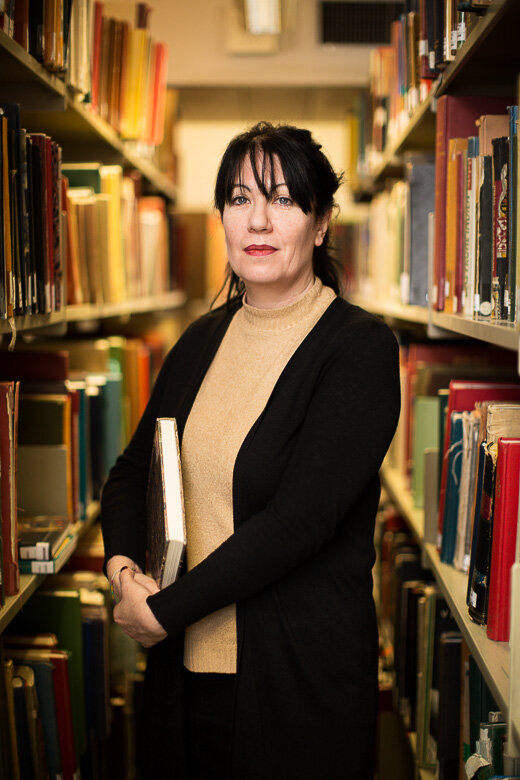
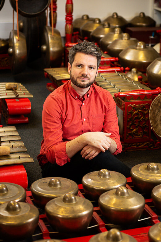
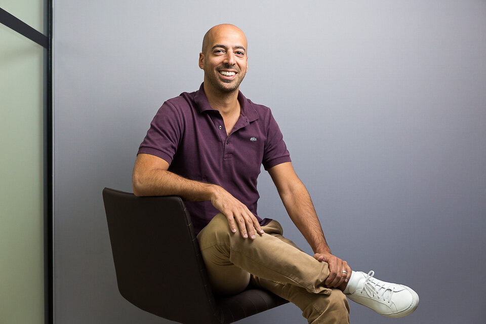
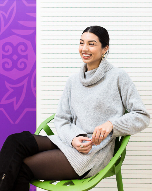
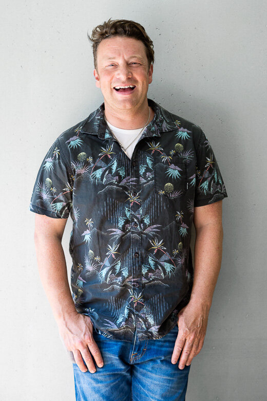
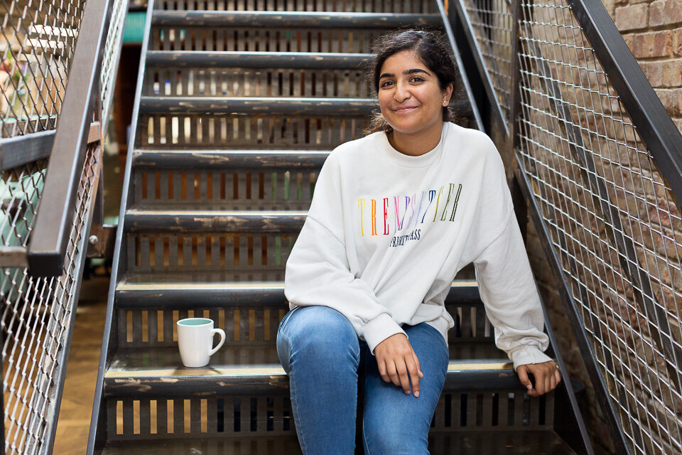
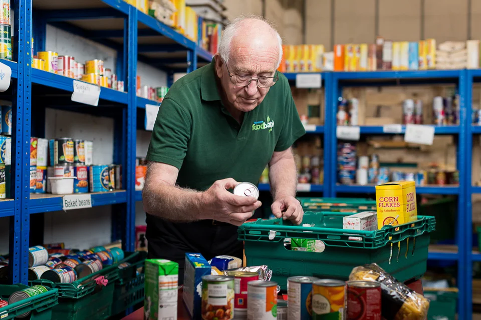
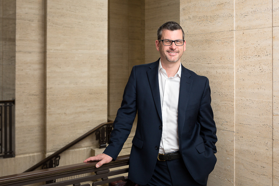
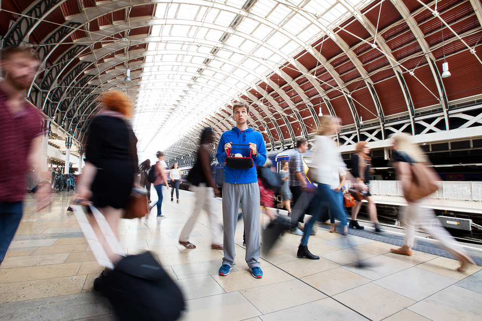
I did some portraits for SOAS’ undergraduate prospectus early in 2020. It was my first commission for them, so it was great to be called back in the summer for the postgraduate version. Not only because I really enjoy this kind of portraiture, but because, as a freelance, there are no promotions or appraisals (even feedback, as I’ve said elsewhere, is often limited). Being commissioned again is the equivalent of a positive review, as is being recommended to another client. Even better is to be taken on as a regular supplier - or indeed, where possible, the main photographer.
Online teaching
I’ve been running online group classes recently. My approach to photography is about experiencing the world as a visual space. It is to see things - and then show them - differently. That’s the photography side. With regards mental health, I’d argue practising it lies somewhere between enjoyment, meditation, and escape. And apart from this, the assignment given after the first session is both an opportunity and a reason to get outside during these dark, winter months.
I’m thrilled by how teams have engaged with the ideas, and so it is with pleasure that I can share a selection of attendees’ images which have resulted from these sessions:
As you’d expect, many were taken on weekend walks: leaves, autumn, and a chill in the air.
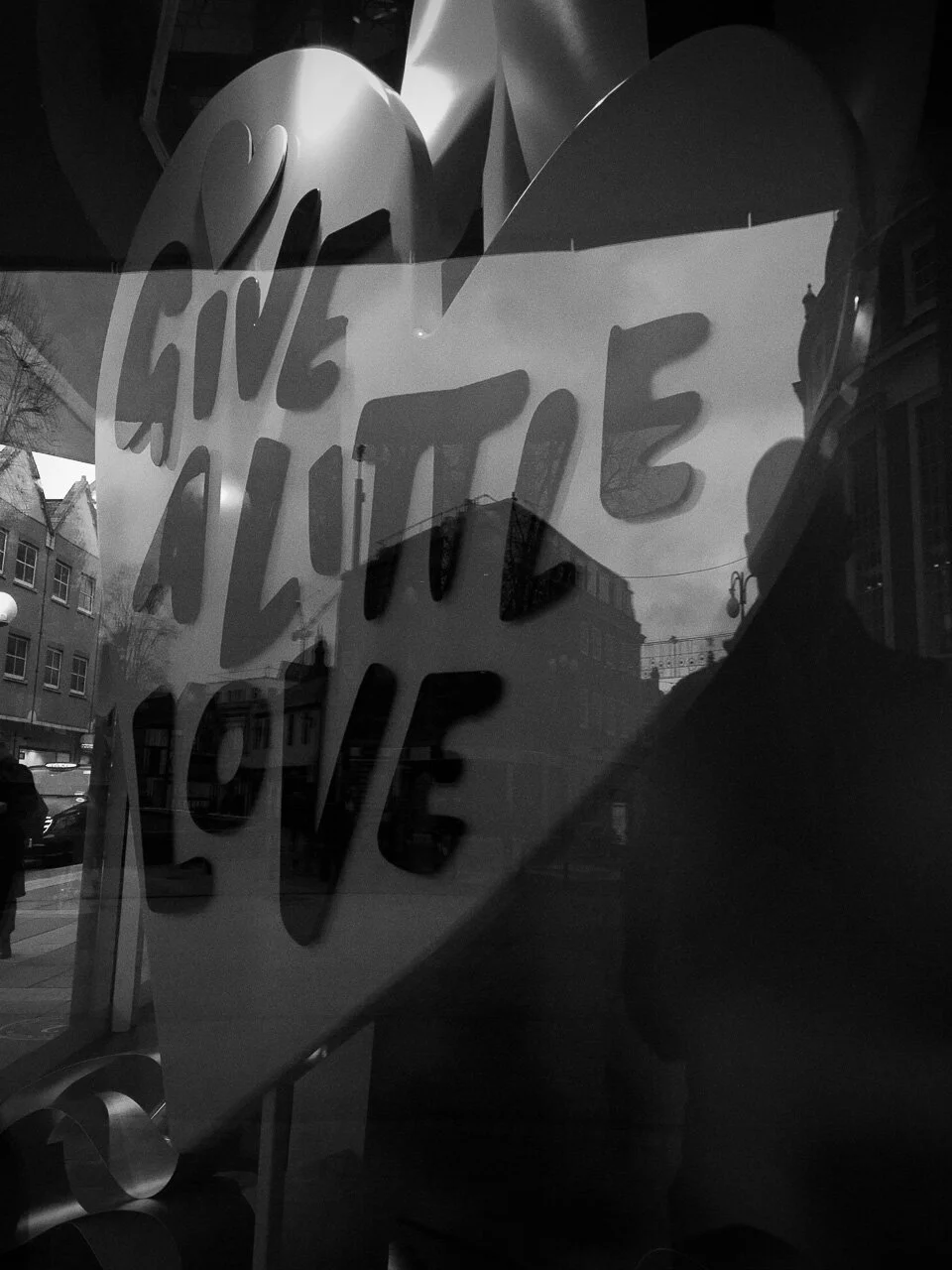
Others, on lunch breaks and evening strolls, found inspiration in the cities and towns.
Many of the images were shot at home. This resulted in a few cats (perhaps too few for my taste), various details of household objects, and even a DJ.
Some went creative…
… and others went all the way to abstract.
I’m really enjoying these and intend to continue after things return to normality. If you’d like to take part, get in touch.
Gratitudes
Once a week or so, usually over dinner, we “do gratitudes”. I got the idea from positive psychologist advocate Shawn Achor some years ago: simply list three things from that day for which you’re grateful.
It’s easy to whinge: we can reel off our disappointments, complaints and regrets without difficulty, and we do so regularly. But thinking about the positive things we’ve encountered during the day can be hard.
By changing our focus, the aim is to change our perspective on the same reality, highlighting the good moments we’ve had, or even finding something useful or fulfilling in an experience which we’d otherwise label as entirely negative. It can turn things around, and indeed Shawn recommends doing it especially when you’ve had an awful day, when you just want to be angry, flat or tired.
Things are awful at the moment for so many people. It can be almost impossible to see very much to be grateful for in an otherwise largely bleak situation. It occurred to me that for the past several months, I’ve hardly taken a single photo for myself. And this can’t be a coincidence.
Normally, I take pictures all the time - or, at least, I go through regular phases. But I’ve barely noticed anything since March, or not cared enough to shoot it when I have seen something.
Of the shots I would normally take, I only keep a small number. And only a few of these I upload to my Instagram (look for the weird abstract ones, sitting amongst the portraits and other commissioned work). As I say, I don’t show all of them: most just aren’t very good. I take them for the pleasure of the moment, and then forget about them. I put the ‘best’ ones on Instagram*. I enjoy it.
I think my lack of interest of late is uncharacteristic, and it means I’m disengaged.
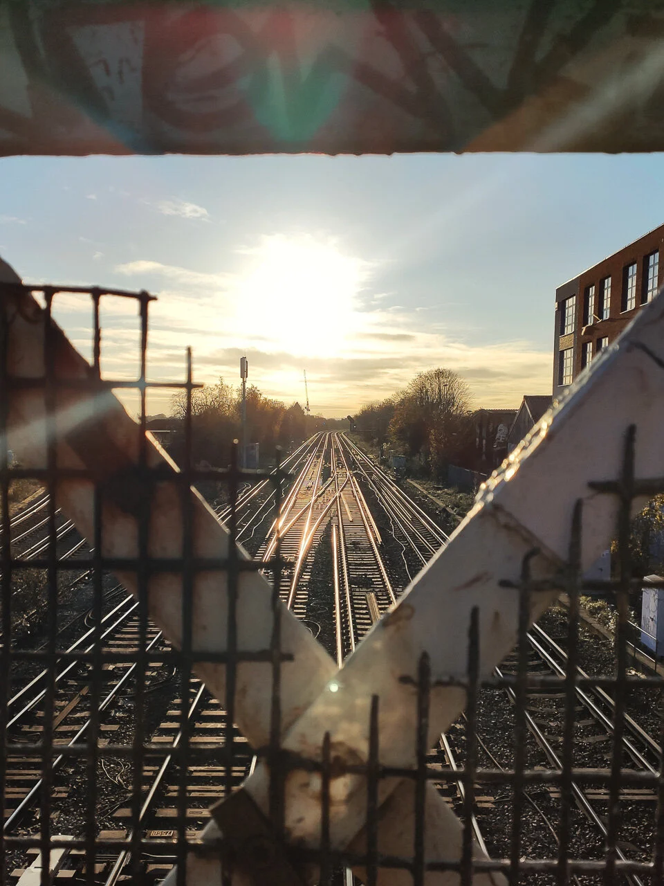
When I’m feeling engaged, I’m able - with an easy change in attention as I go about my day - to look for these details, lines, shapes, reflections, and tones. Looking - really looking - is an exercise in itself, even without taking a photo. And this type of (usually abstract) photography is precisely not about having interesting subject matter, or models, or lighting, or storytelling. No schedule or deadline. It’s simply playing with the language of photography, devoid of context, at one’s own leisure. So, a mix of colours here. A hard shadow there. As I’ve said elsewhere, it’s often about physical objects as purely visual objects. Matter plus light.
These elements are literally everywhere, and we all have cameras. It’s about appreciating the world around, if not as something beautiful, at least as something visual. I think that taking pictures for ourselves - with no audience in mind, and no other purpose than simple pleasure - is another way to express gratitudes. It’s the photographic equivalent of listing what we’re grateful for, what we see. To express them, visually.
It’s quiet at the moment, but I’ll be allowing myself some time off this week to go and take some photos for myself. After yesterday’s World Mental Health Day, and with possible further isolation likely, my small suggestion is that you could try the same.
Ceiling corner.
I’ve covered my general approach in older blog posts, but otherwise, to get you started, here’s how to do it:
Allow yourself 30 minutes’ shooting time.
Choose two of (say) the following: colour, shape, pattern, shadow, detail. Your location and the weather will help determine which. So if it’s cloudy, you’d have to work hard / get lucky to get images which are about shadow, as in the image above of the ceiling corner. If you’re near an outdoor market, then looking for details (ie close-ups) should yield some good results. If you’re in the countryside, photos about colour might be limited to flowers.
How do you know what to look for? Whatever catches your eye. By definition, it has moved you. And so it follows there may be something in it. You know when you see it. It’s about learning how to really pay attention to how things actually appear, how things are devoid of their function and context, and our own assumptions. Here’s the relevant link again in case you missed it before.
There are often photos to be had with graffiti (and the work’s 95% done for you). Picking an interesting part of the artwork and taking it out of context is the necessary step.
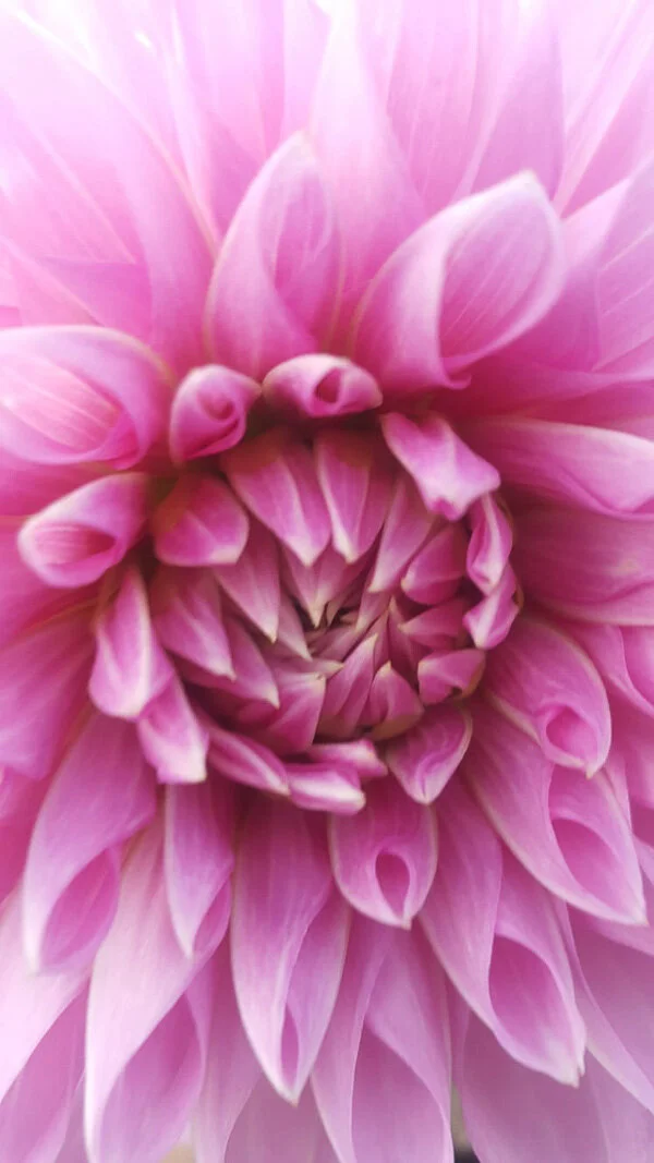
If you’re struggling to see anything interesting, remember there are often ‘fallback’ images to look for. Close ups of fruit. Reflections in puddles. The symmetry of flowers, shot from just above.
If you’re still struggling, limit yourself further. Just look for things that are red. Or diagonal lines. Or graffiti.
Once you’ve found a subject, then it’s onto problem solving. A quick snap won’t do it - you have to capture the essence of the thing you noticed.
How? That’s the question. But start by working around the subject. Get low, high, close, far. Change the composition, or what elements are in the frame. Find the most direct way to show what you’re seeing: it should feel like work, and challenge you. It’s a process, not a single event. And to shortcut this process, keep in mind that very often, less is more with this kind of photography. Which tends to mean getting close, taking elements out their context. Actually, if you are using a phone, it has quite a wide angle of view. So you’ll likely need to get in close anyway, to remove distractions from the edges of the frame.
With abstract photography, it’s irritating when we try to guess what something is. It misses the point. However, with these sorts of shots, I often think in terms of what something looks like, and that shapes my approach.
Take at least three or four shots per situation, and allow yourself no more than a minute or two. Then move on.
If you can, perhaps meet with a friend for a coffee beforehand, go off your separate ways for the activity, and then reconvene to compare your results.
Maybe you’re not feeling it and you can’t ‘see’ anything. Maybe you’re not enjoying it, or your friend’s photos are way better than yours. That’s fine. You’ve had some exercise, you’ve had some fresh air. And that’s enough.
Give it a go - it might help!
*Actually, sometimes I almost wish I didn’t put any on IG, and shot just for the enjoyment of the moment and for nothing else. There’s a part of me that critiques them hard in the moment, with an audience in mind. I suppose, yes, this does also serve to make me look/work/think a little more, rather than have me just taking snaps. It also might delay gratification until later - the joy of a more polished, considered photo which others can enjoy.
GoFundMe Heroes
Former rough-sleeper Roy Celaire crowdfunded his place to study at Oxford University.
Astrid, 13, has been raising money since she was 9 for her ‘Kits for Kids’ fund, which buys Christmas presents for homeless children.
Patrick Vernon OBE started the Windrush Justice Fund.
Austen, 9, is fundraising for his tea company, which will employ autistic people.
Headshots: why we need them, and why we don't like them
Why do we need a headshot?
At a very basic level, it’s identification: age, sex, appearance. Something to stick on an office ID swipe card, but taken nicely, perhaps.
Yes - but it’s much more. More than just a first impression, it’s a personal statement. It’s branding. Like it or not, it suggests information about us, both personally and professionally. We make judgments based on how someone looks. Not just how someone dresses, but the very shape of their face, even the colour and style of their hair.
Why don’t we like our own photos?
One obvious answer, of course, is the increasing ubiquity for many years, and throughout our culture, of ‘perfection’, or at least the importance of one’s appearance fitting a certain standard. And for some time it hasn’t been solely in magazines, films and on billboards. Every day, people look better than they do on Instagram, to name just one platform. On our phones, post-processing algorithms for a smoother, thinner, brighter whatever are now automatically, immediately applied whenever we press the shutter. We don’t even have a choice. A computer is telling us that we could be, and should be, better looking. Maybe that’s true in your case, I don’t know.
The theory I prefer is to do with our faces being asymmetrical. When we look in the mirror, as we do every time we leave the house, our left is on our left. But for anyone who meets us and - crucially - in any photograph of us, will have our left on the right, and vice versa. That is, whenever we look at our own image, it’s not the same as that which we see in the mirror. Hence we’re uneasy about it. There’s a wonderful, thought-provoking series by Alex John Beck where he makes symmetrical portraits from each half of a face, raising questions of beauty and identity. And there are apocryphal stories of clients complaining to photographers that the photos from their session are no good. The photographer sends the set over again, but flipped 180°, and gets the frustrated response, “These ones are much better! Why didn’t you send them the first time?”
And there’s also the process itself. You have an allocated time slot in a production line. It’s reminiscent of tedious school portraits, but instead of idling one’s time away from double maths, it’s over a deadline, or it’s a meeting being interrupted. Most often in a conference room filled with studio lights, and expectations to smile for a stranger. Knowing our new photo could be the corporate portrait we have to use for the next several years.
So how can we get the most from it?
Let’s start with a few pointers:
Get your hair cut a few days before.
Wear simple, comfortable clothes - nothing too busy or colourful - and make sure they’re ironed. Ideally nothing bright white (this usually doesn’t work on a standard white background for a standard headshot) - or at least wear a jacket. Equally, jet black can look severe.
Arrive at the session a few minutes early. Being late knocks on for everyone after, and means you have less time. More time equals more options, as well as an opportunity to relax into the session.
It’s natural to be self-conscious. It means you care about the result, and how you look.
Ask to see a few of the photos as you go. There may be an angle you prefer, or your necklace may be too much, or you may feel you look too serious etc. At the very least you'‘ll feel confident in the photographer, and that these are so much better than you thought they’d be.
Don’t fret about anything temporary eg. blemishes, tired eyes. Anything which wouldn’t be there in a fortnight, or after a good night’s sleep, will be taken care of in post-production.
Nearly everyone has something they don’t like about themselves: this is not the time to focus on it. And it’s true to say that nobody else notices it, or cares very much. Remember, the photographer, your colleagues - everyone - wants you to look your best. You owe it to yourself to make the most from the session with a positive attitude.
What do you want to show?
With those basic tips out of the way, the purpose of corporate portraiture is to convey your positive attributes. It’s much more than the binary smiling/not smiling (equating to friendly/serious). Here’s a list of some of the more common traits we might wish to use to describe ourselves:
adaptable · confident · creative · determined · direct · educated · experienced · energetic · enthusiastic · good communicator · intelligent · kind · leadership · open · proactive · patient · personable · relaxed · reliable · team-player · thorough · well-rounded
The first thing to say is that you can’t convey any of these attributes - not one - in a photo. The idea is nonsense.
So, how do we show them?
Well, what is our language? It’s the background, composition, the lighting and clothing. Gesture, expression and pose. It’s body language (there’s a clue in the phrase), and, of course, it’s the eyes. While they can’t directly translate adjectives, they can suggest them, or talk around them. Picking up where language ends, and taking over where words are insufficient.
Where there is correlation, I’d concede only that a photo could point to the most obvious characteristics. A smile means friendly; a suit and tie implies corporate; hair up suggests business (hair down, casual) etc.
Secondly, while it is certainly more than just a choice between friendly or serious, let’s not overstate how specific we can be. The example adjectives listed above overlap with others, and some are, effectively, synonyms eg ‘confident’ looks the same as, or could be read as, ‘experienced’, say. Furthermore, some characteristics (eg team-player, well-travelled) couldn’t apply at all in a photo; they can’t be interpreted from an expression.
So take your list of characteristics, and pick two.
Remember: not every attribute is desirable. One’s sector, role and experience will determine key values. A graphic designer might want to appear creative; a therapist, a good listener. A law firm wouldn’t value skills relevant to a school, and neither would want the same as, say, an advertising agency. Sometimes, the same qualities apply to each end of the spectrum: a CEO and a graduate might both wish to show experience and energy, but for different reasons. All this is so obvious as to be barely worth mentioning, except as to highlight the point that you can’t - and wouldn’t want to be - everything.
You can choose warm and personable. But you can’t (in the same photo, at least) be direct and no-nonsense. As CEO, do you want to appear as a leader, or one who listens and collaborates? Does an influencer want to portray gravitas, or quirkiness? Is it better to emphasise enthusiasm (associated with youth) at a cost of experience (associated with age)?
Choosing your image
When the unedited options come back, it’s usually worth asking colleagues their opinions, but ultimately you choose what you want to convey and which option does it best. Doing so, you need to keep in mind how you come across in person, and/or how you’d like to be perceived. You select the photo which will reinforce this brand image. Or, in rare instances, the one which changes it.
In the end, most people just want to look their best. But it’s not a hard question of taking the most professional-looking image and putting it up against the most flattering one. No - they’re usually the same photo. That is, the most professional image is the most flattering, because conveying those attributes makes it so.
If you need a new corporate portrait for your website or LinkedIn, get in touch.You can see examples of my work here.
Afterword / Corporate self-portraiture (three)
It’s hard to espouse the importance of a headshot when you don’t have one. I wrote the piece, then reflected that I’ve not been using a photograph of me on my “about” page for about two years. The only shot of me I like, and had been using, was taken nine years ago, My attempts since (the first is here, second is here) didn’t quite work, and weren’t much used. It was time for a new photo.
My original headshot, which was getting old. Shot by my extremely talented friend James, this covered everything I’d want to convey, along the lines of creative/artistic and experienced/capable.
So I started with a similar setup this time around - but, as I’ve said before, it’s very hard to photograph yourself. Where James’ original shot had a lovely balance of simplicity, dramatic lighting, and capturing a natural expression, this felt forced throughout.
I then simplified the setup, shot about 30 frames, and ended up with this, which is what I’m going with. Mostly this uses soft window light, and I opted for a brighter background and top, hence less drama but something more natural. It’s not perfect but it’ll do.
From the archives - seven
Portfolio woes
Making a portfolio is easy: you start with the images you like, and from there select those which best represent you.
You then remove shots with a similar style or subject matter. Ditch any which don’t sit well with the rest of the gallery, and those which will date badly. Delete ‘one-note’ images eg portraits which solely rely on a subject’s celebrity status; fisheye shots; basic silhouettes. Get rid of generic, broad images which have no discernible or unique style. But equally, consider setting aside highly-stylised images (as these risk defining your abilities too narrowly). Finally, dump any you’re not quite sure of.
If you have anything left, that’s your portfolio.
This was from my very first portfolio, and I was really proud of this, once upon a time. This was my NCTJ (basic press photography qualification) entry as the sports image (back in the early 2000’s). Looking at this photo after so long, I can say it’s pretty rubbish.
Maintaining a portfolio over time is even worse, as you never really get past the starting point: you hate nearly everything you’ve shot. It’s just the way of things: partly it’s over-familiarity, and partly it’s one’s critical eye.
Out with the old - two
At the start of lockdown, I culled a number of photos from my website: my efforts last time didn’t go far enough, and I’d felt for a while that more pruning was necessary to improve my portfolio.
This was my sports entry for the NCE press photography final exam (perhaps from 2005?). Again, I must have liked it once, but now think it is a horrible image and it hurts my eyes. Our final exam requirements also included portraiture, news, fashion, night, use of flash, weather, and some other things. I still have my final portfolio, and may scan the images for a future blog. Or cringe, and bin it.
For me, although I may dislike my work(!), that’s not the hard part. I find this inevitable boredom with one’s own images can, at least, help with objectivity.
No - the tricky part is separating an image from its context: how difficult it was to achieve, how technical, how pressured, how enjoyable, even. And the more that goes into our images, the more we want to like them. We are there through their creation and delivery: the more memorable and significant, the more inextricably tied up when we view them. Yet, rarely do these aspects actually come through in the final image in any meaningful way. They really shouldn’t count for anything.
All that matters, in the end, is that a portfolio should show the best work you can do and the work you’d like to do, as I’ve said above. All the while having a clear, consistent style. Subjectivity is only there as a guide. Be objective. Yet even the most ruthless approach brings doubts, later.
The best way around this issue is to have someone else do it, with your potential clients in mind. It’s your shop window, after all, and not a vanity project. A fresh and unbiased point of view is painful but - with trust and understanding - the sensible way to go.
…nah. Perhaps next time. And after removing a dozen or so irrelevant or weaker images, I was happy enough.
Diamonds in the Rough
I expect that for many photographers there’s something inevitable about the occasional browse through the archives, especially during lockdown. I do this anyway from time to time, collecting content for my occasional “From the Archives” blog series. On this occasion, my portfolio having been on my mind and little actual commissioned work, I was soon at it with a different mindset: actively trawling for photographs I’d once liked and discarded, to put them on my website.
Yes - finding ‘new’ images rather undermines the earlier cull - but anyway. And I knew a positive result would be unlikely.
We’ve all done it - we hope for a rediscovery of a photo in some unhelpfully-named “Maybe” folder which, with a fresh look after some years, aligns with one’s style again. One which might represent what we can and want to do, which could then be put into a portfolio. It would be something previously unappreciated, carelessly ignored. Something which with a bit of a dust-off, a new interpretation (we’ve since forgotten the context of the image), even a fresh run through PS, would be enough to get it onto the website. A new image, without even leaving the house.
The typical ‘deadpan’ portrait was one from a ‘Maybe’ folder and keeps coming up when I trawl old folders. I so want to like this kind of Sunday supplement image (or at least my efforts at them). But I don’t. I used to try to shoot this way from time to time, but it always felt forced. In this case, it didn’t really suit the subject. Somehow, others do the same shot better, and I’m never sure what ingredient is missing when I try. And although it’s important to push our boundaries and try things, with some shots I find I don’t really care after a while. This particular style is just not me.
Not from a “Maybe” folder, but posted as it’s the same basic shot as above, but this looks like I’ve done it more my way: a smile; her feet skewy; and her hands where she wanted them. Still, it’s nowhere near good enough for it to make the grade - it’s too simple a portrait.
Taken during corporate portrait sessions, these two images (above and right) were once potential portfolio material. While, I suppose, they fail by traditional standards, I felt they could perhaps fit in the portrait gallery instead.
However, on revisiting them again, nothing had changed. They’re not strong enough as portraits, and aren’t corporate. And perhaps the reason they don’t work is precisely because they’re neither one thing nor the other.
In the end, nothing was added to my website. But it’s never time wasted. Whenever I look through old work, I’m stock-taking, seeing how and where I’ve improved over time, how my approach and style have developed. Improving in some areas, and by definition, narrowing at the same time.
Oddly, I even notice things I used to do better. Or rather, I wish from time to time I could get something back of my older approach and style which, although less mature and of lower quality (technical and aesthetic), has an appeal, with its simplicity and immediacy. The combination of enthusiasm and ignorance.
There’s almost never anything good in old portfolio folders. And fewer which fit with what we’re up to now. It’s very hard to justify an image that never made it before, regardless of a retouch and wishful thinking. They all lack something - whatever was missing the first time, with years added.
From the Archives
Still, some images catch my eye even if they’re not very good. Often unworthy of much commentary, they’re interesting nonetheless - hence my “From the Archives” sets. These last few images below (to clarify - not potential website material) are some which popped up on this occasion:
Take that jarring colour palette from the earlier motocross shot, and add it to a dreamcoat.
Jazz hands, off-camera flash, a low angle, saturation off the scale, underexposed sky: this is a staple of simple, quirky ‘show picture’ press/PR photography. It actually ticks those boxes quite well - it’s not bad for what it is.
I always felt this was one of those images which, with a few tweaks, could have been very good. It’s an example of how the little details can add up. Maybe not now, but at some point in the past, this could have been a possible portfolio shot but for some simple improvements: a looser composition overall; the hand on the right lit properly; both hands more visible; a better sky; a bit more expression; jacket tidied up and/or pulled out at the bottom, perhaps filling the bottom of the frame with some movement blur.
Seeing these things and taking care of them in the time available for this sort of photo is a tall order, but the more you do it, it becomes second nature. If you didn’t read the link earlier, I talk about this in depth here.
This is another ‘show picture’, which I use in my Instagram / photography classes as an example of storytelling. A local school was creating a newspaper (boring), so I had them hamming it up (fun).
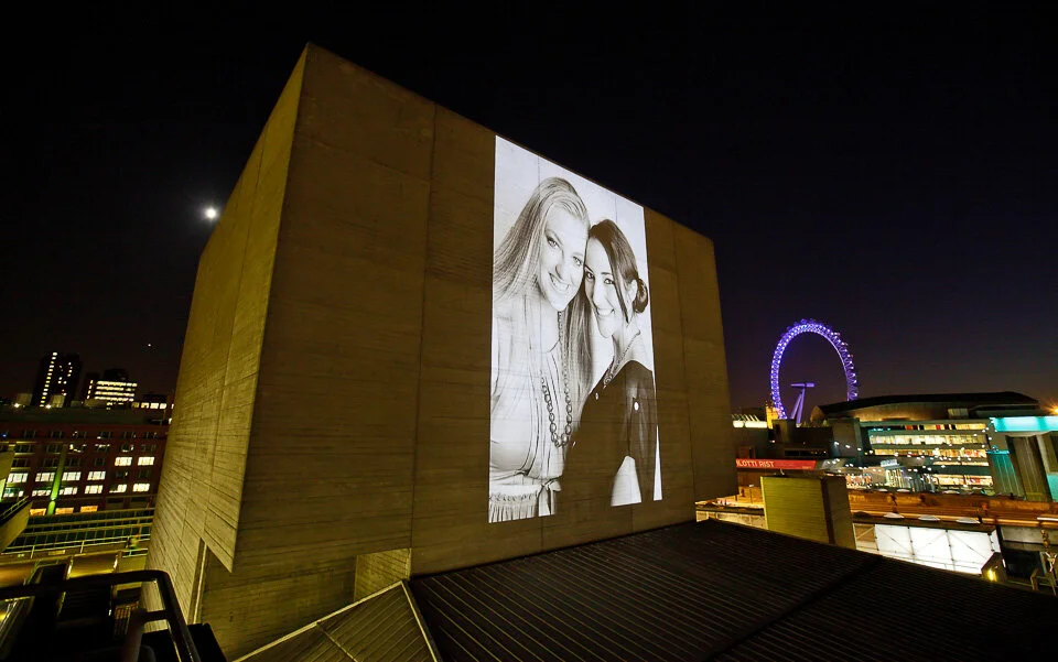
Nothing to do with show pictures or portfolios, but to close today’s post, this was an interesting one for me. A PR commission from many moons ago, above is one of the shots from a quick portrait session I did of two competition winners.
A portrait exhibition (not mine, alas) was being projected onto the National Theatre’s Flytower, on a loop. Part of competition prize was to have these images they’d just had taken, displayed first, to up open the show.
Recent work - September 2020
It’s been a little quiet lately on the photography front. So if allow me to use the term ‘recent work’ loosely, then here are a series of portraits:
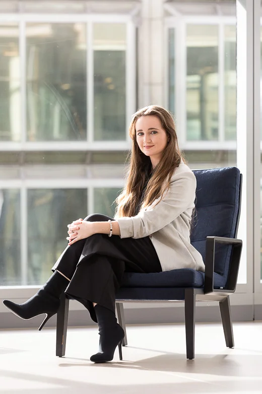
Shot for the SOAS University of London undergraduate prospectus (above, right, below and below right).
Corporate portraiture for OakNorth Bank.
(above and right) Corporate portraiture for Satellite TV service Freesat.
Actor Tyrone Huntley, for Mousetrap Theatre Projects.
MP Sarah Olney, for Accounting and Business magazine.
ACCA President Jenny Gu, also for Accounting and Business Magazine
Mootral
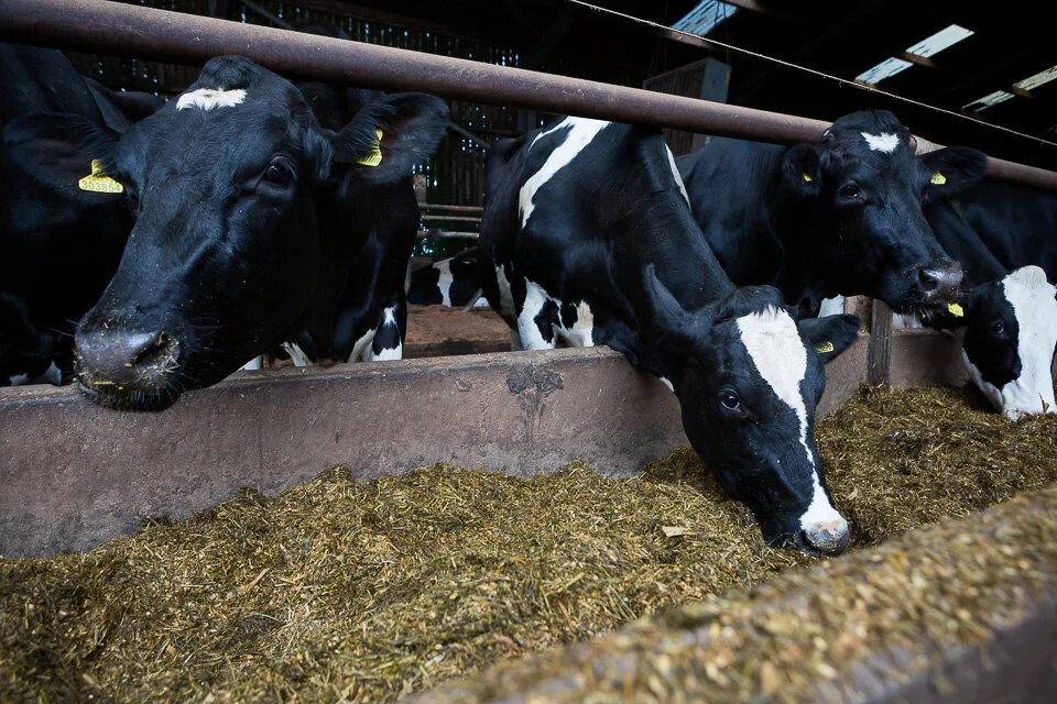
Mootral is a natural food supplement which reduces cows’ methane emissions by about a third - the environmental implications are huge. It’s a garlic and citrus extract which has the added bonus of deterring pesky flies, meaning happier cows.
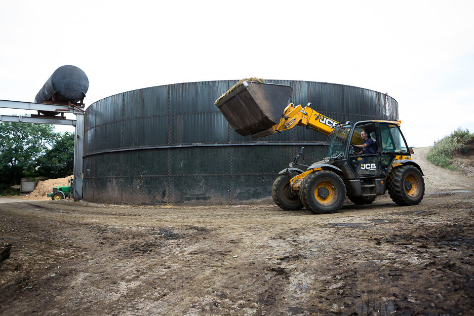
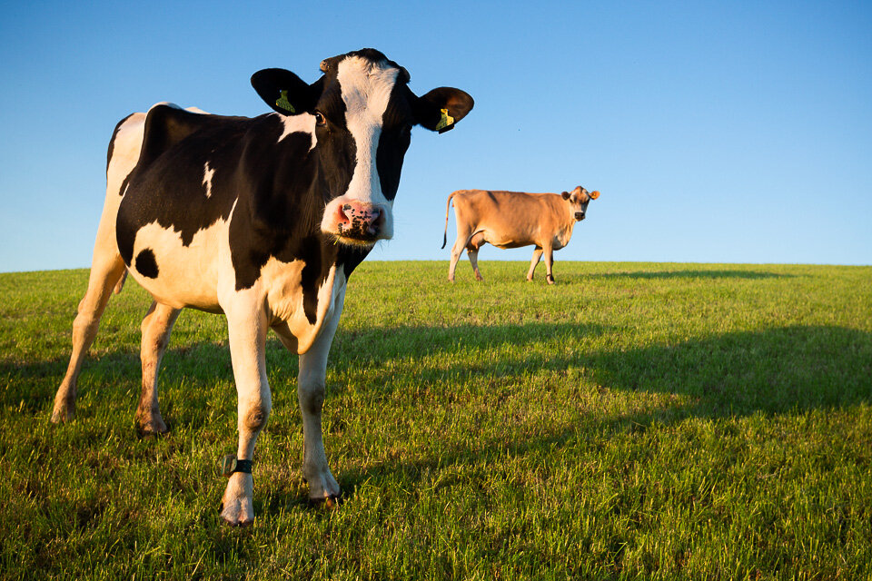
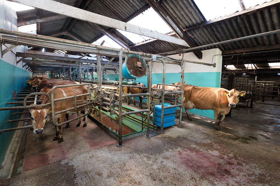
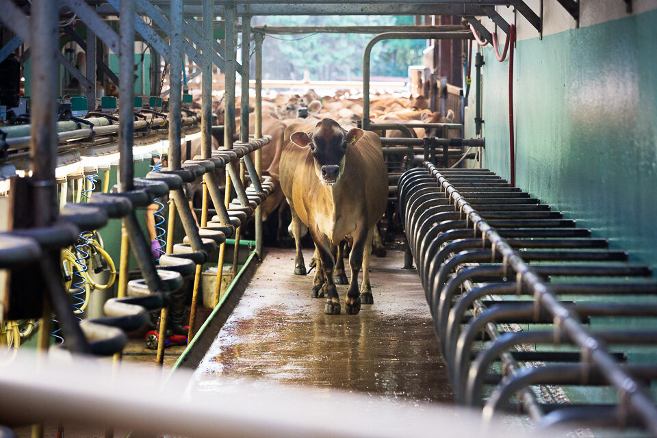
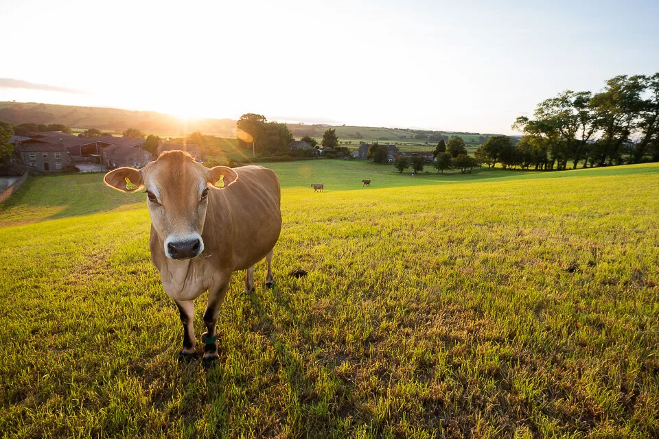
I was fortunate to spend some time on Brades farm at the end of 2019. They make high-quality ‘Original Barista Milk’, and use Mootral in the feed. I was there taking portraits of cows (well, stock photos) and of the farm workers.
Brades Farm Dairy is just outside Lancaster.
Joe Towers
and his brother, Ed Towers.
Thomas Hafner, Mootral CEO and co-founder.
Yummy Mootral
A cow using a back-scratcher.
A lovely cow
(above and below) lots and lots more lovely cows.
Composition-aware cows
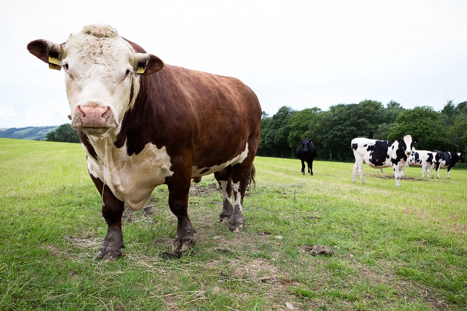
A big, scary bull
Biteback 2030
I was commissioned to photograph the Youth Board for Biteback 2030 - an education drive for healthy eating against the food industry’s manipulative advertising techniques. I shot around a dozen portraits at the Jamie Oliver head office in North London, and here’s a selection:
Guinness World Records
The most fun shoot - bar none. Guinness World Records commissioned me to photograph Taekwondo black-belts Lisa and Chris Pitman. Among many other achievements, they’d broken records including the most pine boards broken in one minute with one hand (Lisa), the most roof tiles broken in one minute (Lisa), and the fastest time to break 1,000 roof tiles (Chris).
We weren’t photographing the record attempts, of course, but shooting what are known as ‘show pictures’ - lively, quirky, often silly illustrations. As they’re married, the logical angle was to have them smashing bricks in a chapel while in their wedding attire. Obviously.
Suresh Joachim holds more than 60 Guinness World Records (mainly endurance-based) to help underprivileged children across the world.
They include: the longest time balancing on one leg (76 hours and 40 minutes), the longest radio broadcast (120 hours), the longest dance marathon by an individual, the longest ten-pin bowling marathon, the record for basketball-dribbling distance in 24 hours, the longest drumming marathon (84 hours), and the longest continuous crawl of (56.62 km).
I photographed him to illustrate his record of watching films back-to-back (121 hours and 18 minutes). The rules are strict - let alone nodding off, you’re not even permitted to rest your head in your hand:
We knew roughly how to shoot it - from the viewpoint of a cinema screen. How best to bring the record to life? We tried a number of options, including him ‘reacting’ to horror films, comedies, and dramas. Popcorn seemed to work as a prop, and worked best when it was thrown around:
We also photographed him for his record of the longest time going up and down on an escalator (225.44 km). The shot itself took a number of attempts as we raced around, shooting during the quiet periods of commuters on the DLR. The record - I understand - took days:
Suresh also holds the record for the quickest time to reach 100 miles on a treadmill (13 hours, 42 minutes and 33 seconds):
And here he is with the ‘Peace Torch’. He ran the World Peace Marathon, running marathons in 72 countries across 6 continents:
B3 Living
Here’s a series of portraits and case studies of staff, supporters and residents from a commission by B3 Living:
Recent work - July 2019
Shane Richie, who is appearing as Archie Rice in John Osborne’s play, The Entertainer.
Cover shoot for the Donmar Warehouse magazine
(Above and below) Professor Wendy Thomson CBE, University of London's Vice-Chancellor, pictured at Senate House, along with staff members.
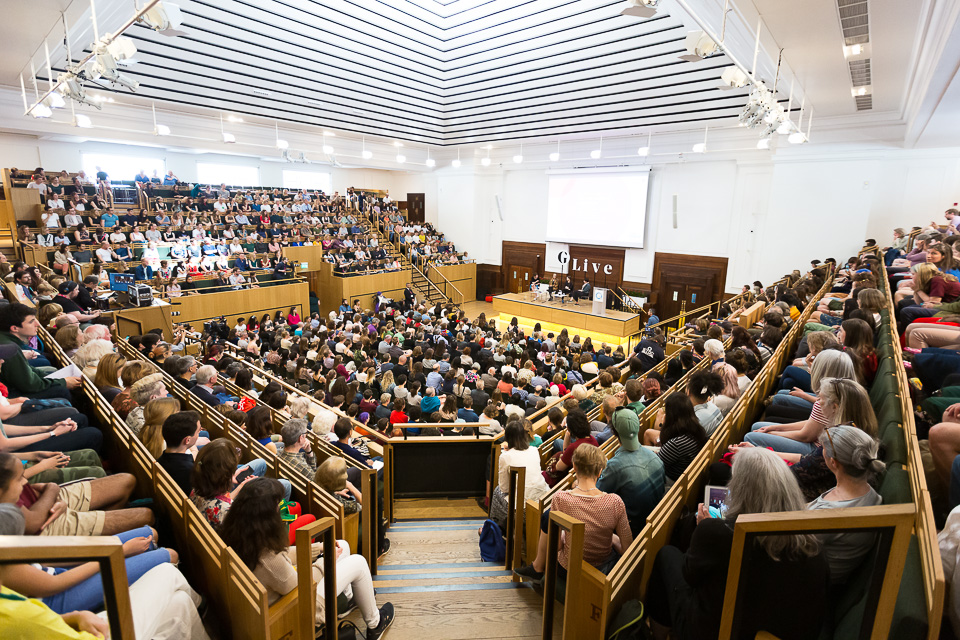
Anna Taylor, Greta Thunberg & Caroline Lucas at a Guardian Live panel in London.
Corporate portrait for Proofpoint
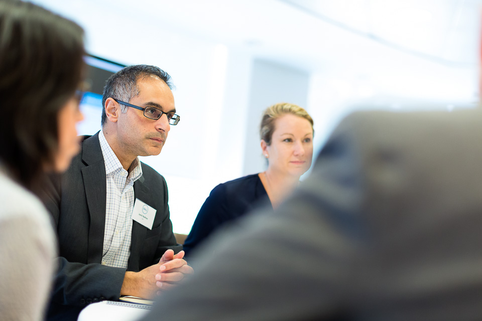
Jamil Nathoo, Dell’s Vice President and General Manager, Consumer & Small Business
Marta Krupinska, head of Google for Startups UK at the Shoreditch campus.
David Kamenetzky, Director at Kuehne + Nagel International AG
(Above and below) Arlo Brady, CEO of Freuds.
From the archives - six
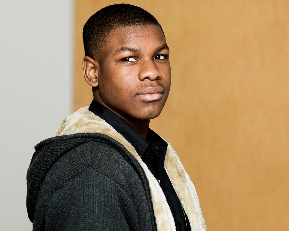
I’m finally getting round to watching the Star Wars series and recognised actor John Boyega (he plays a stormtrooper who joins the good guys). I felt sure I’d met him somewhere, but I wasn’t too certain. I couldn’t think where it could have been, or when.
And I don’t really trust my memory. I have mild prosopagnosia - meaning I struggle to remember faces (one of the worst things for a photographer to have). However, I always remember faces I’ve edited. That is, if I’ve photographed someone, I'll remember. My prosopagnosia has led to some interesting situations which I’m sure I’ll blog about.
Anyway, with John, if we had met, it would have had to have been at a rehearsal or photocall. Browsing the archives, there he was. At the Tricyle theatre (now The Kiln Theatre), I photographed a series of work entitled Not Black & White - three plays tackling prejudice. Several years ago. I got two frames of John.
But what I remember most wasn’t John, or the rehearsals, but a conversation about music with the guy on the right (above), and him telling me about ‘Radiodread’ - a reggae/ska cover of OK Computer.
Funny thing, memory.
Recent work - April 2019
(Above and below) A series of images of street cleaners, enforcement officers, and waste collection teams for Wandsworth Council.
For Standard Chartered Bank’s annual report.
Corporate portrait for Pearson.
(Above and below) portraits for Corporate Financier magazine.
Corporate portraits where people are blinking are, on their own, entirely useless, but make an intriguing set that one day I might put on the blog. The same goes for lighting test shots (as in the example above) which - by definition - aren’t even posed. This photo would normally have been deleted straight after import but caught my eye.
(Above and below) Interior designer Sam Watkins-McRae.
(Above and below) Workshops for Mousetrap Theatre Projects.
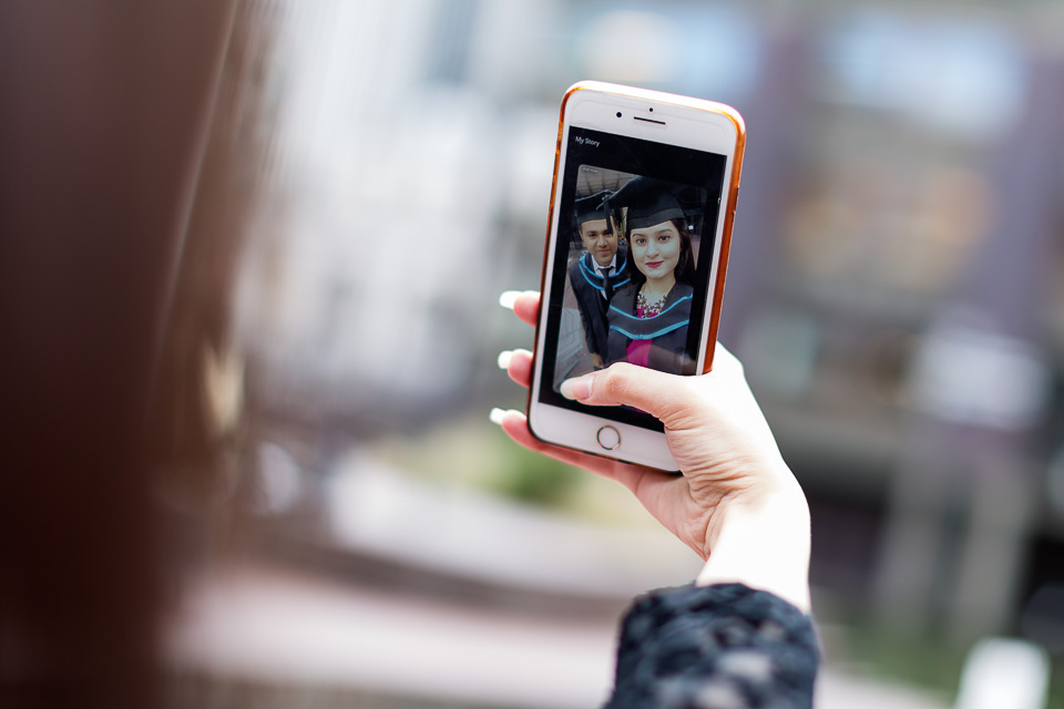
(Above and below) For the University of London, some portraits of graduates - and some quick candids in between - at the Barbican.
International Women's Day
Landsec commissioned me to take portraits of ten staff members at their offices in Victoria. We had a room reserved, and were free to use any available locations in the vicinity (ie reception, foyer & cafe) as well as Cardinal Place, their adjacent retail centre and outdoor public space.
Poor weather meant we couldn’t shoot outside, so the issue was about getting a good variety with limited indoor options. This became increasingly difficult as the day went on. Happily, all the ladies were very generous with their time (and their patience). Here’s a selection from the shoot:
Recent work - February 2019
Here’s a selection of recent work , mostly with a commercial / event angle:
We took Joey up on the roof at dusk to announce the return of War Horse return to the National Theatre.
Also for the NT, The Curious Incident of the Dog in the Night-Time was moving to the Piccadilly Theatre. We took the scene where Christopher is lost and bewildered on arriving in London, and shot it at Piccadilly Circus lights. It was probably the least unusual thing going on there, despite Toby being a real rat on this occasion (we’d used a puppet previously).
Egypt’s tourism minister Rania Al-Mashat prepares for a live interview at Bloomberg.
One of a set of portraits for Freesat at their offices.
(above and below) I was sent to photograph BTS of the judges and finalists of for Toyota Mobility Foundation’s $4 million ‘Mobility Unlimited Challenge’ at the offices of (partner) Nesta, the Innovation Foundation. Innovators from around the world presented their technologies aimed to improve the lives of people with lower limb paralysis.
(above and below) Global industry leaders came together for the live launch of the Alliance to End Plastic Waste (AEPW) at the Leadenhall building.
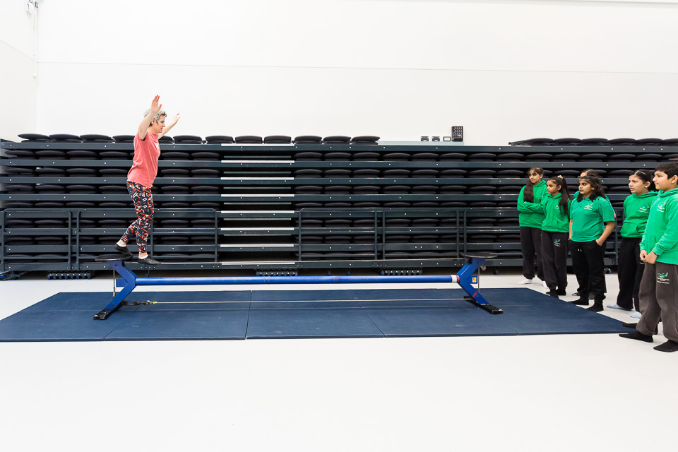
(above and below) A circus skills workshop for students ahead of Cirque du Soleil’s Totem
Also for Mousetrap Theatre Projects, I photographed a Relaxed Performance of Motown - The Musical. These performances are designed for families with children with special needs.
I ran a (very) informal photography session, and took photos of visitors, at Facebook London’s annual ‘Take Your Parents to Work’ day. This is me - and I don’t like having my picture taken.
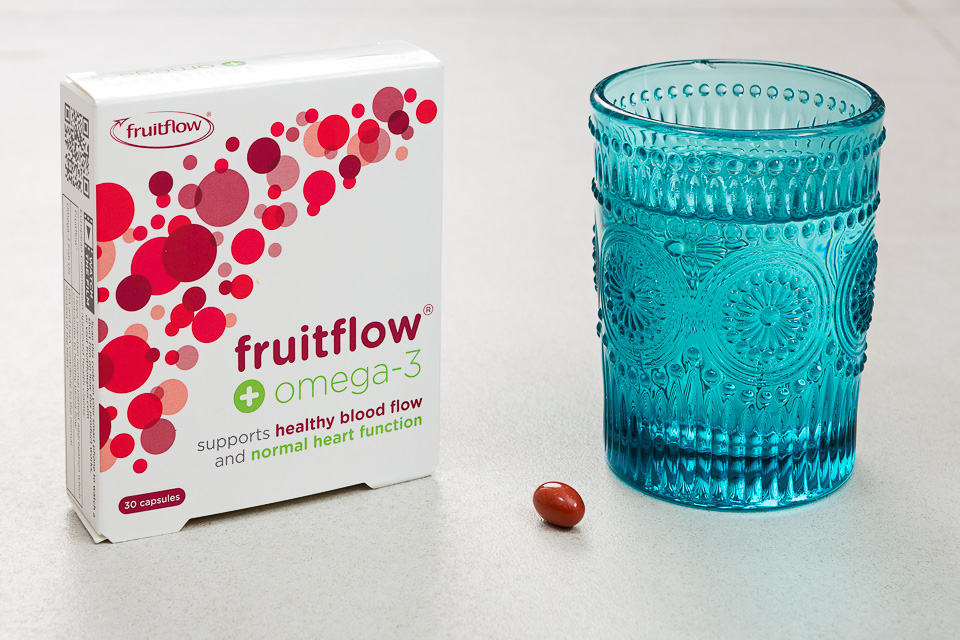
(above and below) Product shots for Fruitflow.
MP Ed Miliband speaks about Net Zero Britain at Portcullis House (a discussion on climate policy, not Brexit).
Four photographs
While visiting my parents recently, I saw these little framed photos on the mantelpiece in the guest bedroom. The house has always been a kind of museum as my mum sells antiques: for all I knew, these may have been gathering dust there for years, hiding in plain sight among the bric-a-brac.
But that’s not why I hadn’t noticed them before. It’s a magical house: objects inside are - if not invisible - unseen. Since they exist solely not to be broken, they only appear to visitors when in danger - and even then briefly - with the aim of revealing their weight, material and potential repair cost. It takes a second or third look to actually notice anything, to see something as an object of interest.
Anyway, I was intrigued. There’s something of the gothic about them. And, as personal pictures, they seem familiar as they look out from their tiny, ornate frames. But no, they don’t look like any of the rest of my family at all. Their faces don’t elicit any emotion. None of that sudden sorrow pricked by the image of a great-aunt I might half-remember. These were definitely strangers.
I was also curious as a couple of the sitters are looking off camera. I felt this seemed odd in more traditional times, where a photo-session would take some time and be expensive, I imagine. In other words, you have one shot, but you choose to look away for it. Either they’re dead (Victorian post-mortem photography may or may not have been a thing) or these weren’t family portraits at all, but official royal / celebrity photographs.
Also, there are just four - this is an aside, as I’m aware people didn’t own cameras a hundred years ago - but it made me think: my own childhood fills a couple of albums of images. A hundred photos. Fewer? Not enough to tell a story, but there’s a flavour, perhaps. And throughout the house, on tables, walls, mantelpieces and shelves there are a few dozen framed.
I already have several thousand photos of my family and friends, very few of which I’ll care for enough to print and get anything more considered than an Oliver Bonas frame. I don’t whittle them down: I barely look at them. Everything is downloaded, then uploaded for some future date. Unlike the attic where albums end up (awaiting being thrown away by children on the parents’ death, after just one, cursory, curious browse), there’s infinite space in the cloud.
Memory really is cheap, it seems.
In this stream of recorded consciousness, there’s no hierarchy, no defining moments, no defining times. No editing. Just a near-continuous record of everything both important and irrelevant. Everything captured, just in case, because of the fear of forgetting (as if forgetting’s so awful). Surely we remember what’s important?
Anyway, back to the thread. This lovely collection of four photos.
Who were these people? Were they related? When were the photos taken? They must have been important to someone. The main difference with our current culture of recording is that these are not ‘moments’ - well, one moment in a person’s life, perhaps - but instead, portraits. They may each be the only picture of the person in existence, and as such have a lot of work to do.
Immediately I put them into my bag (without telling mum - it’s easier to seek forgiveness than permission), planning to return them after taking pictures. I later emailed to ask her about them.
She replied:
“Oh, those!
They belonged to a Mrs Annie Haines - she became a family friend when she baby sat [my uncle] when he was a toddler. She died twenty odd years ago so unless I can find a medium and a ouija board - I can’t ask about her connection - if any - to the subjects.
I helped clear her few belongings when she went into a home a couple of years before she died and kept the photos because I liked them. They are typical of late Victorian/early Edwardian family photographs - especially (as in photo two) where the husband is seated while the wife stands!
I may be wrong but I think that the handsome young man in the fourth photo could be a ‘celebrity’ of the day rather than a family member. His face is familiar. Sorry, can’t be of any more help. Might be worth taking the photos out of the frames to see if anything is written on the backs…”
So that’s what I did:
Not much. The only one with anything useful to go on is the first picture. A quick search yielded a list of photography studios in the West Midlands in the later half of the 19th century, in this case it looks like Sunderland and Hudson. And the picture is labelled “Great-Grandma Gammage”.
Oddly, I remember Mrs Haines - we used to visit her when I was little.
The rest of her email talked about photos she has at home, on which she does have information. Photos of Georgie, whose death (aged three) was predicted by a gypsy. John, a murderer. An uncle, one of thousands who died building the Burma Railway for the Japanese. I’ve managed to get hold of these and will scan and write about them once I’ve get everything together.
As for these, I don’t really care that I don’t know who they are. They’re nothing to do with me, and there’s no mystery or rabbit-hole of research I’m going down. But in time I’ll inherit them and - just to mess with visitors - put them up somewhere prominent.
Handy gadgets and where to find them
Thinking of what I wanted for Christmas, I asked on a photographers’ forum what they considered to be their most useful gadget.
Although gadgets usually refer to tech, let’s define it (loosely) here as
(1) a non-essential photography tool or device - something that not everyone will have
or
(2) something general but essential, which sits outside photography.
After seeing the answers on the forum, I’m also going to add in some of their responses (3) and one utterly useless, useful thing (4).
I’ve included links where relevant.
(1) Photographic gadgets
While we can discount camera bodies as they’re essential, certain features are handy. Different kinds of focusing, wireless transmitting etc. and also (great if true) cat facial recognition.
And while most lenses, too, are essential kit, when I use my 50mm f1.2 lens wide open it serves to give a definite look - as well as enabling me to shoot in very low light. These effects are otherwise much less easily achievable.
We can also disregard lights. We all use different brands and types depending on our work and the situation, but along with diffusers, modifiers and reflectors, it all does (basically) the same thing.
Lighting
Anyway, starting with lighting, there are many add-ons and various paraphernalia which could be considered gadgets, so I’ll list a few which come to mind.
I have a Rogue Flashbender and a Gary Fong Collapsible Lightsphere - I use both as rough tools in tricky lighting situations.
For more creative work, I like the Magmod kit - not only for the gels, but specifically the Magmask. They allow for easy, controlled playing with light and effects.
I love my medium reflector. The exact model is no longer available, but it’s something like this and has five different ‘faces’ - gold, silver, black, white and translucent. A world of possibility.
I also have a small diffuser for flash. It’s a bit wobbly but does the job.
Other
The X-rite Colorchecker Passport is good for accurate colours: I have one (but in truth I rarely remember to use it).
A battery grip is a costly, but useful extension to a DSLR camera body which allows for easy shooting of uprights. It also stores a second battery, meaning fewer charges and little chance of running low, even on longer shoots.
(2) General gadgets
Moving away from photography to the more general, gaffer tape comes to mind. I have Gorilla Tape which attaches anything to anything, but also some weaker standard masking tape, for when I don’t want to rip the paint off a wall.
Velcro is useful. I have it glued onto my flashes for attaching flags, and I keep some spare to stick flashes to walls for the rare occasion where there’s no other option.
Bulldog clips and different sized spring clamps are in my kit, too.
Bungee / ball loops are versatile little things which allow you to attach small items (flashes, usually) to poles, handles, stands etc.
Sugru - mouldable glue, which I mainly used to keep cables from breaking.
(3) Other photographers’ suggestions
Blackrapid straps, polarising filter, tripod, micro fibre cloth (to keep optics pristine), waterproof boots & darn tough socks, hotshoe spirit-level, travel collapsible beauty dish/soft box and mini pole, Interfit Strobies Portrait kit, a ladder, a monopod*.
Also mentioned were: the ability to make people laugh, shrapnel for the pub, and sharp elbows.
(4) Utterly useless useful thing
My “Colourful Rainbow Silicone Laptop Keyboard Cover Skin” is pretty sweet.
The rest of the stuff filling up my bags is either for security/backup or for specific uses: extra rechargeable batteries (Eneloops), cash, a lens cloth, a second card reader, (too many) memory cards, a hand mirror, gels, a lint roller.
There’s no particular gadget I own which I could not do without. This is probably a good thing, as it’s all too easy to fall back on using the same tools and approaching a shoot with that already in mind. I think much of the time it’s more about finding a method, or using whatever available thing will achieve the result. I’ve used my mobile phone as a rest for my lens on the ground for a night shot, in place of a tripod. I’ve used car headlights to light a subject, a white shirt as a reflector in a forest, and clips to pull back baggy shirts.
The useless gadgets I’ve bought and hardly used makes for a sad list of gimmicks. But, reluctant to throw anything away, I have heaps of rubbish in cupboards which must have seemed like a good idea to buy - perhaps in a different life. These are stored along with a lot of obsolete cables and connectors, 512MB memory cards, old phones without chargers and, of course, small pieces of wood.
*The photographer explains: It lets me do pole shots from above or in dangerous situations e.g. motorbikes at speed, tigers following behind the vehicle I'm travelling in etc. Keeps long lenses from wobbling about. Doubles as a baton for dodgy people like football hooligans as it tends to deter them when they see it coming down towards their head.
From the archives - five
Another selection of images from the past few years which never made the cut.
(Above and Below) Shot near Cardinal Place, these two images were from a publicity shoot as part of the “Create Victoria” campaign for Land Sec.
I also found this old one, also for Land Sec, from a shoot at One New Change, beside St Paul’s Cathedral, where they put on a (slightly gothic) fairytale event.
For Mousetrap Theatre Projects, this portrait was part of a feature on their Youth Forum.
This photograph was taken at Unum’s rather lovely headquarters in Surrey.
Actor Martin Freeman at an event.
How to compose photographs
While composition is only one aspect of what makes a picture work, it’s the one aspect over which you always have some control. It’s about balance, so we can think of the frame as a lever. The simplest setup has a weight directly over the fulcrum:
It is stable, certainly - but in a photograph stable implies safe, and safe can equate to uninteresting, boring. Often something else is done with the composition to imply counterbalance. This image of an umbrella has been cropped to a panorama. Whilst still a very static shot, the crop reduces dead space and makes it about solitude:
A weight placed slightly off-centre is sometimes all that’s required to create some imbalance or tension:
In this analogy, a simple off-placement is an effective technique for a photograph containing just one subject. In the image below, placing the girl centre-frame would probably result in cropping to a square, to fill the frame better. The off-centre composition, the angle of the chair, the girl’s legs over the corner and her informal pose work to emphasise her spirited, youthful nature:
Although the subject in the photo below has been placed centrally, her looking out of frame provides a similar - if only slight - imbalance:
This image uses a similar idea, but you could argue that the lighter side of the building acts as a counterbalance to the main subject (more on this later):
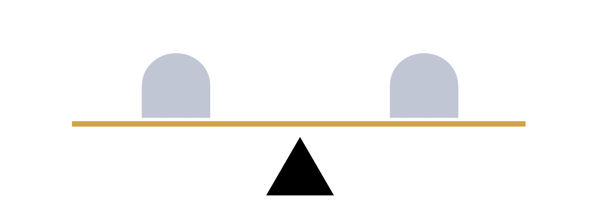
Moving on, the diagram below is balanced with equidistant objects of equal weighting:
Photographically, this would refer to bisected or symmetrical compositions. Although a frame may (often) be filled more readily with two subjects - a good thing - one might assume that such blunt placement would lead to dull or confusing composition. Dull, because it’s reminiscent of the single object above the fulcrum. An confusing, because both subjects compete for attention, breaking the ‘rule’ of simplicity.
But this needn’t necessarily be the case: this kind of balance in a photograph can create various kind of tension.
They two subjects may invite comparison eg where they’re not quite the same. Consider the various series of images online which show a black and white city scene as it once looked during wartime, or a hundred years ago, blended with a colour photograph of how it appears now, both taken from the same viewpoint. This comparison is precisely the point when two images are combined in Before/After.
The composite of the two images (below) results in looking back and forth between the two expressions:
In a single shot, we might make comparisons with family photographs, for instance, and more specifically of siblings, with the most obvious example being identical twins. Here’s an excellent set of portraits by Peter Zelewski.
Other kinds of symmetry can be more exact - as in someone by a mirror - or merely suggested. And sometimes they just point to a simple, direct relationship between two subjects, as in the photograph of the chess players below.
Note that in all these cases (and as illustrated previously with the girl looking out of frame), composition can be merely implied. An example would be found in action shots, where traditionally we compose a photo so that the action is shown coming into the frame. That is, it needs space to move into. Normally we might think of a moving vehicle, a runner, or a ball being kicked - but even an eye line will suffice. That the players are both looking into frame serves to tighten the composition, drawing our own eyes to the chessboard:
Next, balance can be satisfied with the arrangement of one larger object, with a smaller one placed further from the fulcrum:
Translated to a photograph, the subject - sharp/dominant/larger in the frame - is composed with a secondary subject positioned on the other side of the frame which may be smaller/darker/out of focus etc:
The shot of the dancers below uses the same technique:
Moving onto imbalance, scales weighted with a single object near the end will fall, with nothing to act as a counterbalance:
In a photograph, this equates to skewed or disharmonious composition, and can be employed to create an edgy, uncomfortable, exciting or dramatic mood.
Typically I think of fashion photography, where it could be a face, cropped in half, right at the edge of the frame. It’s also often seen in war, ‘hard’ photojournalism and documentary photography. James Nachtwey, Martin Parr have plenty of examples. Or have a look at how TV drama series Mr Robot uses this framing device to evoke unease and tension.
This technique needn’t necessarily use composition to achieve this - disorder and discomfort can be created by subverting other expectations. For instance the subject, centre frame, but out of focus, would achieve the same discomforting effect as an off-composition.
I struggled to find any good examples from my own work to illustrate this kind of image! It’s neither my style, nor does it apply to much of my commissioned work by its nature. Anyway, hopefully I can make the point with this photo of my eldest when he was much smaller (I should admit I applied this crop in post):
In the triptych below, the effect is only slightly applied, and done so for comic/absurd effect. Note that given its subject matter, it would be hard to justify placement any further to the edge of frame:
Finally, a complex arrangements of objects across the lever may still have equilibrium, and the diagram below illustrates how this might look:
Photographically, this refers to the majority of images which have several points of interest around the frame. Photos are rarely in perfect equilibrium; a mix of balance and imbalance within a frame is very common. After all - unlike the lever - composition is not exact mathematics, and I think most would agree that composition probably shouldn’t ever be too perfect. Here are some examples of busier compositions which still retain sufficient harmony:
In the image below, it’s easier to envisage an (unwelcome) imbalance if the lady in the background on the right of the frame weren’t there:
Where time or location is a constraint, eg day to day scenes, candid or street photography etc. situations don’t usually even allow for the 'clean’ setups shown in the examples so far (this is all assuming such a style of image were even desirable, of course - I’ve used these simple examples so far to illustrate the point). In any case, composition may not be the main aspect of what helps make a particular photograph.
The Rule of Thirds
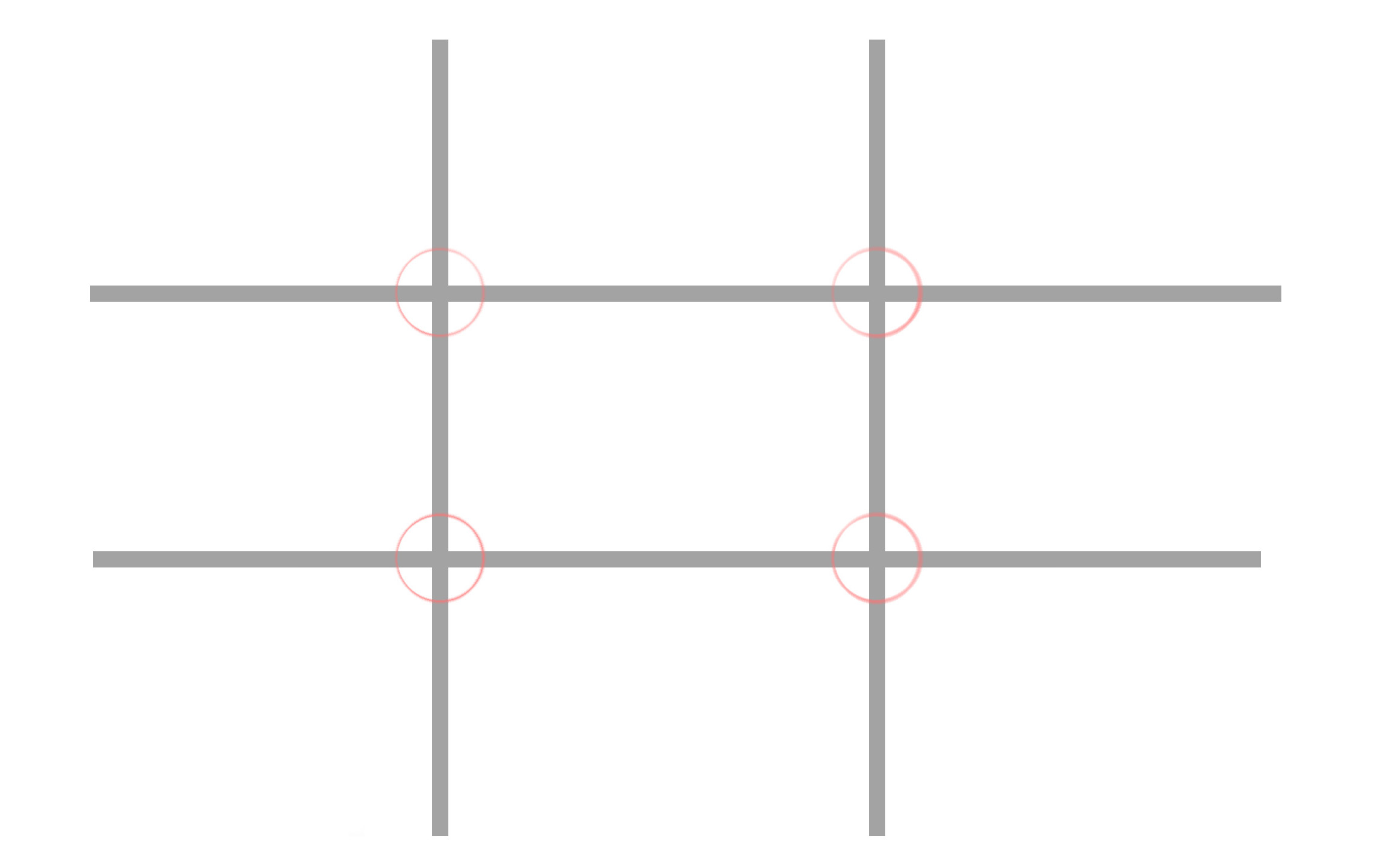
Photographers tend to dislike photographic rules - this one in particular. Rules can be formulaic and safe: they often work best when they’re bent or broken. That said, I’d be remiss not to mention the ‘ROT’ - and it’s an easy go-to. With this idea, the frame is usually depicted as a noughts and crosses board:
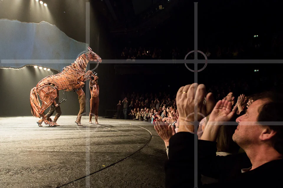
Simply put, it means placing the subject off-centre, on both axes. Where there are other points of interest, they would ‘ideally’ fall on the opposite junction:
As I’ve said elsewhere, cropping is the most powerful tool of all (and is included in all editing software), meaning composition can therefore be applied/corrected afterwards.
This leads to a final aside - if composition can be employed to emphasise or draw attention to something, at its extreme it can be used to change the meaning of a photo entirely. “Cause of Death” by John Hilliard illustrates this with four images of a dead body, each telling a different story:
I hope this has been of interest!
