
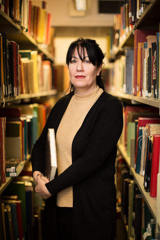
SOAS - postgraduate prospectus
Prospectus portraits for SOAS, University of London
I did some portraits for SOAS’ undergraduate prospectus early in 2020. It was my first commission for them, so it was great to be called back in the summer for the postgraduate version. Not only because I really enjoy this kind of portraiture, but because, as a freelance, there are no promotions or appraisals (even feedback, as I’ve said elsewhere, is often limited). Being commissioned again is the equivalent of a positive review, as is being recommended to another client. Even better is to be taken on as a regular supplier - or indeed, where possible, the main photographer.


Online teaching
I’ve been running online photography classes recently, while the world is on hold.
I’ve been running online classes recently. My approach to photography is about experiencing the world as a visual space. It is to see things - and then show them - differently. That’s the photography side. With regards mental health, I’d argue practising it lies somewhere between enjoyment, meditation, and escape. And apart from this, the assignment given after the first session is both an opportunity and a reason to get outside during these dark, winter months.
I’m thrilled by how teams have engaged with the ideas, and so it is with pleasure that I can share a selection of attendees’ images which have resulted from these sessions:

As you’d expect, many were taken on weekend walks: leaves, autumn, and a chill in the air.


Others, on lunch breaks and evening strolls, found inspiration in the cities and towns.


Many of the images were shot at home. This resulted in a few cats (perhaps too few for my taste), various details of household objects, and even a DJ.


Some went creative…

… and others went all the way to abstract.

I’m really enjoying these and intend to continue after things return to normality. If you’d like to take part, get in touch.

Gratitudes
We can complain all day long about anything and everything. But finding something positive - especially on a bad day - can help change our neural pathways.
Once a week or so, usually over dinner, we “do gratitudes”. I got the idea from positive psychologist advocate Shawn Achor some years ago: simply list three things from that day for which you’re grateful.
It’s easy to whinge: we can reel off our disappointments, complaints and regrets without difficulty, and we do so regularly. But thinking about the positive things we’ve encountered during the day can be hard.
By changing our focus, the aim is to change our perspective on the same reality, highlighting the good moments we’ve had, or even finding something useful or fulfilling in an experience which we’d otherwise label as entirely negative. It can turn things around, and indeed Shawn recommends doing it especially when you’ve had an awful day, when you just want to be angry, flat or tired.
Things are awful at the moment for so many people. It can be almost impossible to see very much to be grateful for in an otherwise largely bleak situation. It occurred to me that for the past several months, I’ve hardly taken a single photo for myself. And this can’t be a coincidence.
Normally, I take pictures all the time - or, at least, I go through regular phases. But I’ve barely noticed anything since March, or not cared enough to shoot it when I have seen something.

Of the shots I would normally take, I only keep a small number. And only a few of these I upload to my Instagram (look for the weird abstract ones, sitting amongst the portraits and other commissioned work). As I say, I don’t show all of them: most just aren’t very good. I take them for the pleasure of the moment, and then forget about them. I put the ‘best’ ones on Instagram*. I enjoy it.
I think my lack of interest of late is uncharacteristic, and it means I’m disengaged.
When I’m feeling engaged, I’m able - with an easy change in attention as I go about my day - to look for these details, lines, shapes, reflections, and tones. Looking - really looking - is an exercise in itself, even without taking a photo. And this type of (usually abstract) photography is precisely not about having interesting subject matter, or models, or lighting, or storytelling. No schedule or deadline. It’s simply playing with the language of photography, devoid of context, at one’s own leisure. So, a mix of colours here. A hard shadow there. As I’ve said elsewhere, it’s often about physical objects as purely visual objects. Matter plus light.
These elements are literally everywhere, and we all have cameras. It’s about appreciating the world around, if not as something beautiful, at least as something visual. I think that taking pictures for ourselves - with no audience in mind, and no other purpose than simple pleasure - is another way to express gratitudes. It’s the photographic equivalent of listing what we’re grateful for, what we see. To express them, visually.
It’s quiet at the moment, but I’ll be allowing myself some time off this week to go and take some photos for myself. After yesterday’s World Mental Health Day, and with possible further isolation likely, my small suggestion is that you could try the same.

Ceiling corner.
I’ve covered my general approach in older blog posts, but otherwise, to get you started, here’s how to do it:
Allow yourself 30 minutes’ shooting time.
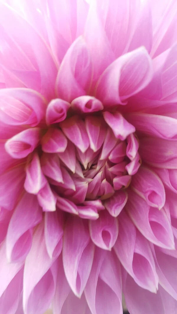
Choose two of (say) the following: colour, shape, pattern, shadow, detail. Your location and the weather will help determine which. So if it’s cloudy, you’d have to work hard / get lucky to get images which are about shadow, as in the image above of the ceiling corner. If you’re near an outdoor market, then looking for details (ie close-ups) should yield some good results. If you’re in the countryside, photos about colour might be limited to flowers.
How do you know what to look for? Whatever catches your eye. By definition, it has moved you. And so it follows there may be something in it. You know when you see it. It’s about learning how to really pay attention to how things actually appear, how things are devoid of their function and context, and our own assumptions.

There are often photos to be had with graffiti (and the work’s 95% done for you). Picking an interesting part of the artwork and taking it out of context is the necessary step.
If you’re struggling to see anything interesting, remember there are often ‘fallback’ images to look for. Close ups of fruit. Reflections in puddles. The symmetry of flowers, shot from just above.
If you’re still struggling, limit yourself further. Just look for things that are red. Or diagonal lines. Or graffiti.
Once you’ve found a subject, then it’s onto problem solving. A quick snap won’t do it - you have to capture the essence of the thing you noticed.
How? That’s the question. But start by working around the subject. Get low, high, close, far. Change the composition, or what elements are in the frame. Find the most direct way to show what you’re seeing: it should feel like work, and challenge you. It’s a process, not a single event. And to shortcut this process, keep in mind that very often, less is more with this kind of photography. Which tends to mean getting close, taking elements out their context. Actually, if you are using a phone, it has quite a wide angle of view. So you’ll likely need to get in close anyway, to remove distractions from the edges of the frame.

With abstract photography, it’s irritating when we try to guess what something is. It misses the point. However, with these sorts of shots, I often think in terms of what something looks like, and that shapes my approach.
Take at least three or four shots per situation, and allow yourself no more than a minute or two. Then move on.
If you can, perhaps meet with a friend for a coffee beforehand, go off your separate ways for the activity, and then reconvene to compare your results.
Maybe you’re not feeling it and you can’t ‘see’ anything. Maybe you’re not enjoying it, or your friend’s photos are way better than yours. That’s fine. You’ve had some exercise, you’ve had some fresh air. And that’s enough.
Give it a go - it might help!
*Actually, sometimes I almost wish I didn’t put any on IG, and shot just for the enjoyment of the moment and for nothing else. There’s a part of me that critiques them hard in the moment, with an audience in mind. I suppose, yes, this does also serve to make me look/work/think a little more, rather than have me just taking snaps. It also might delay gratification until later - the joy of a more polished, considered photo which others can enjoy.

Headshots: why we need them, and why we don't like them
Everything you need to know about business headshots: how to prepare, what they are, and why they’re important
Why do we need a headshot?
At a very basic level, it’s identification: age, sex, appearance. Something to stick on an office ID swipe card, but taken nicely, perhaps.
Yes - but it’s much more. More than just a first impression, it’s a personal statement. It’s branding. Like it or not, it suggests information about us, both personally and professionally. We make judgments based on how someone looks. Not just how someone dresses, but the very shape of their face, even the colour and style of their hair.
Why don’t we like our own photos?
One obvious answer, of course, is the increasing ubiquity for many years, and throughout our culture, of ‘perfection’, or at least the importance of one’s appearance fitting a certain standard. And for some time it hasn’t been solely in magazines, films and on billboards. Every day, people look better than they do on Instagram, to name just one platform. On our phones, post-processing algorithms for a smoother, thinner, brighter whatever are now automatically, immediately applied whenever we press the shutter. We don’t even have a choice. A computer is telling us that we could be, and should be, better looking. Maybe that’s true in your case, I don’t know.
The theory I prefer is to do with our faces being asymmetrical. When we look in the mirror, as we do every time we leave the house, our left is on our left. But for anyone who meets us and - crucially - in any photograph of us, will have our left on the right, and vice versa. That is, whenever we look at our own image, it’s not the same as that which we see in the mirror. Hence we’re uneasy about it. There’s a wonderful, thought-provoking series by Alex John Beck where he makes symmetrical portraits from each half of a face, raising questions of beauty and identity. And there are apocryphal stories of clients complaining to photographers that the photos from their session are no good. The photographer sends the set over again, but flipped 180°, and gets the frustrated response, “These ones are much better! Why didn’t you send them the first time?”
And there’s also the process itself. You have an allocated time slot in a production line. It’s reminiscent of tedious school portraits, but instead of idling one’s time away from double maths, it’s over a deadline, or it’s a meeting being interrupted. Most often in a conference room filled with studio lights, and expectations to smile for a stranger. Knowing our new photo could be the corporate portrait we have to use for the next several years.
So how can we get the most from a headshot session?
Let’s start with a few pointers:
Get your hair cut a few days before.
Wear simple, comfortable clothes - nothing too busy or colourful - and make sure they’re ironed. Ideally nothing bright white (this usually doesn’t work on a standard white background for a standard headshot) - or at least wear a jacket. Equally, jet black can look severe.
Arrive at the session a few minutes early. Being late knocks on for everyone after, and means you have less time. More time equals more options, as well as an opportunity to relax into the session.
It’s natural to be self-conscious. It means you care about the result, and how you look.
Ask to see a few of the photos as you go. There may be an angle you prefer, or your necklace may be too much, or you may feel you look too serious etc. At the very least you'‘ll feel confident in the photographer, and that these are so much better than you thought they’d be.
Don’t fret about anything temporary eg. blemishes, tired eyes. Anything which wouldn’t be there in a fortnight, or after a good night’s sleep, will be taken care of in post-production.
Nearly everyone has something they don’t like about themselves: this is not the time to focus on it. And it’s true to say that nobody else notices it, or cares very much. Remember, the photographer, your colleagues - everyone - wants you to look your best. You owe it to yourself to make the most from the session with a positive attitude.
What do you want to show?
With those out of the way, the purpose of corporate portraiture is to convey your positive attributes. It’s much more than the binary smiling/not smiling (equating to friendly/serious). Here’s a list of some of the more common traits we might wish to use to describe ourselves:
adaptable · confident · creative · determined · direct · educated · experienced · energetic · enthusiastic · good communicator · intelligent · kind · leadership · open · proactive · patient · personable · relaxed · reliable · team-player · thorough · well-rounded
The first thing to say is that you can’t convey any of these attributes - not one - in a photo. The idea is nonsense.
So, how do we show them?
Well, what is our language? It’s the background, composition, the lighting and clothing. Gesture, expression and pose. It’s body language (there’s a clue in the phrase), and, of course, it’s the eyes. While they can’t directly translate adjectives, they can suggest them, or talk around them. Picking up where language ends, and taking over where words are insufficient.
Where there is correlation, I’d concede only that a photo could point to the most obvious characteristics. A smile means friendly; a suit and tie implies corporate; hair up suggests business (hair down, casual) etc.
Secondly, while it is certainly more than just a choice between friendly or serious, let’s not overstate how specific we can be. The example adjectives listed above overlap with others, and some are, effectively, synonyms eg ‘confident’ looks the same as, or could be read as, ‘experienced’, say. Furthermore, some characteristics (eg team-player, well-travelled) couldn’t apply at all in a photo; they can’t be interpreted from an expression.
So take your list of characteristics, and pick two.
Remember: not every attribute is desirable. One’s sector, role and experience will determine key values. A graphic designer might want to appear creative; a therapist, a good listener. A law firm wouldn’t value skills relevant to a school, and neither would want the same as, say, an advertising agency. Sometimes, the same qualities apply to each end of the spectrum: a CEO and a graduate might both wish to show experience and energy, but for different reasons. All this is so obvious as to be barely worth mentioning, except as to highlight the point that you can’t - and wouldn’t want to be - everything.
You can choose warm and personable. But you can’t (in the same photo, at least) be direct and no-nonsense. As CEO, do you want to appear as a leader, or one who listens and collaborates? Does an influencer want to portray gravitas, or quirkiness? Is it better to emphasise enthusiasm (associated with youth) at a cost of experience (associated with age)?
Choosing your image
When the unedited options come back, it’s usually worth asking colleagues their opinions, but ultimately you choose what you want to convey and which option does it best. Doing so, you need to keep in mind how you come across in person, and/or how you’d like to be perceived. You select the photo which will reinforce this brand image. Or, in rare instances, the one which changes it.
In the end, most people just want to look their best. But it’s not a hard question of taking the most professional-looking image and putting it up against the most flattering one. No - they’re usually the same photo. That is, the most professional image is the most flattering, because conveying those attributes makes it so.
If you need a new corporate portrait for your website or LinkedIn, get in touch.You can see examples of my work here.
Afterword / Corporate self-portraiture
It’s hard to espouse the importance of a headshot when you don’t have one. I wrote the piece, then reflected that I’ve not been using a photograph of me on my “about” page for about two years. The only shot of me I like, and had been using, was taken nine years ago, My attempts since (one example is here) didn’t quite work, and weren’t much used. It was time for a new photo.

My original headshot, which was getting old. Shot by my extremely talented friend James, this covered everything I’d want to convey, along the lines of creative/artistic and experienced/capable.

So I started with a similar setup this time around - but, as I’ve said before, it’s very hard to photograph yourself. Where James’ original shot had a lovely balance of simplicity, dramatic lighting, and capturing a natural expression, this felt forced throughout.

I then simplified the setup, shot about 30 frames, and ended up with this, which is what I’m going with. Mostly this uses soft window light, and I opted for a brighter background and top, hence less drama but something more natural. It’s not perfect but it’ll do.

From the archives - seven
A brain-dump of thoughts about portfolios, ‘show pictures’, niches, rediscovering old photos and one’s personal style.
Portfolio woes
Making a portfolio is easy: you start with the images you like, and from there select those which best represent you.
You then remove shots with a similar style or subject matter. Ditch any which don’t sit well with the rest of the gallery, and those which will date badly. Delete ‘one-note’ images eg portraits which solely rely on a subject’s celebrity status; fisheye shots; basic silhouettes. Get rid of generic, broad images which have no discernible or unique style. But equally, consider setting aside highly-stylised images (as these risk defining your abilities too narrowly). Finally, dump any you’re not quite sure of.
If you have anything left, that’s your portfolio.

This was from my very first portfolio, and I was really proud of this, once upon a time. This was my NCTJ (basic press photography qualification) entry as the sports image (back in the early 2000’s). Looking at this photo after so long, I can say it’s pretty rubbish.
Maintaining a portfolio over time is even worse, as you never really get past the starting point: you hate nearly everything you’ve shot. It’s just the way of things: partly it’s over-familiarity, and partly it’s one’s critical eye.
Out with the old - two
At the start of lockdown, I culled a number of photos from my website: recent efforts didn’t go far enough, and I’d felt for a while that more pruning was necessary to improve my portfolio.

This was my sports entry for the NCE press photography final exam (perhaps from 2005?). Again, I must have liked it once, but now think it is a horrible image and it hurts my eyes. Our final exam requirements also included portraiture, news, fashion, night, use of flash, weather, and some other things. I still have my final portfolio, and may scan the images for a future blog. Or cringe, and bin it.
For me, although I may dislike my work(!), that’s not the hard part. I find this inevitable boredom with one’s own images can, at least, help with objectivity.
No - the tricky part is separating an image from its context: how difficult it was to achieve, how technical, how pressured, how enjoyable, even. And the more that goes into our images, the more we want to like them. We are there through their creation and delivery: the more memorable and significant, the more inextricably tied up when we view them. Yet, rarely do these aspects actually come through in the final image in any meaningful way. They really shouldn’t count for anything.
All that matters, in the end, is that a portfolio should show the best work you can do and the work you’d like to do, as I’ve said above. All the while having a clear, consistent style. Subjectivity is only there as a guide. Be objective. Yet even the most ruthless approach brings doubts, later.
The best way around this issue is to have someone else do it, with your potential clients in mind. It’s your shop window, after all, and not a vanity project. A fresh and unbiased point of view is painful but - with trust and understanding - the sensible way to go.
…nah. Perhaps next time. And after removing a dozen or so irrelevant or weaker images, I was happy enough.
Diamonds in the Rough
I expect that for many photographers there’s something inevitable about the occasional browse through the archives, especially during lockdown. I do this anyway from time to time, collecting content for my occasional “From the Archives” blog series. On this occasion, my portfolio having been on my mind and little actual commissioned work, I was soon at it with a different mindset: actively trawling for photographs I’d once liked and discarded, to put them on my website.
Yes - finding ‘new’ images rather undermines the earlier cull - but anyway. And I knew a positive result would be unlikely.
We’ve all done it - we hope for a rediscovery of a photo in some unhelpfully-named “Maybe” folder which, with a fresh look after some years, aligns with one’s style again. One which might represent what we can and want to do, which could then be put into a portfolio. It would be something previously unappreciated, carelessly ignored. Something which with a bit of a dust-off, a new interpretation (we’ve since forgotten the context of the image), even a fresh run through PS, would be enough to get it onto the website. A new image, without even leaving the house.

The typical ‘deadpan’ portrait was one from a ‘Maybe’ folder and keeps coming up when I trawl old folders. I so want to like this kind of Sunday supplement image (or at least my efforts at them). But I don’t. I used to try to shoot this way from time to time, but it always felt forced. In this case, it didn’t really suit the subject. Somehow, others do the same shot better, and I’m never sure what ingredient is missing when I try. And although it’s important to push our boundaries and try things, with some shots I find I don’t really care after a while. This particular style is just not me.

Not from a “Maybe” folder, but posted as it’s the same basic shot as above, but this looks like I’ve done it more my way: a smile; her feet skewy; and her hands where she wanted them. Still, it’s nowhere near good enough for it to make the grade - it’s too simple a portrait.

Taken during corporate portrait sessions, these two images (above and right) were once potential portfolio material. While, I suppose, they fail by traditional standards, I felt they could perhaps fit in the portrait gallery instead.

However, on revisiting them again, nothing had changed. They’re not strong enough as portraits, and aren’t corporate. And perhaps the reason they don’t work is precisely because they’re neither one thing nor the other.
In the end, nothing was added to my website. But it’s never time wasted. Whenever I look through old work, I’m stock-taking, seeing how and where I’ve improved over time, how my approach and style have developed. Improving in some areas, and by definition, narrowing at the same time.
Oddly, I even notice things I used to do better. Or rather, I wish from time to time I could get something back of my older approach and style which, although less mature and of lower quality (technical and aesthetic), has an appeal, with its simplicity and immediacy. The combination of enthusiasm and ignorance.
There’s almost never anything good in old portfolio folders. And fewer which fit with what we’re up to now. It’s very hard to justify an image that never made it before, regardless of a retouch and wishful thinking. They all lack something - whatever was missing the first time, with years added.
From the Archives
Still, some images catch my eye even if they’re not very good. Often unworthy of much commentary, they’re interesting nonetheless - hence my “From the Archives” sets. These last few images below (to clarify - not potential website material) are some which popped up on this occasion:

Take that jarring colour palette from the earlier motocross shot, and add it to a dreamcoat.
Jazz hands, off-camera flash, a low angle, saturation off the scale, underexposed sky: this is a staple of simple, quirky ‘show picture’ press/PR photography. It actually ticks those boxes quite well - it’s not bad for what it is.
I always felt this was one of those images which, with a few tweaks, could have been very good. It’s an example of how the little details can add up. Maybe not now, but at some point in the past, this could have been a possible portfolio shot but for some simple improvements: a looser composition overall; the hand on the right lit properly; both hands more visible; a better sky; a bit more expression; jacket tidied up and/or pulled out at the bottom, perhaps filling the bottom of the frame with some movement blur.
Seeing these things and taking care of them in the time available for this sort of photo is a tall order, but the more you do it, it becomes second nature. If you didn’t read the link earlier, I talk about this in depth here.

This is another ‘show picture’, which I use in my Instagram / photography classes as an example of storytelling. A local school was creating a newspaper (boring), so I had them hamming it up (fun).

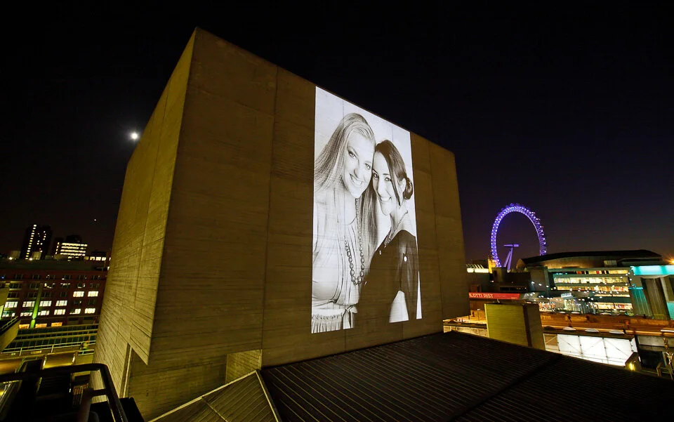
Nothing to do with show pictures or portfolios, but to close today’s post, this was an interesting one for me. A PR commission from many moons ago, above is one of the shots from a quick portrait session I did of two competition winners.
A portrait exhibition (not mine, alas) was being projected onto the National Theatre’s Flytower, on a loop. Part of competition prize was to have these images they’d just had taken, displayed first, to up open the show.


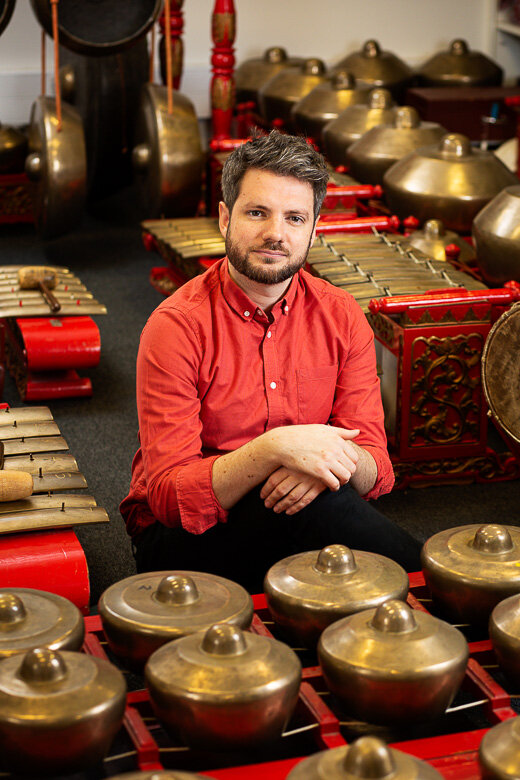
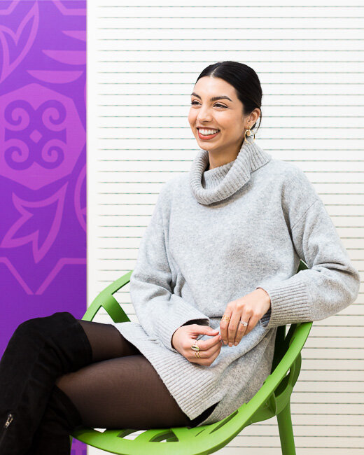
Recent work - September 2020
Recent commissions during Covid. Also, pretty much the entirety of my work during Covid.
It’s been a little quiet lately on the photography front. So if allow me to use the term ‘recent work’ loosely, then here are a series of portraits:

Shot for the SOAS University of London undergraduate prospectus (above, right, below and below right).


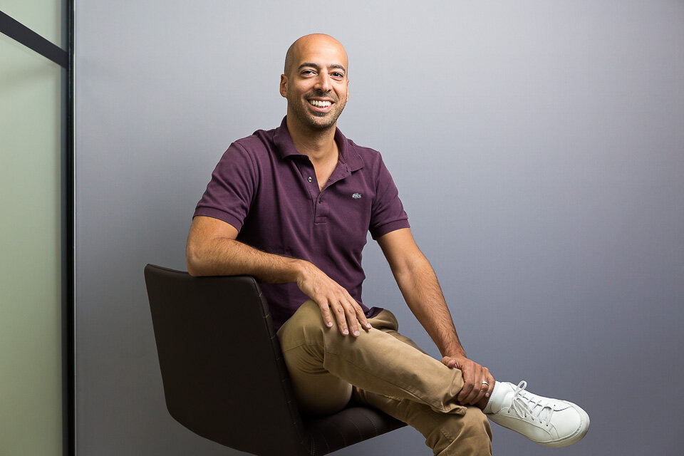
Corporate portraiture for OakNorth Bank.

(above and right) Corporate portraiture for Satellite TV service Freesat.


Actor Tyrone Huntley, for Mousetrap Theatre Projects.

MP Sarah Olney, for Accounting and Business magazine.


ACCA President Jenny Gu, also for Accounting and Business Magazine


Mootral
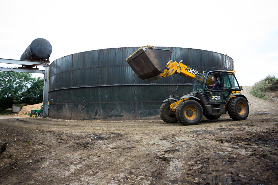
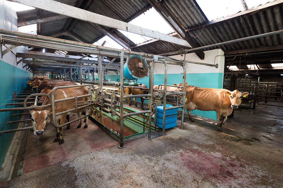
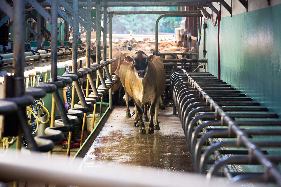
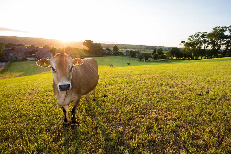
I was commissioned to photograph cows, farmers and more cows for Mootral, an environmentally friendly food-supplement.
Mootral is a natural food supplement which reduces cows’ methane emissions by about a third - the environmental implications are huge. It’s a garlic and citrus extract which has the added bonus of deterring pesky flies, meaning happier cows.
I was fortunate to spend some time on Brades farm at the end of 2019. They make high-quality ‘Original Barista Milk’, and use Mootral in the feed. I was there taking portraits of cows (well, stock photos) and of the farm workers.

Brades Farm Dairy is just outside Lancaster.

Joe Towers

and his brother, Ed Towers.

Thomas Hafner, Mootral CEO and co-founder.


Yummy Mootral

A cow using a back-scratcher.

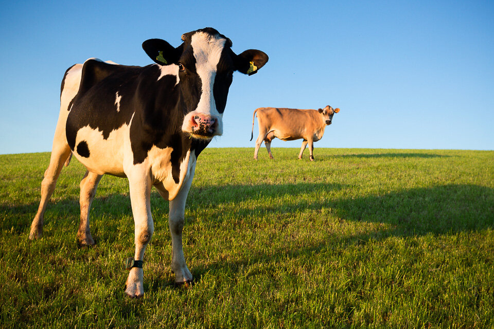
A lovely cow

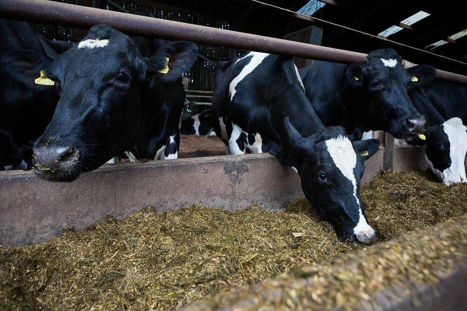
(above and below) lots and lots more lovely cows.


Composition-aware cows
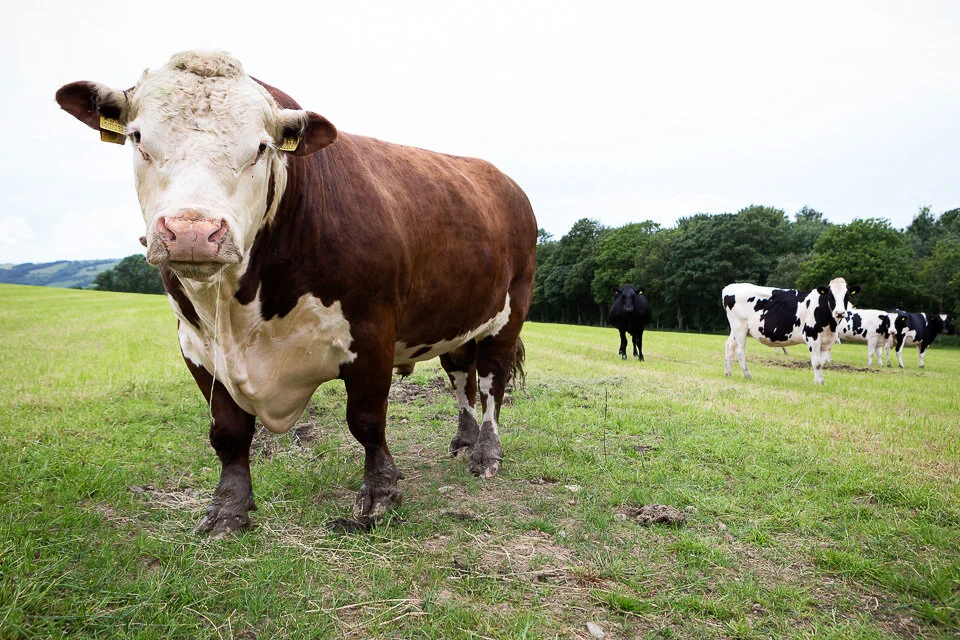
A big, scary bull


-
June 2025
- 19 Jun 2025 The forever purge
- 11 Jun 2025 Recent work - June 2025
- 6 Jun 2025 On Looking
-
January 2025
- 21 Jan 2025 The photographer's dictionary
-
November 2024
- 19 Nov 2024 Recent work - November 2024
-
September 2024
- 17 Sept 2024 Recent work - September 2024
-
July 2024
- 4 Jul 2024 Mean Girls
-
May 2024
- 28 May 2024 Wakehurst
- 20 May 2024 Graduation
-
April 2024
- 16 Apr 2024 Recent work - April 2024
-
January 2024
- 22 Jan 2024 Recent work - January 2024
- 9 Jan 2024 Long live the local
-
October 2023
- 13 Oct 2023 CBRE
- 4 Oct 2023 Recent work - October 2023
-
September 2023
- 22 Sept 2023 Seeing past the subject (2)
-
April 2023
- 12 Apr 2023 Recent work - April 2023
-
February 2023
- 7 Feb 2023 Will AI do me out of a job?
-
December 2022
- 12 Dec 2022 Freelance life and other animals
-
November 2022
- 4 Nov 2022 Recent work - November 2022
-
July 2022
- 26 Jul 2022 Recent work - July 2022
- 25 Jul 2022 SOAS
- May 2022
-
January 2022
- 6 Jan 2022 Recent work - December 2021
- 5 Jan 2022 Prevayl
-
December 2021
- 17 Dec 2021 The day the hairdressers opened
-
December 2020
- 15 Dec 2020 SOAS - postgraduate prospectus
- 7 Dec 2020 Online teaching
-
October 2020
- 11 Oct 2020 Gratitudes
-
September 2020
- 24 Sept 2020 Headshots: why we need them, and why we don't like them
- 15 Sept 2020 From the archives - seven
- 10 Sept 2020 Recent work - September 2020
-
February 2020
- 13 Feb 2020 Mootral
-
November 2019
- 7 Nov 2019 Biteback 2030
-
September 2019
- 16 Sept 2019 B3 Living
-
July 2019
- 22 Jul 2019 Recent work - July 2019
- 19 Jul 2019 From the archives - six
-
April 2019
- 15 Apr 2019 Recent work - April 2019
-
March 2019
- 12 Mar 2019 International Women's Day
-
February 2019
- 4 Feb 2019 Recent work - February 2019
-
January 2019
- 17 Jan 2019 Four photographs
-
December 2018
- 10 Dec 2018 From the archives - five
-
November 2018
- 26 Nov 2018 How to compose photographs
- 5 Nov 2018 Recent work - November 2018
-
October 2018
- 17 Oct 2018 How to edit photographs in Instagram
- 8 Oct 2018 Out with the old
- 4 Oct 2018 Recent work - October 2018
- 1 Oct 2018 A little learning is a dangerous thing
-
September 2018
- 12 Sept 2018 From the archives - four
-
August 2018
- 16 Aug 2018 Recent work - August 2018
- 15 Aug 2018 I don't follow you
- 6 Aug 2018 Cookpad
-
June 2018
- 7 Jun 2018 Monks & Marbles
-
May 2018
- 23 May 2018 Netflix & Woof
- 21 May 2018 Best of Instagram
-
April 2018
- 24 Apr 2018 Standard Chartered Bank
-
March 2018
- 16 Mar 2018 Corporate self-portraiture (two)
- 8 Mar 2018 International Women's Day
-
February 2018
- 9 Feb 2018 Winter swimming
-
January 2018
- 16 Jan 2018 2017 in pictures
-
December 2017
- 6 Dec 2017 Toyota Mobility Foundation
-
November 2017
- 24 Nov 2017 Corporate work
-
October 2017
- 31 Oct 2017 Recent work - October 2017
- 13 Oct 2017 Pfizer - Protecting our Heroes
-
August 2017
- 22 Aug 2017 Wyborowa vodka
- 1 Aug 2017 Vauxhall animation
-
July 2017
- 20 Jul 2017 Take your parents to work
-
June 2017
- 22 Jun 2017 Recent work - June 2017
-
May 2017
- 9 May 2017 Huawei - The New Aesthetic
-
April 2017
- 24 Apr 2017 S.H.O.K.K.
-
March 2017
- 30 Mar 2017 Parkour Generations
- 27 Mar 2017 War Horse in Brighton
- 20 Mar 2017 Jane Eyre
-
January 2017
- 23 Jan 2017 Framing 101
-
December 2016
- 14 Dec 2016 Studio Fractal
-
November 2016
- 29 Nov 2016 Musician
- 10 Nov 2016 While I was waiting...
- 3 Nov 2016 Canvas
-
October 2016
- 11 Oct 2016 Rose Bruford
-
September 2016
- 21 Sept 2016 Instawalks
-
July 2016
- 28 Jul 2016 Property brochure
-
April 2016
- 6 Apr 2016 Breaks and burns
-
March 2016
- 31 Mar 2016 Mixed bag
- 1 Mar 2016 Sky Garden
-
November 2015
- 10 Nov 2015 Romain Grosjean
- 2 Nov 2015 Egosurfing
-
October 2015
- 1 Oct 2015 Ratings are overrated
-
September 2015
- 15 Sept 2015 Seeing past the subject
-
August 2015
- 25 Aug 2015 British Gas
- 19 Aug 2015 Problem solving vs creativity
-
December 2014
- 15 Dec 2014 2014 in pictures
-
January 2014
- 9 Jan 2014 2013 in pictures
-
December 2012
- 31 Dec 2012 2012 in pictures