2018

Handy gadgets and where to find them

Thinking of what I wanted for Christmas, I asked on a photographers’ forum what they considered to be their most useful gadget.

Although gadgets usually refer to tech, let’s define it (loosely) here as

(1) a non-essential photography tool or device - something that not everyone will have

or

(2) something general but essential, which sits outside photography.

After seeing the answers on the forum, I’m also going to add in some of their responses (3) and one utterly useless, useful thing (4).

I’ve included links where relevant.

(1) Photographic gadgets

While we can discount camera bodies as they’re essential, certain features are handy. Different kinds of focusing, wireless transmitting etc. and also (great if true) cat facial recognition.

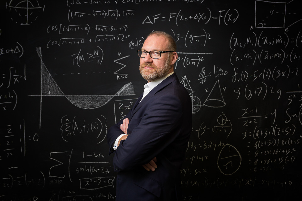
And while most lenses, too, are essential kit, when I use my 50mm f1.2 lens wide open it serves to give a definite look - as well as enabling me to shoot in very low light. These effects are otherwise much less easily achievable.

We can also disregard lights. We all use different brands and types depending on our work and the situation, but along with diffusers, modifiers and reflectors, it all does (basically) the same thing.

Lighting

Anyway, starting with lighting, there are many add-ons and various paraphernalia which could be considered gadgets, so I’ll list a few which come to mind.

I have a Rogue Flashbender and a Gary Fong Collapsible Lightsphere - I use both as rough tools in tricky lighting situations.

For more creative work, I like the Magmod kit - not only for the gels, but specifically the Magmask. They allow for easy, controlled playing with light and effects.

I love my medium reflector. The exact model is no longer available, but it’s something like this and has five different ‘faces’ - gold, silver, black, white and translucent. A world of possibility.

I also have a small diffuser for flash. It’s a bit wobbly but does the job.

Other

The X-rite Colorchecker Passport is good for accurate colours: I have one (but in truth I rarely remember to use it).

A battery grip is a costly, but useful extension to a DSLR camera body which allows for easy shooting of uprights. It also stores a second battery, meaning fewer charges and little chance of running low, even on longer shoots.

(2) General gadgets

Moving away from photography to the more general, gaffer tape comes to mind. I have Gorilla Tape which attaches anything to anything, but also some weaker standard masking tape, for when I don’t want to rip the paint off a wall.

Velcro is useful. I have it glued onto my flashes for attaching flags, and I keep some spare to stick flashes to walls for the rare occasion where there’s no other option.

Bulldog clips and different sized spring clamps are in my kit, too.

Bungee / ball loops are versatile little things which allow you to attach small items (flashes, usually) to poles, handles, stands etc.

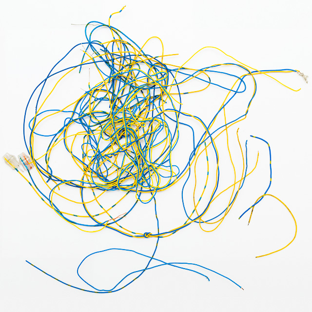
Sugru - mouldable glue, which I mainly used to keep cables from breaking.

(3) Other photographers’ suggestions

Blackrapid straps, polarising filter, tripod, micro fibre cloth (to keep optics pristine), waterproof boots & darn tough socks, hotshoe spirit-level, travel collapsible beauty dish/soft box and mini pole, Interfit Strobies Portrait kit, a ladder, a monopod*.

Also mentioned were: the ability to make people laugh, shrapnel for the pub, and sharp elbows.

(4) Utterly useless useful thing

My “Colourful Rainbow Silicone Laptop Keyboard Cover Skin” is pretty sweet.

The rest of the stuff filling up my bags is either for security/backup or for specific uses: extra rechargeable batteries (Eneloops), cash, a lens cloth, a second card reader, (too many) memory cards, a hand mirror, gels, a lint roller.

There’s no particular gadget I own which I could not do without. This is probably a good thing, as it’s all too easy to fall back on using the same tools and approaching a shoot with that already in mind. I think much of the time it’s more about finding a method, or using whatever available thing will achieve the result. I’ve used my mobile phone as a rest for my lens on the ground for a night shot, in place of a tripod. I’ve used car headlights to light a subject, a white shirt as a reflector in a forest, and clips to pull back baggy shirts.

The useless gadgets I’ve bought and hardly used makes for a sad list of gimmicks. But, reluctant to throw anything away, I have heaps of rubbish in cupboards which must have seemed like a good idea to buy - perhaps in a different life. These are stored along with a lot of obsolete cables and connectors, 512MB memory cards, old phones without chargers and, of course, small pieces of wood.

*The photographer explains: It lets me do pole shots from above or in dangerous situations e.g. motorbikes at speed, tigers following behind the vehicle I'm travelling in etc. Keeps long lenses from wobbling about. Doubles as a baton for dodgy people like football hooligans as it tends to deter them when they see it coming down towards their head.

From the archives - five

Another selection of images from the past few years which never made the cut.

(Above and Below) Shot near Cardinal Place, these two images were from a publicity shoot as part of the “Create Victoria” campaign for Land Sec.

(Above and Below) Shot near Cardinal Place, these two images were from a publicity shoot as part of the “Create Victoria” campaign for Land Sec.

Archive-five-blog_02.jpg
I also found this old one, also for Land Sec, from a shoot at One New Change, beside St Paul’s Cathedral, where they put on a (slightly gothic) fairytale event.

I also found this old one, also for Land Sec, from a shoot at One New Change, beside St Paul’s Cathedral, where they put on a (slightly gothic) fairytale event.

For Mousetrap Theatre Projects, this portrait was part of a feature on their Youth Forum.

For Mousetrap Theatre Projects, this portrait was part of a feature on their Youth Forum.

This photograph was taken at Unum’s rather lovely headquarters in Surrey.

This photograph was taken at Unum’s rather lovely headquarters in Surrey.

Actor Martin Freeman at an event.

Actor Martin Freeman at an event.

How to compose photographs

While composition is only one aspect of what makes a picture work, it’s the one aspect over which you always have some control. It’s about balance, so we can think of the frame as a lever. The simplest setup has a weight directly over the fulcrum:

Lever01.jpg

It is stable, certainly - but in a photograph stable implies safe, and safe can equate to uninteresting, boring. Often something else is done with the composition to imply counterbalance. This image of an umbrella has been cropped to a panorama. Whilst still a very static shot, the crop reduces dead space and makes it about solitude:

Composition-blog_01.jpg

A weight placed slightly off-centre is sometimes all that’s required to create some imbalance or tension:

Lever02.jpg

In this analogy, a simple off-placement is an effective technique for a photograph containing just one subject. In the image below, placing the girl centre-frame would probably result in cropping to a square, to fill the frame better. The off-centre composition, the angle of the chair, the girl’s legs over the corner and her informal pose work to emphasise her spirited, youthful nature:

Composition-blog_02.jpg

Although the subject in the photo below has been placed centrally, her looking out of frame provides a similar - if only slight - imbalance:

Composition-blog_05.jpg

This image uses a similar idea, but you could argue that the lighter side of the building acts as a counterbalance to the main subject (more on this later):

Composition-blog_09.jpg

Moving on, the diagram below is balanced with equidistant objects of equal weighting:

Lever07.jpg

Photographically, this would refer to bisected or symmetrical compositions. Although a frame may (often) be filled more readily with two subjects - a good thing - one might assume that such blunt placement would lead to dull or confusing composition. Dull, because it’s reminiscent of the single object above the fulcrum. An confusing, because both subjects compete for attention, breaking the ‘rule’ of simplicity.

But this needn’t necessarily be the case: this kind of balance in a photograph can create various kind of tension.

They two subjects may invite comparison eg where they’re not quite the same. Consider the various series of images online which show a black and white city scene as it once looked during wartime, or a hundred years ago, blended with a colour photograph of how it appears now, both taken from the same viewpoint. This comparison is precisely the point when two images are combined in Before/After.

The composite of the two images (below) results in looking back and forth between the two expressions:

Composition-blog_11.jpg

In a single shot, we might make comparisons with family photographs, for instance, and more specifically of siblings, with the most obvious example being identical twins. Here’s an excellent set of portraits by Peter Zelewski.

Other kinds of symmetry can be more exact - as in someone by a mirror - or merely suggested. And sometimes they just point to a simple, direct relationship between two subjects, as in the photograph of the chess players below.

Note that in all these cases (and as illustrated previously with the girl looking out of frame), composition can be merely implied. An example would be found in action shots, where traditionally we compose a photo so that the action is shown coming into the frame. That is, it needs space to move into. Normally we might think of a moving vehicle, a runner, or a ball being kicked - but even an eye line will suffice. That the players are both looking into frame serves to tighten the composition, drawing our own eyes to the chessboard:

Composition-blog_03.jpg

Next, balance can be satisfied with the arrangement of one larger object, with a smaller one placed further from the fulcrum:

Lever03.jpg

Translated to a photograph, the subject - sharp/dominant/larger in the frame - is composed with a secondary subject positioned on the other side of the frame which may be smaller/darker/out of focus etc:

Composition-blog_04.jpg

The shot of the dancers below uses the same technique:

Composition-blog_14.jpg

Moving onto imbalance, scales weighted with a single object near the end will fall, with nothing to act as a counterbalance:

Lever04.jpg

In a photograph, this equates to skewed or disharmonious composition, and can be employed to create an edgy, uncomfortable, exciting or dramatic mood.

Typically I think of fashion photography, where it could be a face, cropped in half, right at the edge of the frame. It’s also often seen in war, ‘hard’ photojournalism and documentary photography. James Nachtwey, Martin Parr have plenty of examples. Or have a look at how TV drama series Mr Robot uses this framing device to evoke unease and tension.

This technique needn’t necessarily use composition to achieve this - disorder and discomfort can be created by subverting other expectations. For instance the subject, centre frame, but out of focus, would achieve the same discomforting effect as an off-composition.

I struggled to find any good examples from my own work to illustrate this kind of image! It’s neither my style, nor does it apply to much of my commissioned work by its nature. Anyway, hopefully I can make the point with this photo of my eldest when he was much smaller (I should admit I applied this crop in post):

Composition-blog_06.jpg

In the triptych below, the effect is only slightly applied, and done so for comic/absurd effect. Note that given its subject matter, it would be hard to justify placement any further to the edge of frame:

Composition-blog_10.jpg

Finally, a complex arrangements of objects across the lever may still have equilibrium, and the diagram below illustrates how this might look:

Lever05.jpg

Photographically, this refers to the majority of images which have several points of interest around the frame. Photos are rarely in perfect equilibrium; a mix of balance and imbalance within a frame is very common. After all - unlike the lever - composition is not exact mathematics, and I think most would agree that composition probably shouldn’t ever be too perfect. Here are some examples of busier compositions which still retain sufficient harmony:

Composition-blog_07.jpg

In the image below, it’s easier to envisage an (unwelcome) imbalance if the lady in the background on the right of the frame weren’t there:

Composition-blog_08.jpg

Where time or location is a constraint, eg day to day scenes, candid or street photography etc. situations don’t usually even allow for the 'clean’ setups shown in the examples so far (this is all assuming such a style of image were even desirable, of course - I’ve used these simple examples so far to illustrate the point). In any case, composition may not be the main aspect of what helps make a particular photograph.

The Rule of Thirds

Photographers tend to dislike photographic rules - this one in particular. Rules can be formulaic and safe: they often work best when they’re bent or broken. That said, I’d be remiss not to mention the ‘ROT’ - and it’s an easy go-to. With this idea, the frame is usually depicted as a noughts and crosses board:

noughtsandcrosses.jpg

Simply put, it means placing the subject off-centre, on both axes. Where there are other points of interest, they would ‘ideally’ fall on the opposite junction:

Composition-blog_12.jpg
Composition-blog_13.jpg
Composition-blog_14.jpg

As I’ve said elsewhere, cropping is the most powerful tool of all (and is included in all editing software), meaning composition can therefore be applied/corrected afterwards.

This leads to a final aside - if composition can be employed to emphasise or draw attention to something, at its extreme it can be used to change the meaning of a photo entirely. “Cause of Death” by John Hilliard illustrates this with four images of a dead body, each telling a different story:

Cause of death.png

I hope this has been of interest!

Recent work - November 2018

Nathan is Chief Investment Officer at global innovation foundation Nesta, and I photographed him for Economia magazine.

Nathan is Chief Investment Officer at global innovation foundation Nesta, and I photographed him for Economia magazine.

Oct_portrait-blog_09.jpg
Oct_portrait-blog_08.jpg
Michael Rosen is a poet, broadcaster, and writer among other things, and made the BBC Radio 4 Appeal on behalf of the Meningitis Research Foundation. I photographed him at the BBC offices.

Michael Rosen is a poet, broadcaster, and writer among other things, and made the BBC Radio 4 Appeal on behalf of the Meningitis Research Foundation. I photographed him at the BBC offices.

Oct_portrait-blog_05.jpg
I thought I’d do a deadpan / Sunday supplement image for this portrait. I’m not sure this style of shooting is for me, and interestingly both the selection and the editing were just as tough: being so far from my usual approach I felt much less sure…

I thought I’d do a deadpan / Sunday supplement image for this portrait. I’m not sure this style of shooting is for me, and interestingly both the selection and the editing were just as tough: being so far from my usual approach I felt much less sure what I was looking for or working towards.

I photographed art expert Natalia Cola at the Westbury Hotel.

I photographed art expert Natalia Cola at the Westbury Hotel.

Oct_portrait-blog_03.jpg
Oct_portrait-blog_01.jpg
Oct_portrait-blog_02.jpg

How to edit photographs in Instagram

#nofilter

This hashtag means, “This is straight out of camera. It looks great without any effects or editing. It’s all down to me.”

Well, even if they’re telling the truth (ahem), they’re sadly mistaken. The camera/phone has to process the shot to create a jpeg file. It applies sharpness, contrast, brightness, adds blacks, reduces noise and compresses the file, having already determined colour balance and exposure. That’s quite a lot of work.

Also - like it or not - pretty much every image can be improved - SHOULD be improved - with some further work. Editing is to an photographer what revision is to a writer, presentation is to a chef, or pruning is to a gardener. That’s why #nofilter doesn’t really impress. Depending on the image, I’d say the editing makes up between 20%-40% of the final impact.

Editing begins with correction, which gradually becomes improvement, which then runs into creation (which is at the opposite end of the scale to #nofilter). Everyone has different views to where the boundaries lie, how much to do or declare, and the context of the photo and its purpose will also largely determine this. Note that the ‘creation’ aspect is very limited in Instagram, but I’d certainly place the ‘filters’ in this camp.

So the first thing to say when editing is: ditch the filters. But not for the reason above. But instead, because they make an image look processed: all style over substance. And for anyone who cares about creating nice imagery, why put all that effort into taking a photograph, then leave the rest to an algorithm you don’t understand? I’ve found doing the editing myself informs my photography, and my photography influences the editing.

Some of Instagram’s filters, which apply an instant ‘look’ to an image.

Some of Instagram’s filters, which apply an instant ‘look’ to an image.

Let’s think about what we’re trying to achieve.

The approach

For me, the rule is to make an image look as good as possible, without making it look like you’ve done much at all. And remember, edits are global. That is, the effect is applied to the entire image. So for instance if you wanted to darken something, then everything gets darker. Improvements will therefore have trade-offs: a good reason for a light touch.

OK - the ‘correction’ part' is easy - is it too dark, does it need cropping etc?

When it turns into improvement, it’s then about asking what the picture is about, and emphasising that aspect. So if it’s a picture of friends, your adjustments should mainly consider their faces, and so may involve Brightness, Saturation and Sharpness. If it’s a sunset silhouette, you’re looking at Contrast. If it’s a portrait of your grandmother, best to skip Structure. If the subject is centre-frame, you might be considering cropping, or the Vignette tool. And so on. With global edits, the trade-off means you have to let the rest of the frame fall where it may.

It is not about sliding every slider each way to see what looks nice. That’s time-consuming and results in an over-processed look ‘just because it looks good’. You’re not being sympathetic to the right treatment. Plus if you’re spending more than a minute editing, that’s too long.

We’ve dealt with the filters. Let’s look at the editing tools now, starting with the most essential one: the crop.

The editing tools

crop.jpg

Crop

This is on the very first page, and not immediately obvious as it sits near Boomerang and Layout. Instagram defaults your image to a square, and this function returns it to its original shape, if different. You can crop in/out by pinching/squeezing, or move the canvas around.

When to use

Always. It can be used as a trim to tidy up the frame. It can be used more severely to cut out unwanted elements. Or it can be used to radically recompose and change the meaning of the image.


Lux.jpg

Lux

Also often missed, this appears at the top of the filter page. It’s the odd one out in that by clicking on it, it automatically adds 50%. It works on contrast, saturation and sharpness, and gives a bit of a ‘pop to flat images.

When to use

Nearly always, and roughly between 10-30. Never above 50. Be careful to press ‘Cancel’ - not ‘Done’ - if you don’t want it.


Adjust.jpg

Adjust

Since you can crop on the opening edit page, this is only useful for perspective correction.

When to use

Almost never. Occasionally you’ll have something large or small at the edge of an image which looks wrong, eg a face in a group photo. Otherwise, it’s only necessary if your image relies on exact angles, parallel lines etc.


Brightness.jpg

Brightness

I often return to this tool a couple of times during editing, as Highlights, Shadows and Contrast all affect overall brightness.

When to use

You should use this for almost every photo.


Contrast.jpg

Contrast

This is about how much ‘punch’ there is in your image; it’s the difference between the shadows and the highlights. Be aware this will affect the saturation of an image.

When to use

Most of the time: the majority of images need a little boost. However, with misty landscapes and images with a calmer mood you might want to go the other way, reducing contrast.


Structure.jpg

Structure

Similar to the ‘clarity’ tool in professional editing programs, this tool lies somewhere between sharpness and contrast, and gives a crunchy, hi-definition feel to an image.

When to use

It pulls up texture, so definitely not to be used on a portrait of your grandmother as it would be unflattering. But for a photograph of her hands, it would be fantastic. I use it a lot for detail and abstract images.


Warmth.jpg

Warmth

This gives a red/orange hue sliding right into the positive; sliding to the left (negative) gives a blue/green hue.

When to use

I rarely use this except to give a bit of a ‘look’. Use sparingly - you never want to push this too far in either direction.


Saturation.jpg

Saturation

This determines how strong the colours appear in an image. Strictly, it’s about how much grey there is.

When to use

Naturally, images relying on (‘about’) colour may benefit from saturation. But you’d be surprised how effective a slight reduction can be, typically between -10 to -20, especially in more moody/soft-light portraiture.


Colour.jpg

Colour

This tints the highlights, shadows, or both with a colour and to a degree of your choosing.

When to use

Rarely, if ever. And extremely sparingly. It gives the image a look (in the same way as the filters do). So as soon as it’s noticeable, you’ve gone too far.


Fade.jpg

Fade

This reduces the blacks and colours. Again, it gives a very obvious look to an image.

When to use

Perhaps on a misty scene, but otherwise never: this belongs among the filters.


Highlights & Shadows.jpg


Highlights

This deals with the brightest parts of an image. Sliding to the right can ramp them towards white, whereas to the left darkens them.

Shadows.jpg

Shadows

Like highlights, but covering the darker tones. Sliding to left pulls them towards black, while to the right lightens them, revealing shadow detail.

When to use

Nearly always, for both. While degree is a matter of taste, more contrast tends to be more desirable; pulling them apart achieves this, resulting in punchier and simpler results which work well on the platform, but at the risk of losing subtlety and detail. Bringing them together has a softening/fading effect, and can result in an HDR-type look.


Vignette.jpg

Vignette

This darkens the edges of the picture, drawing the viewer’s attention to the centre of the frame.

When to use

Use for anything where the corners are unimportant, but they must already be (slightly) dark. On a light background, vignetting looks horrible, or at least makes the image look overly processed eg sky.


Tilt Shift.jpg

Tilt Shift

This is a naughty little cheat tool, blurring everything outside the target area. Blur can be radial, with both the size and location of the focus area set with pinching and moving. It can also be linear, where the width and angle can be changed. It’s a lot of fun and has immediate impact.

When to use

For snaps - if you use this, it’s very obvious and unnatural.


Sharpen.jpg

Sharpen

This is an essential tool, even though the results can be hard to see at anything less than about 50%, especially on small screens. It gives that final little tweak. Our eyes are drawn to - among other things - anything sharp, so it’s an important part of the process.

When to use

Always.


Final tips

Left to right workflow

Work left to right, and go back if you need to. A dot will appear underneath the settings you’ve changed. Remember, you don’t need to use every tool.

left to right.jpg

Touch and go

Keep checking the before and after. By holding your finger on an editing screen, you’ll see how the image would look without that adjustment. On the main screen, it shows how it would look without any adjustments applied. Touching and removing is a handy before/after view.

Pull back.jpg

Ease off

With that last point in mind, pull back on your effects, as they compound one another. 34 Saturation, 47 Contrast, 45 Highlights, -28 Shadows: all of a sudden you have a very heavily-processed image. 34 should be 20; perhaps bring 47 down to around 30, and so on.

I hope this is of use! Happy ‘gramming.

Out with the old

In my recent article about how we improve (“A little learning is a dangerous thing"), I talked about how my old work isn’t good enough now - can’t be good enough - as my skills / critical eye have developed. I wrote, “Hopefully, in the years to come I'll feel the same way about the pictures I have in my portfolio now. Because if not, I'm not improving.”

There’s this idea that anything not recent doesn’t represent us, is somehow false or misleading for being out of date. We’ve moved on - or regressed. But I’m now coming round to the conclusion this is erroneous. More on this later.

Regardless, in the meantime my website is bloated, and in need of a refresh: I’ve not done much to it in a while. This seems like a good opportunity to remove some of the dead wood. And besides, the more I’ve improved, the easier I should be able to cull old images. Right..?

Before finishing marking pictures for deletion - a troubling task - I ask for thoughts on a forum: how old is old? How do you feel about showing work you haven’t done in a long time? Does it still represent you?

I say troubling because it’s really not easy. It’a not like old food - I can’t just look at the date and bin it. Some of my old photos I still like. Do I really have to take them down? I don’t want to. Hmm. I’m not nearly as dispassionate as I should be in displaying my work. Or today, at least. It just doesn’t feel like the right thing to do in the name of a cleaner portfolio.

The hive-mind replies. The near-unanimous response - a slight surprise and a great relief - was that it’s completely fine to have old pictures, as long as they don’t look dated, and as long as you have new work, too.

So I’ve gone through again, looking only for the weaker pictures, with only half an eye on the date taken. That’s surely more important, how good an image is. But I don’t know which are good or bad. It’s an important skill and notoriously difficult. I’ve only ever culled a few images over the years, those which begin to stick out rather obviously after a time. But nowadays the quality and style is, I feel, fairly consistent throughout. I know better than to seek true objectivity from colleagues, as they will tear apart my keepers and praise the ones which need to go. And they’ll disagree with one another. As for deleting the weak ones myself, on the one hand I’m bored of nearly all my work, and on the other, I’m oddly attached to much of it.

But the ‘bored’ part - does this mean I’ve improved? Yes? Great…but if so, where’s the new, improved work to replace what’s to be removed? Ah. Well, I do have a few images which need putting up. But for now, mostly, it’s about culling.

So I ask myself these questions about each image:

  • Do I like it?

  • Does it represent the work I do, or would like to do? Or rather, will it appeal to the clients with whom I’d like to work?

  • Is it the best example among similar images in my portfolio? Is it different enough to justify existing?

    (while keeping in mind)

  • Has it been taken recently?

Devoid of context, the best images in a portfolio continue to shine. These images below - the ones I’m retiring - all suffer from the corollary: standing alone as they do, they don’t say much. There’s nothing wrong with them per se, but I don’t feel any of them quite spark an emotion or connection on their own. And I realise why - I’d included many of them as placeholders, representing a technique, style, or kept just because they were a little different.

Getting rid of a dozen images is not quite the grand cull I’d imagined, but it’s a start.

deleted-blog_13.jpg
deleted-blog_12.jpg
deleted-blog_18.jpg
deleted-blog_06.jpg
deleted-blog_01.jpg
deleted-blog_07.jpg
deleted-blog_02.jpg
deleted-blog_17.jpg
deleted-blog_11.jpg
deleted-blog_04.jpg
deleted-blog_05.jpg
deleted-blog_16.jpg
deleted-blog_03.jpg

Recent work - October 2018

I cover a range of commissions outside portraiture. I enjoy the variety and the learning; challenges, ideas, approaches and techniques from one shoot usually come up again. Here’s a selection of recent(ish) work:

University of London networking evening.

University of London networking evening.

A PR stunt for Epson to illustrate the loneliness felt by many UK freelancers. Vicki Psarias (aka blogger Honest Mum) worked for a day from inside a perspex box, situated near Covent Garden.

A PR stunt for Epson to illustrate the loneliness felt by many UK freelancers. Vicki Psarias (aka blogger Honest Mum) worked for a day from inside a perspex box, situated near Covent Garden.

MB6-blog_11.jpg
Rehearsal images at the National Theatre for The Curious Incident of the Dog in the Night-Time.

Rehearsal images at the National Theatre for The Curious Incident of the Dog in the Night-Time.

Patricia Hodge and David Suchet at a fundraising gala for Mousetrap Theatre Projects.

Patricia Hodge and David Suchet at a fundraising gala for Mousetrap Theatre Projects.

MB6-blog_03.jpg
MB6-blog_04.jpg
MB6-blog_16.jpg
(above) Also for Mousetrap, their annual awards ceremony, The Mousetraps.(below) All the following images are from various Mousetrap workshops, events and projects.

(above) Also for Mousetrap, their annual awards ceremony, The Mousetraps.

(below) All the following images are from various Mousetrap workshops, events and projects.

MB6-blog_06.jpg
MB6-blog_17.jpg
MB6-blog_10.jpg
MB6-blog_08.jpg
MB6-blog_15.jpg
MB6-blog_12.jpg

A little learning is a dangerous thing

“Do you still improve as a photographer?” a friend asked recently. What an odd question - I’ve been doing it for nearly 15 years, and have only in the last few reached a point where I’m not constantly worrying and feeling like a fraud. All I ever strive for is improvement. It’s a strange idea that one day you just ‘get it’ and you’re done.

I realised three things.

One is that you don’t ‘just get’ anything. Everything can be improved. Even walking? Yes, I’m pretty good at that, but put me on a catwalk and I’d like some lessons first. What about drinking? Maybe, but ask the people who taste coffee, buy wines, and you’ll find there’s more to it.

Two is that any assumption - here, that photography is something you ‘get’ - is based, in part at least, on our being unable to see, judge or understand anything much outside our sphere of knowledge. On a recent weekend in Dublin, my Irish hosts were stunned I couldn’t hear the difference between their accents - Galway, Cork, Derry*. Why would I? But while not important to me, it is where it concerns one’s identity within a country. Or to take another example: I’ve barely touched my guitar in 20 years (and was only Oasis-round-the-campfire level then). Yet my kids think I’m a rock legend. Because they don’t know better, I’m up there with Slash and Jimmy Page.

Three is that improvements must become smaller. What I learn in the next few years will be far less than what I learned in my first years as a freelance. Or to put it another way, I need to work much harder now to to improve the same amount**.

Anyway, the following diagram - which I came across some years ago - describes the learning process from beginner to expert, and applies to any skill or ability - driving a car, playing the piano or, indeed, practising photography.


    Stage one is 'unconscious incompetence'. This is where you have a subject which you don't know about, and, moreover, you don't know what you don't know. This could be something like the stock market, interior design, or Bolivian basket-weaving. It applies to most things, for most people.

    The next stage is 'conscious incompetence'. You have a basic grasp of a subject, and realise there’s a lot more to learn. This applies to the well-read, the busy, the educated and the hobbyists, about most things.

    The third stage is 'conscious competence'. You are practised enough to do it, aware of how far you've come, and aware of what else there is to know and learn. The most basic techniques are perhaps second-nature, but the bulk of performing the activity is very much a conscious process. 

    Then, at stage four, we reach 'unconscious competence'. The knowledge acquired is now hardwired in the unconscious part of the brain through practice and/or study. Almost as if you're not aware of what you know - it's second-nature. Like riding a bike. Or, like speaking in our native tongue, we can produce and process complex sentences at will, taking into account grammar, vocabulary, intonation and body language. But most of us would be unable to analyse or explain the compound verbs, adjuncts, facial clues or speech patterns we use so readily.

There’s also "reflective competence", which is to do with a self-awareness and deep understanding of a subject, the kind required for teaching or writing. It might also suggest an ability to adapt and respond naturally to entirely new challenges.

Or, the arrow could lead back to stage one. Unconscious competence can lead to complacency and habit as one develops a personal style, set along certain ways of doing things, and self-belief becomes stronger. It can be hard to learn (or one might actively resist) new techniques or accept new ideas, and to do so requires starting again, at least in some way. I remember as a student the feeling of ‘unlearning’ what style I’d had as a keen amateur.

Competence and the Critical Eye

    Bringing it back to photography, as you improve and get the basics under your belt, you being to notice things previously hidden or ignored. Things which didn't bother you before - didn't even appear on your radar - now become issues to deal with. Your pictures get better through experience, but as this learning finds its way into your work, you become more critical of them. In learning what to 'look for', so you see those things when you judge the picture later. Messy backgrounds, dead space, and burnt-out highlights never bothered me when I started out. They simply didn't register. But looking now, these flaws would be the first thing I see and all I notice. Hopefully, in the years to come I'll feel the same way about the pictures I have in my portfolio now. Because if not, I'm not improving.

    For me, this is where doing photography and viewing photography overlap. Doing photography takes place in real time, with all the difficulties and problems that brings. The better you become, the 'higher' the concerns which you need to consciously think about, concerns which didn’t exist before. And with these newer concerns on your mind, when you view the pictures later, these are the things you may (or may not) have got right. Those are the new benchmarks by which you judge the success of the shoot.

Ars est celare artem

    And the higher up you go, the more theoretical they become. For the really good photographers, the 'rules' count for less and less. Some of the greatest pictures can look, at first glance, almost like amateur snapshots, in my opinion. They look easy, without any apparent art or style. The Latin quotation above (sometimes incorrectly attributed to Ovid) loosely translates as "Art is the concealment of art", or "Art hides itself". The idea is that the greatest art lacks overt ingenuity or self-conscious craftsmanship. It doesn't seem to present itself as art - until you look closer. It suggests that you need to be at a certain 'level' to really appreciate it. And one recognises that improvements are harder and harder to get: the final few metres are what separates the good from the great.


The Dunning-Kruger effect

Going back to the second idea (how little we really know, when we know very little), this is a symptom of unconscious incompetence. The model below describes the relationship between one’s ability and one’s confidence:

Dunning Kruger copy.jpg

After only a short time learning a new skill, we feel we know a great deal. Probably because even after a few lessons (in anything), we’re already ahead of 98% of people. But soon enough, our self-belief plummets (consciously incompetent), before we begin to build up our ability and confidence at a more equal ratio (consciously competent).

Alexander Pope described the behaviour in 1709:

A little learning is a dangerous thing;

drink deep, or taste not the Pierian spring:

there shallow draughts intoxicate the brain,

and drinking largely sobers us again.

I’d like to think “I’m kind of getting it now” with regards photography. And I’d point out that if we knew from the start how much there is to learn about something, we’d probably never bother to do anything. A little ignorance and a touch of unwarranted confidence is a helpful nudge to get things started.

*If I’m honest, I sometimes struggle hearing between Scottish and Irish.

**An analogy from Breaking Bad: Gale Boetticher’s meth reaches 96% purity, yet he is in awe of Walter’s 99.1%.

Recent work - August 2018

Some portraits from the past few months:

Lizzy Watts, playing the lead in Hedda Gabler at the National Theatre.

Lizzy Watts, playing the lead in Hedda Gabler at the National Theatre.

Jacqueline Davies, Chair of the Board of Trustees at NSAFS.

Jacqueline Davies, Chair of the Board of Trustees at NSAFS.

Azad Cola, owner of the Westbury Hotel, for Forbes magazine.

Azad Cola, owner of the Westbury Hotel, for Forbes magazine.

Belmond CFO Martin O'Grady, photographed for Economia magazine (and below).

Belmond CFO Martin O'Grady, photographed for Economia magazine (and below).

MB-blog_04.jpg
Alex Gaumond and Jonathan Bailey, joining the cast of Company at the Gielgud Theatre.

Alex Gaumond and Jonathan Bailey, joining the cast of Company at the Gielgud Theatre.

Corporate portraiture at Cohn & Wolfe (and below)

Corporate portraiture at Cohn & Wolfe (and below)

MB-blog_07.jpg
MB-blog_06.jpg
MB-blog_11.jpg
MB-blog_10.jpg
Facebook EMEA Head of News Partnerships, Nick Wrenn.

Facebook EMEA Head of News Partnerships, Nick Wrenn.

I don't follow you

Instagram again. I'm going to talk about those I don't / won't follow. Probably because it's cathartic to make a vague swipe at the misuse, self-indulgence and poor behaviour on the platform.

A little background: for me, IG is mostly a place for all my 'singles', images which I take outside of work and which don't belong in a portfolio. Usually patterns, shapes and abstracts, that sort of thing (here). I also put the odd 'proper' image in there to mix it up, with half an eye on the (potential) professional/portfolio aspect.

I spend between 5-20 minutes a day on IG, and have 1,453 followers (today), and follow 604.

So, accounts I tend to follow include: quality photography and art; picture editors and related; potential and existing clients; odd, interesting and similar accounts, and some friends.

Regrettably, like many, I also follow accounts upon which I border on indifference, but I'm whittling these down over time. And some accounts whose origins I can't remember. The rest are the remnants of the few days last year when I used a bot. I remove these as and when. 

Follow_blog01.jpg

Anyway, here's who I don't follow:

  • People who list their kit. I just don't understand why anyone would do this. Nobody cares.

  • Anyone who uses more than one or two emojis in their profile.

  • Anyone following more than 500 people (I'm aware of the hypocrisy, but I'm trying). Seriously, though, some people follow a couple of thousand accounts. This is silly. They only care about themselves - they're not interested in you, or me, or anyone. Someone following over 10k people followed me the other day. Do the maths. Them spending, say, two seconds looking at one image per person per day equals... 5.5 hours per day on IG. So, do they want to see my work? No. It's clickbait, in order for me to follow back. Sometimes these people then unfollow. The cheek of it.

  • #catsofinstagram - I'd never get any work done. It's the pinnacle of human achievement.

  • People who post more than a couple of inspirational quotes. Just please stop.

  • Anyone with a disproportionately high following in relation to their number of posts. This is suspicious. Do your time and upload some content, don't use a bot.

  • Professional photographers whose target audience is those who they know personally, and worse, just those they know very well. Typically, you can spot them because their posts are insider-ish (to the exclusion of others) eg friends, BTS shots, holidays, in-jokes, family. You're not posting for me. That's fine - equally I'm not interested in you, I'm here to see your work.

  • People who describe themselves as an "influencer", "dreamer", "disrupter" or "thought leader". Or use hashtags like #lifegoals. It's not that I don't get it - I do. We're just very different people and we wouldn't be friends in the real world.

  • People who have too many selfies. 1 per 20 uploads is probably fine. More if you're a model, I guess.

  • Friends who didn't follow me back. Why do you hate me?

Finally, there are posts which raise an eyebrow, but aren't necessarily dealbreakers. The absolute worst are portraits taken of celebrities who've just died, sometimes within minutes of the news breaking. The caption talks about the time (six years previously) when they photographed them, how nice they were, how sad it is etc. followed by a sea of these hashtags: #death #sorrow #tragedy #death #celebrity #overdose #portraitphotographer #londonphotographer #rip #sad #commission #suicide. You are horrible people. But I like your style. 

In the interests of full disclosure, I should note that actually I'll follow anyone, and am guilty of most of the offences listed.

Monks & Marbles

This set of pictures is from a long time ago, when I was in Nepal. Out walking one day, I came to Benchen Monastery in West Kathmandu and decided to take a look around. The novice monks were playing marbles:

monks-blog_05.jpg
monks-blog_04.jpg
monks-blog_14.jpg
monks-blog_08.jpg
monks-blog_01.jpg
monks-blog_02.jpg
monks-blog_06.jpg
monks-blog_07.jpg
monks-blog_10.jpg
monks-blog_03.jpg
monks-blog_09.jpg
monks-blog_13.jpg
monks-blog_12.jpg
monks-blog_11.jpg

Netflix & Woof

I’m a cat person, and I watch Netflix.

I might binge from time to time, but in my defence I normally have one or both of my cats asleep on my lap, and I consider it a cruelty to move from the sofa.

According to a survey by Netflix, most people prefer to watch box sets with their pets. There’s no chance of spoilers - or, worse - cheating. 

The study also claims: “More than a third of respondents (37%) have moved where they were sitting so their pet would be more comfortable, 22% have bribed them with treats to watch longer, and some (12%) have even gone so far as turning off a show because their pet didn’t appear to like it.”

Anyway, to accompany the study, I was commissioned to photograph behind the scenes for a light-hearted video shoot - Netflix & Woof - at Dogs Trust, Basildon, with some very well-trained dogs.

(During the afternoon, the tiniest puppy ever was brought in to reception. Despite being a committed ailurophile, I did consider making space in my camera bag to bring it home. It was the size of a lens, and not even one of the large ones.)

I'm not at liberty to publish all the images, but here's a flavour.

Picture credits: Alex Rumford/Dogs Trust:

Netflix-blog_10.jpg
Netflix-blog_12.jpg
Netflix-blog_01.jpg
Netflix-blog_03.jpg
Netflix-blog_02.jpg
Netflix-blog_08.jpg
Netflix-blog_11.jpg
Netflix-blog_13.jpg
Netflix-blog_05.jpg
Netflix-blog_14.jpg
Netflix-blog_06.jpg
Netflix-blog_07.jpg
Netflix-blog_04.jpg


Best of Instagram

My IG feed - @alexrumford - is diluted with my regular work and archive material. If you're anything like me, you tend not to view more than the most recent couple of dozen pictures on someone's feed, and early posts soon get buried in an ever-growing pile.

Secondly, I like to see posts from everyone, but following nearly 800 people would mean an hour a day just keeping up.  

With no way of filtering the 'best' images ('likes' are often largely irrelevant, at best a rough indication of quality) IG is then more about getting a sense of someone's work and interests rather than seeing their portfolio. Which is fine, but since my "out and about" shots - mostly minimalist and abstracts - are a world away from my commissioned work, I wanted to some of my favourites to date:

Corporate self-portraiture (two)

A new headshot is long overdue: my existing one is around seven years old. So, tethering to my laptop, with a remote trigger, a tripod and a couple of lights, I set to work. 

Headshot-blog_01.jpg

I played around with colours in photoshop to make it look arty, but the issue is still that I look unhappy, and there's not a lot I can do about that in post. But forcing a smile alone made me feel a little insane. When I'm shooting corporate headshots, I don't know the people and so I can objectively work towards trying to make them look professional, friendly, trustworthy etc. There's no right way for each person: aside from everyone photographing differently, depending on age, role and level a softer look will suit some, a more assertive expression others.

The subjects, on the other hand, are usually concerned with looking their best. 95% claim not to be photogenic as they come into the room, and/or dislike their nose/ears/chin/hairline etc. We're often looking for different things from the process.

I knew I should adopt the objective approach, but it's very hard to do. And I don't think I've ever taken a real selfie. Sometimes, knowing what goes into something makes it all the more difficult to achieve.

Headshot-blog_02.jpg

I had another go a couple of days later, with a different lighting setup and less post-production. The hint of a smile (as much as I can muster) is definitely better. The tilt of the head softens it somewhat, and the stronger catchlights in the eyes help bring some life into it.

On reflection, I'd prefer an environmental portrait over a headshot on a background next time. So whilst it will do for now, I'm still not thrilled with it, and will likely do a swap with another photographer at the next opportunity. 

Winter swimming

I photographed the lovely writer and swimmer Ella Foote in the river Thames, near Marlow. Ella swims outdoors regularly, and had recently completed "Dip a Day December" for charity, despite the cold and grey. 

At 7.30am I was already cold, despite my four layers.

At 7.30am I was already cold, despite my four layers.

Before the shoot, I had in my mind a bleak, peaceful solitude as the tone. Bare trees, mist and dark water. Although presence and solitude were very much the mood, Ella is a much smilier and relaxed person than these images convey.

Before the shoot, I had in my mind a bleak, peaceful solitude as the tone. Bare trees, mist and dark water. Although presence and solitude were very much the mood, Ella is a much smilier and relaxed person than these images convey.

It would have taken me ten painful minutes to do this. Ella is so used to it; she might as well have been getting out of bed.

It would have taken me ten painful minutes to do this. Ella is so used to it; she might as well have been getting out of bed.

Ella Foote-blog_04.jpg
I'd been hoping for - counting on - mist, but this requires a greater difference between the air temperature and water. I thought I'd play around in photoshop how it might have looked with mist, and was surprised how realistic it looked, given I was…

I'd been hoping for - counting on - mist, but this requires a greater difference between the air temperature and water. I thought I'd play around in photoshop how it might have looked with mist, and was surprised how realistic it looked, given I was working from nothing. I used a technique from the wonderful Phlearn.

Ella Foote-blog_06.jpg
I wanted to shoot remotely, with my camera on a monopod over the water - there was no way I'd be going in. It didn't work from the off - I needed to see through the viewfinder. I could have shot tethered, but this might have slowed things down more,…

I wanted to shoot remotely, with my camera on a monopod over the water - there was no way I'd be going in. It didn't work from the off - I needed to see through the viewfinder. I could have shot tethered, but this might have slowed things down more, and it was so cold (for both of us!) there wasn't a lot of time for the shoot.

Ella Foote-blog_08.jpg
Ella Foote-blog_09.jpg
Ella Foote-blog_10.jpg
The sunrise was beautiful, but shooting any later would have been too backlit and the trees would have burned out.

The sunrise was beautiful, but shooting any later would have been too backlit and the trees would have burned out.

Ella Foote-blog_12.jpg